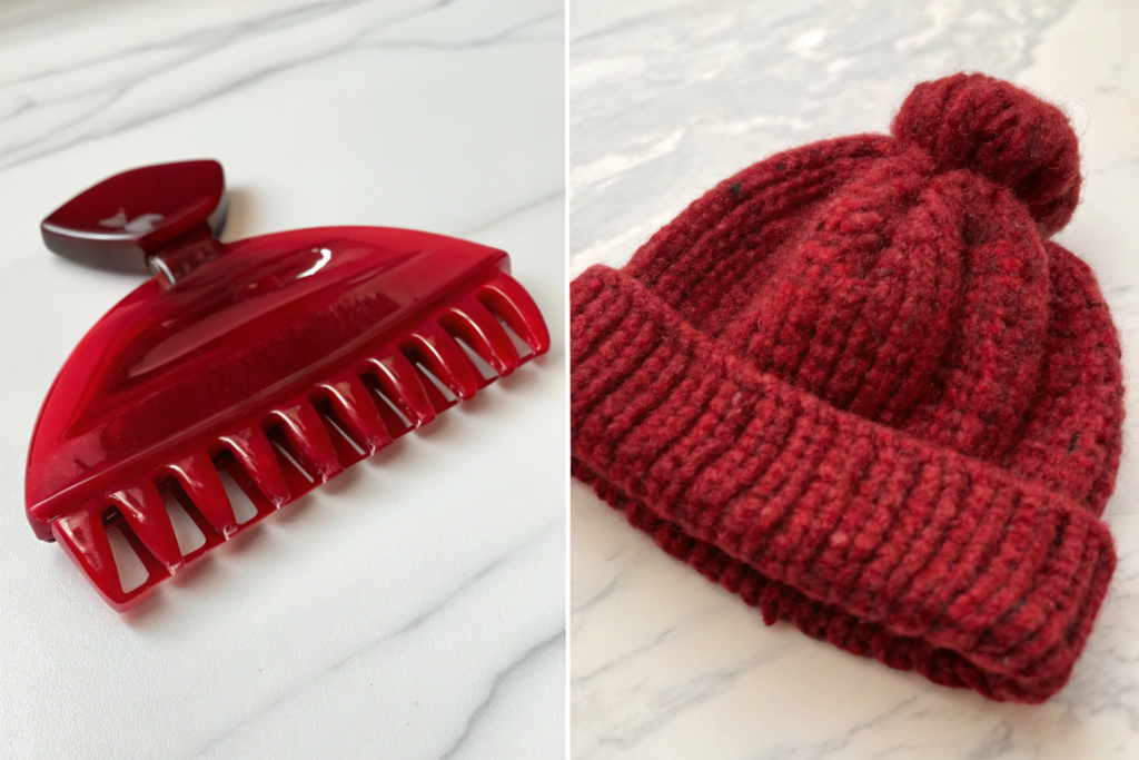
I remember a client named Olivia who launched a beautiful collection of hair claws , silk scarves , and knit beanies all in her signature shade of "Terracotta Clay." The product photos on her website looked stunning. But when customers started receiving the items, she was flooded with returns and negative reviews. The hair claw was a muted, dusty orange. The silk scarf was a bright, rusty red. The knit beanie was a brownish-brick. Side-by-side on a shelf, they looked like three different colors. Her carefully curated brand aesthetic fell apart at the point of delivery. If you are like Ron, you understand that a signature color is a cornerstone of brand identity. The fear of launching a multi-category collection and having it look like a mismatched jumble sale is a very real and expensive anxiety.
Ensuring consistent color across different accessory materials requires a disciplined, three-phase process: first, establishing a single, physical Master Standard (usually a Pantone fabric chip) as the absolute reference; second, conducting a rigorous Cross-Material Lab Dip approval process where each material (acetate, silk, yarn) is dyed to match the master under controlled lighting; and third, implementing a final Visual Harmony Check where all finished goods are physically placed together to assess their "visual marriage" before bulk production is approved. The goal is not scientific identity (which is impossible), but visual harmony.
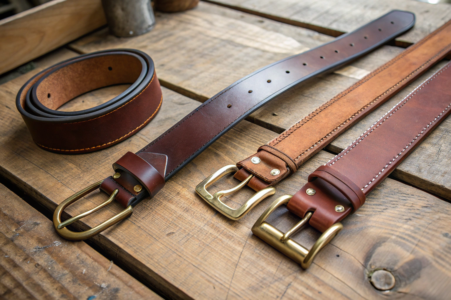
I run AceAccessory in Zhejiang Province. We manufacture across a wide range of materials. I have spent years navigating the complex chemistry and physics of color. I have learned that you cannot simply email a Pantone number to three different factories and expect them to match. Color is a function of Material Substrate. The same dye formula that creates a perfect "Terracotta" on lustrous silk will look completely different on matte, fuzzy acrylic yarn. The secret is managing Expectations and controlling the Approval Process. Let me walk you through the exact, actionable steps we take at AceAccessory to ensure that a belt , a bag , and a hat all sing the same color note.
Why Is Achieving Exact Color Matches Across Materials Impossible?
The first step to success is accepting a fundamental truth of material science: You cannot achieve a perfect, scientifically identical color match across different materials. The physics of light and surface texture make it impossible.
Color is not an inherent property of an object. It is the result of Light interacting with a Surface. The human eye perceives this interaction.
Two material properties create unavoidable perceptual differences:
- Surface Texture (Gloss vs. Matte): A smooth, glossy surface (like polished acetate on a hair claw ) reflects light in a Specular (mirror-like) way. This concentrated reflection makes the color appear Brighter and More Saturated. A rough, matte surface (like the fuzzy yarn on a knit beanie ) scatters light in a Diffuse way. This scattered reflection makes the color appear Softer, Lighter, and Less Saturated.
- Material Composition (Dye Absorption): Different fibers absorb dye differently. Silk is a protein fiber that takes dye brilliantly, producing vibrant, luminous colors. Cotton is a cellulose fiber that can appear slightly duller. Polyester is a synthetic that requires a completely different class of dyes (disperse dyes). The exact same dye cannot be used across silk, cotton, and plastic.
Therefore, the goal cannot be Scientific Identity (the spectrophotometer reads the exact same number). The goal must be Visual Harmony. The items must look like they belong to the same Color Family when placed next to each other under natural light. They must tell the same Color Story.
At AceAccessory, we educate our clients on this principle from day one. We set the expectation that the beanie and the hair claw will be Sisters, not Twins. They will share the same DNA, but they will have slightly different expressions based on their material nature. This shift in mindset is the foundation of a successful multi-category color program .
How Does Surface Texture (Glossy vs Matte) Change Color Perception?
Let's dive deeper into the physics of Gloss. This is the number one source of client concern during the approval process. A color that looks perfect on a matte Pantone chip can look "too bright" or "too dark" on a glossy finished product.
Here is a practical table to understand the shift:
| Material Finish | Light Reflection | Perceived Color Shift |
|---|---|---|
| High Gloss (Polished Acetate) | Specular (Mirror-like) | Darker, More Saturated. The concentrated reflection creates deep shadows and bright highlights. |
| Satin / Semi-Gloss (Silk Chiffon) | Soft Sheen | True to Hue. A gentle, even reflection that reveals the color accurately. |
| Matte / Flat (Bio-Acetate, Cotton Canvas) | Diffuse (Scattered) | Lighter, Less Saturated. The scattered light "dilutes" the color, making it appear softer and slightly chalkier. |
| Textured / Pile (Boucle Yarn, Velvet) | Trapped Light | Deep, Complex. Light gets trapped in the pile, creating rich shadows and a color that shifts as you touch it. |
The Implication for Approval:
You cannot approve the Glossy Hair Claw sample by comparing it only to the Matte Pantone Chip. You must view it in the context of its own finish. We often advise clients: "The glossy claw will read as one shade darker and more intense than the matte chip. This is expected and correct for this material."
At AceAccessory, we provide Finish Reference Samples. We show clients a piece of matte acetate and a piece of polished acetate in the same color, side-by-side. This educates the eye and sets realistic expectations for how the final products will look. This is a crucial part of our client education process.
Why Do Dye Lots Vary Even with the Same Pantone Reference?
Even when we are working within a Single Material (e.g., 100% Acrylic Yarn), the color can vary slightly from one production run to the next. This is due to the inherent variability of the Dyeing Process.
A Pantone Number is a recipe, not a guarantee. The dye house mixes a formula of pigments to achieve the target shade. However, tiny variations in the following factors cause Dye Lot Variation:
- Water Quality: The pH and mineral content of the water used in the dye vat affects how the dye bonds to the fiber.
- Temperature: A 2-degree fluctuation in the vat temperature can shift the final shade.
- Humidity: The drying conditions affect how the dye oxidizes and sets.
The industry standard for acceptable dye lot variation is Delta E < 1.0 (a measure of color difference that is imperceptible to the untrained eye). A good factory will maintain a Dye Lot Library with a retained sample of every production batch.
The Risk of "Chasing the Perfect Match":
If you place a reorder for your "Terracotta" beanie six months later, it will be from a New Dye Lot. It will be Slightly Different from the first batch. If you have a multi-category collection, and you try to match the new beanie lot to the old scarf lot, you will enter an endless, frustrating cycle of adjustments.
The Solution:
- Accept Minor Variance: Understand that a Delta E < 1.0 is a commercial reality and is not noticeable when the items are worn separately.
- Batch Production: For a multi-category collection launch, Order all components simultaneously. We coordinate the yarn dyeing, fabric printing, and plastic molding to occur within the same 2-week window. This minimizes the impact of environmental variables. The entire collection is born from the same "seasonal" conditions.
At AceAccessory, we manage this Batch Synchronization for our clients. We know that a cohesive launch is critical. We prioritize the simultaneous production of all items in a collection to ensure the closest possible harmony.
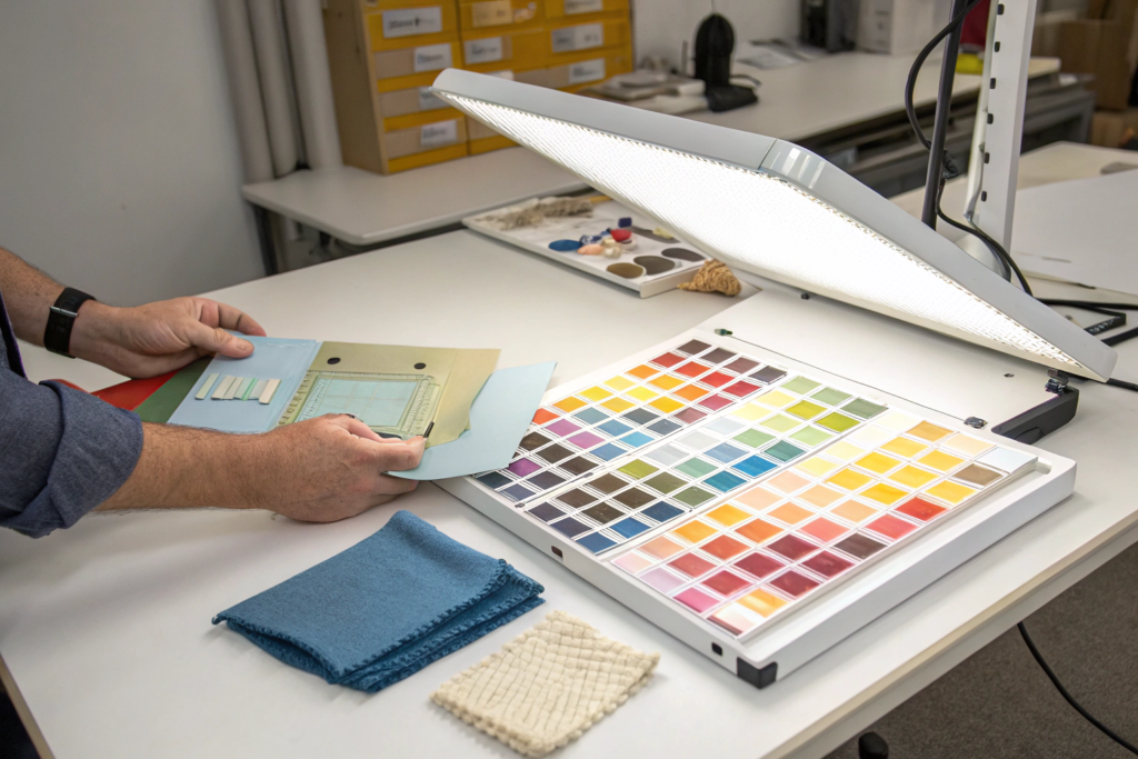
What Is the Professional "Lab Dip" Process for Multi-Material Matching?
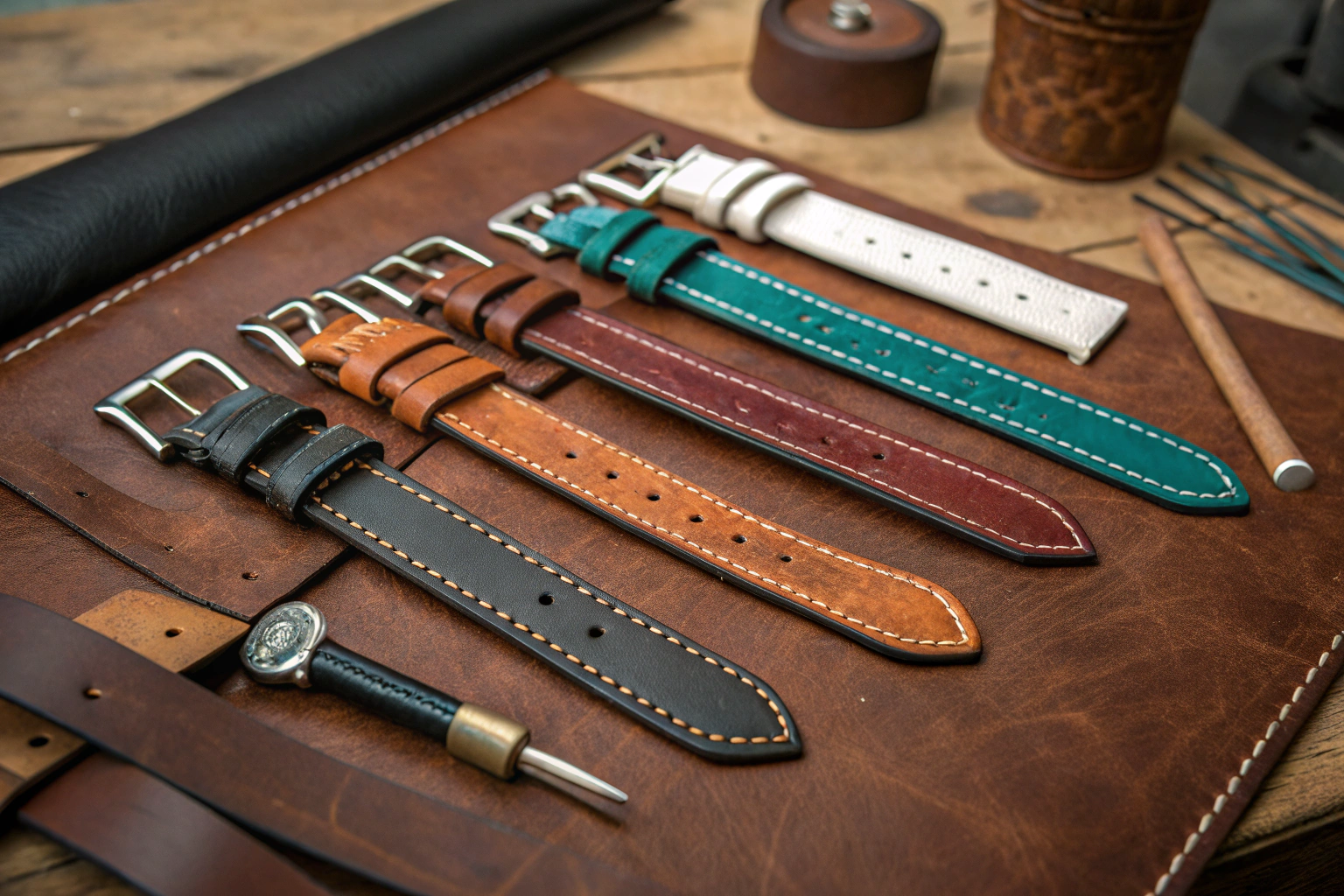
The Lab Dip is the universal tool for color approval in manufacturing. It is a small, physical sample of the Exact Material dyed to the target color. For a multi-material project, you will receive a Suite of Lab Dips—one for the acetate claw, one for the silk scarf, one for the acrylic beanie.
This is the Critical Control Point. The decisions made at the Lab Dip stage determine the success or failure of the entire collection's color harmony.
The AceAccessory Cross-Material Lab Dip Protocol:
- Single Master Standard: We establish One Physical Reference as the unassailable truth. This is typically a Pantone Fashion, Home + Interiors Cotton Chip. This chip is cut in half. We keep one half. The client keeps the other half. All lab dips are compared to This Exact Chip.
- Simultaneous Submission: We do not approve the acetate dip, then move on to the silk. We wait until All Three Lab Dips are ready. We then submit them to the client Together.
- The "Visual Marriage" Photo: We do not just send the dips loose in a bag. We take a Professional Photograph of the three lab dips Side-by-Side on a neutral grey background, under our D65 Daylight Viewing Lamp. This photo shows the client exactly how the materials will relate to each other in the real world.
- Physical Swatch Card: We mount the three approved lab dips onto a single Swatch Card. This card becomes the Binding Production Standard for the entire collection. It is what our QC team uses to inspect the bulk goods.
This process forces the evaluation of Harmony, not Identity. The client looks at the photo and says, "Yes, the glossy claw is slightly darker, and the beanie is slightly softer, but they work beautifully together. Approved." This is the outcome we want.
How Do You Evaluate Lab Dips Under Different Lighting Conditions?
This is a non-negotiable skill. Colors that look perfectly matched under the bright, blue-toned light of a factory or office can look completely mismatched under the warm, yellow light of a home or the golden light of sunset. This phenomenon is called Metamerism.
A responsible factory evaluates lab dips under Multiple Light Sources.
The Three Standard Light Sources:
- D65 (Artificial Daylight): This simulates noon sunlight. It is the Primary Standard for color evaluation. The match must be good under D65.
- TL84 / F11 (Store Light): This simulates the fluorescent lighting found in retail stores (e.g., Target, Macy's). The match must be acceptable under store light, as this is where the purchase decision is made.
- A / Incandescent (Home Light): This simulates the warm, yellow light of a living room or restaurant. The match must hold together under warm light, as this is where the product will be worn and seen by friends.
The Client's Role:
You should ask for photos of the lab dips under All Three Light Sources. Better yet, if you have a physical sample, you should evaluate it in the environments where your customer will use the product. Take the swatch card to a room with natural window light. Look at it under your desk lamp. Look at it in your bathroom.
At AceAccessory, we have a Standard Light Booth in our QC lab. We evaluate every lab dip under D65, TL84, and A light. We note any Metameric Failure (e.g., "The silk and acetate match perfectly under D65, but the acetate turns slightly greener under A light"). We communicate this to the client transparently. This level of quality control prevents costly surprises after bulk production.
Can You Create a Physical "Color Standard" Swatch Card for Future Orders?
Yes, and this is the single most valuable asset you can create for your brand's long-term consistency. The Approved Swatch Card from your first production run becomes the Master Reference for all future reorders.
The Swatch Card Protocol:
- Creation: After you approve the final lab dips, we mount a piece of the Actual Production Material (not just a lab sample) onto a sturdy, acid-free card. This card includes a swatch of the hair claw acetate, the scarf fabric, and the beanie yarn.
- Sign-Off: Both AceAccessory and you (the client) sign and date the back of the card. This card is now a Legal Reference Document.
- Archiving: We store one signed copy in our Climate-Controlled Color Archive. You store one copy in your office, Away from Direct Sunlight.
- Reorders: When you reorder in 12 months, we do not refer to a Pantone number. We refer to "Client's Master Swatch Card #2604-01." We pull our archived copy from the vault. We match the new production to This Specific, Physical Artifact.
This process bypasses the variability of Pantone books (which fade over time) and the subjectivity of memory. It provides a Stable, Physical Anchor for your brand's color identity. It is the professional standard for brands that are serious about long-term color consistency.
At AceAccessory, we provide this Swatch Card Service as a standard part of our custom development process. We view it as an investment in the long-term success of our clients' brands .
How Do You Coordinate Dye Lots Across Acetate, Fabric, and Yarn?
Once the lab dips are approved, the operational challenge begins. How do you ensure that the Bulk Production of thousands of units across three different materials actually matches the approved swatch? The answer is Lot Control and Batch Traceability.
Each material is produced in a specific Production Lot.
- Acetate Sheets: Lot #2604-AC (Produced on April 15, 2026).
- Silk Fabric: Lot #2604-SC (Printed on April 18, 2026).
- Acrylic Yarn: Lot #2604-YN (Dyed on April 22, 2026).
Our internal system links all three of these disparate lots to a single Client Work Order Number. When our warehouse team pulls materials for your hair claw , they scan the acetate sheet. The system verifies: "Yes, this is Lot #2604-AC, which is linked to Work Order #WO-2604. Proceed."
The Coordination Timeline:
Because the materials are made by different specialist suppliers, we Stagger the Production to align with the Longest Lead Time item.
- Yarn Dyeing: Takes the longest (10-14 days). Started first.
- Fabric Printing: Takes medium time (7-10 days). Started next.
- Acetate Molding: Takes shortest time (5-7 days for color mixing). Started last.
All three materials are scheduled to arrive in our assembly facility within a 3-Day Window. This minimizes the time that partial inventory sits on the shelf. It ensures that the entire collection is manufactured from materials that were produced under the same seasonal environmental conditions.
The QC Check:
Before bulk assembly begins, our QC team pulls a sample of the actual bulk acetate sheet, the bulk silk fabric, and the bulk yarn. They lay them on the Master Swatch Card. They verify the match under the D65 lightbox. Only then is bulk production authorized. This is the supply chain discipline required for consistent multi-material color.
![]()
What Happens If One Material Fails the Bulk Production Color Check?
Even with perfect lab dips and careful lot control, things can go wrong in bulk. The dye vat temperature might fluctuate. The fabric printer might have a calibration error.
If one material fails the Bulk Production Color Check, we have a strict Non-Conformance Protocol. We do not hide the issue and hope you won't notice. We address it immediately.
Scenario: The bulk silk scarf fabric arrives, and it is visibly More Yellow than the approved Master Swatch Card. It does not harmonize with the beanie and hair claw.
Our Protocol:
- Immediate Notification: We email you with a photo of the failed fabric next to the Master Swatch Card. We state clearly: "Bulk silk fabric is out of tolerance. It has a yellow shift."
- Root Cause Analysis: We work with the fabric printer to determine why the bulk run shifted from the approved strike-off. Was it a machine calibration error? A dye lot issue?
- Corrective Action Options (Presented to Client):
- Option A (Reject and Remake): We reject the fabric lot. The printer remakes the fabric to match the standard. Time Impact: +10-14 days. Cost: Borne by the printer (if their error) or shared.
- Option B (Accept with Concession): You, the client, look at the photo and decide the shift is minor and acceptable in the context of the overall collection. You sign a Concession Form. Production proceeds. This is common for very slight variations.
- Option C (Adjust Other Materials - RARE): If the fabric shift is minor and the fabric is the dominant item in the collection, we might be able to slightly adjust the beanie yarn or the acetate mix to Match the Fabric. This is complex and requires re-starting the lab dip process.
The key is Transparency and Choice. You are never left in the dark. You are presented with the data and the options. At AceAccessory, we believe that managing these inevitable variances with honesty and professionalism is what builds long-term trust .
How Do You Ensure Reorders Match the Original Collection Color?
This is the challenge of Long-Term Brand Consistency. Your "Terracotta" collection is a hit. You reorder six months later. How do we ensure the new batch matches the batch your customers already own?
We use the Master Swatch Card as the bridge across time.
The Reorder Color Protocol:
- Reference the Master: You do not provide a Pantone number. You provide your Swatch Card Reference Code (e.g., "Match to Master Swatch #2604-01").
- Retrieve the Archive: We go to our Climate-Controlled Color Archive. We retrieve our signed copy of Swatch Card #2604-01. This card has been stored in darkness, at a stable temperature and humidity. It is Not Faded. It is the truest representation of the original color.
- New Lab Dips: We create new lab dips for the reorder. But this time, the Target is not a Pantone book. The target is the Archived Swatch Card.
- Side-by-Side Approval: We place the new lab dips Directly Next To the archived original swatches. We photograph them together under D65 light. We send you this comparison photo.
- Client Approval: You look at the photo and say, "The new beanie yarn is a 98% match to the original. It's within acceptable tolerance. Approved."
This process acknowledges that a Perfect 100% Match across six months is physically impossible due to dye lot variation. But it strives for a Commercial Match—a match so close that the customer cannot perceive the difference unless they hold the two items side-by-side in a lightbox.
At AceAccessory, our Color Archive is a core asset of our business. It is the institutional memory that protects our clients' brand equity over time. This is the level of service that defines a true manufacturing partner .
How Do You Photograph Multi-Material Collections for E-Commerce Consistency?
You have successfully achieved visual harmony in the physical products. Now you face the final, critical hurdle: Communicating that harmony through digital screens. The best color matching in the world is worthless if your product photography makes the items look mismatched.
Many brands make a fatal error: they photograph the hair claw on a white background with harsh flash, the scarf on a model outdoors in sunlight, and the beanie in a flat lay with warm, yellow studio light. The resulting website gallery looks chaotic. The customer cannot trust the colors.
The Solution: Standardized E-Commerce Photography Protocol.
- Single Background Color: Use the Same Background for all items in the collection. A seamless Warm Grey or Natural Linen background is ideal. It provides a neutral reference point that doesn't compete with the product colors.
- Consistent Lighting: Use the Same Studio Lighting Setup for all items. Soft, diffused strobes with a color temperature of 5000K-5500K (Daylight) .
- Color Calibration: Include a Professional Grey Card (like an X-Rite ColorChecker) in one frame of each setup. In post-production, use the grey card to White Balance the images. This ensures the color temperature is consistent across all photos.
- The "Family Photo": Photograph All Three Items Together in a single frame. This is the most important image. It shows the customer the Visual Relationship between the pieces. It sets the expectation: "These items are designed to go together. They are a family."
At AceAccessory, we offer Professional E-Commerce Photography as a value-added service. We understand that for many of our clients, high-quality, color-accurate images are essential for online sales. We can shoot the entire collection in our studio and provide you with a set of Color-Calibrated, Ready-to-Use Images. This ensures the color story you worked so hard to create is communicated flawlessly to your customer.
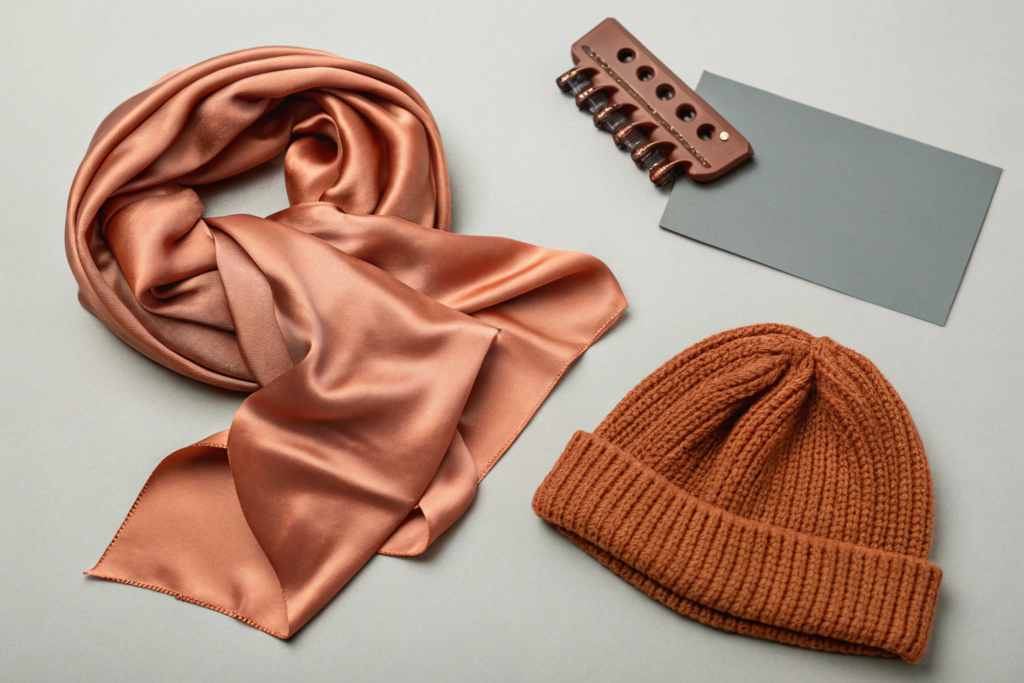
Why Is a "Family Photo" of the Collection Essential for Setting Customer Expectations?
The Group Shot or Family Photo is the single most effective tool for managing color expectations and reducing returns. It performs a psychological function that individual product shots cannot.
The Problem with Individual Shots:
A customer browses your "New Arrivals" page. They see the terracotta claw. They click "Add to Cart." Then they see the terracotta scarf. They hesitate. "Is that the same terracotta? It looks different in this photo." Doubt creeps in. They abandon the cart or only buy one item.
The Power of the Group Shot:
The group shot shows the claw, the scarf, and the beanie Together in One Frame. The customer instantly understands:
- Intentionality: "Oh, these are a set. The designer meant for them to be worn together."
- Material Variance: "Okay, the claw is a bit glossier and darker. The scarf is softer. The beanie is fuzzier. That makes sense. They are different materials."
- The Overall Vibe: The group shot communicates the Mood and Aesthetic of the collection. It sells a Lifestyle, not just a product.
This single image does more to prevent "color mismatch" returns than a thousand words of disclaimer text. It aligns the customer's visual expectation with the physical reality of the products. At AceAccessory, we strongly advise all our multi-category clients to invest in this specific shot. It is a critical piece of brand marketing collateral.
How Can You Use Descriptions to Manage Color Perception Online?
Even with perfect photography, screens vary. A customer's iPhone screen set to "Night Mode" will display colors completely differently than a calibrated desktop monitor. You must use Words to bridge the gap.
Your product description should Acknowledge and Explain the material color variance. Do not pretend it doesn't exist. Frame it as a feature of the collection's thoughtful design.
Example of Good Description Copy:
"Our 'Terracotta Clay' colorway is a curated story across textures. Please note the subtle, intentional variations: The acetate hair claw has a polished finish that deepens the hue to a rich, earthy rust. The silk scarf captures the color's luminous warmth. The knit beanie offers a soft, heathered expression of the same shade. They are designed to be sisters, not identical twins, creating a layered, sophisticated look when worn together."
Why This Works:
- Manages Expectations: It tells the customer exactly what to expect before they open the box.
- Reframes the Issue: It turns a potential defect ("the colors don't match exactly") into a design feature ("the colors are intentionally nuanced").
- Builds Trust: It demonstrates that your brand is thoughtful and transparent, not trying to hide a flaw.
This kind of honest, educational copy resonates deeply with the sophisticated customer. It enhances their appreciation for the product and reduces the likelihood of a return based on unmet expectations. It is a simple, powerful tool for protecting your brand reputation .
Conclusion
Achieving consistent color across different accessory materials is a sophisticated challenge that requires a shift in mindset from seeking perfect scientific identity to cultivating intentional visual harmony. The inherent differences in surface texture and material composition mean that a glossy hair claw and a fuzzy knit beanie will never look identical. The goal is to make them look like they belong to the same carefully curated family.
This is accomplished through a disciplined, professional process: establishing a single master standard, evaluating cross-material lab dips side-by-side under multiple light sources, and controlling bulk production through rigorous lot traceability. The creation of a physical Master Swatch Card provides a stable, long-term anchor for your brand's color identity, ensuring consistency across seasons and reorders.
Finally, the story of that color harmony must be communicated effectively to the customer through standardized e-commerce photography and honest, educational product descriptions. The "Family Photo" and the acknowledgment of textural variance are powerful tools for managing expectations and reducing returns.
If you are developing a multi-material collection and want to ensure a cohesive color story from concept to customer, we can guide you through every step of the process. Contact our Business Director, Elaine. She can explain our cross-material lab dip protocol and provide examples of our Master Swatch Cards. Email Elaine at: elaine@fumaoclothing.com