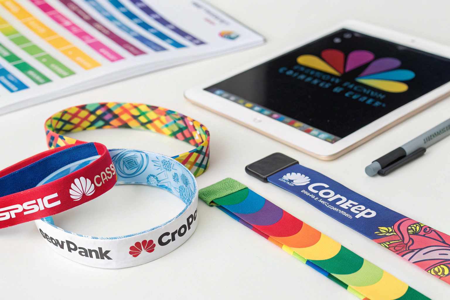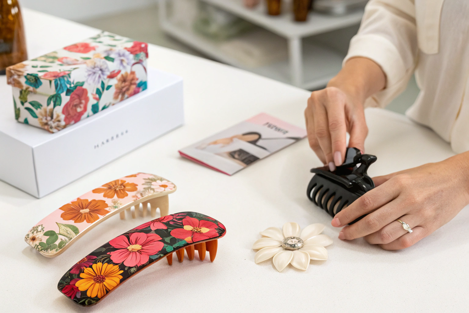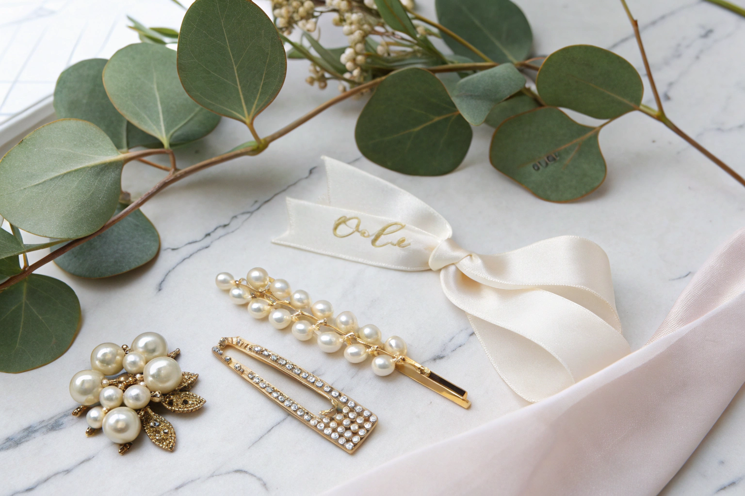
You open a wholesale catalog and see a sea of beige, black, and last season's dusty pink. These same dull colors sit unsold on clearance racks while trend-forward boutiques sell out of scarves in shades you cannot even name yet. The customers walking into stores in 2026 are not looking for basic neutrals to match their old coat. They want a scarf that signals they understand the cultural conversation around color, sustainability, and mood. Ignoring the color shift means ordering 5,000 units of inventory that gathers dust in a warehouse because the palette already feels stale to a 25-year-old browsing Instagram.
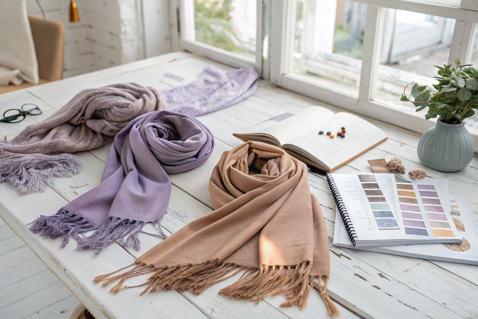
The latest color trends for Chinese-made scarves in 2026 are dominated by three distinct palettes: liquid metal pastels derived from low-impact dye baths, digital lavenders that bridge the physical and virtual worlds, and warm terracotta-based earth tones that reflect a deep consumer desire for grounded authenticity. These shades move far beyond simple seasonal forecasting into psychological and technological territory.
The dye houses in Zhejiang and Jiangsu have already retooled their vats for these specific wavelengths. I see the color cards changing every month. I want to walk you through exactly why these three families will own the 2026 scarf market, how we achieve them on different fabrics like modal and wool, and why US and European buyers are writing them into their contracts right now.
Why Are Liquid Metal Pastels Replacing Traditional Soft Pinks?
Traditional millennial pink had a long run. It was flat, chalky, and relied on nostalgia. The new 2026 pastels behave differently. When light hits a liquid metal pastel scarf, the fabric appears to move. The color shifts subtly between a cool silver base and a warm pastel tint, mimicking the iridescence of an oil slick but in an extremely muted, elegant way. This is not achieved with a simple dye bath.
Liquid metal pastels are replacing traditional soft pinks because they offer a dynamic, light-reactive quality that photographs exceptionally well on video and still images. They contain a microscopic pearlescent pigment binder that traditional reactive dyes lack, giving the scarf a "glazed" finish that feels technologically futuristic while remaining soft and breathable against the skin.
The secret lies in a two-stage finishing process. First, we dye the base fabric, often a modal blend, in a soft celadon green or whisper pink. Then, we apply a thin, water-based shimmer coating that cures under low heat. This coating does not stiffen the hand feel of the scarves. It remains fully washable and breathable. We have tested this on hundreds of units shipping to North America, and the coating survives multiple gentle cycles without delamination.
How does this pearl coating affect the scarf's drape?
A cheap plastic coating turns a scarf into a stiff sheet. Our coating is based on a nano-mica mineral pigment suspended in a polyurethane binder so thin it measures less than 0.05 millimeters thick. This allows the fabric belts and scarves to maintain their supple drape. When a customer ties a knot in a liquid metal pastel scarf, the folds create natural highlights and shadows that look consciously luxurious. Department store buyers specifically ask for this "crush effect" because it photographs so richly on a mannequin.
Is the shimmer coating durable enough for retail quality standards?
Retailers fear returns. If the shimmer rubs off onto a customer's black wool coat, the brand takes a hit. We use an encapsulation process where the mica particle is completely sealed inside the binder. We perform a dry crocking test, rubbing a white cloth fifty times against the printed surface under controlled pressure. The mica must not transfer. Our quality control team rejects any batch where the grey scale rating drops below 4.5. This ensures the liquid metal pastel shawls and wraps sold in high-end European boutiques do not shed their magic.
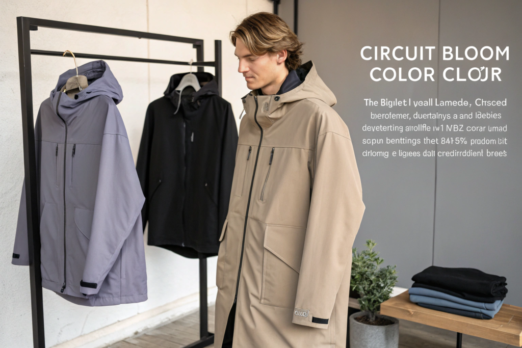
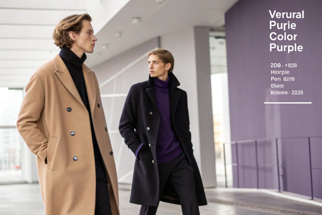
Is Digital Lavender Still Dominating the Accessory Market?
Digital lavender exploded when Pantone named Very Peri the color of the year, but the 2026 iteration is more complex. It is not just a purple hue. It is a neutral purple. It functions almost like a grey or a navy in a wardrobe, blending seamlessly with black techwear jackets and camel coats simultaneously. The psychological research behind it states that it lowers stress levels.
Yes, digital lavender is still dominating the accessory market, but it has evolved into a more muted, grey-cast version known internally as "Circuit Bloom." It taps directly into the wellness and digital escapism trend, acting as a soothing bridge color that looks equally natural on a Zoom screen and in direct sunlight.
We buy specific disperse dyes for our polyester chiffon scarves to nail this exact shade. The recipe includes a crucial 2% addition of a grey pigment that knocks down the brightness of a standard purple. Without that grey modifier, the scarf reads as a children's toy color. With it, the scarf reads as luxury loungewear.
How does digital lavender perform on natural versus synthetic fibers?
The fiber dictates the final mood. On a 100% silk twill, digital lavender absorbs deeply, looking velvety and dark. On a viscose voile, it appears lighter and airier, almost ethereal. Our buyers from major supermarkets in America often order this color on a cotton-modal base for hair bands and matching scarves because it provides a consistent, matte finish that does not flare out with reflection under store lighting. The table shows how the substrate changes the color's appearance:
| Fabric Substrate | Dye Type Used | Final Color Appearance | Best Matching Accessory |
|---|---|---|---|
| 100% Silk Twill | Acid Dye | Deep, saturated, glossy | Formal silk scarves |
| Modal-Cotton Blend | Reactive Dye | Matte, soft, dusty | Casual summer wraps |
| Polyester Chiffon | Disperse Dye | Bright, crisp, airy | Beach cover-ups |
This flexibility allows a brand to create a "digital lavender story" across different fabric weights, from a heavy knit gloves pair to a light chiffon neck scarf, reinforcing the brand identity without monotony.
Why is this color so effective for e-commerce product photography?
Digital lavender does not clash with human skin tones in the way a bright magenta does. It recedes slightly, making the wearer's face pop forward. It also holds its color balance under the cold white LED lights used in fulfillment center photo bays, avoiding the blown-out highlight problem that plagues yellows and bright whites. This results in fewer returns initiated due to "color not as pictured" for our online store clients, a metric that saves significant costs.
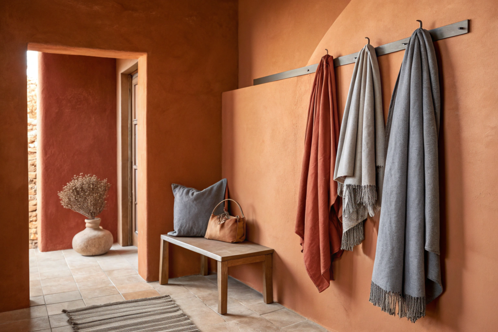
How Do Warm Terracotta Tones Reflect the Demand for Natural Hues?
For a while, everything was grey. Minimalist interiors demanded grey scarves. That coldness has not disappeared, but it has been pushed aside by a craving for warmth that mimics sunbaked clay and desert rock. The 2026 terracotta family includes burnt sienna, raw umber, and a new "spice route" orange that recalls paprika and cinnamon.
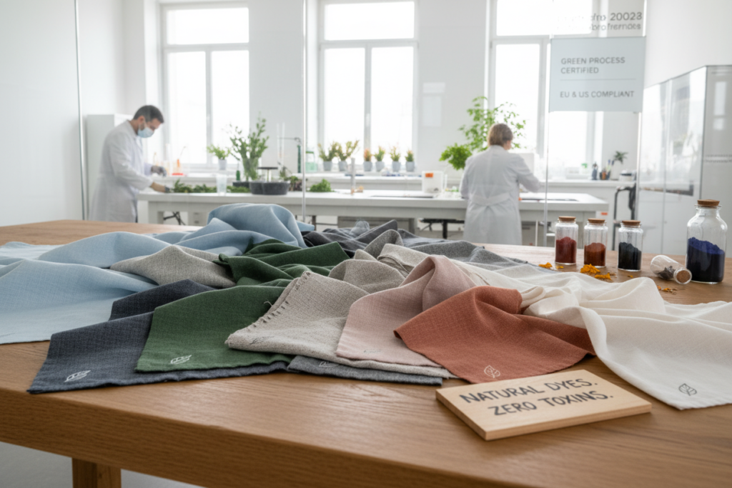
Warm terracotta tones reflect the deep consumer desire to reconnect with natural, unprocessed landscapes. These earthy palettes evoke stability and comfort during a time of digital overwhelm, and they are produced using authentic low-water natural dye extracts or their certified synthetic equivalents to maintain ecological integrity.
I source a specific natural madder root extract for a boutique client who demands genuine botanical dyeing. For bulk production destined for a supermarket chain, we use a synthetic iron oxide buffering process that perfectly replicates the organic look without the variation issues of true natural dyes.
What is the difference between burnt sienna and the old rust colors?
Old rust was a flat, heavy brown-orange that often looked like a dirty penny. Burnt sienna has a lively, translucent quality. It comes from roasting raw sienna pigment, which dehydrates the iron oxide and turns it a deeper, richer reddish shade. When applied to a brushed wool scarf, it creates shadows in the nap that shift as the wearer moves. This hand-feel and visual depth cannot be achieved with a plastic-based print.
Can these earth tones work for summer collections too?
Absolutely. Earth does not mean heavy. We apply a "dusty terra" shade to lightweight linen scarves and open-weave cotton wraps. The color breathes. It pairs well with white linen shirts and raw denim. The secret is to lower the dye saturation by 40% compared to a winter weight. This creates a sun-faded, washed effect that looks intentionally relaxed, perfect for a summer music festival or a breezy coastal dinner.
What Dyeing Techniques Make These 2026 Colors Pop Sustainably?
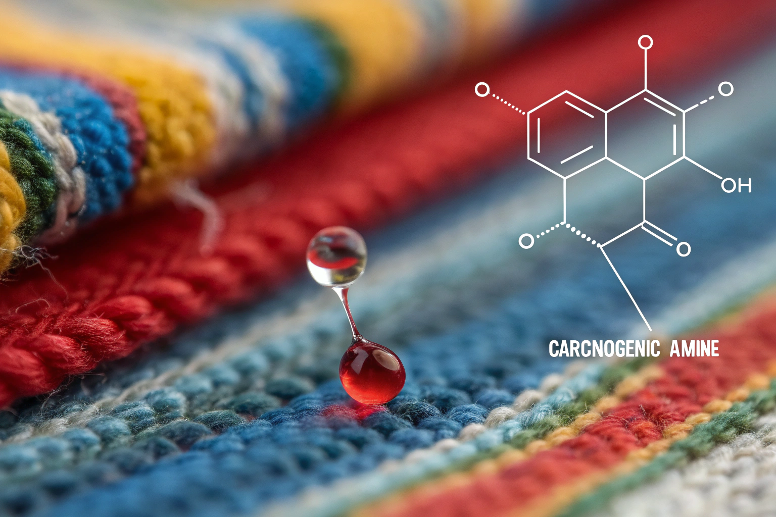
A beautiful color derived from a toxic sludge of heavy metals is no longer acceptable. The European Green Deal and US state-level regulations are tightening the rules on chemical runoff from textile mills. The 2026 color trends themselves are cool, but the process that creates them is where the real innovation lies. Buyers are auditing the process, not just the product.
The dyeing techniques making 2026 colors pop sustainably are dope dyeing for synthetic chiffons, which injects pigment into the molten polymer before the fiber is even spun, and cold pad batch dyeing for cotton and modal blends, which uses reactive dyes at room temperature with virtually zero water waste.
Dope dyeing, also called solution dyeing, embeds the digital lavender or liquid pastel pigment directly into the polyester filament. The color becomes part of the plastic, not a coating on top. This eliminates the massive water consumption of traditional dip dyeing. The color also cannot rub off, ever, because it exists through the entire cross-section of the yarn.
How does cold pad batch dyeing work for natural fibers?
We mix the reactive dye with an alkali agent, pad it onto the cotton scarf fabric at room temperature, then wrap the fabric in plastic and let it rotate slowly for 12 to 24 hours. No steam, no huge boilers burning coal. This unheated chemical fixation process bonds the dye completely to the fiber. It uses 50% less salt and 60% less water than standard hot dyeing, making our terracotta accessories far cleaner for the environment. The water we do discharge from rinsing meets bluesign standards before it leaves our treatment plant.
Are these sustainable methods more expensive?
The chemical cost for cold pad batch dyeing is slightly higher, roughly 8% more, but the energy savings from not heating water offset most of that premium. For a 10,000-piece scarf order, the total cost difference is negligible compared to losing a contract because your factory lacks a clear environmental policy. I present the cost analysis of sustainable dye systems upfront to show buyers that green chemistry is not a charitable donation. It is an investment in securing long term market access for our knit hats and caps in Europe.
Conclusion
The 2026 scarf color palette tells a story of escape, calm, and grounding. Liquid metal pastels offer a futuristic shimmer. Digital lavender provides a neural, stress-reducing neutral. Warm terracotta earth tones bring the raw, tactile beauty of the physical world back into fashion. The thread connecting all three is a production process that respects the planet through dope dyeing and cold pad batch chemistry.
Our factory in Zhejiang is not just mixing these dyes blind. We are working directly with brands to select the exact shade that will stop a scroll, fit a retail planogram, and wash perfectly at home. We manage the entire chain, from the raw yarn to the final tagged and bagged scarf.
If you want to receive our 2026 physical color swatch book and discuss how these trending colors apply to your next collection of hair bands, shawls, or belts, please reach out directly. Contact our Business Director, Elaine. She will arrange a sample shipment and provide our current proforma pricing for trend-forward dyeing. Write to her at elaine@fumaoclothing.com. Let's put the right color around your customers' necks this season.