I have been manufacturing hair accessories for over 15 years. Every spring, the color palette shifts. It gets lighter. It gets brighter. It gets more cheerful. I remember a client who ordered a large batch of hair ties in dark winter colors for spring. They did not sell. The colors were wrong for the season. She learned that spring has its own language of color. Today, I want to share the most popular colors for hair ties in the 2026 spring season.
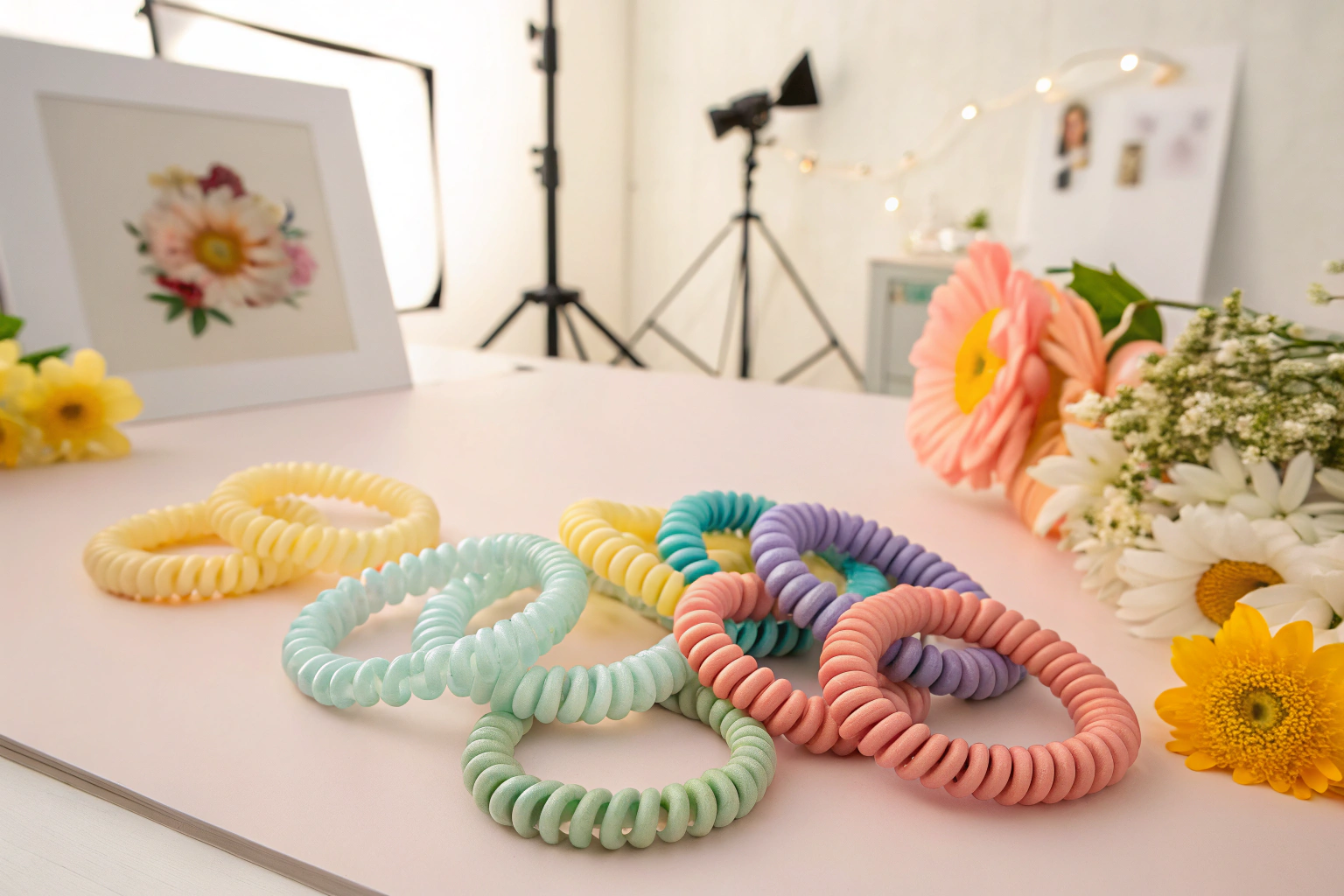
The most popular colors for hair ties in the 2026 spring season are butter yellow, seafoam green, dusty pink, lilac, and coral. These colors reflect the freshness and renewal of spring. Butter yellow is soft and sunny. It is cheerful without being bright. Seafoam green is a pale, muted green. It evokes new leaves and ocean spray. Dusty pink is a soft, romantic pink. It is feminine and gentle. Lilac is a light purple. It is dreamy and whimsical. Coral is a warm, pink-orange. It is energetic and vibrant. These colors are versatile. They match spring clothing. They are popular across hair tie styles, from elastic bands to scrunchies. At Shanghai Fumao, we have seen a surge in orders for these colors.
You might be thinking, "Colors change every year. How do you know what will be popular?" We track trends. We watch the runways. We monitor social media. We listen to our clients. The 2026 spring palette is a shift from past seasons. It is softer. It is more pastel. It is less neon. Let me walk you through the top colors.
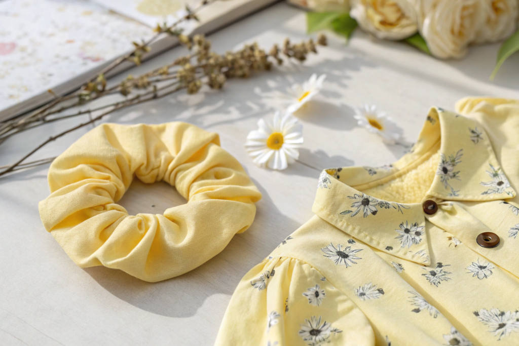
Why Is Butter Yellow the Top Color for Spring 2026?
Butter yellow is not bright yellow. It is soft. It is pale. It is like the first light of spring. I have seen this color grow in popularity. It is cheerful but not overwhelming.
Butter yellow is the top color for spring 2026 because it is soft, sunny, and versatile. It is a pale yellow with a hint of warmth. It is not neon. It is not mustard. It is gentle. Butter yellow pairs well with other pastels. It also pairs with neutrals like white, beige, and grey. It works with denim. It works with florals. Butter yellow hair ties add a subtle pop of color. They are cheerful without being loud. This color appeals to a wide range of customers.
I want to share a story about butter yellow. A client was hesitant. She thought yellow was too bold. We showed her butter yellow. It was soft. It was pretty. She ordered a batch. They sold out. The customers loved the gentle color.
What Colors Pair Well with Butter Yellow?
Butter yellow, a hue as bright and inviting as a sunlit meadow at dawn, pairs with crisp white for a fresh look that feels like a gentle breeze on a clear morning—light, airy, and effortlessly cheerful. It pairs with warm beige, a color that wraps around like a soft blanket, for a neutral look that exudes calm and understated elegance, perfect for creating spaces that feel both cozy and timeless. It pairs with sleek grey, a shade as cool and sophisticated as a rainy afternoon in the city, for a modern look that radiates clean lines and contemporary flair, adding a pop of warmth to otherwise minimalist settings.
Who Is the Target Customer for Butter Yellow?
Butter yellow, with its warm, sun-kissed glow, appeals to a broad spectrum of tastes and ages. Young women are drawn to it for its unapologetic cheerfulness, a hue that radiates joy like a morning meadow bursting with daffodils, lifting spirits and adding a playful spark to any ensemble. Older women, too, find solace in its embrace, appreciating its subtle sophistication—a color that whispers elegance rather than shouts. It is not the harsh, blinding brightness of a summer noon sky, nor does it carry the naive, over-the-top vibrancy of a child’s crayon box. Instead, butter yellow strikes a perfect balance, a safe harbor for those seeking freshness without the risk of overwhelming boldness.
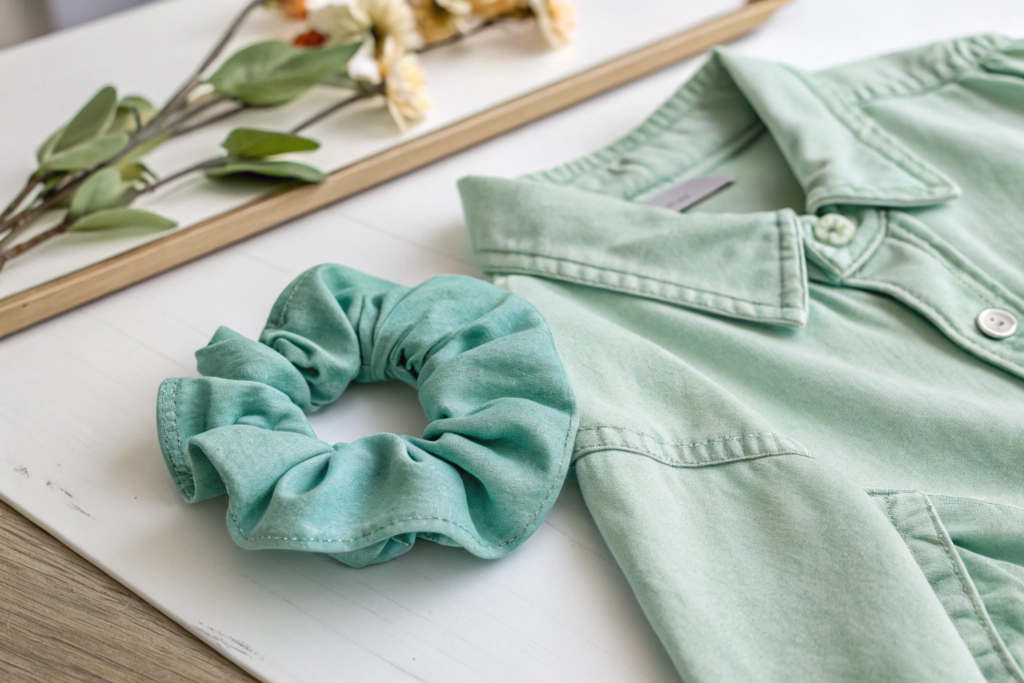
Why Is Seafoam Green a Spring Essential?
Seafoam green is the color of new leaves. It is the color of the ocean on a calm day. It is fresh. It is calming. I have seen this color become a spring staple.
Seafoam green is a spring essential because it is fresh, calming, and natural. It is a pale, muted green. It is not bright. It is not dark. It is soft. Seafoam green evokes nature. It reminds people of spring growth. It is a versatile color. It pairs with other pastels. It pairs with white and beige. It also pairs with coral for a complementary look. Seafoam green hair ties are popular for everyday wear. They add a touch of nature to any outfit.
I want to share a story about seafoam green. A client wanted a color for a wellness brand. We suggested seafoam green. It was calming. It was natural. The brand loved it. The hair ties sold well. The color matched the brand's identity.
What Colors Pair Well with Seafoam Green?
Seafoam green, a hue as soft and luminous as the first light of dawn breaking over gentle waves, pairs with crisp white for a clean, airy look that feels fresh and invigorating, like a breath of salt-kissed sea breeze on a sunlit morning. Its cool, translucent quality blends seamlessly with white, creating a palette that is both serene and sophisticated, evoking the calm of a quiet coastal cottage. It pairs with warm beige for an earthy look, grounding the softness of seafoam in the comforting embrace of natural tones, reminiscent of sun-warmed sand and weathered driftwood, fostering a sense of warmth and organic harmony.
Who Is the Target Customer for Seafoam Green?
Seafoam green, a hue that mirrors the gentle lapping of ocean waves against sun-kissed shores, exerts an irresistible pull on customers who hold nature close to their hearts. Its soft, luminous shade evokes the tranquility of misty morning forests and the serene vastness of coastal landscapes, making it a favored choice for those seeking a connection to the natural world. Wellness brands, in particular, embrace this color as a visual embodiment of balance and harmony, adorning their products and spaces with its calming presence to signal purity, renewal, and holistic well-being.
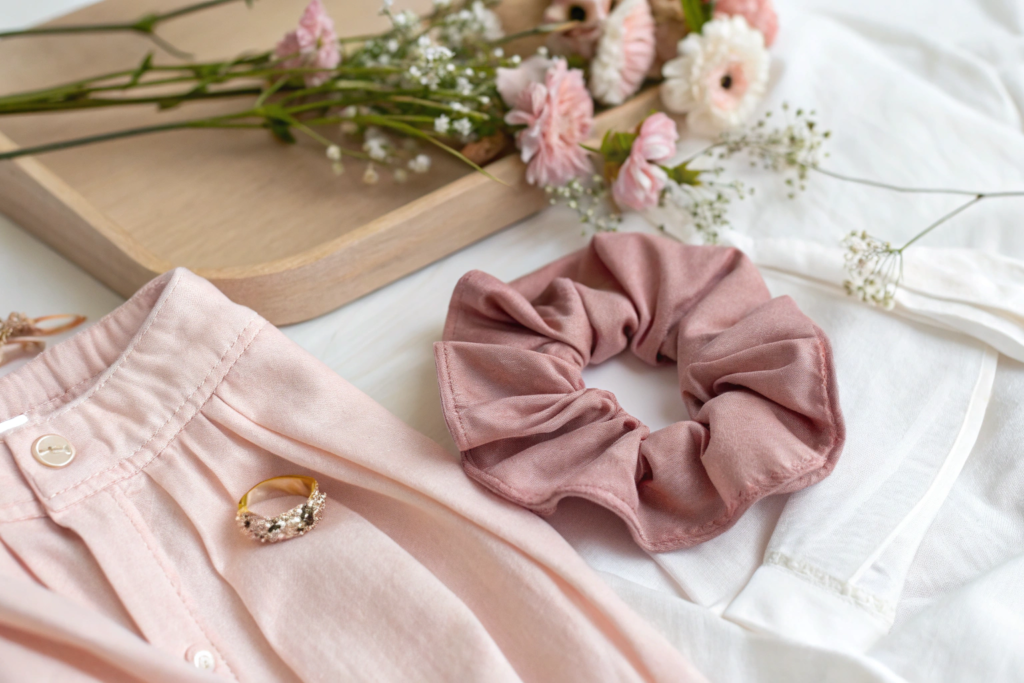
Why Is Dusty Pink a Romantic Favorite?
Dusty pink is not bright pink. It is not hot pink. It is soft. It is muted. It is romantic. I have seen this color become a favorite for spring. It is feminine without being childish.
Dusty pink is a romantic favorite for spring 2026 because it is soft, feminine, and versatile. It is a pale pink with a hint of grey. It is not bright. It is not pastel. It is muted. Dusty pink evokes romance and tenderness. It pairs well with other pastels. It pairs with neutrals. It pairs with denim. It pairs with florals. Dusty pink hair ties are popular for everyday wear and special occasions. They add a touch of femininity to any outfit.
I want to share a story about dusty pink. A client wanted a color for a bridal line. We suggested dusty pink. It was romantic. It was elegant. The bride loved it. The hair ties were used for bridesmaids. The color was a hit.
What Colors Pair Well with Dusty Pink?
Dusty pink, a hue like the blush of dawn on weathered rose petals, pairs with crisp white for a clean, romantic look that feels both ethereal and timeless. The softness of the pink mingles with the brightness of white, creating an air of delicate elegance, as if woven from the first light of spring morning.
It pairs with warm beige, a color reminiscent of sun-bleached linen and aged parchment, for a soft look that wraps around you like a gentle embrace, evoking cozy afternoons in a sunlit cottage. When combined with lilac, a shade as rich as crushed violets and honey, it forms a purple-pink palette that blooms with depth and femininity, painting a scene of blooming gardens at twilight.
Who Is the Target Customer for Dusty Pink?
Dusty pink, a hue as soft and inviting as a whispered secret, holds an enduring charm that captivates women across the span of their lives. For young women, it is a celebration of femininity—a color that wraps around them like a gentle hug, evoking the blush of first love, the delicate petals of cherry blossoms in spring, and the quiet confidence of a girl who knows her worth. It speaks to their dreams, their sensitivity, and their desire to express a side of themselves that is tender yet unapologetically theirs. For older women, dusty pink takes on a new, more nuanced allure.
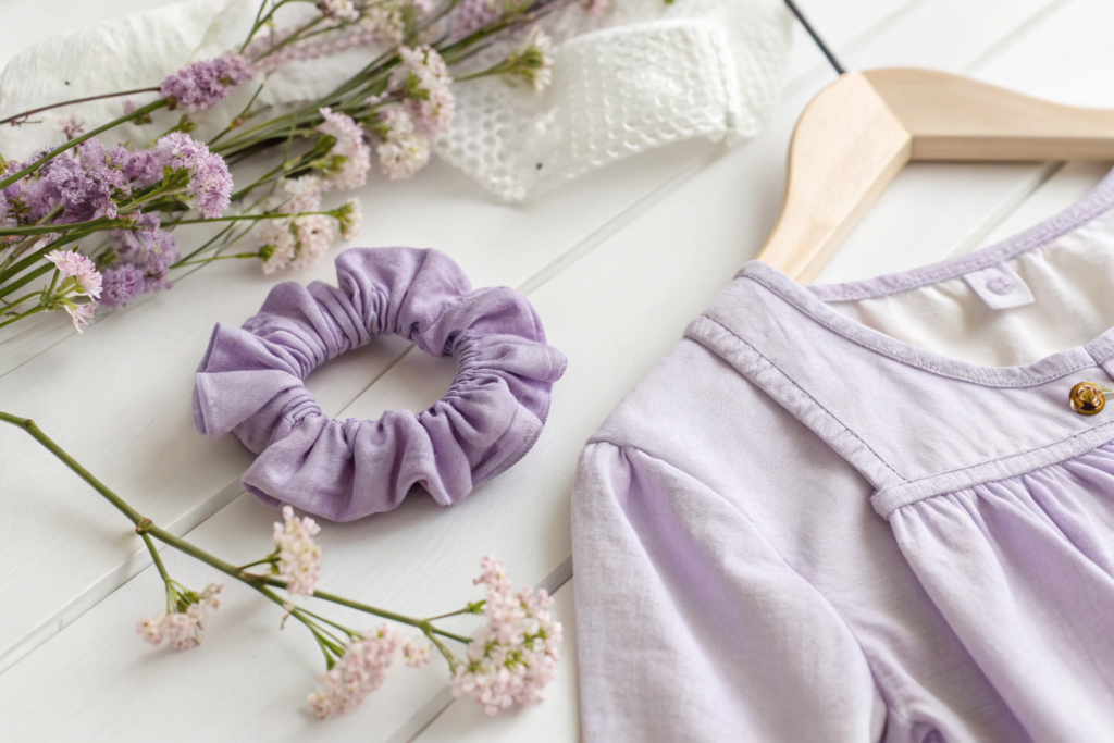
Why Is Lilac a Dreamy Choice for Spring?
Lilac is the color of spring flowers. It is light purple. It is dreamy. I have seen this color grow in popularity. It is whimsical. It is creative. Lilac is a dreamy choice for spring 2026 because it is light, whimsical, and creative. It is a pale purple with a hint of pink. It is not dark. It is not bright. It is soft. Lilac evokes spring flowers like lilacs and wisteria. It is a color of creativity and imagination. Lilac pairs well with other pastels. It pairs with dusty pink for a romantic palette. It pairs with butter yellow for a cheerful palette. It pairs with white for a clean look. Lilac hair ties are popular for customers who want a unique, playful color.
I want to share a story about lilac. A client wanted a color for a creative brand. We suggested lilac. It was unique. It was playful. The brand loved it. The hair ties stood out on the shelf.
What Colors Pair Well with Lilac?
Lilac, with its soft, dreamy hue that evokes the first blush of spring, pairs with crisp white for a fresh look—like dew-kissed petals against a cloudless sky, exuding purity and lightness. It blends harmoniously with dusty pink, creating a romantic palette that feels like a whispered secret at dusk, soft and tender, as if plucked from a vintage garden. When combined with butter yellow, it sparks a cheerful palette, bright and sunlit, reminiscent of golden sunlight dappling through leaves, radiating warmth and joy. It complements seafoam green beautifully, forming a complementary look that is as serene as a coastal breeze, cool and refreshing, like waves lapping at a sandy shore.
Who Is the Target Customer for Lilac?
Lilac, with its soft, dreamy hue that dances between the delicate blush of dawn and the gentle purples of twilight, casts an irresistible spell over creative, playful souls. It is a color that whispers to the hearts of younger women, those who embrace their individuality and seek to express themselves beyond the ordinary. For them, lilac is not just a shade—it is a statement, a celebration of uniqueness that sets them apart from the crowd. It appeals to customers who crave something more than the predictable pinks and blues that line the shelves, yearning for a touch of the extraordinary in their choices.
Conclusion
The most popular colors for hair ties in the 2026 spring season are butter yellow, seafoam green, dusty pink, lilac, and coral. These colors are soft, fresh, and cheerful. They reflect the renewal of spring. They are versatile. They match spring clothing.
Butter yellow is the top color. It is sunny and gentle. Seafoam green is fresh and calming. Dusty pink is romantic and feminine. Lilac is dreamy and whimsical. Coral is energetic and tropical.
Choose the colors that fit your brand. Test them. Let the market guide you.
At Shanghai Fumao, we are ready to help you produce hair ties in these popular colors. We offer small batches for testing. We scale up for production. Let us help you make this spring your best season yet. Please contact our Business Director, Elaine, at elaine@fumaoclothing.com to discuss your spring hair tie collection. We can help you select the right colors and produce high-quality hair ties that your customers will love.*