As a manufacturer for over two decades, I've learned that the smallest details often have the biggest impact. I have countless conversations with buyers like Ron from the US, and we can spend hours discussing materials, hardware, and construction. But a topic that is often overlooked, yet has the power to completely transform a product, is the choice of thread color. A common pain point for brands is creating a product that looks "almost right" but lacks a distinct personality or feels cheap. Often, the culprit is a thoughtless thread choice.
The choice of thread color is a powerful design tool that fundamentally defines a product's character. It's not just a functional component; it's a key aesthetic decision that dictates whether an accessory will be: 1) Tonal and Monochromatic for a subtle, luxurious feel, or 2) High-Contrast and Bold for a statement, casual look.
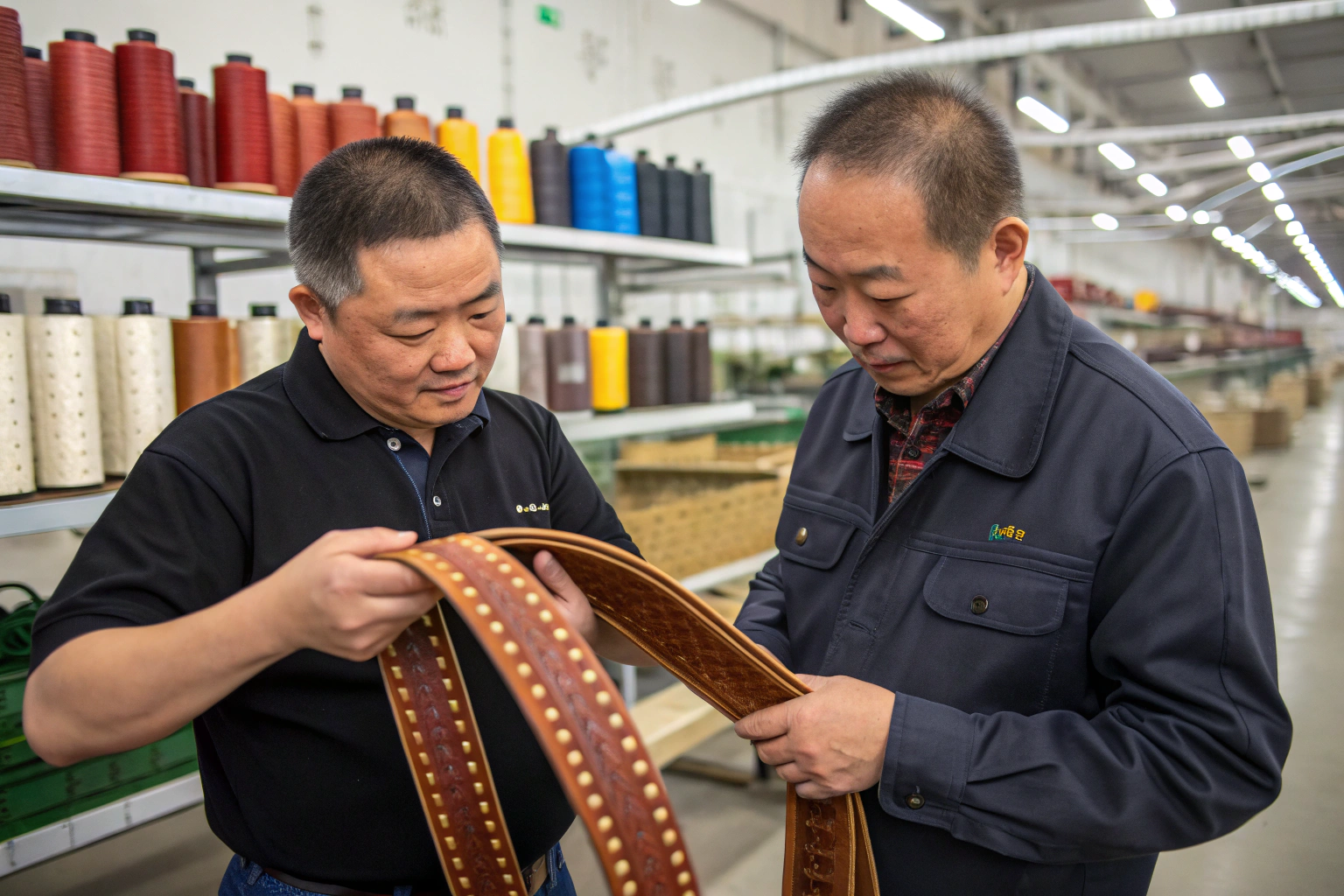
This single decision can elevate a design from generic to iconic or, if chosen poorly, undermine the quality of the materials. At my factory, we stock thousands of thread colors because we know this detail is critical. In this article, I'll show you how to leverage thread color to achieve your precise design vision.
What Is the Tonal & Monochromatic Approach?
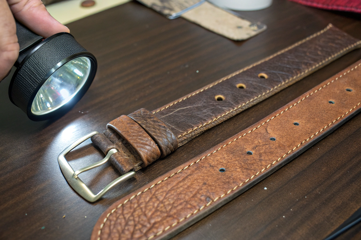
The tonal or monochromatic approach is the art of subtlety. It involves selecting a thread color that is an exact or very close match to the color of the base material. The goal is for the stitching to blend in seamlessly, becoming almost invisible.
The tonal approach is used to create a look of sophisticated, understated elegance. By matching the thread to the fabric, you place all the emphasis on the quality of the material itself and the silhouette of the accessory. The construction is clean and uninterrupted, which is a hallmark of classic, high-end design. This is the default choice for many luxury goods because it is timeless. At Shanghai Fumao Clothing, when a client wants to create a "classic" or "premium" feel, our first recommendation is always to start with a perfect tonal thread match.
When should you choose a tonal thread?
This approach is ideal when:
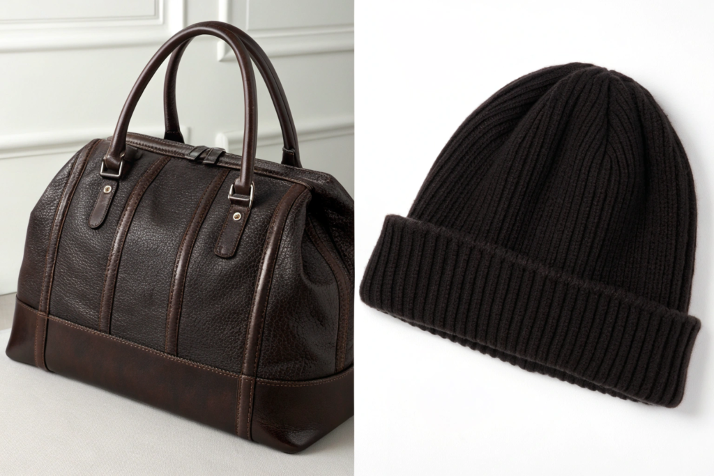
- You want to highlight a luxurious material: If you are using a beautiful, full-grain leather or a rich cashmere knit, you don't want distracting thread to take away from the material's natural beauty. Tonal stitching allows the texture and quality of the material to be the star.
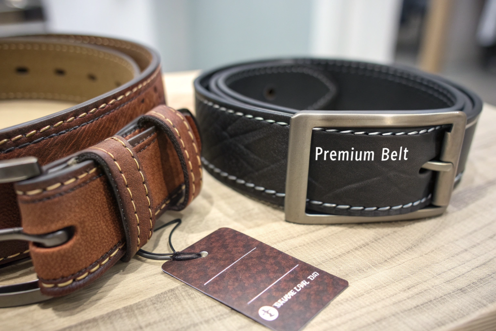
- You are aiming for a formal or professional look: For items like a business tote, a classic leather belt for a suit, or elegant leather gloves, tonal stitching communicates seriousness and sophistication. It's clean, non-fussy, and professional.
- The design has a complex or minimalist silhouette: If the shape of the accessory is very intricate or, conversely, very minimalist, tonal stitching helps to maintain the purity of the form. It doesn't "draw lines" over the design, allowing the shape to speak for itself. This principle is a cornerstone of minimalist design, as seen in brands like Cuyana.
What is the challenge of tonal stitching?
The biggest challenge of tonal stitching is that it is unforgiving. Because the thread blends in, any imperfections in the stitch line—uneven spacing, a crooked line—are less noticeable from a distance. However, it also means the quality of the stitching must be perfect. A poor-quality tonal stitch can make a product look cheap, whereas a perfect one looks effortlessly luxurious. It requires a high level of skill from the machine operator.
What Is the High-Contrast & Bold Approach?
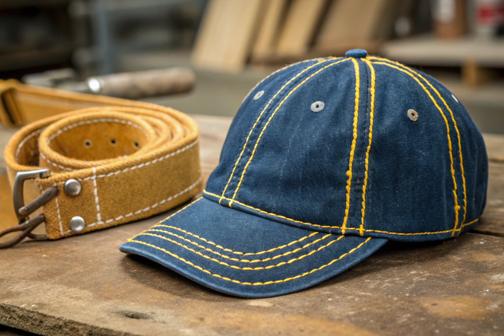
If tonal stitching is about whispering, contrast stitching is about shouting. This approach involves deliberately choosing a thread color that stands out against the base material. Think of the iconic yellow/gold thread on blue jeans—that's the most famous example of contrast stitching in the world.
The high-contrast approach uses the thread as a graphic design element in its own right. It highlights the construction of the accessory, turning the stitch lines into a key part of the visual identity. This creates a more casual, rugged, or playful look. This technique is a powerful tool for adding personality and a distinct point of view to an accessory. It can make a simple product feel more designed and intentional.
When should you choose a contrast thread?
This approach is perfect when:
- You want to create a casual or rugged aesthetic: This is the go-to choice for products like baseball caps, canvas belts, backpacks, and workwear-inspired items. The visible stitching communicates durability and a more relaxed, informal vibe. Brands like Carhartt have masterfully used contrast stitching to define their rugged brand identity for over a century.
- You want to add a "pop" of color: A simple black or navy accessory can be instantly energized by a pop of a bright, contrasting thread color like red, yellow, or electric blue. This is a great way to incorporate a seasonal trend color in a subtle, cost-effective way.
- You want to emphasize a design feature: If your bag has a uniquely shaped pocket or your belt has a special loop detail, using contrast stitching to outline that feature draws the customer's eye to it. It allows you to use the thread to tell a story about the product's design and construction.
What are the considerations for contrast stitching?
With contrast stitching, the stitch quality has to be absolutely perfect, because it's on full display. Every single stitch is a visible design element. A crooked line or an inconsistent stitch length will be immediately obvious and will ruin the look of the product. Furthermore, the choice of color is critical. The contrast color needs to be a deliberate and complementary part of the overall color palette of the product and your collection.
How Does Thread Thickness and Finish Play a Role?
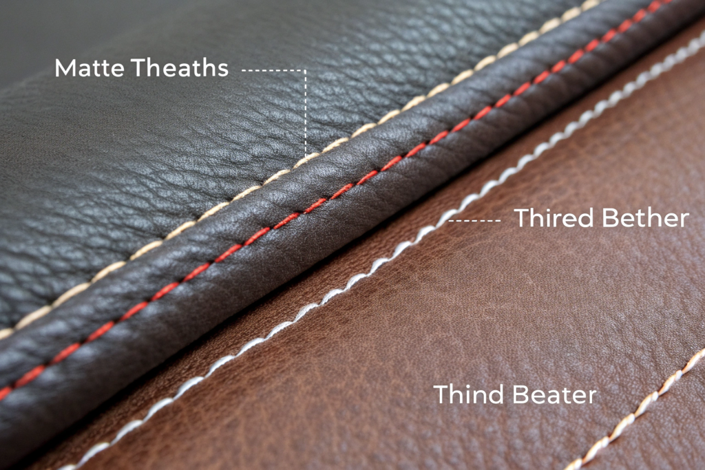
Beyond just color, the physical properties of the thread itself play a crucial role in the final look. Two threads of the exact same color can create vastly different effects depending on their thickness and finish.
The thickness and finish of the thread work in tandem with the color choice to define the final aesthetic. A thicker thread will always make the stitching more prominent, while the finish—matte or glossy—determines how the thread interacts with light, affecting its perceived color and texture. At Shanghai Fumao Clothing, our project managers always discuss thread thickness (denier or Tex) and finish with clients, as it's a critical detail for achieving the desired outcome.
How does thread thickness impact the look?
Thread thickness, often measured in Tex, determines the "heft" of the stitch line.
- Thinner Thread (e.g., Tex 40): This creates a fine, delicate stitch line. It's perfect for a tonal approach on lightweight fabrics or for creating a very refined, high-end look on leather goods.
- Thicker Thread (e.g., Tex 80 or higher): This creates a bold, chunky stitch that is highly visible. It is almost always used for a high-contrast, rugged look on items like canvas bags, denim, and heavy-duty belts. Using a thick thread for a tonal stitch is an unusual but interesting choice that can add subtle texture.
What is the difference between a matte and glossy finish?
The thread's finish affects how it reflects light.
- Matte Finish (e.g., spun polyester): This thread has a soft, low-sheen finish that looks more like natural fiber. It absorbs light, making the color appear deep and flat. It's excellent for a subtle, tonal look or a more understated, rustic contrast.
- Glossy Finish (e.g., bonded nylon or polyester): This thread has a slight sheen or gloss. It reflects light, which can make the color appear brighter and more vibrant. It's often used for a "pop" of contrast color on synthetic materials or to create a more polished, premium look on leather goods. The gloss can help the thread stand out even more.
How Does Thread Choice Affect Perceived Quality and Price?
Ultimately, the choice of thread color is a key signal to the consumer about the product's quality, brand identity, and price point. It's one of those subconscious details that helps a customer decide if a product is "cheap" or "worth it."
A thoughtful and well-executed thread choice directly increases the perceived value of an accessory. Whether it's a perfectly invisible tonal stitch or a flawlessly executed bold contrast stitch, the message to the customer is the same: this product was designed with intention and crafted with care. This is something I consistently emphasize to my clients. You can use the exact same high-quality leather to make two belts, but the one with the more thoughtful thread choice will be the one that commands a higher price.
How does it signal brand identity?
Your approach to stitching can become a part of your brand's DNA. Are you a minimalist luxury brand? Then a perfect tonal stitch is your signature. Are you a fun, youthful, and bold brand? Then bright, unexpected contrast stitching might be your calling card. Consistency in your thread strategy across your product line helps to build a cohesive and recognizable brand identity. This is a key part of building a strong brand, as noted by branding resources like Aaker on Branding.
Why does it justify a higher price point?
A deliberate thread choice signals that the product is a "designed" object, not just a generic commodity. When a customer sees that the thread color perfectly matches the hardware finish or picks up an accent color from a printed lining, they recognize that a designer made a conscious choice. This attention to detail creates confidence in the overall quality of the product and makes a customer more willing to pay a premium price. It's a tangible sign of the thought and effort that went into creating the accessory.
Conclusion
The color, thickness, and finish of a thread are not minor afterthoughts; they are foundational design decisions. This single, simple component has the power to define an accessory's entire personality—transforming it from understated and luxurious to bold and casual. A tonal approach celebrates the material and silhouette, while a high-contrast approach turns the very construction into a graphic statement. By making a conscious and deliberate choice, you can elevate your product, strengthen your brand identity, and increase its perceived value in the eyes of your customer. The next time you are reviewing a sample, don't just look at the big picture; look closely at the stitches. They are telling you a story.
If you are looking for a manufacturing partner who obsesses over these critical details and can help you execute your design vision with precision, my team at Shanghai Fumao Clothing is here to help. We understand that the smallest choices make the biggest difference. Please contact our Business Director, Elaine, at her email: elaine@fumaoclothing.com to start the conversation.