I remember my first big mistake. A client from London asked me to make 10,000 hair clips. She sent me a photo of a sunset. She said "make these colors." I did not ask more questions. I just picked red, orange, yellow, pink, and purple. We made the clips. We shipped them. She called me angry. She said the colors did not match her brand. She wanted muted colors. Not bright colors. I lost $8,000 on that order. I had to remake everything. That day I learned a hard lesson. Color is not just color. Color is communication. Now I help my clients build color palettes before we make anything. I want to help you too.
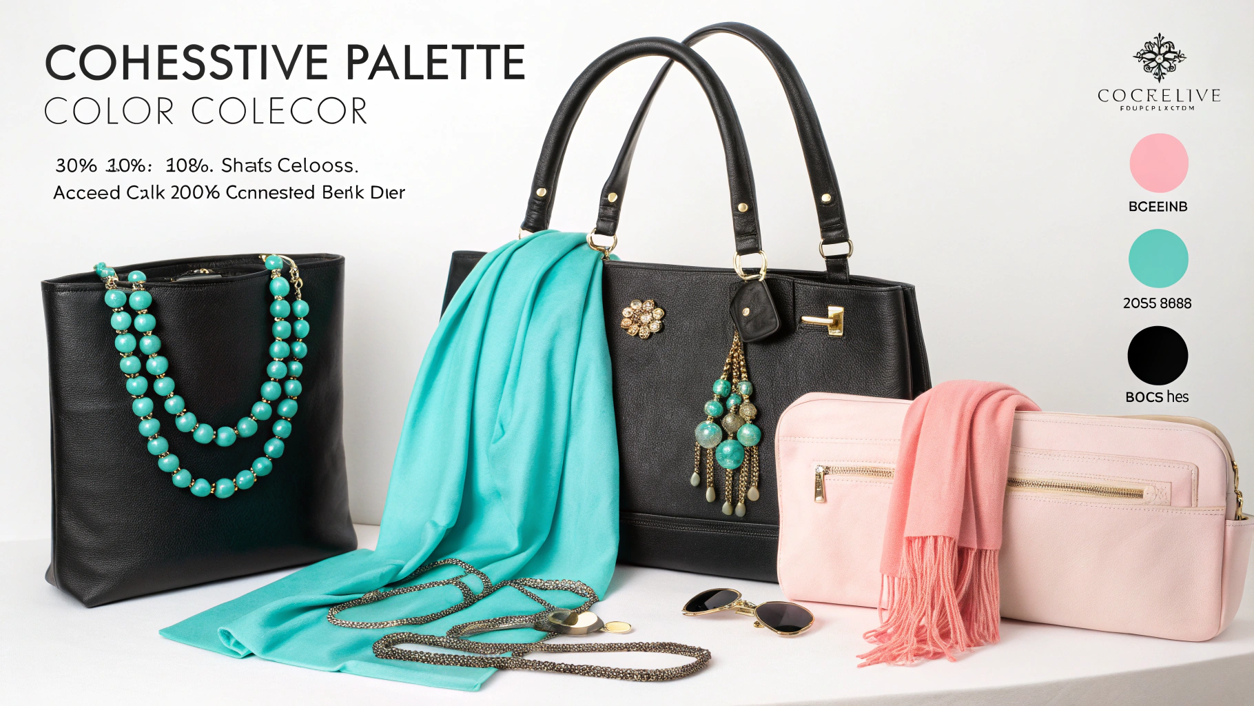
To develop a cohesive color palette for your accessory collection, start with your brand's existing colors. Pick one neutral base like black, white, beige, or navy. Then pick two accent colors that complement each other. Use the 60-30-10 rule. 60% of your collection uses the neutral base. 30% uses the primary accent. 10% uses the secondary accent. Test your colors on different materials. Hair bands look different in matte versus shiny finish. Scarves change color under store lighting. Always make physical samples before bulk production.
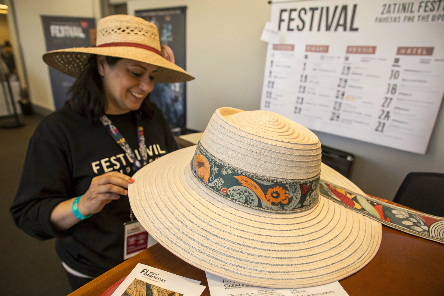
You might think color is easy. Just pick what looks good. But I have seen too many collections fail because colors clash. Or because the palette has no flow. Or because the colors look good on a screen but terrible on fabric. Let me walk you through how we build color palettes at our factory. These are the exact steps we teach our biggest clients. From Walmart to small Etsy shops. The same rules apply.
What Is The 60-30-10 Rule For Accessories?
The 60-30-10 rule is old. Interior designers use it. Fashion designers use it. Even website designers use it. But many accessory brands ignore it. That is a mistake. I saw a client from New York make this error. She made 20 different hair band colors. Each color had equal quantity. She thought more choice meant more sales. But her customers got confused. They could not decide. So they bought nothing. She sold only 30% of her stock. The next season, we used the 60-30-10 rule. She made 60% black hair bands. 30% white. 10% red. She sold 85% of her stock. Same quality. Same price. Just better color balance.
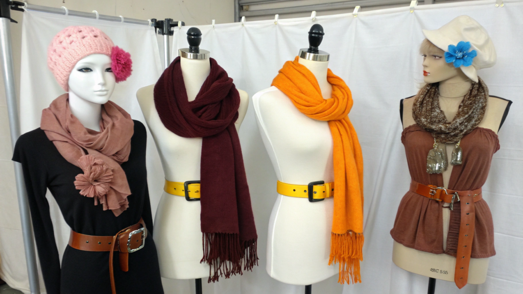
The 60-30-10 rule means 60% of your collection uses your dominant color. 30% uses your secondary color. 10% uses your accent color. For a collection of 1000 hair clips, 600 clips are your neutral base. 300 clips are your primary accent. 100 clips are your secondary accent. This creates visual harmony. Your customers see a clear story. They can mix and match easily. They buy more because everything goes together.
Let me show you real examples. This is not theory. This is what works in actual stores and online shops.
| Collection Type | 60% (Base) | 30% (Primary) | 10% (Accent) | Best For |
|---|---|---|---|---|
| Winter hats | Beige | Navy | Burgundy | Department stores |
| Hair bands | Black | Leopard print | Gold glitter | Fast fashion brands |
| Scarves | Cream | Olive green | Rust orange | Boutique shops |
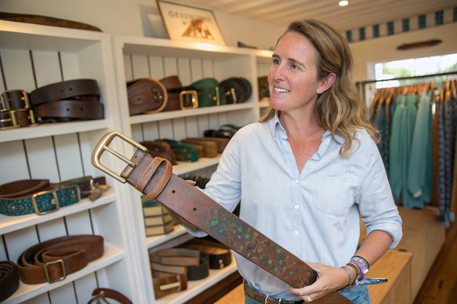
| Belts | Brown | Tan | Turquoise | Western wear brands |
We have a client in Texas. She sells western-style accessories. Her base is brown leather belts. Her primary is tan suede belts. Her accent is turquoise buckle belts. The turquoise belts sell out first. But they only work because the brown and tan belts are there. The accent color pops against the neutrals. Without the neutrals, the turquoise would look too loud.
We also use this rule for multi-packs. Many supermarkets like Walmart supplier guidelines require color variety packs. A pack of 12 hair bands might have 7 black, 3 white, and 2 red. That is 58%, 25%, 17%. Close enough to the rule. Customers love these packs. They feel like they get variety without chaos.
What if my brand has more than three colors?
This is a common question. I recommend you pick your top three colors. Look at your sales data. Find the three colors that sell most. Use those. If you have a strong brand color like Tiffany blue or Hermes orange, make that your primary accent. Not your base. Because bright brand colors work best in smaller doses. For example, a client with a hot pink brand color made 60% black, 30% hot pink, 10% white. Her customers loved it. The hot pink popped against the black. But it was not overwhelming. She sold 90% of her collection.
Can I use patterns as one of my colors?
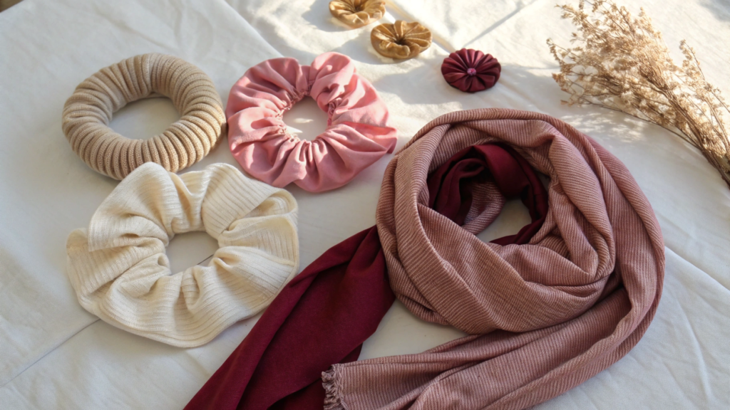
Yes, absolutely. Patterns count as a color group. For example, 60% solid black hair bands, 30% leopard print hair bands, 10% red hair bands. This works very well for fast fashion. We have a client in Los Angeles who does this every season. Her base is always solid black. Her primary changes seasonally. Leopard print in fall. Polka dot in spring. Stripes in summer. Her accent is always a bright pop color. Her customers collect every season. They know the system. They look forward to the new pattern. This is a smart way to build repeat customers.
How To Test Colors On Different Materials?
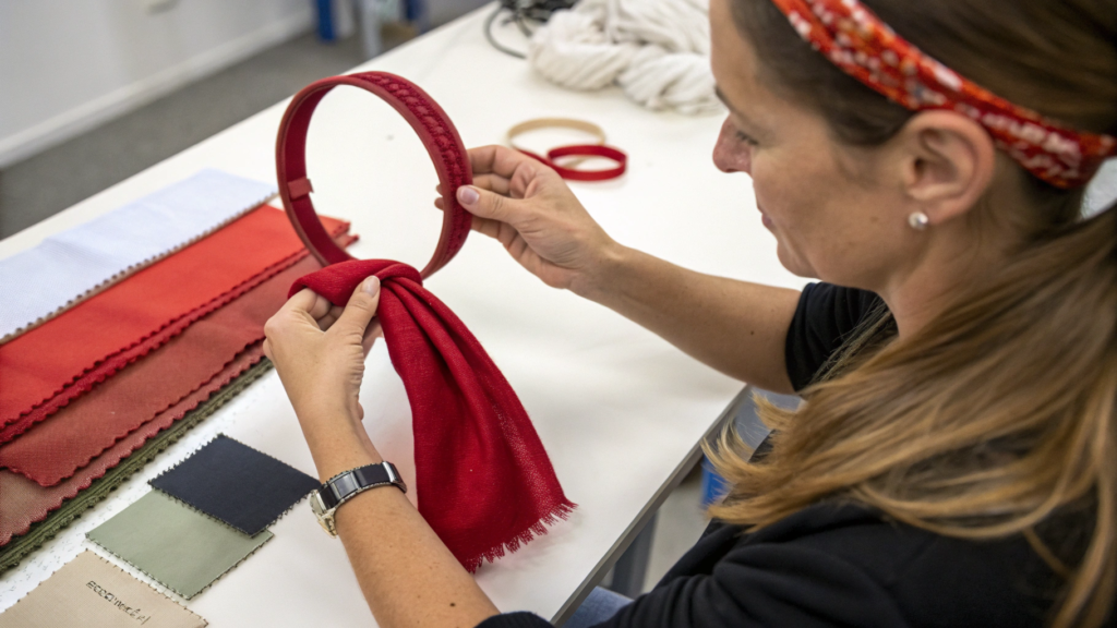
Color changes on different materials. This surprises many new buyers. They pick a color from a Pantone book. They think every product will look the same. Then they get their samples. The polyester hair band looks bright red. The cotton scarf looks dark red. The nylon belt looks orange-red. They are angry. They think we made a mistake. But we did not. Different fabrics absorb dye differently. I learned this 10 years ago. A client from Chicago ordered red hair bands and red gloves. Same Pantone code. But the gloves came out darker. She rejected the whole order. Now I always warn clients. I make samples on each material first. I send photos. I ask for approval. You should do the same.
Always test your color on every different material in your collection. Polyester holds dye well and stays bright. Cotton absorbs dye and looks slightly darker. Nylon can look shiny and change color under light. Wool can look muted and soft. Make a small sample of each material. Put them side by side under natural light. Take photos. Send them to your team. Approve each material separately. Never assume one color code works for all materials.
Let me share our internal material testing guide. We use this with every client. You can use it too.
| Material | Dye Absorption | Color Result | Best For | Shine Level |
|---|---|---|---|---|
| Cotton | High | Darker, matte | Hats, scarves | Low |
| Polyester | Medium | Brighter, consistent | Hair bands, ribbons | Medium |
| Nylon | Low | Shiny, lighter | Belts, bags | High |
| Acrylic | Medium | Soft, muted | Beanies, gloves | Low |
| Wool | High | Very dark, rich | Scarves, hats | Very low |
| Faux leather | Low | Surface coat only | Belts, straps | Medium to high |
We once had a client order beige in four materials. Cotton hat, polyester hair band, acrylic glove, and nylon belt. The cotton hat was perfect. The polyester hair band was too light. The acrylic glove was too yellow. The nylon belt was too shiny. She was upset. But we fixed it. We adjusted the dye formula for each material. We made new samples. She approved them. The final collection looked cohesive. But it took 3 extra weeks. Testing first would have saved that time.
We use a Pantone color guide for every order. You pick the Pantone number. We match it. But we warn you. Pantone on paper is different from Pantone on fabric. So we send you a "dye lot" sample. This is a small piece of the actual fabric with the actual dye. We do not charge for this. We send it by email photo first. Then by mail if you want. Always approve the dye lot before we cut fabric.
How do I know if my material will fade over time?
This is called colorfastness. It is very important for products that get washed or used in sunlight. Hair bands that touch sweaty hair can fade. Hats worn in the sun can fade. Scarves that get washed can fade. We test colorfastness for every material. We have a machine that rubs the fabric 100 times. We also have a machine that shines UV light for 24 hours. This simulates 3 months of sunlight. We can send you these test reports. The industry standard is grade 4 or 5 out of 5. Grade 5 means no fading. Grade 4 means very little fading. Grade 3 or below is not acceptable. We reject any batch below grade 4. You can read more about colorfastness testing standards on the AATCC website.
What is the difference between lab dip and strike off?
These are two terms you will hear from factories. A lab dip is a small piece of fabric, about 2 inches by 2 inches. It shows you the color. We make lab dips first. They cost nothing. We send you 3 to 5 options. You pick one. A strike off is a larger sample, sometimes a full yard of fabric. We make strike offs for big orders over 10,000 units. They cost a small fee, usually $50 to $100. But we deduct this from your bulk order. Strike offs are better because you can see the color on a larger surface. Colors look different on a small swatch versus a large piece. Always ask for a strike off if you are ordering large quantities. It is worth the small cost.
How To Build Seasonal Color Palettes That Sell?
Seasons drive sales. I have seen this for 15 years. In spring, people want pastels. In summer, they want bright colors. In fall, they want warm earthy tones. In winter, they want deep rich colors. A client from Canada ignored this. He ordered bright yellow hats in October. He thought he was being different. But no one bought them. It was fall. People wanted burgundy and forest green. He lost $15,000. Now he follows the season. He lets me advise him on colors. His sell-through rate went from 40% to 85%. Do not fight the season. Use it.
Spring collections sell best with pastel pink, mint green, baby blue, and lavender. Summer collections sell best with bright yellow, coral red, turquoise, and white. Fall collections sell best with burgundy, olive green, rust orange, and mustard yellow. Winter collections sell best with navy blue, charcoal gray, deep red, and forest green. Start developing your seasonal palette 4 months before the season begins. For example, start fall colors in May. Ship in August. Sell in September.
How do I predict colors for next year?
You do not need to predict. You just need to follow the experts. Every year, Pantone releases their color report. So does WGSN. So does Benjamin Moore. Follow them on social media. Read their reports. They are free or low cost. Also watch what big brands are doing. Look at Zara, H&M, and Target. They spend millions on color research. Copy them. Not exactly, but use their direction. If Zara uses rust orange for fall, you should too. They have done the homework for you. Another trick is to look at fabric trade shows. The Premiere Vision trade show in Paris shows colors 2 years ahead. You can buy their color books. They cost $200 to $500. But they are worth it. We have them in our office. You can visit and look at them for free.
What about holiday-specific colors?
Holidays are a great opportunity. Christmas colors are red, green, gold, and silver. Halloween colors are orange, black, and purple. Valentine's Day colors are red, pink, and white. Easter colors are pastel yellow, pink, blue, and green. For holidays, break the 60-30-10 rule. Go 40-40-20 instead. More variety works for holidays because people buy gifts. They want choice. For Christmas last year, one client did 40% red, 40% green, 20% gold. She sold 50,000 hair clips in 6 weeks. But do not make holiday colors year-round. They will not sell. Stop holiday production 2 weeks before the holiday. Start again 4 months before the next holiday. Timing is everything.
How To Avoid Common Color Mistakes With Chinese Factories?
I have seen every color mistake possible. Clients trusting their computer screens. Clients not asking for dye lots. Clients approving colors on a phone photo. Clients changing their mind after production starts. Each mistake costs time and money. Last year, a client from Australia sent me a color from her phone. She took a photo of a flower. She said "match this." We did. But her phone screen showed warm tones. My factory screen showed cool tones. The real flower was in between. We made 3000 hair bands. They did not match her brand. She rejected them. I had to sell them at a loss. Now I have rules. I do not accept phone photos. I need Pantone numbers or physical samples. I am strict because I care about your success.
The top five color mistakes buyers make are: 1) Trusting computer or phone screens instead of physical samples. 2) Skipping the dye lot approval step. 3) Changing colors after bulk production starts. 4) Not testing colors on different materials. 5) Ignoring how store lighting changes colors. To avoid these, always request a physical sample. Approve it in natural daylight. Sign an approval form. Do not change your mind after signing. We follow your signed approval strictly. No exceptions.
What do I do if the bulk color does not match the sample?
First, do not panic. This happens sometimes. Even with good factories. The first step is to check the lighting. Take the bulk product and the sample outside. Compare them in natural daylight. If they still look different, take photos. Send them to us immediately. We will check our production records. We will see if we used the wrong dye formula. If we made a mistake, we will fix it. We will remake the affected products. We will pay for shipping. If the difference is very small (dE under 2.0), most customers accept it. We can offer a small discount, usually 5-10%. If the difference is large (dE over 3.0), we replace for free. This is written in our supplier quality agreement. You can request a copy.
How do I communicate color clearly to a factory?
Use the CLEAR method. C is for Color standard. Send a Pantone number or physical sample. L is for Lighting. Specify daylight, store light, or home light. E is for Evaluation method. Spectrometer or visual? A is for Approval. Written or verbal? R is for Rejection tolerance. What dE level is acceptable? Write all this in your purchase order. Do not assume the factory knows. We have a template. Ask Elaine for it. She will send it to you. It is a one-page form. Fill it out for every order. It takes 5 minutes. It saves weeks of problems.
Conclusion
Color is the first thing your customer sees. Before they touch the product. Before they read the price. Before they know your brand. They see color. And they decide. Like it or leave it. In less than 3 seconds. That is why color matters so much.
I have been in this business for 15 years. I have seen good collections become great because of color. I have seen bad collections fail because of color. The difference is not luck. It is process. The 60-30-10 rule. Material testing. Seasonal planning. Clear communication. These are not secrets. They are just habits. Good habits that lead to good results. You do not need to be a color expert. You just need to follow the steps. Start with your brand's existing colors. Pick one neutral base. Pick two accents. Test them on your materials. Approve physical samples. Sign the approval form. Then trust your factory to follow it. If you do these things, your collection will look cohesive. Your customers will notice. Your sales will improve.
At Shanghai Fumao, we make color easy for you. Our design team has the latest Pantone books. Our QC team has spectrometer machines. Our production team follows your signed approval exactly. We do not guess. We do not assume. We measure. We test. We document. Then we ship. I invite you to try us. Send us your colors. We will make you a sample. You will see the quality. You will see the accuracy. You will see the difference that process makes.
To start your color palette development, please email our Business Director, Elaine. Her email is elaine@fumaoclothing.com. Tell her you want to build a cohesive color collection. She will assign you a dedicated project manager. That person will guide you through every step. From color selection to sample approval to bulk production. No confusion. No surprises. Just beautiful, cohesive accessories that sell.