
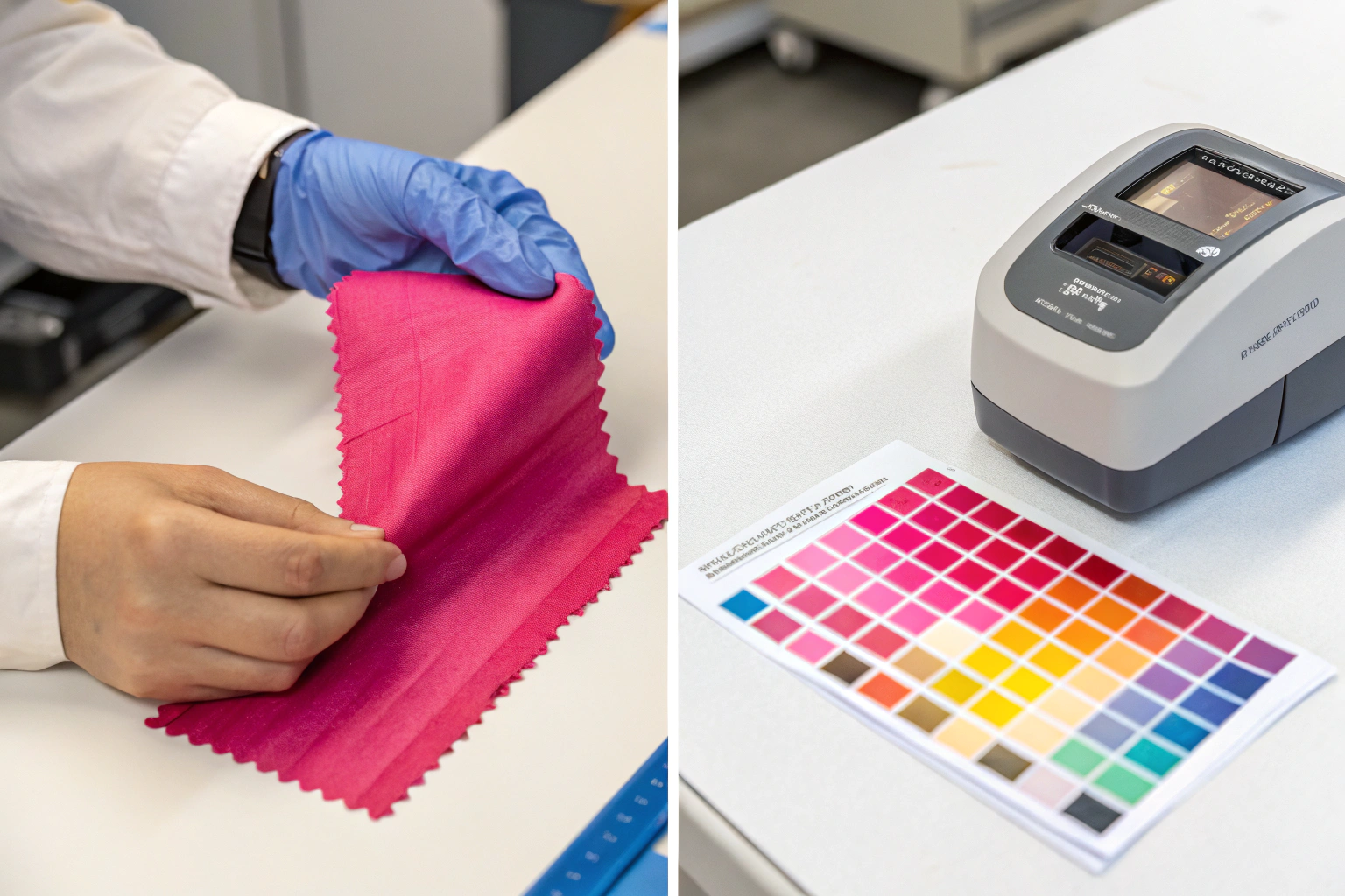
I once opened a shipment of 5,000 scrunchies in front of my client. The color was supposed to be a soft, dusty rose. It was neon bubblegum pink. My stomach dropped. The buyer looked at me with that expression you never want to see. Disappointment mixed with "I knew this would happen." That moment cost me a two-year relationship. I had no system to catch the color error before the goods left the factory. I trusted a verbal approval. I learned the hard way that hope is not a color management strategy.
The best way to handle a factory that sends wrong Pantone colors is to immediately stop production, document the deviation with a physical lab dip comparison under a D65 light booth, and issue a formal corrective action report (CAR). The long-term solution requires shifting from visual approval to instrumental color measurement using a spectrophotometer, and implementing a mandatory "golden sample" sign-off process that locks the Pantone reference physically and digitally before bulk fabric cutting begins.
I run a fashion accessories factory in Zhejiang. I’ve been on both sides of this problem. I’ve made the mistake, and I’ve fixed the mistake. Color accuracy is the hardest quality parameter to control because it involves chemistry, lighting, fabric composition, and human perception. But it is absolutely solvable if you treat color as a measurable science rather than a subjective opinion. I want to walk you through exactly how to prevent this nightmare and how to respond when it happens, because your brand’s visual identity depends on it.
Why Do Factories Frequently Get Pantone Colors Wrong on Accessories?
The factory isn’t necessarily lazy. The problem is often physics and chemistry, not attitude. You send a Pantone code for a cotton hair band. But the dye that works on cotton does not exist for polyester webbing. Or the factory matches the color perfectly on a flat metal clip, but when they plate the curved spring, the current density shifts the shade darker. There are genuine technical reasons why a Pantone code on a paper swatch does not translate directly to a three-dimensional accessory. Understanding these reasons is the first step to fixing the problem permanently.
Factories frequently get Pantone colors wrong because of substrate metamerism, dye lot variation, and reliance on visual assessment under inconsistent lighting. A Pantone color printed on paper reflects light differently than a dye absorbed into polyester or a pigment coated on metal. Additionally, many smaller factories lack a spectrophotometer and still match colors by eye under cheap fluorescent lights, which distort the color spectrum and hide undertone mismatches until the goods are viewed in natural daylight.
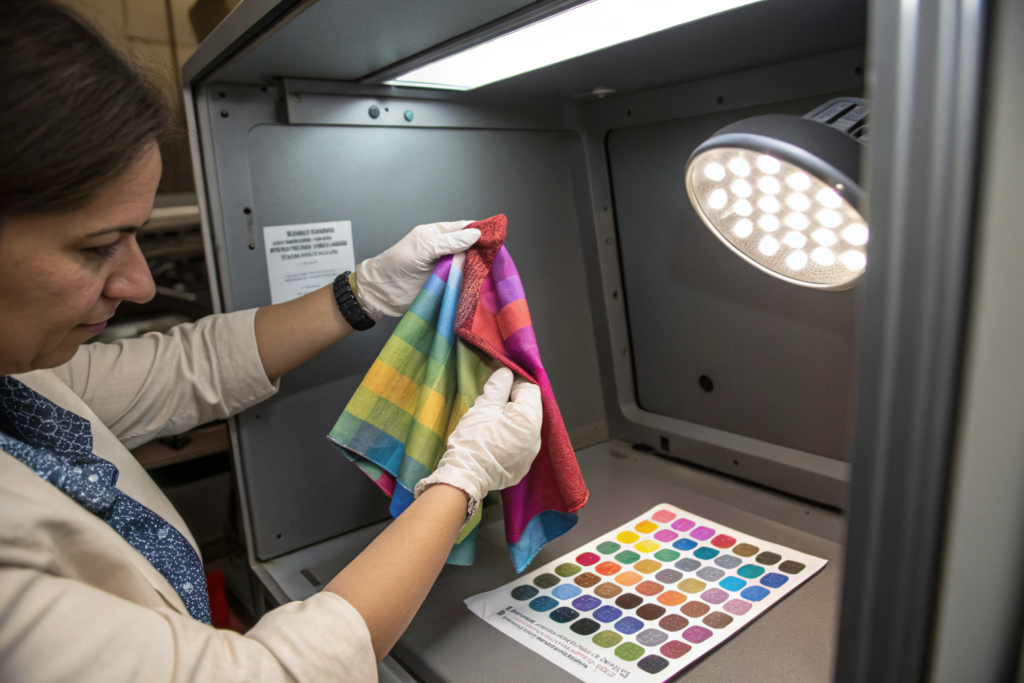
I’ve seen a factory match a navy blue perfectly in their workshop, only for it to look purple under the LED lights of a European boutique. That’s metamerism in action. Two colors match under one light source but not another. If you don’t control the light source during approval, you don’t control the color. I now require all color approvals to be done under a D65 light booth, which simulates natural daylight. This one change eliminated half of my color disputes.
What Is Substrate Metamerism and How Does It Affect Dyed Hair Accessories?
Substrate metamerism is the technical term for when the same dye recipe looks different on two different materials. You pick Pantone 19-4052 Classic Blue. On a paper chip, it looks like a rich, dark sapphire. On a polyester satin ribbon, it might look slightly muted and lighter. On a nylon hair clip, it might shift toward a greenish undertone.
This happens because each material has a different surface texture and chemical structure. Polyester is a synthetic polymer that requires disperse dyes. Cotton requires reactive dyes. Even if both dyes target the same Pantone shade, the way light bounces off the smooth polyester versus the absorbent cotton creates a visual difference. We solve this by creating a separate lab dip for each material in the same product. A hair band with a cotton outer and a polyester elastic inner requires two separate color approvals on the actual production fabric. The science of colorimetry teaches us that the substrate is an inseparable part of the color equation. Ignore the material, and you guarantee a mismatch.
How Does Inconsistent Factory Lighting Trick the Human Eye During Color Approval?
You approve a lab dip in your office under warm, yellowish halogen lights. It looks perfect. The factory produces the bulk order. You open the carton near a window, and the color is completely wrong. The factory didn’t make a mistake. The light source tricked both of you.
The human eye interprets color based on the light that illuminates the object. Warm light hides blue undertones. Cool white fluorescent light makes warm reds look dull. A professional color assessment requires a standardized light source. The industry standard is D65, which mathematically represents average daylight including ultraviolet radiation. We use a D65 light booth for every color approval in our factory. The buyer and the factory both view the sample under the same simulated daylight. This removes the environmental variable. If the color matches under D65, it is objectively correct regardless of whether it’s viewed under office halogen or boutique LED. This single piece of equipment is the cheapest insurance policy against color disputes.
What Immediate Actions Should You Take When You Receive the Wrong Color Sample?
You tear open the express package. Your heart sinks. The color is wrong. Your first instinct is to fire off an angry email. Don’t do it. An emotional reaction damages the partnership and rarely solves the problem. The factory will get defensive. They will claim it looks fine to them. You end up in a subjective argument with no resolution. You need a cold, clinical, evidence-based response that leaves no room for debate. You must shift the conversation from "I don’t like this" to "This measurement proves a deviation."
When you receive a wrong color sample, take these immediate actions: first, photograph the sample next to the approved lab dip under a D65 light source and circle the visual difference. Second, measure the Delta E value using a spectrophotometer to quantify the color deviation. Third, send the objective measurement data along with a request for a root cause analysis, not a demand for a discount. This forensic approach forces the factory to investigate their dyeing or plating process rather than simply re-cutting with the same faulty setup.
I train my project managers to respond to color rejections with data, not drama. When a client sends me a Delta E reading above 2.0, I cannot argue with it. The number is the number. It points directly to a specific step in my production process that failed. This data-driven rejection saves weeks of back-and-forth and results in a corrected sample much faster than a shouting match over WhatsApp.
How Do You Document a Pantone Color Deviation Objectively and Professionally?
A smartphone photo in random office lighting is useless as evidence. The camera sensor auto-corrects white balance. The office light shifts the color. The factory will rightly point out that the photo is not reliable.
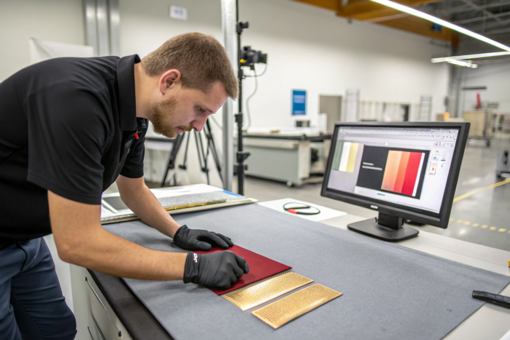
Professional documentation requires a controlled environment. Place the submitted sample and the approved standard side-by-side on a neutral grey background inside a D65 light booth. Use a color-calibrated camera or a spectrophotometer to capture the comparison. The key piece of data is the Delta E value. Delta E is a single number that represents the mathematical distance between two colors. A Delta E of less than 1.0 is imperceptible to the human eye. A Delta E between 1.0 and 2.0 is a minor deviation acceptable for most fashion accessories. A Delta E above 2.5 is a clear failure. By stating "The Delta E measurement is 3.8 against our approved standard," you move the conversation from opinion to objective measurement. This Delta E tolerance standard is the global language of color quality control across textiles, plastics, and metals.
Should You Reject the Entire Shipment or Negotiate a Discount for Color Mismatch?
The goods have already shipped. Rejecting the entire container means paying for return freight, losing the sales season, and potentially ending the supplier relationship. Accepting the wrong color damages your brand. There is a middle ground, but it depends entirely on the severity of the mismatch and the product’s end use.
For a fashion accessory where color is a primary selling feature, such as a hair clip in a specific seasonal trend shade, a visible mismatch is a justifiable reason for a full rejection. The goods are not as described in the purchase contract. For a basic item like a neutral-colored hair tie, a minor shade variation might be commercially acceptable with a negotiated discount. I recommend specifying the color tolerance terms in the original purchase order. A clear clause that states "Delta E must not exceed 2.0 on all bulk shipments; shipments exceeding this tolerance are subject to rejection at seller’s expense" legally protects you before the problem occurs. This removes the emotional negotiation after the fact and replaces it with a pre-agreed pass/fail criterion.
How Do You Prevent Pantone Errors Before Bulk Production Starts?
Waiting until the bulk shipment arrives to check the color is a gamble with your business. The time to catch a color error is before a single meter of fabric is dyed or a single clip is electroplated. Prevention is not expensive. It is a series of mandatory gates that stop a bad batch from ever reaching the cutting table. These gates require discipline, not money. A factory that resists these steps is telling you they are not confident in their own color control.
Preventing Pantone errors before bulk production requires a three-gate approval system: the lab dip approval on the actual production substrate, the strike-off or handloom approval for printed fabrics, and the pre-production sample sign-off that locks the color reference. Each gate must be documented with a physical "golden sample" that is signed and dated by both parties. This sample serves as the legal and visual contract for color, and no bulk cutting is authorized until this sample is physically in the factory’s hands.
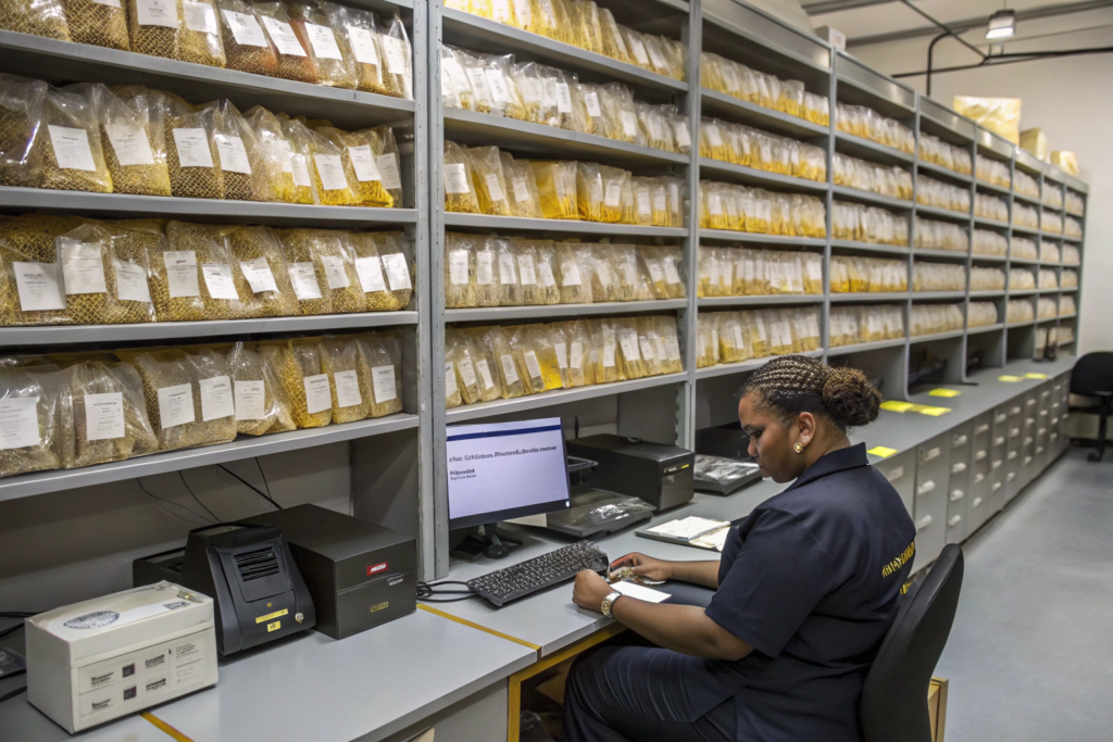
I keep a vault of golden samples in my factory. Each one has a sticker with the client name, the PO number, the Pantone code, and a signature. My cutting manager cannot issue fabric to the sewing line unless that golden sample is attached to the work order. This physical control prevents a well-meaning but rushed production supervisor from using an unapproved dye lot. The system is simple, but it requires absolute managerial commitment.
What Is a Lab Dip and Why Is It the First Critical Color Approval Gate?
A lab dip is a small swatch of the actual production fabric dyed to match the target Pantone color. It is created in a laboratory environment by a textile chemist who formulates a recipe of dyes and chemicals specific to that fabric type. This is fundamentally different from looking at a paper Pantone chip.
The lab dip reveals how the chosen fabric absorbs the dye. A polyester satin will take the dye differently than a cotton canvas. The lab dip process usually takes two to three days. The factory submits multiple variations, each slightly different in shade, to the buyer. The buyer selects the best match and signs it. This signed lab dip becomes the master color standard for the entire production run. The dye house uses the approved recipe to mix the bulk dye bath. Without this step, the bulk dyer is guessing. They might use a standard recipe that is close but not exact. The lab dip approval process is the cheapest and most effective color insurance available. Skipping it to save three days will cost you thirty days in rework later.
How Does a Spectrophotometer Remove Subjectivity from the Approval Workflow?
Two people can look at the same lab dip and disagree. One person sees a warm brown. The other sees a greenish brown. Both are telling the truth according to their unique retinal biology. A spectrophotometer has no biology. It emits a controlled beam of light and measures the exact wavelengths reflected back.
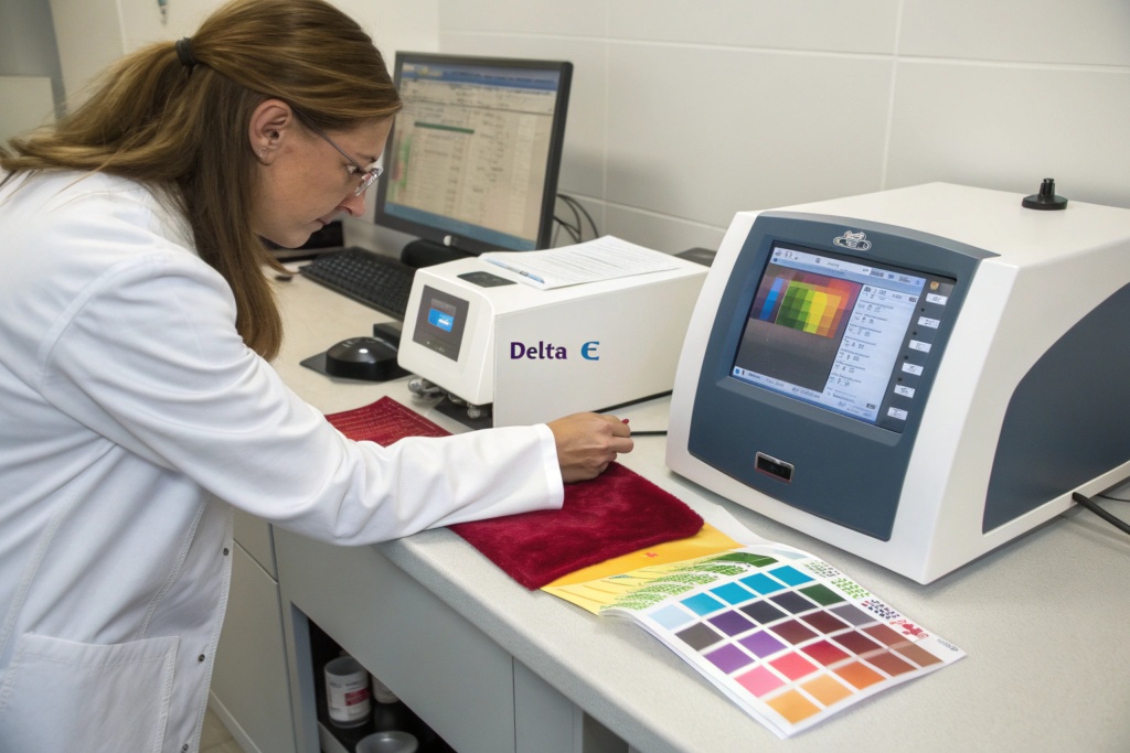
The device produces a spectral curve, which is the color’s unique fingerprint. It then compares this curve to the Pantone master data stored in its digital library. The result is a Delta E value. We use a benchtop spectrophotometer in our lab to measure every incoming dye lot against the signed golden sample. If the Delta E is below 1.5, the fabric is approved for cutting. If it’s above, the fabric is rejected and the dye house must reformulate. This digital color measurement system turns color approval from an artistic debate into an engineering inspection. It is faster, cheaper, and infinitely more reliable than the human eye. I recommend every brand buyer invest in a portable spectrophotometer to check samples in their own office before communicating with the factory.
What Should a Corrective Action Plan Include After a Color Failure?
The factory admitted the mistake. They apologized. Now what? An apology does not prevent the error from happening again on the next purchase order. A genuine corrective action plan is a written document that identifies the root cause of the failure and describes the specific changes to the production process that will eliminate that cause. Without this, you are just accepting an emotional promise. You need a process change.
A corrective action plan for a Pantone color failure must include: a root cause analysis using the "5 Whys" method, a description of the immediate containment actions taken, the specific long-term preventive measures implemented, and a verification schedule. The plan should also clearly assign responsibility to a named individual, not a department. This person becomes accountable for color accuracy on all future orders. The plan must be signed by factory management and accepted by the buyer before the relationship continues.
I once had a failure on a batch of printed scarves where the background ivory shifted to a cold white. The root cause analysis revealed that the fabric mill had changed their base fabric optical brightener level without informing us. The corrective action was not just to tell them not to do it again. It was to add a mandatory UV spectral check on all incoming greige fabric before printing. That specific, measurable change fixed the issue permanently.
How Does Root Cause Analysis Prevent Recurring Pantone Mistakes?
A recurring error is evidence of a system failure. If the factory simply re-dyes the batch without investigating the root cause, the same error will appear in the next order. The root cause is not always obvious. It could be an expired dye stock, a miscalibrated scale in the color kitchen, or contaminated rinse water.
We use the "5 Whys" technique. The color is wrong. Why? The dye bath concentration was off. Why? The weighing scale drifted out of tolerance. Why? The scale was not included in the monthly calibration schedule. Why? The maintenance log only covered cutting and sewing machines. The root cause is a missing calibration protocol, not a lazy dye operator. The corrective action is to add all weighing equipment to a monthly ISO calibration program. This systemic fix prevents the error from happening on a different product with a different operator six months later. This analytical depth is what separates a professional factory from a reactive workshop.
What Role Does a Color Manager Play in an Accessories Factory’s Quality System?
In many small factories, the production manager handles everything. They manage cutting schedules, sewing output, and color approval. They are stretched too thin. Color control is a specialized skill that deserves a dedicated role. A color manager sits between the dye house, the printing department, and the client.
This person owns the color library, maintains the spectrophotometer, archives the golden samples, and approves every lab dip before it leaves the factory. When a client submits a new Pantone code, the color manager creates the initial lab dip recipe and checks it against the physical fabric before sending it for client approval. If a production batch shows a Delta E drift, the color manager stops the production line and investigates. This role is an investment in professionalism. It costs a salary, but it saves a fortune in rejected shipments and lost customers. The emergence of the color management specialist role in fashion manufacturing is a clear signal that the industry is finally treating color as a science, not an afterthought.
Conclusion
Handling a factory that delivers wrong Pantone colors is a test of your supply chain professionalism. You learned that the immediate response must be objective, not emotional. An angry phone call solves nothing. A documented Delta E measurement under a D65 light booth with a corrective action request solves everything. You saw that the root of the problem is often not carelessness but complex physics like substrate metamerism and inconsistent lighting. A factory that matches colors by eye under a warehouse fluorescent tube will never be accurate enough for a brand that sells under boutique halogen.
We mapped out the prevention system that eliminates the risk before a single meter of fabric is cut. The lab dip on the actual production material is the first gate. The spectrophotometer measurement against the golden sample is the second gate. A signed, dated, and archived physical standard that travels with the work order is the third gate. These three gates cost almost nothing to implement but they close the door on subjective color debates forever. And we examined the long-term fix: a corrective action plan that digs into the root cause with the "5 Whys" and assigns personal accountability to a trained color manager.
At AceAccessory, I have built our quality system around the principle that color is a measurable specification, not an artistic interpretation. Our Zhejiang factory has the D65 light booths, the benchtop spectrophotometers, and the dedicated color management staff that make accurate Pantone reproduction a repeatable, reliable process. We archive your golden sample as a physical asset, and we don’t ship a single accessory until the Delta E reading is within tolerance.
If you are exhausted by the cycle of wrong samples and delayed shipments, and you need a factory that speaks the language of Delta E and root cause analysis, I invite you to connect with our Business Director, Elaine. She can share our color control protocol document and set up a trial order with full spectrophotometer reporting. Email your Pantone references to elaine@fumaoclothing.com. Let’s build a supply chain where the color you approve is the color you receive, every single time.