As we look ahead to Spring 2026, what colors will capture the imagination of consumers and dominate the world of fashion accessories? The process of color forecasting is a complex art, blending cultural analysis, runway trends, and data science. The emerging palette for Spring 2026 tells a story of balance—a world grappling with digital acceleration while simultaneously seeking grounding and wellness. It's a sophisticated and optimistic palette that offers both energy and calm.
What are the key emerging colors? The Spring 2026 accessory palette will be defined by four key color families: 1) "Digital Lavender," a serene and ethereal purple that speaks to wellness and digital escapism, 2) "Cyber Lime," an intensely vibrant, near-neon green that connects nature with technology, 3) "Apricot Crush," a warm, restorative, and joyful orange that feels both energizing and comforting, and 4) "Nutrient Greens," a range of rich, earthy greens that ground the palette in nature. At Shanghai Fumao Clothing, we are already sourcing yarns and materials in these exact shades, preparing to help our clients lead the market with on-trend, desirable products.
Is this just about picking pretty colors? No. Each of these shades tells a story about our cultural moment. Let's explore the meaning and application of these four essential colors.
Why Will "Digital Lavender" Be the Season's Key Shade?
What color will be the "Millennial Pink" or "Gen-Z Yellow" of 2026? All signs point to Digital Lavender. This soft, ethereal purple has been building momentum for several seasons and is set to peak in Spring 2026. It sits at the intersection of several major cultural trends: the focus on mental health and wellness, the rise of digital self-care, and a renewed interest in spirituality and escapism.
Digital Lavender is a calming, serene color, but it has a synthetic, digital-age feel that separates it from a simple pastel. It's the color of a calming meditation app, a virtual sunset, or a field of lavender seen through a screen. For accessories, it's a surprisingly versatile shade that acts as a fresh, modern neutral.

How Can This Color Be Used in Different Accessories?
Will this color work for both hard and soft goods? Yes, it's incredibly versatile.
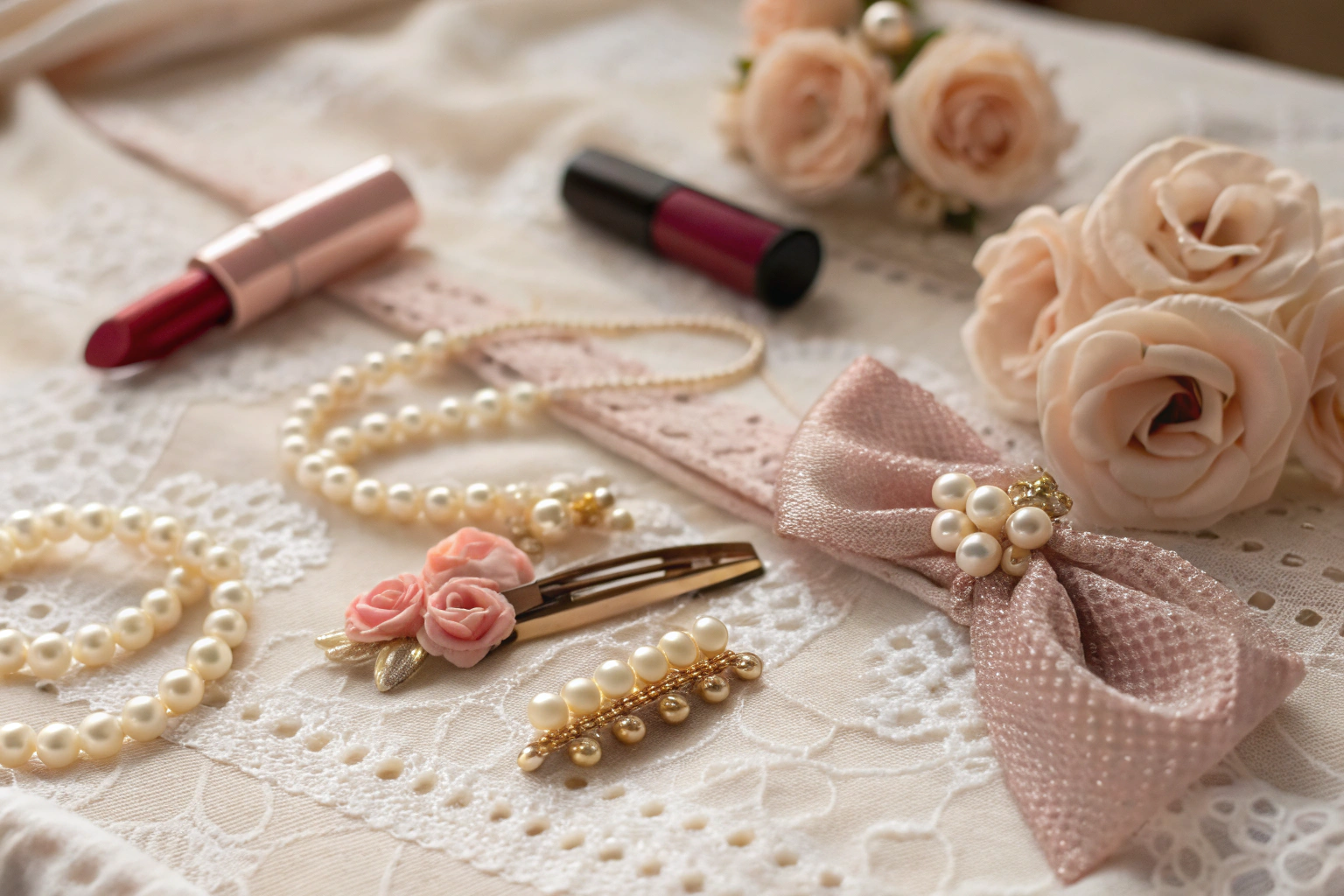
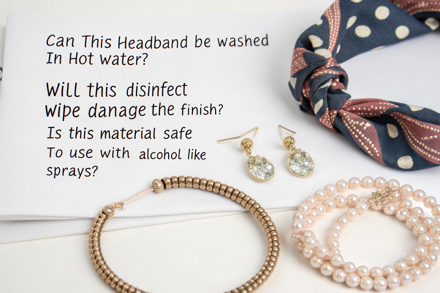
- Soft Accessories: For scarves, shawls, and lightweight knit beanies, Digital Lavender is soft, flattering, and easy to wear. It pairs beautifully with neutrals like beige and grey.
- Hard Accessories: In materials like cellulose acetate for hair claws or sunglasses, it has a modern, almost futuristic look. It's a way to make a classic shape feel completely new and on-trend.
- Bags and Belts: A bag or leather belt in Digital Lavender is a statement piece that can add a soft, contemporary pop of color to a neutral outfit.
What Does This Color Say About Your Brand?
Doesn't using this color signal that your brand is modern and in touch? Absolutely. Incorporating Digital Lavender shows that your brand is aware of the cultural conversation around wellness and the digital world. It positions your brand as thoughtful, contemporary, and aligned with the values of a younger, digitally-native consumer. It's a color that has been widely cited by trend authorities like WGSN as a key color for the coming years.
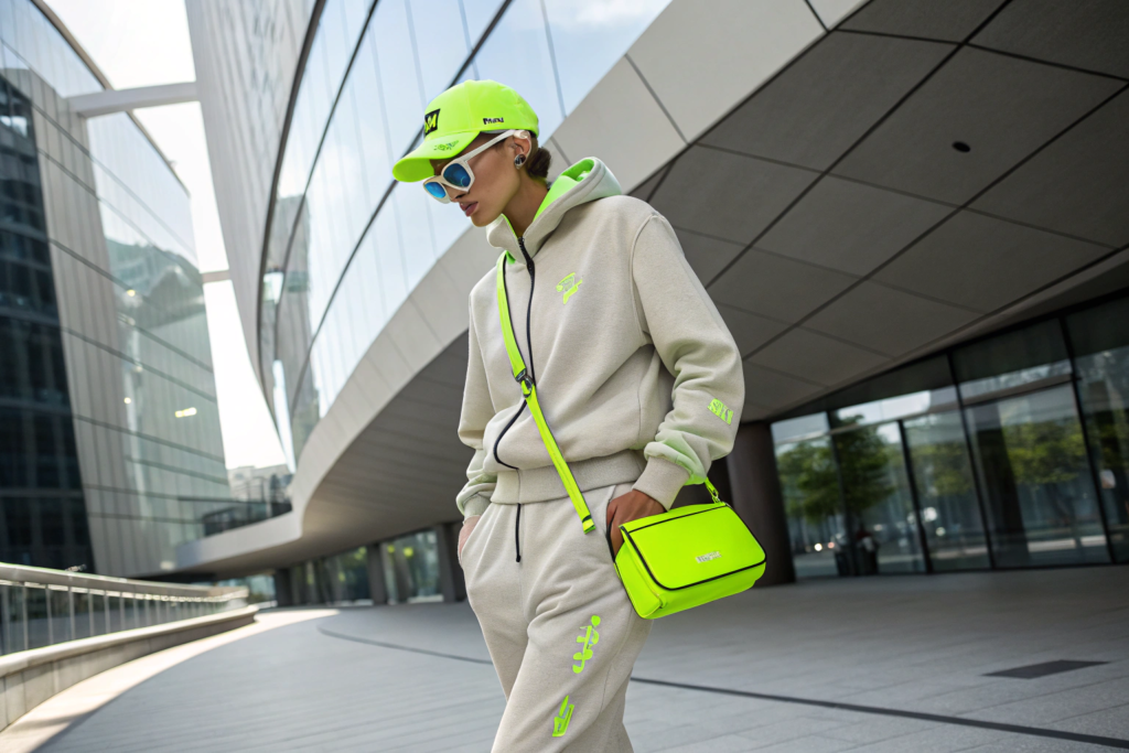
Why is "Cyber Lime" the Perfect Accent Color?
While Digital Lavender is calming, what color will provide the season's jolt of energy? That role belongs to Cyber Lime. This is a hyper-vibrant, almost-neon green that zings with digital energy. It's a synthetic, machine-made color that is directly inspired by the metaverse, AI, and the increasing blur between our physical and digital lives.
Cyber Lime is not a color for the faint of heart. It's a powerful accent color that is meant to be used in small, strategic doses to create a high-impact look. It's the color of a notification icon, a flash of code on a screen, or a futuristic energy drink. For accessories, it's the perfect way to add a jolt of excitement and modernity to a collection.
How Should You Use Such a Bold Color?
Should you make a whole collection in this color? Probably not. The key to Cyber Lime is to use it as a powerful accent.
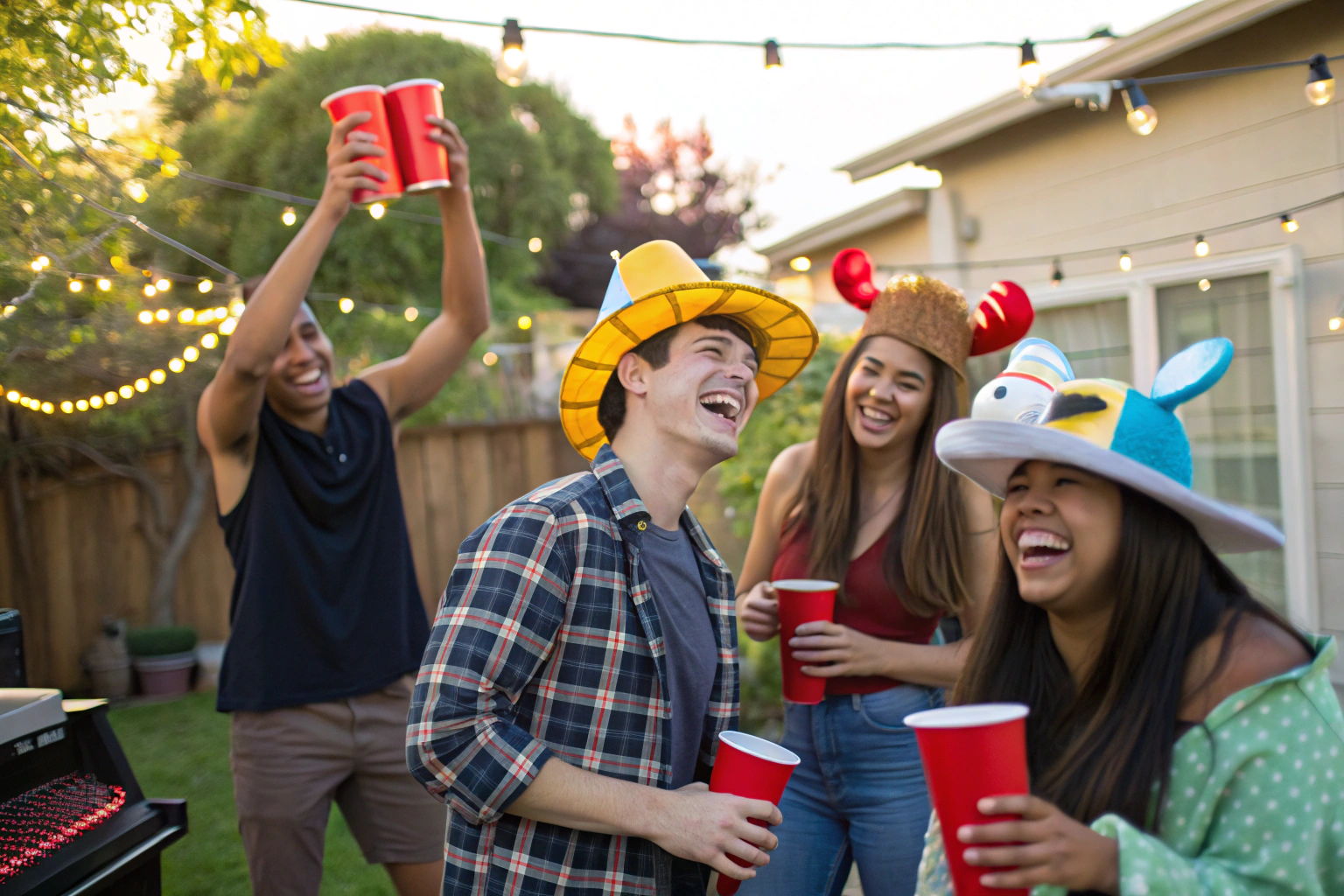
- Sports Accessories: It is the perfect color for sports caps, promotional umbrellas, and details on backpacks. Its high visibility also adds a functional safety element.
- Logos and Trims: Use it for a 3D embroidered logo on a black cap for maximum contrast. Use it as the color for the zipper pulls or lining of a bag.
- Playful Accessories: It's a fantastic color for fun, youthful items like plastic hair clips, phone charms, or festival-style bracelets.
What is the Psychology Behind This Color?
Doesn't this color represent a connection to technology? Yes. Cyber Lime is a direct reflection of our increasingly digital existence. Using it in a collection signals a brand that is forward-thinking, tech-savvy, and connected to youth culture. It's a color that feels optimistic about the future and embraces the stimulating, energetic nature of our digital world. It taps into the same energy seen in the rise of digital fashion.
Why is "Apricot Crush" the Season's Most Versatile Warm Tone?
What will be the go-to warm color for Spring 2026, replacing the pinks of previous seasons? It's Apricot Crush. This is a beautiful, mid-tone orange that is infused with a soft, peachy warmth. It's a color that feels both energizing and restorative, like a perfect spring sunset or a delicious, healthy smoothie.
Apricot Crush is incredibly versatile. It has a youthful, playful energy, but it's also sophisticated enough to be used in more elevated products. It bridges the gap between bright, loud oranges and soft, gentle pastels. It's a color that is overwhelmingly positive, joyful, and associated with health and wellbeing.

How Does This Color Appeal to a Broad Audience?
Can this color work for different age groups? Yes, and that's its greatest strength.
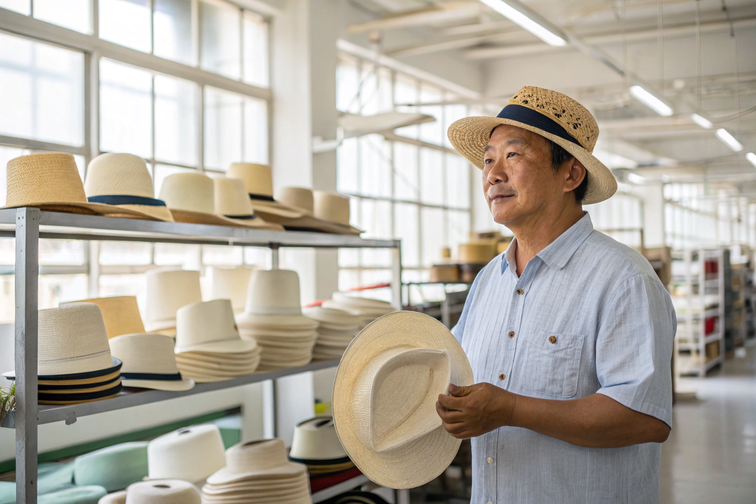
- For a Youthful Market: It has a fun, fruity, and gender-inclusive appeal that is perfect for casual accessories like bucket hats, tote bags, and fun jewelry.
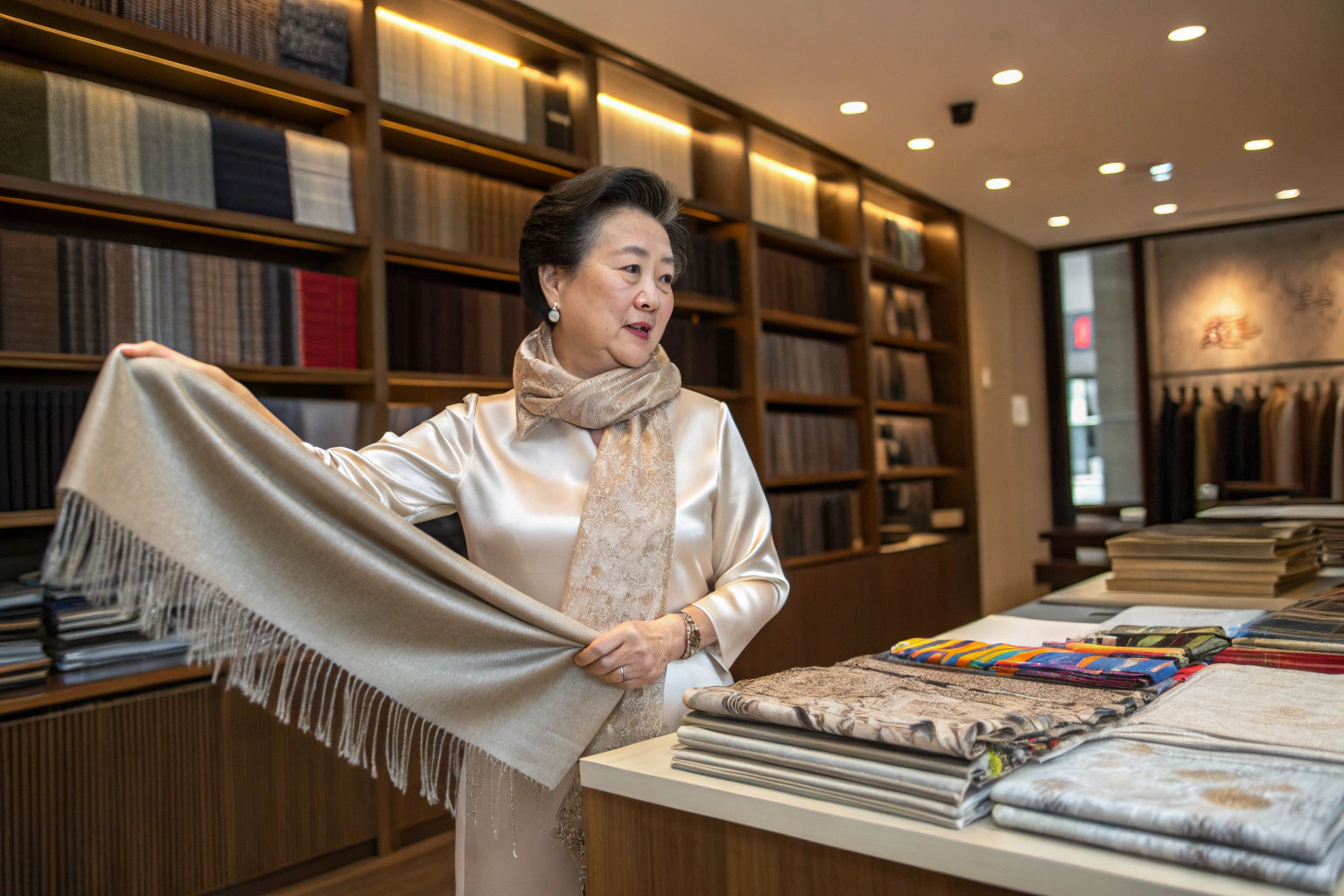
- For a Mature Market: When used in a high-quality material like silk or leather, it has a sophisticated, almost terracotta-like warmth that feels luxurious and pairs beautifully with navy, cream, and olive green. It's a perfect color for a premium silk scarf.
What is the Emotional Resonance of This Color?
Doesn't this color just make you feel good? Exactly. In a world that can feel stressful and uncertain, Apricot Crush offers a dose of optimism and vitality. It's associated with nourishment, creativity, and the simple joy of a sunny day. For a brand, using this color is a way to project an image of positivity, health, and approachable style.
Why Are "Nutrient Greens" the New Foundational Neutrals?
As consumers continue to prioritize nature and sustainability, what colors will replace traditional neutrals like grey and beige? The answer is Nutrient Greens. This is not a single color, but a family of rich, organic, and complex greens inspired by the natural world.
Think of the deep green of kale, the grey-green of a sage leaf, the rich tone of an olive, or the brown-green of a forest floor. These are calming, grounding colors that speak to a desire for authenticity and a connection to the earth. In Spring 2026, these greens will function as sophisticated, nature-inspired neutrals that can form the foundation of an entire accessory collection.

How Do These Greens Function as Neutrals?
Can green really replace beige? Yes. These muted, complex greens are incredibly versatile and pair well with almost any other color.
- An olive green bag or waxed canvas hat works beautifully with denim, cream, and all the other colors in this forecast, like Apricot Crush and Digital Lavender.
- A sage green scarf can soften a dark outfit or complement a light one.
- These colors have a timeless, utilitarian feel that gives products a sense of enduring quality and style.
What Values Does This Color Family Communicate?
Doesn't this connect directly to the sustainability movement? Yes. The popularity of Nutrient Greens is directly linked to the growing consumer focus on sustainability and nature. Using these colors signals that a brand is grounded, thoughtful, and has an appreciation for the natural world. It's a way to communicate an eco-conscious ethos through your color palette, which is a powerful message for the modern consumer.
Conclusion
So, what is the color story for Spring 2026 accessories? Is it a simple, happy pastel palette? No. It's a much more nuanced and intelligent reflection of our times.
It's a palette of balance. The serene, mindful quality of Digital Lavender is energized by the electric vibrancy of Cyber Lime. The joyful, restorative warmth of Apricot Crush is grounded by the earthy, calming presence of Nutrient Greens.
By understanding the stories and emotions behind these key colors, you can create a custom accessory collection that is not only visually on-trend but also deeply resonant with the values and desires of the Spring 2026 consumer.
Our team is already developing materials and samples in these exact shades. If you're ready to build a collection that is ahead of the curve, we are here to help you translate these trends into beautiful, marketable products. Please contact our Business Director, Elaine, at her email: elaine@fumaoclothing.com.