A beautiful logo on a screen can become a muddy, unrecognizable blob when stitched onto a hat, polo shirt, or bag. For brands producing promotional wearables or fashion accessories, this is a critical and costly problem. Embroidery is a proud tradition that adds a premium, durable touch, but it operates under strict physical constraints that digital design does not. So, how do you bridge the gap between your digital brand identity and the tactile art of thread? The secret lies in designing for the medium from the very beginning, not simply adapting an existing logo after the fact.
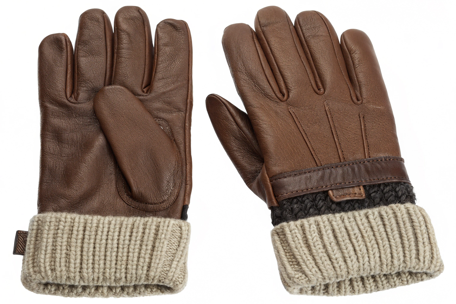
At AceAccessory, we embroider logos on thousands of caps, beanies, tote bags, and blazers for our clients. We've seen brilliant logos fail in embroidery and simple ones become iconic. The difference is always in understanding the craft. A logo designed for embroidery must respect the nature of thread, the mechanics of the embroidery machine, and the limitations of fabric. It's a partnership between graphic design and textile engineering.
This guide will walk you through the essential principles of designing an embroidery-friendly logo. We'll cover the critical rules of simplification, the impact of stitch types, color and thread choices, sizing considerations, and how to work effectively with your embroidery manufacturer. By the end, you'll know how to create or refine a logo that translates your brand's essence into perfect stitches.
Why Must You Simplify Your Logo for Embroidery?
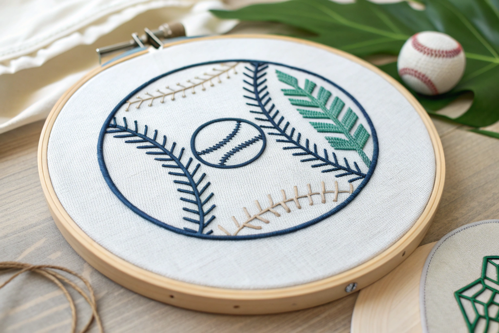
Embroidery is not printing. It builds an image with thousands of individual thread stitches laid down in a specific order and direction. Fine details, gradients, and ultra-thin lines simply cannot be replicated with a thread that has physical thickness. The primary goal is clarity and durability. A simplified logo will read clearly from a distance, withstand washing and wear, and be cost-effective to produce.
Think of it as creating the most essential, bold version of your brand mark. This doesn't mean losing character; it means enhancing the core elements so they shine in the new medium. A common practice is to have a "primary" logo for general use and an "embroidered" or "sewn" version—a simplified adaptation specifically for stitching. This is a sign of a professionally managed brand identity.
What are the key rules for line thickness and spacing?
This is the most critical technical consideration. Thread has width, and stitches need space to hold the fabric together without causing puckering or tearing.
- Minimum Stitch Length: Any line or detail in your logo must be wide enough to accommodate at least 1.5mm to 2mm (approx. 0.06" to 0.08") of stitching. This is the absolute minimum. For best results, aim for lines that are 2.5mm (0.1") or wider. Text is the usual culprit—font strokes must be bold.
- Minimum Spacing (Guttering): Elements within your logo (like the space between letters in text, or between two parts of an icon) must have adequate clearance. A good rule is to maintain a space equal to or greater than the width of your thinnest line. If your line is 2mm wide, keep 2mm of space between it and the next element. This prevents threads from merging and creating a solid, muddy block.
How should you handle text and fine details?
Text is often the most problematic element. Ornate, script, or very thin sans-serif fonts rarely embroider well.
- Choose Bold, Sans-Serif Fonts: Fonts like Arial Black, Impact, or Gotham Bold are embroidery champions. Their uniform stroke width and open letterforms stitch clearly.
- Increase Letter Spacing (Tracking): Slightly increasing the space between letters helps prevent them from bleeding together.
- Set a Minimum Text Size: As a general rule, cap text should be at least 0.25 inches (6mm) tall, and any smaller descriptive text should be avoided entirely. If you must have small text, consider having it screen printed instead and combined with an embroidered logo.
- Eliminate Tiny Details: Drop shadows, fine outlines, and minute graphical elements should be removed. Simplify complex icons to their most recognizable silhouette.
How Do Stitch Types and Direction Affect the Design?
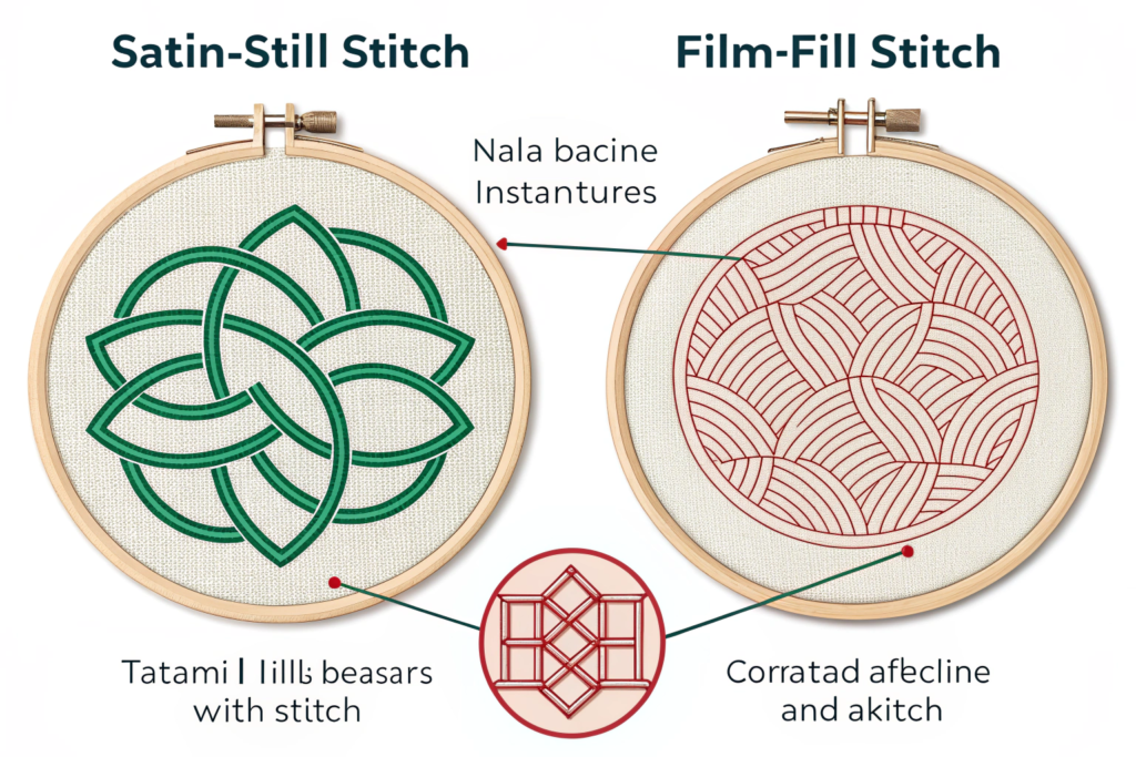
Not all embroidery is created equal. The two primary stitch types used in logo embroidery are Satin Stitch and Fill (Tatami) Stitch. Your design elements should be crafted with an intended stitch type in mind, as each has different strengths and limitations.
- Satin Stitch: Used for text and narrow design elements (like borders or lines). It consists of long, parallel stitches that lay side-by-side to create a smooth, shiny, raised surface. Satin stitch is ideal for elements up to 10mm (0.4") wide. Wider than that, it becomes unstable and prone to snagging.
- Fill Stitch (Tatami): Used for covering larger areas (like a solid shape or background). It's a grid of intersecting stitches that run in alternating directions for stability and coverage. It has a flat, matte texture.
How does stitch direction impact the final look?
The direction the stitches run is a powerful design tool. For a satin-stitched letter, the stitches typically run perpendicular to the direction of the letter's stroke, creating the cleanest edge. For a fill-stitched shape, the stitch direction can be used to create visual interest or mimic texture (e.g., vertical stitches on a mountain to imply height). A skilled digitizer will determine the optimal stitch directions to make your logo look crisp and prevent fabric distortion. Communicating your visual priorities to your embroidery manufacturer is key here.
What is embroidery digitizing and why is it crucial?
Digitizing is the specialized process of converting your vector logo file into a set of instructions (a .DST, .PES, or .EXP file) that an embroidery machine can follow. It is not automatic! A skilled digitizer makes critical decisions about stitch type, direction, density, and sequence. Poor digitizing will ruin even a well-designed logo, causing puckering, thread breaks, or a poor likeness. This is why you must work with a manufacturer like Shanghai Fumao that has an experienced in-house digitizing team. They act as the translator between your design and the machine.
What Are the Best Practices for Color and Thread?
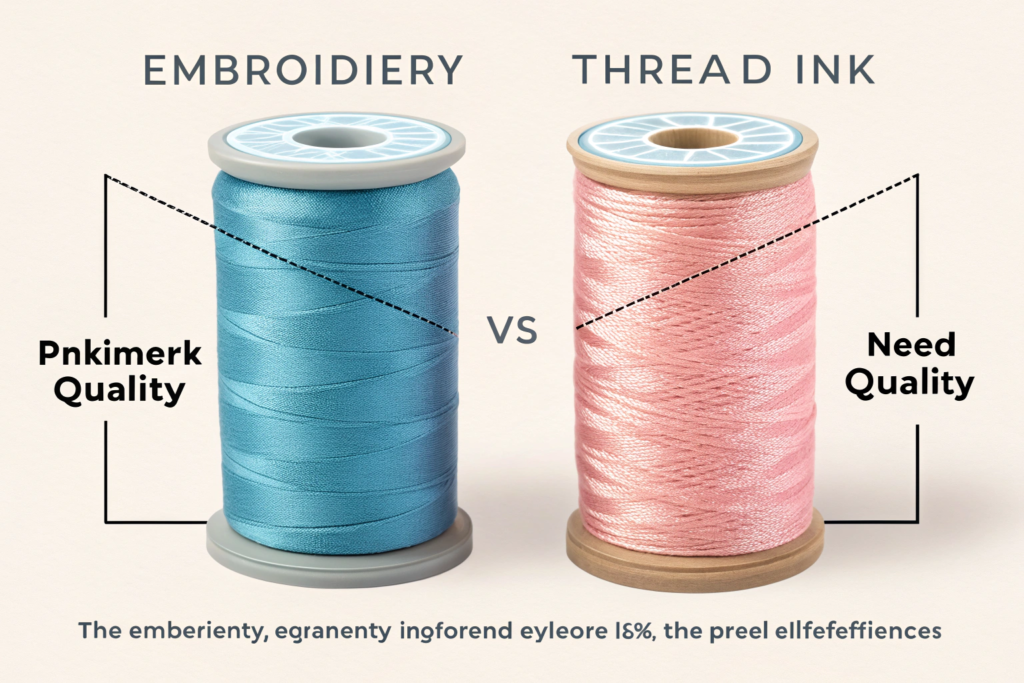
Embroidery thread has different properties than ink. It reflects light, has texture, and colors can blend visually in a way pixels do not. Your color strategy must account for this.
- Limit Your Color Palette: More colors mean more thread changes, higher costs, and more potential points of failure. Aim for 1-4 colors for a standard logo. A well-designed, limited-color logo can be incredibly impactful.
- Ensure High Contrast: Adjacent colors should have strong value contrast (light vs. dark) to ensure the design elements are distinct. A dark blue logo on a black cap will vanish.
- Understand Thread Types: The most common thread is polyester (durable, colorfast, affordable). Rayon has a higher sheen but is less durable. Cotton has a matte, classic look but can break more easily. Your manufacturer can advise on the best choice for your application (e.g., polyester for sportswear, rayon for dressier items).
How do you choose the right fabric backdrop?
The fabric is your canvas, and it affects everything. A loose-knit sweater will behave very differently than a tight-woven twill cap.
- Stable, Woven Fabrics: Like cotton twill, denim, or oxford cloth are ideal. They provide a stable base that minimizes puckering.
- Challenging Fabrics: Knits (like jersey), thin silks, or stretchy performance fabrics require special techniques, higher-quality backing, and potentially a simplified design. Always consult with your manufacturer before finalizing the design if you plan to embroider on a difficult fabric.
What about special threads and 3D effects?
For premium applications, consider metallic threads or thread with high sheen. Be aware that metallic thread is more brittle and requires expert digitizing and machine handling to avoid breaks. 3D Puff Embroidery uses a foam underlay beneath satin stitches to create a raised, tactile effect. It's excellent for making key elements like text pop, but it further simplifies design requirements, as fine details are lost in the puff.
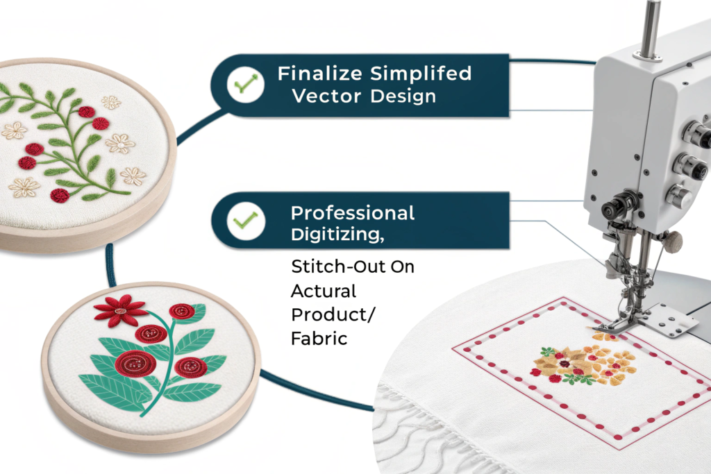
How to Prepare and Test Your Logo Design?
The final step before mass production is validation. Never approve an embroidery run based on a digital mockup alone. The process should be: Finalize Simplified Vector Design > Professional Digitizing > Stitch-Out on Actual Product/ Fabric.
- Provide the Right File: Always give your manufacturer a vector file (AI, EPS, or high-resolution PDF). Never a JPG or PNG. Vector files allow for clean scaling and precise editing by the digitizer.
- Request a Physical Sample (Stitch-Out): This is non-negotiable. Pay for a sample on the exact fabric you plan to use. Examine it for clarity, color accuracy, density, and any puckering. This is the time to make adjustments to the digitizing file, not after 1,000 caps are made.
- Specify Size and Placement: Work with your manufacturer to determine the optimal size for your logo on the specific garment. A logo that's too large can distort and pucker; one that's too small loses detail. Clear placement guidelines ensure consistency across your entire order.
What common mistakes should you avoid?
- Assuming Your Print Logo Will Work: This is the #1 error.
- Ignoring Fabric Choice: Not all fabrics are created equal for embroidery.
- Skipping the Sample: The sample fee is your cheapest insurance policy.
- Using a Non-Professional Digitizer: Cheap digitizing leads to expensive, ruined products.
- Overcomplicating the Design: Embrace the elegance of constraint.
How to Balance Intricacy and Embroidery Feasibility in Logos?
When crafting a logo destined for embroidery, the dance between intricate design and practical execution becomes a delicate art—one where visual allure meets the tactile realities of thread and fabric. Intricacy, with its latticework of fine lines, delicate patterns, and layered details, can transform a logo into a masterpiece of visual storytelling, evoking elegance, complexity, and depth.
Yet, when this intricacy is not tempered by embroidery feasibility, the result can be a disappointment: threads that tangle, stitches that distort, or details that vanish entirely under the needle’s path.
Conclusion
Designing a logo that excels in embroidery is a disciplined art that marries bold graphic design with an understanding of textile craftsmanship. The path to success is paved with simplification: bold lines, ample spacing, limited colors, and clear, legible text. By respecting the physical nature of thread and fabric, and by partnering with a manufacturer that offers skilled digitizing and thorough sampling, you transform your logo from a digital asset into a tangible mark of quality.
Remember, an embroidered logo is often your customer's most tactile and lasting interaction with your brand. Making it impeccable is an investment in perceived value and durability.
If you are looking to create a new logo or adapt an existing one for embroidery on hats, apparel, or accessories, our team is here to guide you through the entire process. At Shanghai Fumao, we provide expert design consultation, professional in-house digitizing, and sample stitch-outs to ensure your brand looks its best in thread. To start your embroidery project, contact our Business Director, Elaine, at elaine@fumaoclothing.com. Let's stitch your brand to perfection.