For accessory designers, brand founders, and product developers, the blank page at the start of a new collection can be both exciting and daunting. How do you translate a feeling, a trend, or a brand vision into tangible designs for belts, bags, or hair accessories? A poorly defined creative direction leads to disjointed collections, wasted sampling budgets, and products that fail to resonate with the target market. The pressure to innovate while staying commercially viable is immense.
A professional mood board is the essential strategic tool that bridges inspiration and execution, providing a visual blueprint that ensures coherence, communicates vision, and streamlines the entire design and production process. It is far more than a collage of pretty pictures; it is a curated narrative that defines the color story, material palette, silhouette direction, and emotional tone of an upcoming collection. For anyone working with a manufacturer like us, a clear mood board is the first and most critical step to ensuring we understand your vision perfectly, saving time and resources.
Let's explore the systematic process of building an effective accessory design mood board, from initial research to final presentation, and how to use it as a powerful communication tool with your supply chain.
What is the Core Purpose of a Professional Mood Board?
Before gathering a single image, you must define the "why." A professional mood board serves multiple, concrete functions that go beyond personal inspiration. It is a foundational business and communication tool.
Its primary purposes are to:
- Crystallize the Creative Direction: To filter a wide range of influences into a focused, cohesive theme (e.g., "Desert Modernism" or "Neo-Victorian Laboratory").
- Establish Visual Cohesion: To guarantee that all items in a collection—whether hair clips, belts, and scarves—feel like they belong together through shared colors, materials, and design language.
- Facilitate Clear Communication: To provide an unambiguous visual reference for your entire team and, crucially, for your manufacturer and suppliers. It eliminates guesswork and misinterpretation.
- Guide Decision-Making: To act as a touchstone throughout the development process, helping to answer questions like, "Does this buckle design fit our theme?" or "Is this pink the right tone?"
A well-crafted board tells the story of your collection before a single sketch is finalized.
How Does a Mood Board Streamline Supplier Communication?
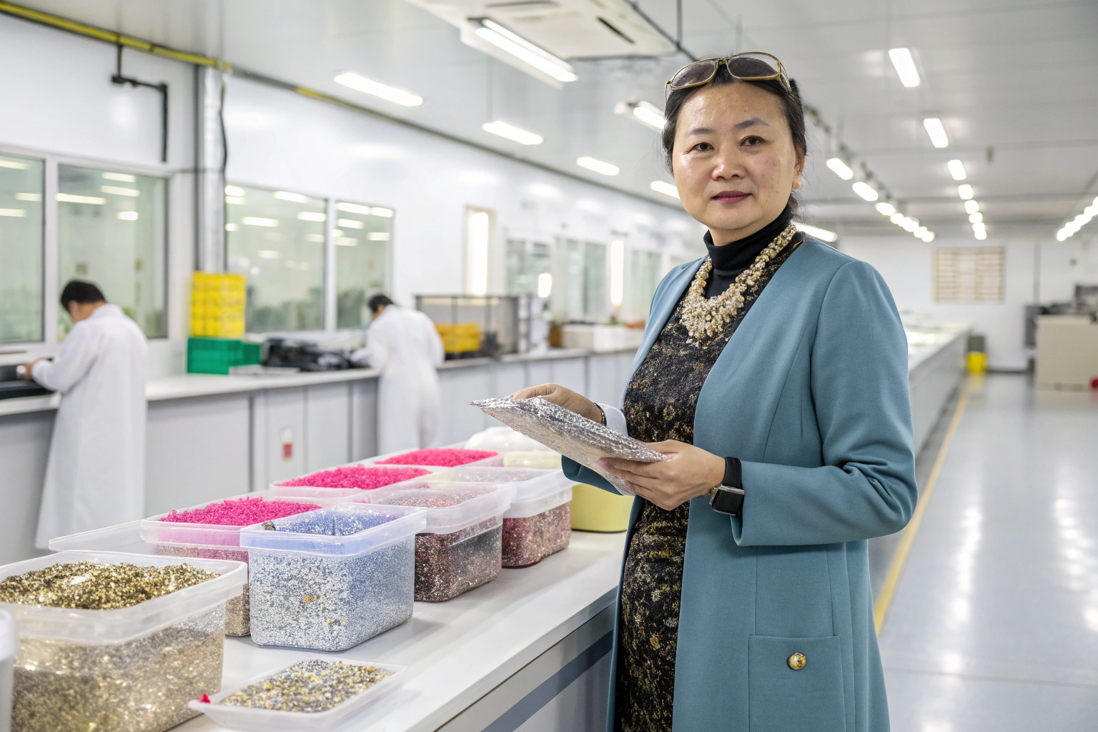
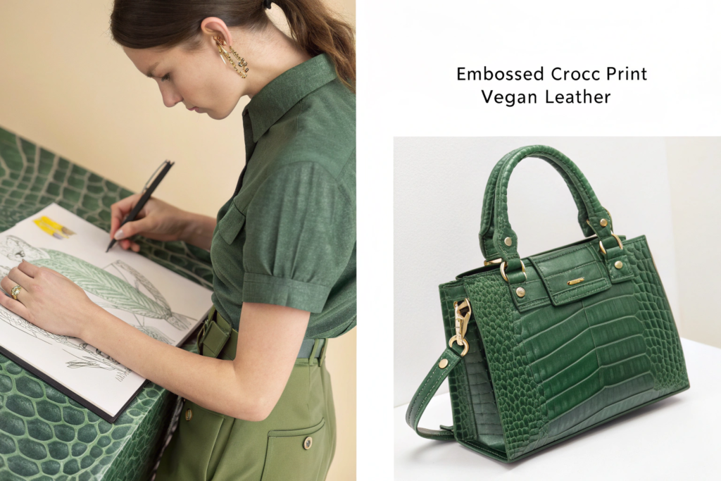
When you send a mood board to a factory like Shanghai Fumao Clothing, you are doing more than sharing inspiration; you are providing a design brief in visual form. It allows our design and project management teams to instantly grasp your aesthetic, target market, and quality expectations. We can then proactively suggest appropriate material sourcing (e.g., "The texture in this photo can be achieved with a pebbled vegan leather"), hardware finishes, and construction techniques that align with your vision. This upfront clarity prevents costly sampling errors and accelerates the product development timeline. It transforms the relationship from transactional to collaborative.
What are the Key Components of an Effective Board?
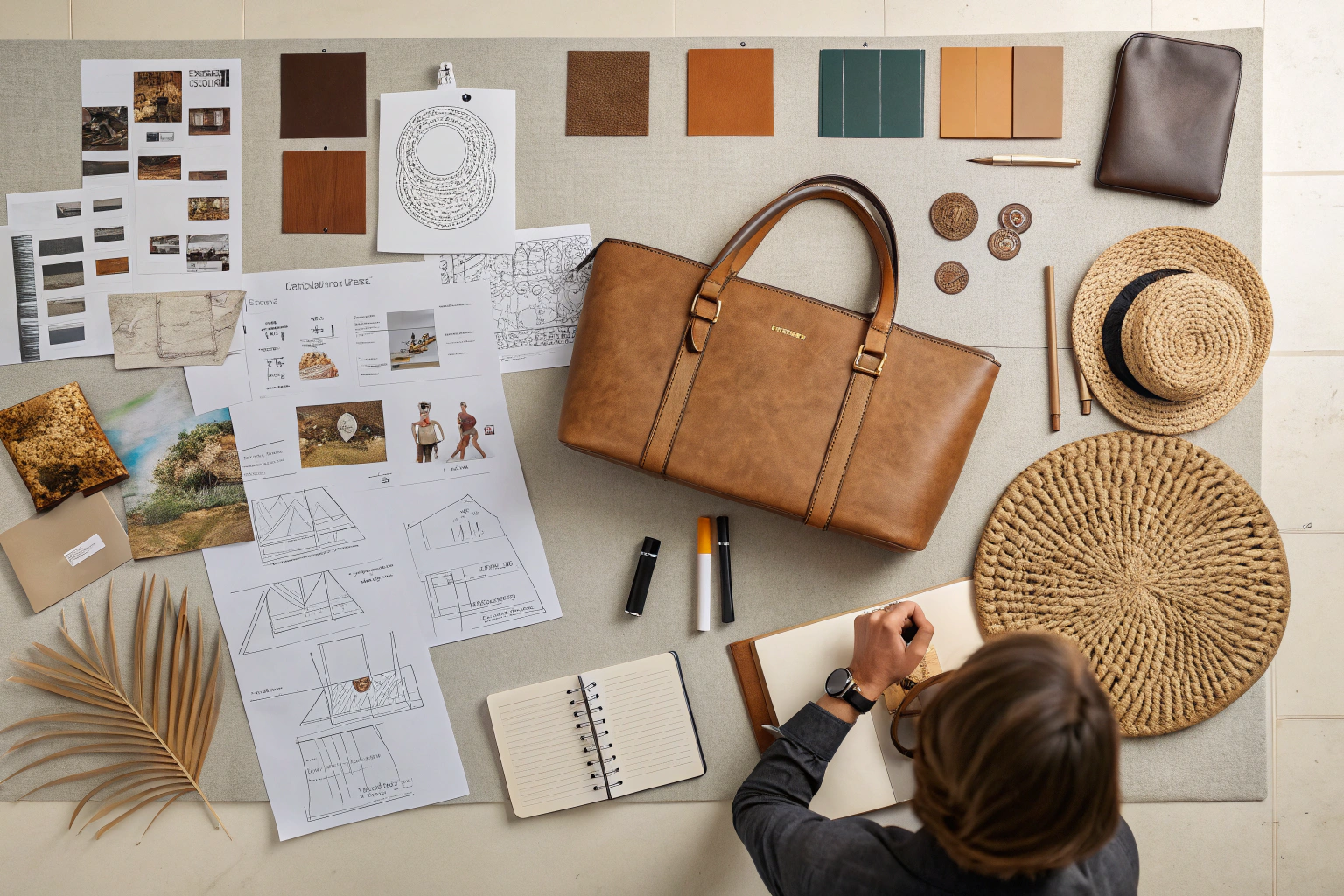
An accessory-specific mood board should be a multi-sensory map. Essential components include:
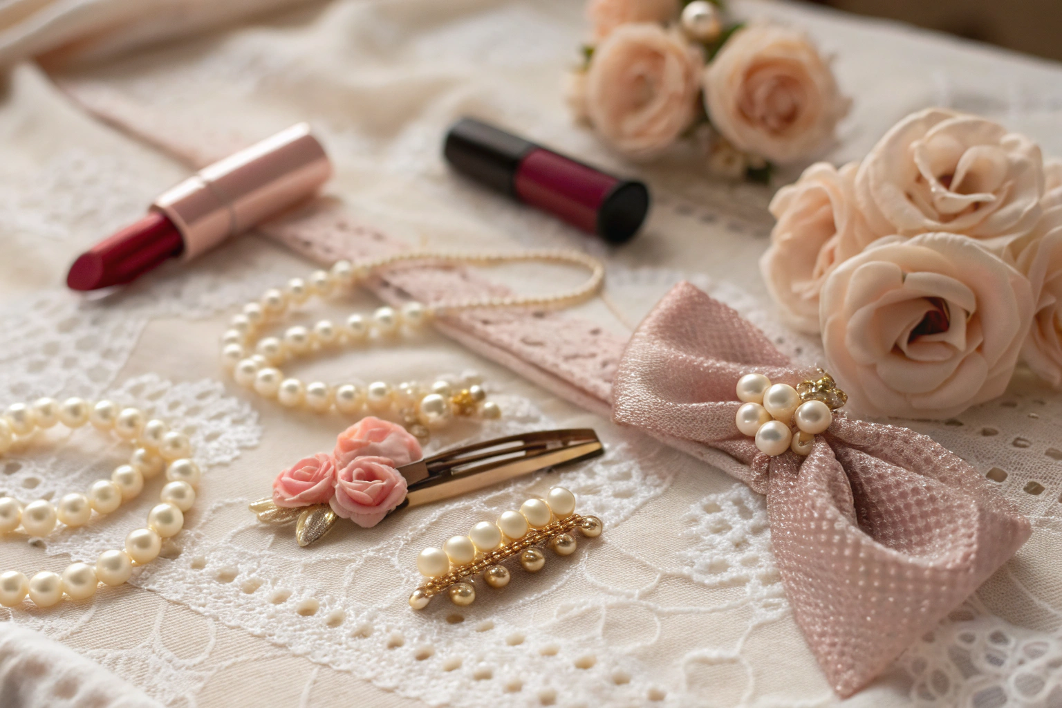
- Color Palette: 5-7 key colors, ideally with physical Pantone chips or precise digital hex codes.
- Material Swatches: Actual fabric snippets, leather grains, metal finishes, chain types, or images that clearly show desired textures.
- Form & Silhouette: Images showing shapes, proportions, and architectural details relevant to your product (e.g., Art Deco geometry for a clutch bag, organic curves for a wooden bangle).
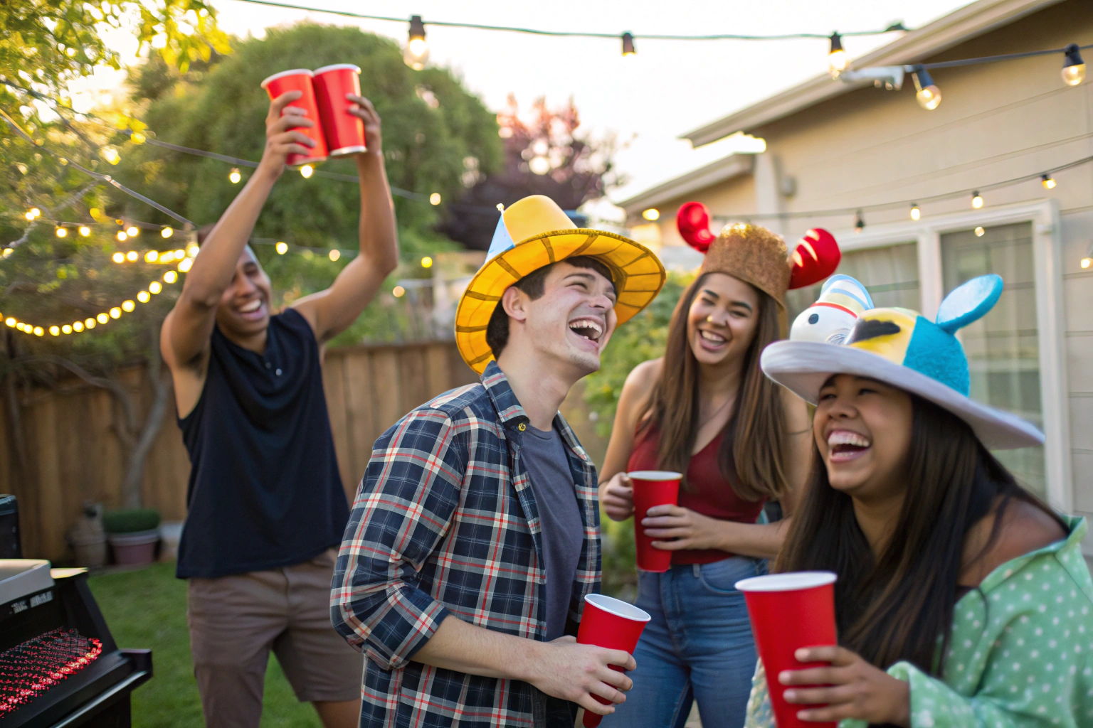
- Lifestyle & Context: Photos that evoke the target customer's environment, attitude, and how the accessories might be worn.
- Key Words: 3-5 descriptive words that define the mood (e.g., "Utility," "Ethereal," "Playful").
This structured approach is endorsed by design thinking methodologies used in product development.
How to Gather and Curate Initial Inspiration?
The inspiration phase is about casting a wide net, then ruthlessly editing. Start broadly without judgment, then refine with a critical eye toward your brand identity and commercial objectives.
Begin by exploring diverse sources: art and architecture history, nature, film stills, street style photography, and current fashion runways. Use tools like Pinterest, Instagram saves, and physical tear sheets. Importantly, look beyond accessories. The texture of a weathered door could inspire a belt finish; the color gradient of a sunset could inform a scarf dye pattern. As you gather, start grouping images by emerging themes—color, texture, shape. The goal is to identify the common threads that will become the pillars of your board.
What Digital and Analog Tools are Most Effective?
A hybrid approach often yields the best results.
- Digital Tools: Pinterest boards are excellent for broad collection and collaboration. Canva or Milanote offer more sophisticated layout capabilities. Save high-resolution images to a dedicated folder.
- Analog Tools: Never underestimate the power of tactile inspiration. Create a physical "swatch box" with fabric snippets, ribbon samples, interesting buttons, or pieces of embellishment. Visiting material fairs or even a hardware store can spark ideas. The act of physically arranging and rearranging elements on a board can lead to unexpected, creative connections that pure digital curation might miss. This process is fundamental to creative direction in tactile product design.
How to Edit and Refine Your Image Selection?
Editing is where vision takes shape. Ask these questions of every potential image:
- Does it directly support the core theme I've identified?
- Does it introduce a necessary element (a missing color, a key texture)?
- Is it redundant with another, stronger image?
Aim for quality over quantity. 15-20 powerful, high-resolution images are far more effective than 50 mediocre ones. Each image should earn its place by clearly communicating a specific aspect of the desired outcome—be it a color, a feeling, a detail, or a context. This curatorial discipline is what separates an amateur collage from a professional design tool, a skill highlighted in visual communication principles.
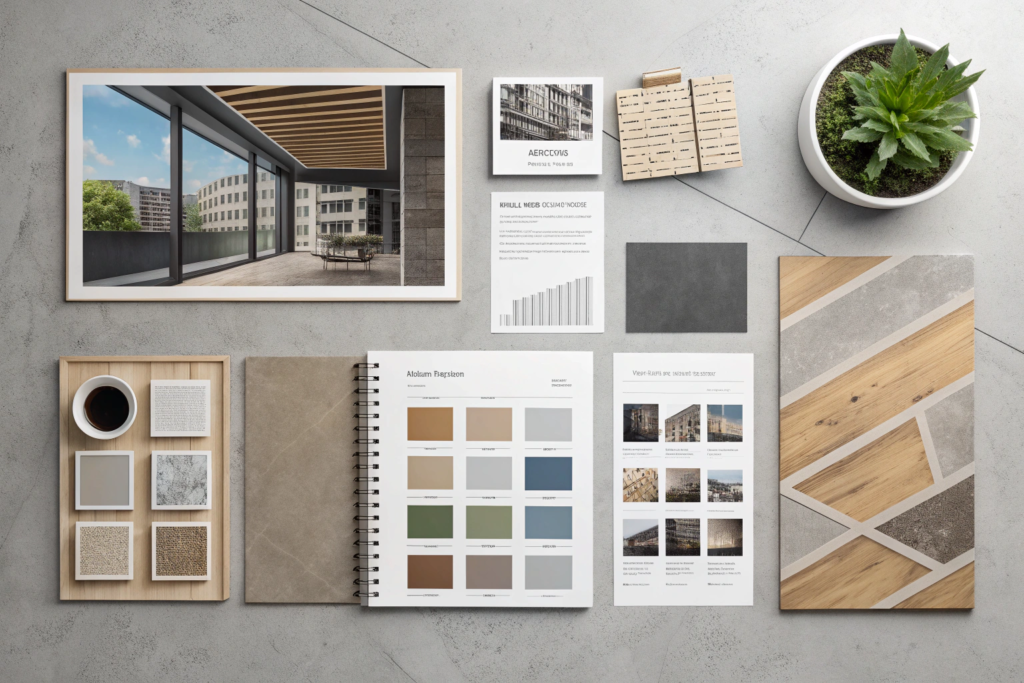
How to Structure the Physical or Digital Layout?
The layout of your mood board is its narrative flow. A disorganized board creates confusion; a structured one tells a clear story. Whether digital or physical, the arrangement should guide the viewer's eye logically through your concept.
Start by defining your focal point—often a key lifestyle image or a striking color/texture combination that encapsulates the mood. Arrange supporting elements around it. Group related items: cluster all color references together, place material swatches in a tactile block, and position silhouette inspirations in another area. Use white (or negative) space strategically to prevent visual clutter and allow key elements to breathe. The overall composition should feel balanced and intentional.
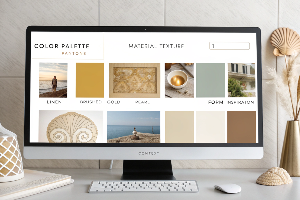
What are Best Practices for a Digital Presentation Board?
For digital sharing with remote teams and factories, clarity is paramount.
- Use a Grid: Align images and swatches to a clean grid for a professional appearance.
- Label Strategically: Use minimal text to label sections (e.g., "SS25 Color Story," "Key Hardware Finishes") or to note specific Pantone references directly on color swatches.
- Maintain Resolution: Use the highest resolution images possible so details in textures and finishes are visible when zoomed in.
- Create a PDF Master File: Compile the final board into a single, high-quality PDF document. This becomes the official, uneditable reference document to be shared with all stakeholders, including your manufacturing partner. This format is standard in the industry for design handoff and specification.
How to Build an Engaging Physical Board for In-Person Meetings?
A physical board has immense persuasive power in sales meetings or internal reviews.
- Substrate: Use a sturdy foam core or cork board.
- Layering: Pin or use removable adhesive to layer elements. Place physical material swatches and trims over printed images to create depth and tactility.
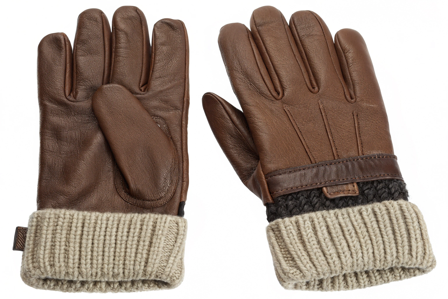
- Incorporate Objects: Attach small, relevant 3D objects—a unique zipper pull, a stone, a piece of tarnished metal—to convey finish and detail directly.
- Craftsmanship: Neatly cut images, straight pins, and clean edges signal professionalism and respect for the viewer's time. This tactile presentation can be particularly effective when discussing products like handbags or embellished hair accessories where material feel is crucial.
How to Translate the Mood Board into Actionable Design Steps?
The mood board's ultimate test is its utility in guiding the concrete stages of product creation. It must move from inspiration to instruction. This is where you bridge the gap between "vibe" and "specification."
Use the board to start sketching. Let the silhouettes and forms you've gathered inform the outline of a tote bag or the curve of a headband. Extract the definitive color palette and begin applying it to different accessory categories. Most importantly, use the material section to begin a source list. For example, if your board features tarnished silver, you would instruct your supplier to source oxidized silver-plated hardware for your belt buckles and bag clasps. The mood board becomes the benchmark against which all subsequent design decisions are measured.
How to Develop a Technical Color and Material Brief?
This is a critical output for your manufacturer. From the mood board, create a separate, succinct document:
- Color Brief: List each primary color with its Pantone number (PMS), name, and intended application (e.g., "PMS 19-4052 Classic Blue: Main body of backpack, contrast stitching").
- Material Brief: Describe each key material with as much specificity as possible. Instead of "a shiny plastic," specify "injected acrylic with a high-gloss finish, 3mm thickness, in PMS Cool Gray 1." Attach physical swatches if available. This precision allows a factory to provide accurate counter samples and costings immediately. Resources on technical packaging for fashion often provide templates for such briefs.
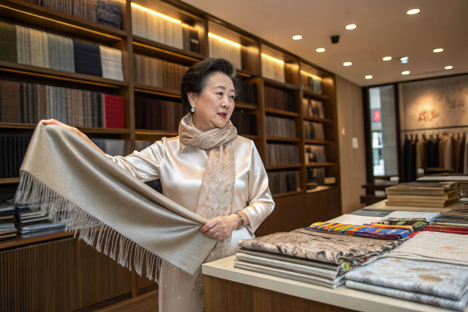
How to Use the Board During Sampling and Review?
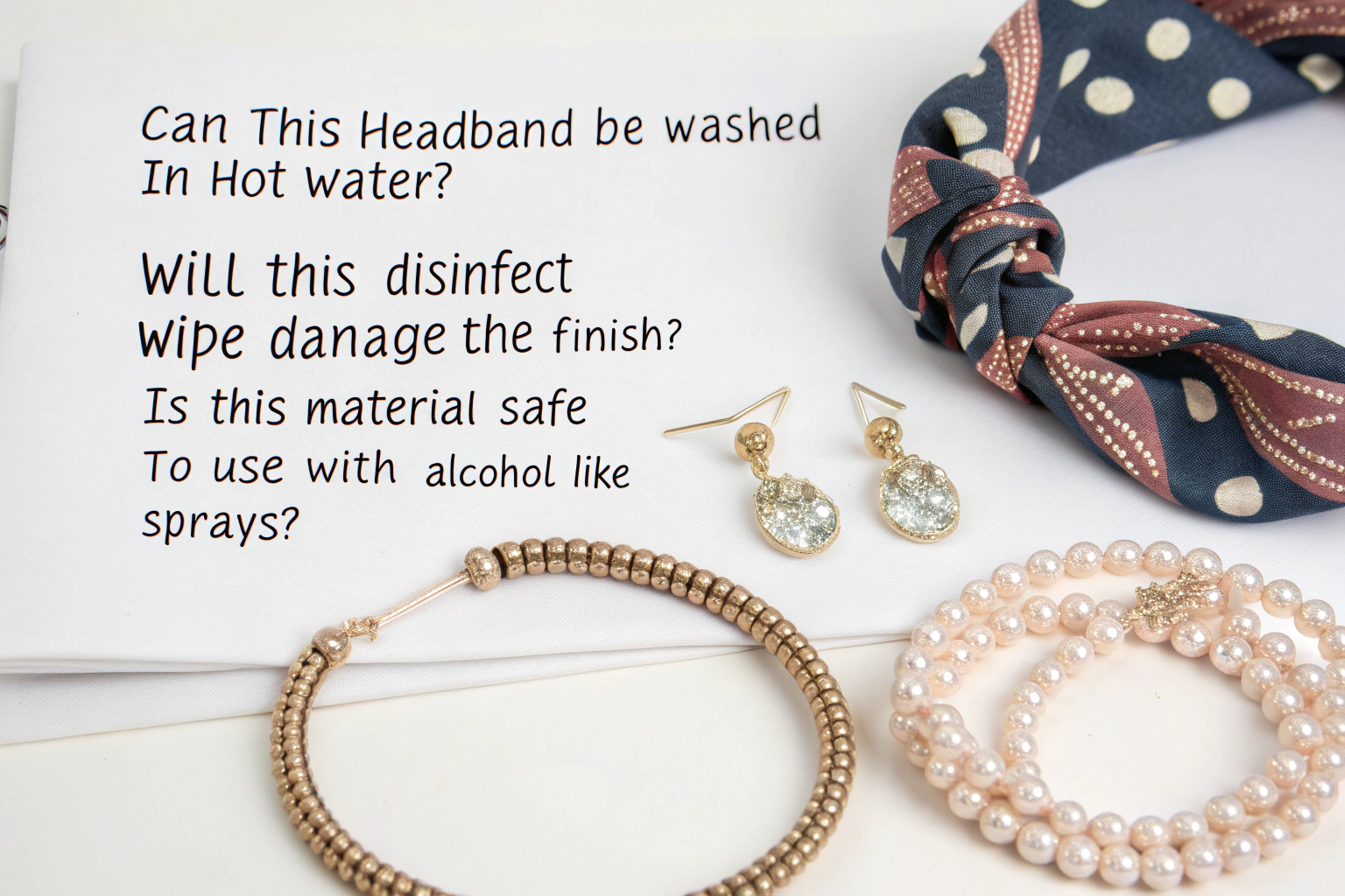
Once sampling begins, keep the mood board visible during all reviews. When evaluating a first sample, hold it against the board. Ask: Does this woven straw hat capture the organic, rustic texture we referenced? Does the hue of this silk scarf match our color palette? The board provides objective criteria, reducing subjective debates. It empowers you to give clear, focused feedback to your project manager, such as, "The bag shape is perfect, but please make the hardware more matte, like the finish in the top-right reference image." This process is central to effective quality control and design iteration.
Conclusion
Creating a mood board for accessory design is a disciplined creative process that transforms abstract inspiration into a concrete roadmap for collection development. It serves as the foundational communication tool that aligns internal teams and external manufacturing partners, ensuring everyone is working from the same visual script. A well-executed board defines color, material, form, and mood with clarity, thereby de-risking the design process, accelerating timelines, and ultimately leading to a more coherent and commercially resonant product line.
For designers and brands, mastering this tool is not optional; it is a professional necessity that bridges the gap between a great idea and a great product on the shelf.
Ready to bring your next accessory vision to life with a partner who values clear creative direction? Share your mood board with Shanghai Fumao Clothing. Our design and development teams are experts at interpreting your inspiration and translating it into impeccably manufactured accessories, from initial sample to bulk production. Contact our Business Director, Elaine, at elaine@fumaoclothing.com to start a collaborative partnership.