The checkout counter is a prime piece of retail real estate, perfect for capturing impulse buys and increasing transaction value. However, a cluttered, disorganized display of hair accessories can be easily ignored by customers focused on completing their purchase. How can you transform this space into a high-performing, visually appealing destination that sells? The key is to combine psychological placement, strategic product selection, and interactive, touch-friendly organization to make shopping effortless and enticing for time-pressed customers.
Effective checkout displays require a focus on impulse appeal, visual clarity, and ease of access. Success lies in creating a compact, mood-boosting “treasure chest” of essentials that solves a last-minute need or offers a small, affordable reward. This goes beyond simple storage to become a curated experience.
Understanding the shopper’s mindset and physical constraints at the checkout is crucial. Let’s break down the optimal strategies.
Which Hair Accessories Should Be Placed at Checkout?
Not all hair accessories are created equal for impulse purchases. The wrong choice will sit untouched, wasting valuable space. You need products that are universally needed, immediately understandable, and low-friction in the decision-making process. Complexity is the enemy of impulse sales.
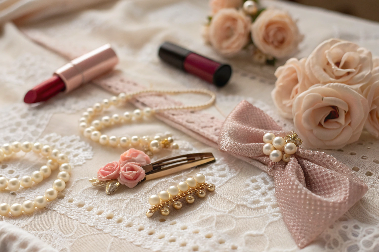
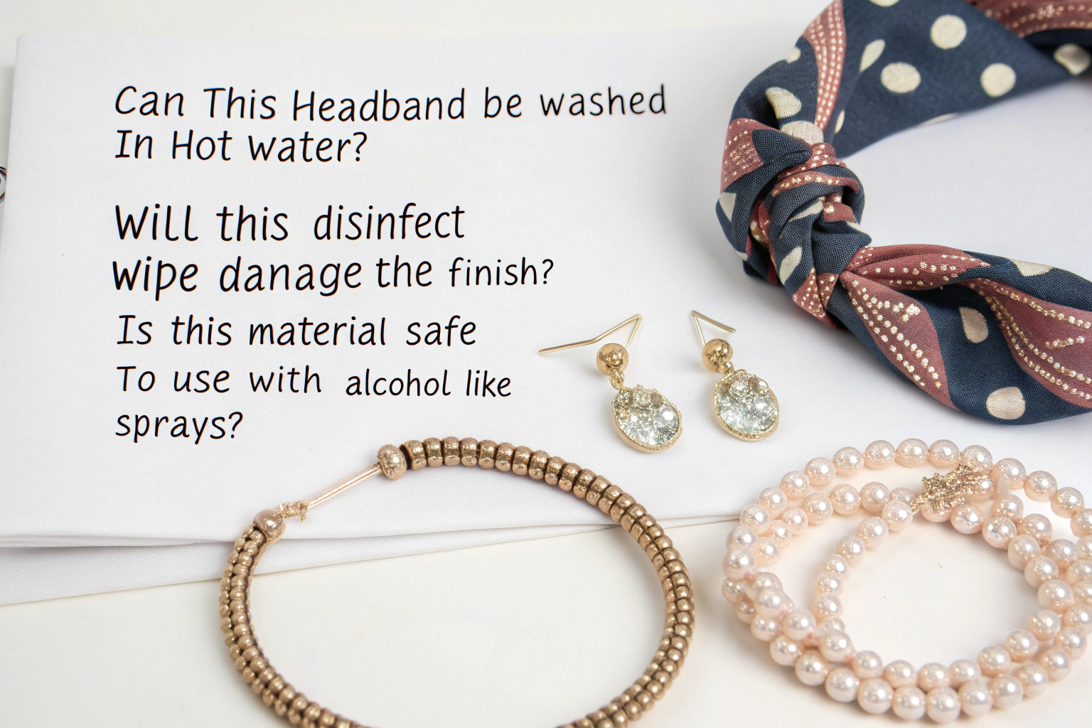
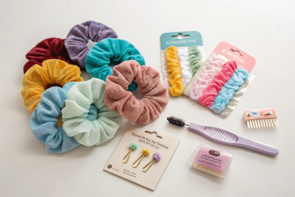
The ideal products are low-cost, high-visibility essentials that solve a common, immediate problem. Think simple hair ties (scrunchies and elastics), basic claw clips, foldable travel brushes, and small packs of bobby pins. These items are inexpensive, require no explanation, and can be purchased on a whim as a small treat or practical backup. Avoid complex styling tools or high-value items that require consideration.
Selection is driven by immediacy and universal appeal. Here’s how to categorize the winners for this unique zone.
Why Are Simplicity and Low Price Point Critical?
The checkout moment is measured in seconds. Products must have an instant “grab-and-go” appeal. Hair elastics and scrunchies are the quintessential impulse buy—nearly everyone uses them, they wear out or get lost, and a spare is always useful. Their low price point (ideally under $5) removes any financial hesitation.
Focus on bold, solid colors (black, white, navy) for practicality, mixed with seasonal or trending colors (pastels in spring, neutrals in fall) for emotional appeal. Multi-packs offer greater perceived value. This strategy of offering affordable, colorful solutions is a staple for successful supermarket impulse buy sections and aligns with the high-volume, fast-moving goods that suppliers like shanghaifumaoclothing excel in producing for global retail chains.
How Can You Solve an Immediate “Pain Point”?
The most effective impulse items solve a minor frustration. A customer who has been shopping might feel her hair is messy before running errands. A simple claw clip or a compact brush offers an instant solution. Small, carded packages of bobby pins are another classic, as they are easily lost and often needed.
Think of the display as a “Hair Emergency Kit.” Packaging should be minimal and transparent so the product itself is the hero. Avoid bulky clamshells that are hard to open. The goal is to make the customer think, “Oh, I actually need one of those,” or “That would be handy for later.” This problem-solving approach is central to effective point-of-purchase (POP) display design.
What Are the Most Effective Display Formats and Layouts?
A jumbled bin of mixed products is visually noisy and frustrating to shop. Customers won’t dig through a mess. You need a display that provides at-a-glance orientation, encourages interaction, and maintains order with minimal staff intervention. The format must work within the tight physical confines of the checkout lane.
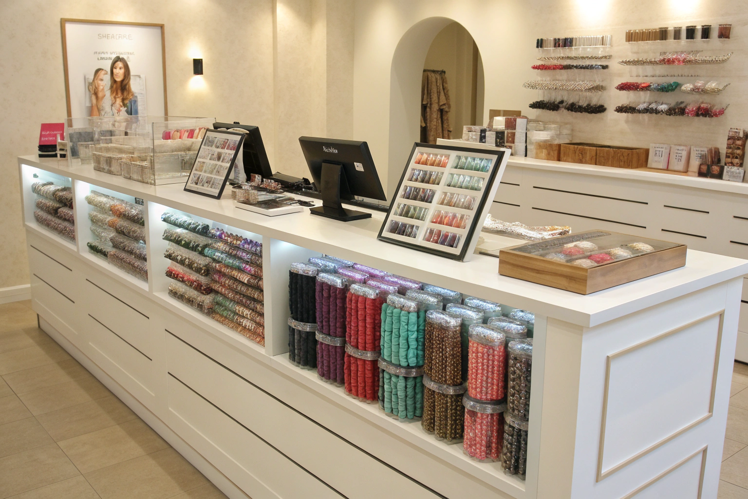
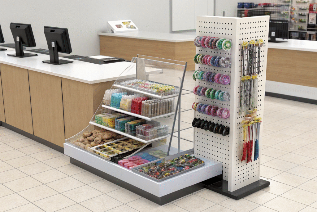
The most effective formats are modular, transparent, and vertical. Think clear acrylic bins, tiered spinner racks, and wall-mounted pegboards. These systems create a clean, branded look, maximize SKU density in a small footprint, and make restocking straightforward. The display should look abundant but never chaotic.
The right hardware turns products into a compelling shop. Let’s compare the top formats.
When Should You Use Acrylic Bins vs. Spinner Racks?
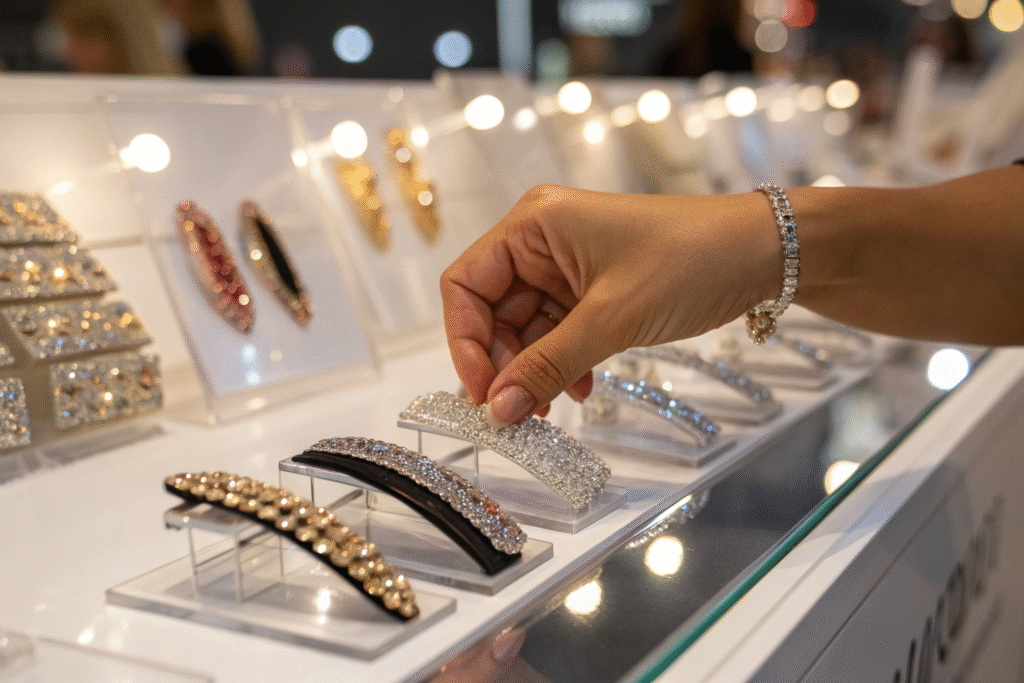
Clear acrylic bin systems (especially stepped or slanted ones) are ideal for the checkout counter itself. They allow every product to be visible, create a neat, color-blocked effect when organized by product type, and prevent tangling. They are perfect for scrunchies, elastics, and small clip packs. Their sleek look upgrades the perceived quality of the items.
Spinner racks or carousels are excellent for the floor space immediately adjacent to the queue. They utilize vertical space, allow customers to easily browse all sides, and are great for displaying a wider variety of claw clips, headbands, and brushes. Their kinetic nature can also attract attention. For suppliers, these formats require products with secure, hook-ready packaging, a design consideration that manufacturers like shanghaifumaoclothing are well-versed in for global retail compliance.
How Does Layout Psychology Drive Sales?
The layout follows the “golden triangle” of impulse merchandising within the checkout zone:
- Eye-Level is Buy-Level: Place the highest-margin or most popular items (like trendy colored clips) at adult eye level (approx. 55-65 inches).
- Grab Zone for Essentials: Position staple items like black hair ties at arm’s reach level for easy grabbing.
- Child’s Eye Level for Fun Items: Use the lower shelves or racks for brightly colored, character-themed items aimed at children, which parents will see and add to the cart.
Always group like with like (all clips together, all ties together). Use small, clear signage with price and brief benefit (e.g., “No-Slip Grip”, “Gentle on Hair”) to reassure and inform the quick decision. This strategic zoning is a proven tactic in retail merchandising guides to maximize unit sales per square foot.
How Can You Optimize for Impulse and Visual Appeal?
A display that doesn’t catch the eye in the first three seconds is a failed display. With shoppers distracted by phones, bags, and the queue ahead, you need to create a visual “speed bump” that interrupts their gaze. Dull or messy displays are simply invisible.
Optimization is about color, light, and touch. Use bold, cohesive color stories (like an entire section of pastel accessories), ensure the area is well-lit (consider integrated LED lights on the display), and most importantly, encourage tactile interaction by making products easy to pick up and examine. An inviting display feels curated, not just stored.
Turning a fixture into a magnet requires layered tactics. Here’s how to execute them.
Why is Creating a “Color Block” Effect So Powerful?
A mass display of a single product type in a coordinated color palette is incredibly arresting. Instead of mixing all colors randomly, create a gradient or color block—for example, a row of scrunchies arranged in a rainbow order or a bin of clips in shades of blue. This transforms a functional display into a visual spectacle that looks abundant, organized, and Instagram-worthy.
This tactic not only attracts attention but also simplifies choice. A customer drawn to the color pink can easily find all pink options together. It triggers an emotional response (“so pretty!”) that often overrides pure practicality. This principle of visual merchandising is used by the world’s best retailers to create desire for even the smallest items.
How Do You Use Lighting and “Demo” Models to Sell?
Lighting is non-negotiable. If the checkout area is dim, the display will be dead. Use spot lighting or displays with built-in LEDs to make products sparkle and colors pop. This immediately signals “new,” “fresh,” and “important.”
For certain items, like decorative headbands or larger clips, use a small mannequin head or a picture frame showing the item in use on a model. This solves a key problem for impulse shoppers: “How would this look on me?” A visual demonstration bridges that gap and dramatically increases the likelihood of purchase. It’s a simple form of suggestive selling that provides instant styling inspiration.
Conclusion
Effectively displaying hair accessories at the supermarket checkout is a precise science of consumer psychology and space optimization. By focusing on low-cost, high-need products, employing clear and interactive display formats like acrylic bins and spinner racks, and optimizing for visual appeal through color blocking and lighting, you can transform dead space into a dynamic profit center. The goal is to make the shopping experience effortless, enjoyable, and rewarding for the customer in those final, decisive moments.
For supermarkets and large retailers looking to source high-volume, checkout-ready hair accessories with compelling packaging and consistent quality, partnering with a reliable manufacturer is essential. At AceAccessory, we specialize in producing the exact types of fast-moving impulse items—from scrunchies to claw clips—that thrive in this environment. To discuss creating a custom, high-performance assortment for your checkout lanes, please contact our Business Director, Elaine, at elaine@fumaoclothing.com.