Have you ever pre-ordered a hat collection in what you believed were the season's hottest colors, only to see the actual season arrive and your hats look like a relic from another year? I have seen a boutique owner weep quietly in her stockroom. She had bet her entire autumn budget on a bright, electric orange that a forecasting agency had promised would be the color of the season. The season arrived. The influencer posts showed a soft, muted, dusty cedar. Her orange hats were unsold. They were marked down, then marked down again. They ended up in a clearance bin. The problem was not the quality. It was the color timing. She had ordered the right color for the wrong season, a summer bright that had no place in the 2026 autumn landscape.
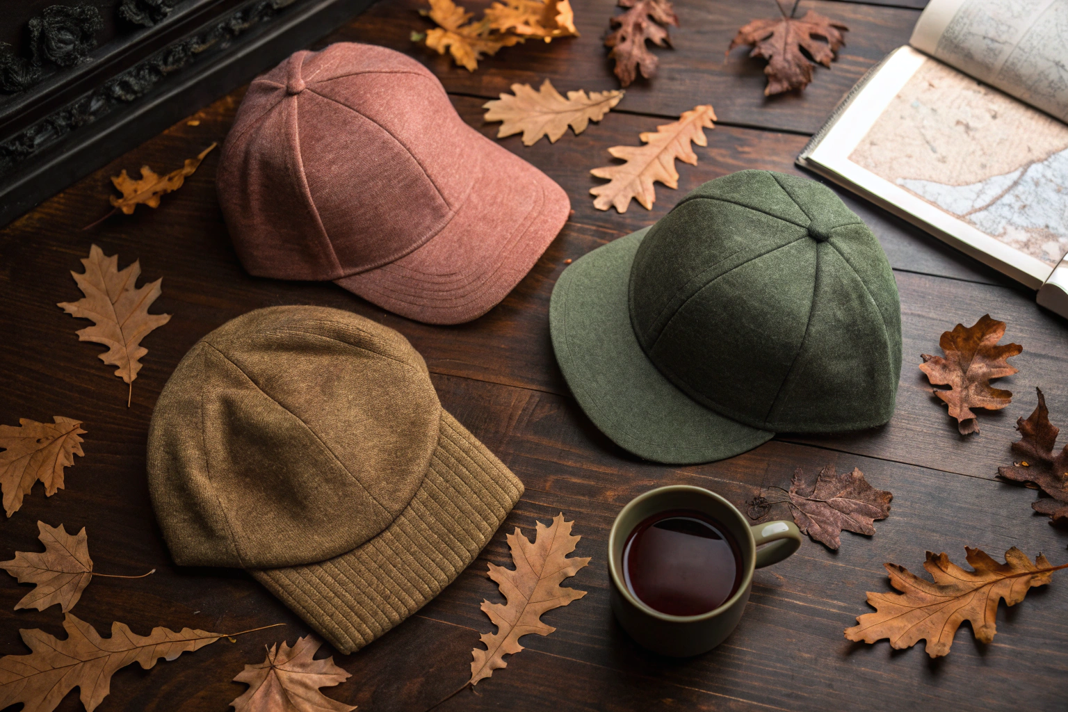
AceAccessory is a professional manufacturer and exporter of accessories. The trending hat colors for autumn 2026 pre-orders are grounded in a "New Neutrality" palette: a warm, clay-like Dusty Cedar, a deep, organic Gilded Olive, and a soft, mineral-washed Shadow Mauve. These three colors reflect a macro shift from digital vibrancy to tactile, natural warmth, a desire for colors that feel excavated from the earth rather than projected from a screen.
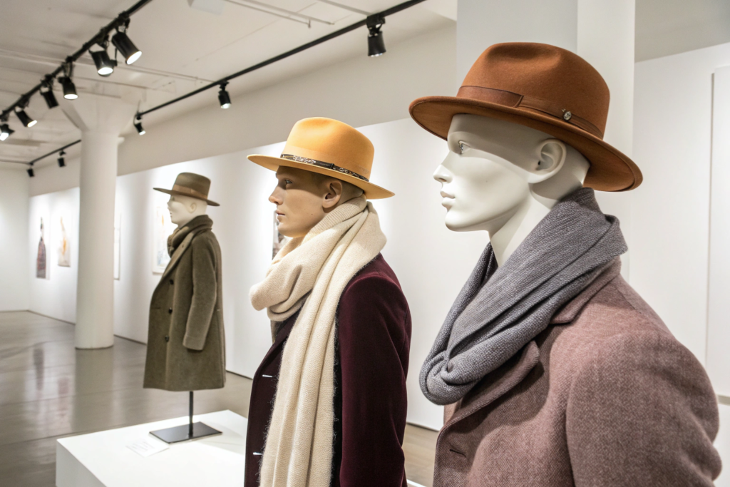
Autumn 2026 is not about a single "it" color. It is about a sophisticated, tonal palette that communicates stability, warmth, and understated luxury. The consumer is weary of overstimulation. They want their accessories to feel like a comforting, textural embrace. As a factory owner in Zhejiang who works a year ahead with fabric dyers and trend forecasters, I have already mixed the dye recipes for these exact shades. Let me share the specific color codes, the material applications, and the cultural logic behind this season-defining palette.
Why Is Dusty Cedar the Defining Neutral of Autumn 2026?
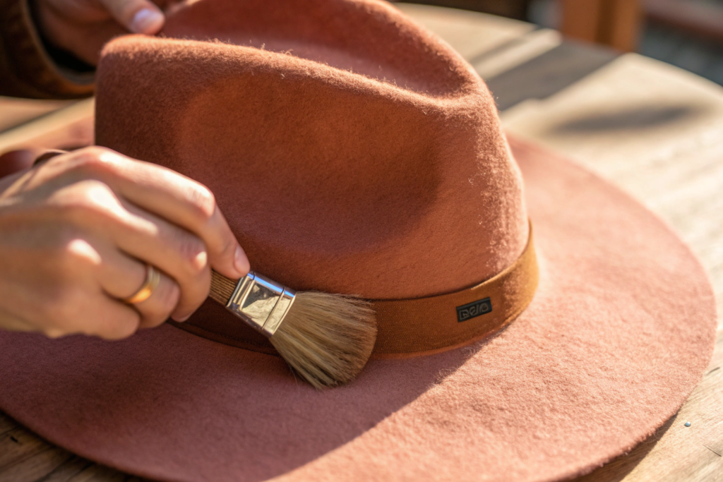
Dusty Cedar is not the bright, spicy orange of past autumns. It is a much softer, more complex evolution. Think of a sun-baked clay roof tile in a Tuscan village, or the faded petals of a dried rose. It has a pinkish-brown undertone that makes it incredibly versatile.
This color works because it functions as a new neutral. It replaces the ubiquitous beige and camel as the warm base tone for an autumn wardrobe. It pairs beautifully with the creams, chocolates, and deep greens that dominate cold-weather clothing. It is flattering against a wide range of skin tones. It adds a subtle, romantic warmth to a face without being as demanding as a bright red or a stark orange. For hat materials, Dusty Cedar is spectacular on a soft, brushed wool felt fedora. The fuzzy texture of the wool absorbs the light, giving the color a soft, velvety, almost edible quality. It also works perfectly on a fine-gauge cashmere-blend beanie, where the color takes on a more delicate, elegant character. This color is the anchor of the autumn 2026 palette. It is the safe, sophisticated choice that will not end up in the clearance bin. It represents a desire for gentle, human warmth in a chaotic world.
What Is the Exact Pantone Reference for This Color?
The closest standard reference is Pantone 17-1340 TCX "Tawny Port" or the slightly lighter 18-1435 TCX "Desert Sand." Our dye recipe is a custom match that sits precisely between these two, pulling slightly more pink. We call it "Dusty Cedar" internally. Our clients can request a lab-dip reference swatch. This removes any ambiguity in color communication.
How Does This Color Behave on Different Hat Fabrics?
Color is a collaboration with texture. On a smooth, tightly woven cotton twill, Dusty Cedar appears more saturated and slightly darker. On a thick, fluffy wool felt, the texture traps light and makes the color appear lighter and more complex. On a shiny polyester sports cap, it can look flat and cheap. We guide our clients to use this color specifically on matte, natural, or textural fabrics. The material choice amplifies the color's inherent luxury.
Why Is Gilded Olive the Essential Deep Tone for the Season?
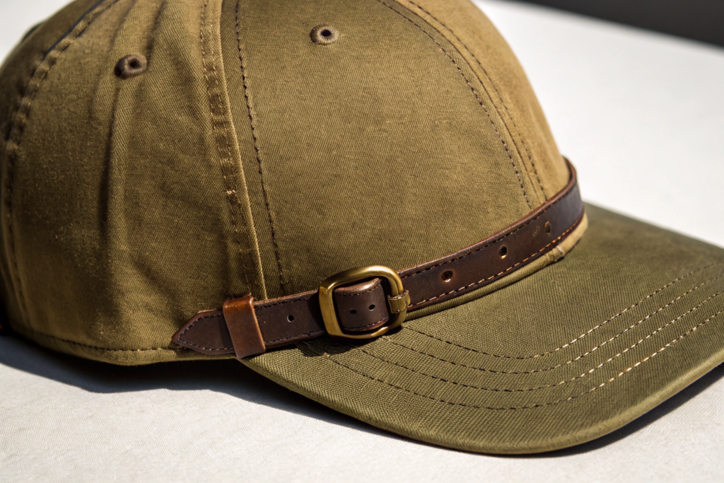
Green has been trending for several years, but the 2026 autumn iteration is a specific, elevated shade. Gilded Olive is a move away from the bright, grassy greens and the cool, minty sages of previous seasons. It is a darker, warmer, more mysterious green.
This color has a distinct golden undertone. It is not a flat, drab olive. It is an olive with a hidden treasure of gold inside it. This golden warmth gives it a luxury patina. It feels like a vintage military garment that has aged beautifully over decades. It is a color associated with resilience, nature, and quiet authority. In the 2026 context, it represents a desire for grounded strength and a connection to the natural world. For hats, Gilded Olive is the definitive baseball cap color for the season. A structured, high-crown cap in a heavy cotton twill in this shade is the essential unisex streetwear piece. It also works beautifully on a wide-brim wool fedora with a tonal grosgrain ribbon, creating a sophisticated, intellectual look. It is a color that photographs exceptionally well against the grey, overcast skies of autumn. It is a direct response to the consumer's growing weariness with bright, artificial digital colors.
What Is the Difference Between Gilded Olive and Classic Olive Drab?
Classic olive drab is a flat, yellow-green with a strong military association. It can look harsh and utilitarian. Gilded Olive is darker, with a more pronounced brown and gold undertone. It has a sophistication and warmth that olive drab lacks. It is olive drab that has been aged, oiled, and steeped in history. It is a premium reinterpretation of a workwear staple.
How Does Brass Hardware Enhance This Specific Color?
The metallic accent is critical. A silver-tone buckle clashes with the golden warmth of Gilded Olive. It looks cold and disconnected. A brass or antique gold buckle, or a dark tortoiseshell effect plastic clip, harmonizes with the hidden gold in the color. It amplifies the vintage, luxury feel. This attention to hardware is a detail that separates a mass-market hat from a premium accessory.
What Makes Shadow Mauve the Surprising New Season Color?
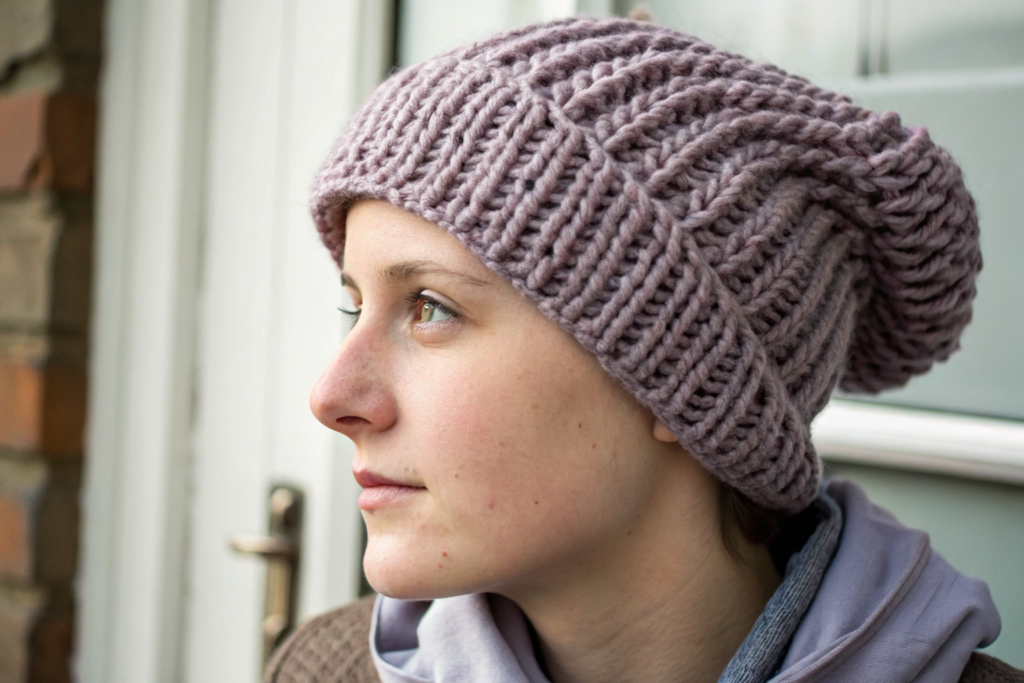
Shadow Mauve is the wildcard, the fashion-forward injection into the autumn 2026 palette. It is a cool, muted, mineral-tone that sits perfectly between a soft grey and a dusty lavender. It is the color of a shadow on a rock face, or the pale, desaturated purple of dried hydrangea blooms.
This color is the antidote to the pink and bright lavender trends that have saturated the market. It is a much more adult, introspective, and calming shade. It has a slight melancholy, a quiet beauty. It taps directly into the "Quiet Luxury" and "Soft Minimalism" trends. It is a color that feels personal and comforting. For hats, Shadow Mauve is the breakout star in knitted beanies. A chunky, slouchy rib-knit beanie in this color, worn with a neutral camel coat, is the defining look of the season. It adds a subtle, intelligent point of color without screaming for attention. It also works as a very unexpected, modern accent on a baseball cap, perhaps as the contrast color under the brim. It is the color chosen by the early adopters, the fashion insiders who set the trends. Its inclusion in a pre-order collection signals that the brand has its finger on the pulse.
How Is This Color Different from a Simple Grey?
A simple grey is an achromatic mix of black and white. It has no color character. Shadow Mauve has a distinct, cool purple undertone. In soft light, it reads as a complex grey. In brighter light, the violet undertone reveals itself. This chameleon-like quality makes it endlessly fascinating and versatile. It adds depth to an outfit without being loud.
What Skin Tones Does Shadow Mauve Complement?
It is remarkably flattering. The cool, muted undertone makes the skin appear warmer and healthier by contrast. It works particularly well on cool and neutral skin tones. It avoids the yellowing effect that some grey shades can have. It makes the wearer's eyes appear brighter. This facial framing effect is a key reason for its predicted popularity.
How Should These Colors Be Combined in a Pre-Order Collection?
A palette is more powerful than a single color. The strategic combination of these three shades in a pre-order catalog creates a compelling, complete autumn story. We advise our clients to structure their collection as a "three-pillar" offering.
The first pillar is the Neutral Hero. This is Dusty Cedar. It is the volume driver, the safe, wearable choice. It should be offered across the widest range of silhouettes, the fedora, the beanie, the cap. It is the color the buyer orders the most units of. The second pillar is the Core Dark. This is Gilded Olive. It is the slightly edgier, more masculine-leaning choice. It anchors the collection. It gives it weight and substance. It is the color for the streetwear-inspired cap and the wide-brim wool hat. The third pillar is the Fashion Statement. This is Shadow Mauve. It is the riskier, high-reward color. It is the image-maker. It is offered in just one or two key silhouettes, like the standout slouchy beanie. It generates the editorial coverage and the social media buzz. It signals the brand's trend authority. This three-tiered strategy balances commercial safety with fashion credibility. It maximizes sell-through by covering the three distinct consumer mindsets for the season.
What Is the "60-30-10" Color Allocation Rule for Orders?
This is a practical buying guideline. Allocate 60% of your budget to the core neutral, Dusty Cedar. This is your guaranteed seller. Allocate 30% to the core dark, Gilded Olive. This is your strong secondary performer. Allocate 10% to the fashion statement, Shadow Mauve. This is your test buy. It creates excitement. If it sells out fast, you have validated the trend and can place a quick reorder. This allocation minimizes financial risk while maximizing trend participation.
How Do These Colors Work Together in a Single Hat Design?
Color-blocking is a key design detail for 2026. A baseball cap with a Gilded Olive crown and a Dusty Cedar brim and button is a sophisticated, organic combination. A beanie with a Dusty Cedar base and a Shadow Mauve pom-pom is a subtle, creative accent. These internal color combinations are a way to increase the design value and the retail price. Our design team can propose specific color-blocking options based on these three core shades.
Conclusion
The autumn 2026 hat color palette is a deliberate retreat from the digital noise. Dusty Cedar offers a warm, baked-clay neutral that replaces beige. Gilded Olive provides a deep, golden-infused green that redefines military utility as quiet luxury. Shadow Mauve introduces a cool, mineral-tone wildcard that captures the introspective, soft minimalist mood.
These three colors are designed to work together, to be mixed, and to form a cohesive collection that feels rich, textural, and emotionally resonant. They are the result of our year-long analysis of runway themes, street style, interior design, and the macro cultural shift toward grounded, tangible comfort.
In our Zhejiang factory, the dye lab has already finalized the recipes for these colors on wool felt, cotton twill, and acrylic knit yarns. The lab dip swatches are ready to be sent to our clients.
If you are placing your autumn 2026 pre-orders and want to ensure your color palette is both commercially safe and fashion-forward, I invite you to contact our Business Director, Elaine. She can send you the physical Pantone-matched lab dip swatches for Dusty Cedar, Gilded Olive, and Shadow Mauve. She can discuss the optimal 60-30-10 allocation for your specific silhouettes. Send her an email at elaine@fumaoclothing.com. Let us color your autumn collection with the confidence of deep research and the beauty of the natural world.