As you plan your 2026 collections, you’re seeing a clear signal: the muted, earthy palettes that dominated for years are making way for an explosion of unapologetic, joyful color. But is this just a fleeting reaction, or a deeper shift in consumer psychology and culture? Understanding the "why" behind this bright color trend is key to creating accessories that don't just follow, but lead the market.
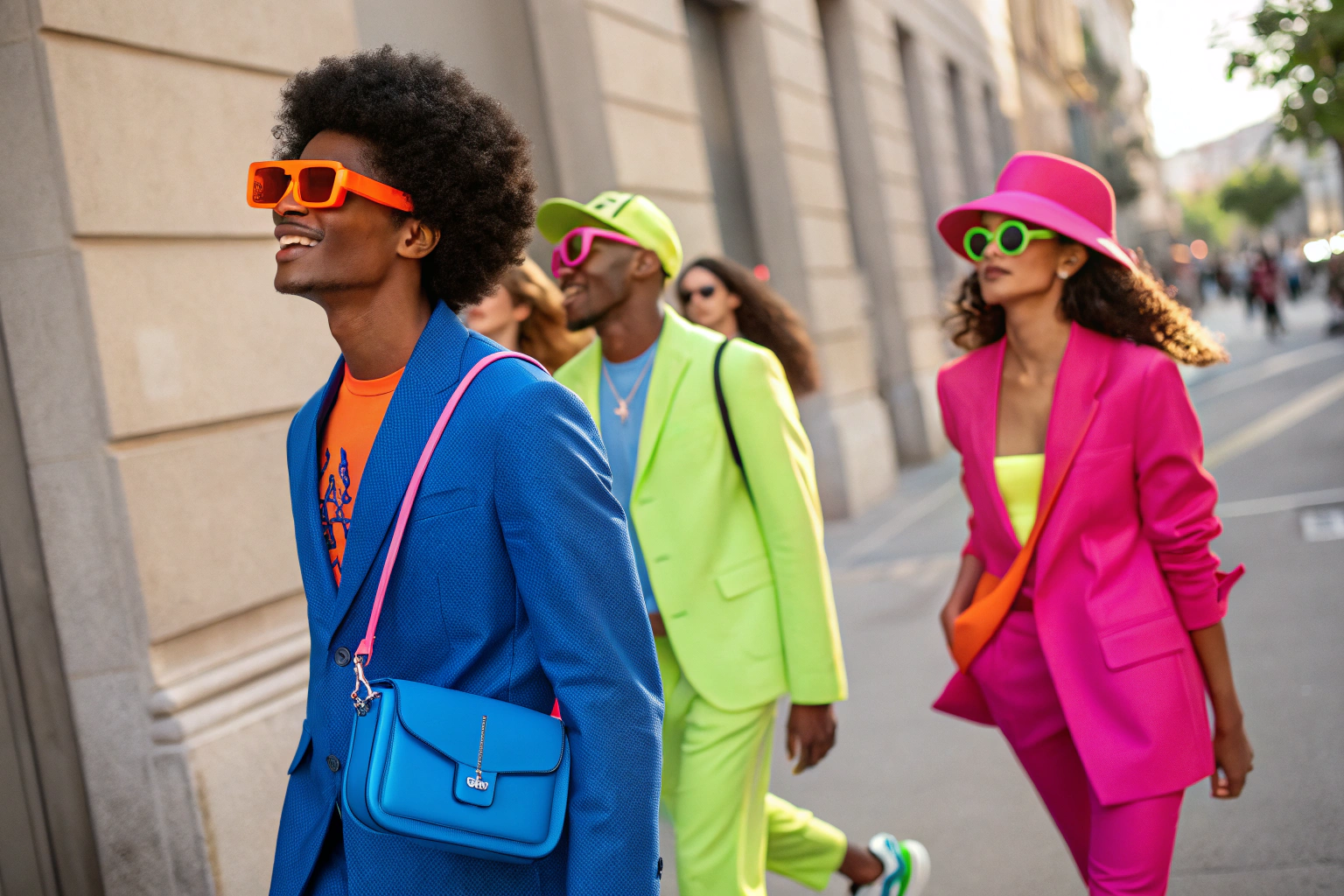
Bright colors are trending for Summer 2026 as a direct response to a collective desire for optimism, digital visibility, and sensory engagement. Following years of global uncertainty and a screen-dominated life, consumers are seeking "Dopamine Dressing"—using vibrant hues to boost mood and express joy. Simultaneously, the need for products to stand out in social media feeds ("Instagrammability") and the influence of retro-futurism from the late 90s/Y2K era are converging to make electric blues, neon pinks, acid greens, and solar yellows the defining palette of the season.
This trend is more than a simple color forecast; it's a cultural barometer. To leverage it effectively in accessory design—from sunglasses and bags to hats and scarves—we must dissect its origins in psychology, technology, and nostalgia. Let's explore the core drivers that make bright colors not just a style choice, but a strategic one for the upcoming season.
How Does "Dopamine Dressing" Drive Color Psychology?
The term "Dopamine Dressing" has evolved from a niche concept to a mainstream fashion philosophy. It posits that what we wear directly impacts how we feel, and bright, saturated colors are the most direct pathway to eliciting feelings of happiness, energy, and confidence.
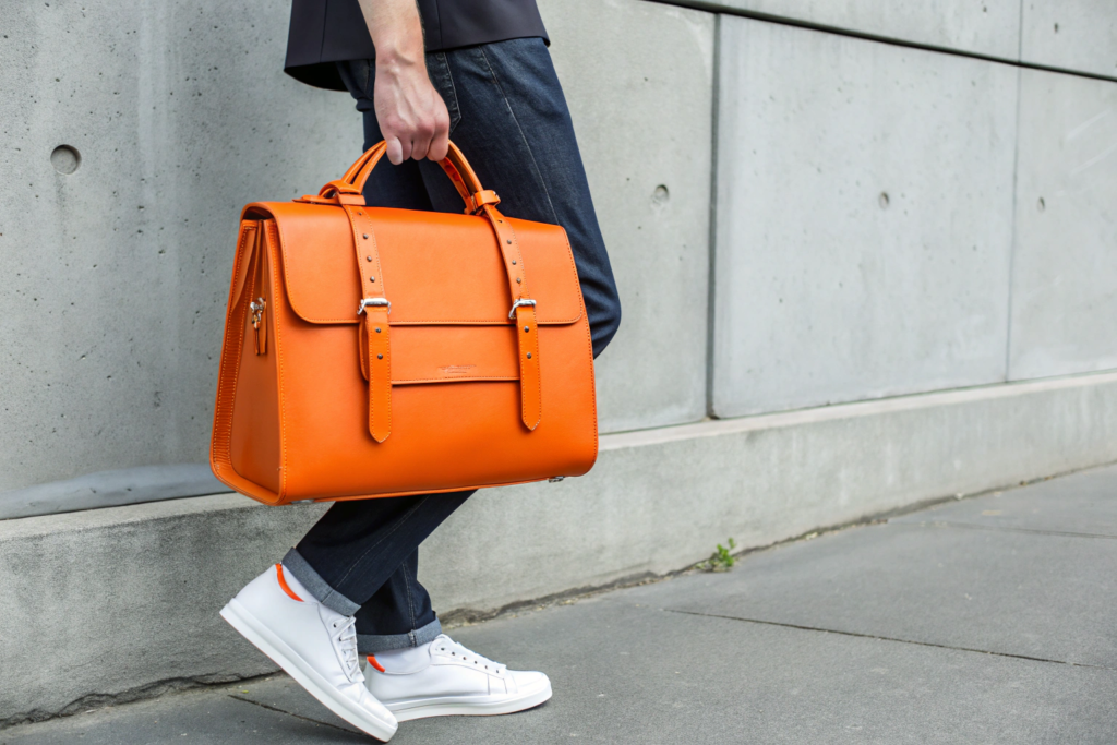
After a period dominated by news cycles of conflict, economic anxiety, and climate concern, consumers are actively seeking avenues of personal joy and control. Wearing a bright color is an accessible, immediate form of self-care and self-expression. For Summer 2026, this translates to colors that feel like a "shot of sunshine": Solar Yellow (optimism), Vibrant Orange (adventure and creativity), and Hyper Pink (playfulness and boldness). Accessories are the perfect entry point for this trend, as they allow for a bold statement without a full wardrobe overhaul. A customer might pair a neon green belt or a cobalt blue scarf with neutral basics, instantly elevating their mood and outfit.
What specific bright shades are leading the trend?
The trend isn't just about any bright color; it's about specific, high-voltage hues. Key shades for Summer 2026 include:
- Digital Lavender: A cool, luminous purple identified by Pantone as a key color, representing wellness and digital escapism.
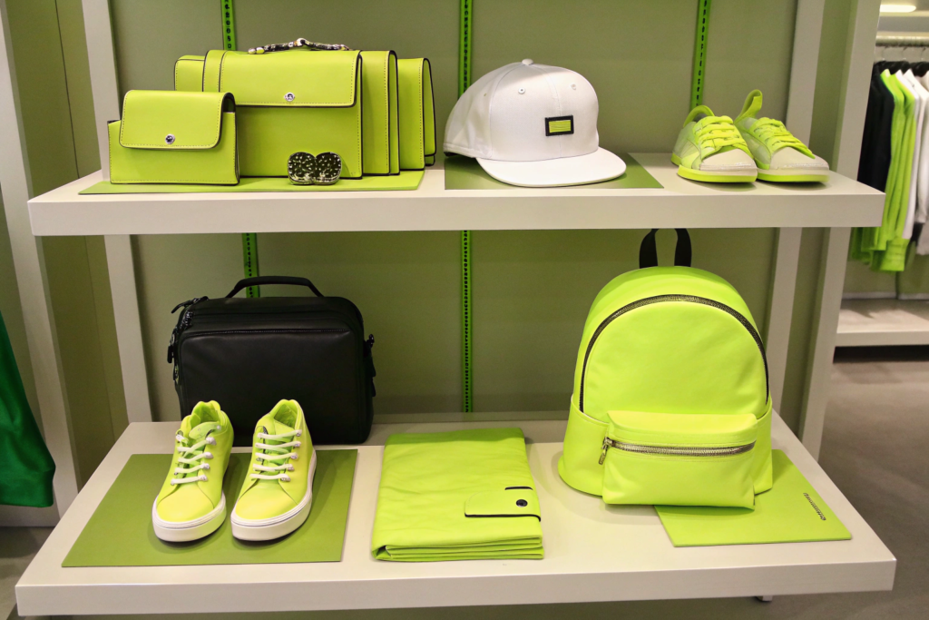
- Acid Lime: A sharp, green-leaning yellow that screams energy and modernity.
- Cobalt Blue: A deeply saturated, classic blue that feels both retro and futuristic.
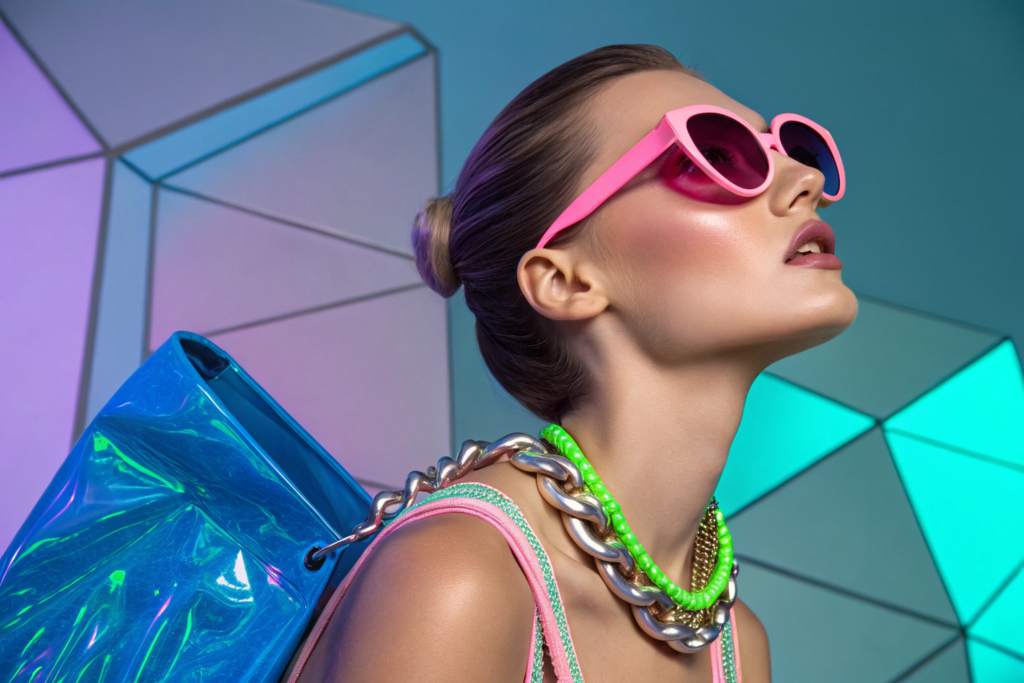
- Fuchsia Fever: An intense, blue-based pink that is inherently bold and graphic.
These colors work best in color-blocking combinations (pairing two or three brights together) or as monochromatic statements. For manufacturers, achieving these precise, clean dyes on materials like nylon, silicone, or coated canvas requires expert color matching and quality control to ensure consistency and vibrancy.
How can accessories maximize the dopamine effect?
Accessories are catalysts for this trend. A brightly colored bucket hat, vibrant resin hair clips, or a set of multicolored beaded bracelets offer low-commitment, high-impact ways to participate. The trend favors tactile materials that enhance the sensory experience: glossy PVC in brights, fuzzy pom-poms, or iridescent finishes that change with light. Designing with this in mind means thinking beyond color to texture, creating pieces that are joyful to both see and touch—a core aspect of thoughtful product development.
Why Is Social Media a Key Catalyst for Vibrant Hues?
In the algorithm-driven landscape of Instagram, TikTok, and Pinterest, visual saturation is currency. Muted tones often get lost in the scroll, while bright, bold colors capture attention and increase engagement.
This creates a powerful feedback loop. Users and brands post content featuring bright items, which generates more likes and shares, which in turn pushes more brands to create bright products. The trend is amplified by the rise of "Outfit of the Day" (#OOTD) culture and unboxing videos, where the visual "pop" of a product is paramount. For an accessory to succeed in this environment, it must be "Instagrammable"—it needs to look striking in a square photo or a short video clip. This directly influences design, favoring simple, graphic shapes in super-saturated colors that read instantly on a small screen.
How does the "unboxing experience" tie into color trends?
The journey of a product from parcel to post is a critical marketing moment. Brightly colored product packaging (a hot pink dust bag, a electric blue box) or the product itself revealed in a vibrant hue creates a shareable moment of delight. This extends the bright color trend from the product to the entire brand experience. When sourcing, considering how the accessory will look when first unveiled—whether in-person or on camera—adds another layer to its marketability. A factory with strong R&D capabilities, like Shanghai Fumao Clothing, can help develop this holistic color story from product to packaging.
What role do influencers and digital communities play?
Micro-trends often originate in specific digital communities (e.g., #Y2KFashion, #Kidcore) that heavily favor bright, clashing palettes. Influencers within these niches make the trends visible to mainstream audiences. When these influencers showcase bright accessories, they provide immediate styling inspiration, reducing the perceived risk for the average consumer. Tapping into this requires brands to be agile and to understand the visual language of these online spaces, where nostalgia and futurism collide in a riot of color.
How Are Nostalgia and Futurism Shaping the Palette?
The bright colors of Summer 2026 are not entirely new; they are a retro-futuristic reinterpretation. The trend pulls heavily from the optimistic, tech-obsessed aesthetics of the late 1990s and early 2000s (Y2K), as well as the bold graphics of 1980s design.
This nostalgia is filtered through a contemporary, futuristic lens. Think "cyber neon"—the glow of a futuristic cityscape—or "virtual citrus"—the hyper-real fruit colors of digital rendering software. It’s a look that feels both familiar and forward-thinking. This manifests in accessories through translucent materials (like tinted plastic for bags or sunglasses), metallic finishes on bright colors, and graphic logos in contrasting brights. The trend rejects minimalism in favor of a maximalist, personality-driven aesthetic.
Which iconic eras are influencing specific colors?
- Y2K / Late 90s: Inspires Metallic Silver paired with Hot Pink or Electric Blue. Think frosted eyeshadow hues and jelly shoe tones.
- 1980s Memphis Design: Inspires primary color blocking (red, blue, yellow) with black and white graphic patterns.
- 1960s Space Age: Inspires Pure White with Signal Orange or Astro Green, focusing on clean shapes and synthetic materials.
Understanding these references allows designers to create accessories that feel intentionally curated and rich with context, rather than randomly colorful.
How does material innovation support this bright futurism?
New materials are crucial for executing this trend. Chromed plastics, silicone in candy colors, UV-reactive fabrics, and iridescent foils allow for colors and effects that weren't widely available in the original eras being referenced. This is where a manufacturer's technical development capability is vital. Pushing the boundaries of how bright color is applied—through new coatings, material blends, or molding techniques—can create truly novel products that capture the "future" side of the retro-futurism equation.
How to Integrate Bright Colors into a Cohesive Collection?
Adopting a bright color trend requires strategy to avoid a chaotic or childish result. The key is to integrate vibrancy within a framework of sophisticated design and balanced styling.
A successful approach is to use brights as accent colors within a base of neutrals (black, white, beige, navy). For example, a classic tan tote bag with a bright orange interior and matching strap. Another method is tonal bright dressing, using different shades and saturations of a single bright color (e.g., a collection featuring magenta, rose, and baby pink). This creates a cohesive, fashion-forward look. The collection's hardware (zippers, buckles) should be considered part of the color story—using matching or contrasting bright finishes to unify pieces.
What are the risks of misapplying the bright color trend?
The main risks are visual overload and perceived low quality. If colors are not carefully balanced or are applied to poorly constructed items, the result can look cheap and dated rather than chic and contemporary. Ensuring colorfastness is non-negotiable; a fading bright color is the fastest way to ruin the aesthetic. Rigorous quality control in dyeing and finishing processes is essential to maintain the vibrant, premium look that justifies the trend.
How do you forecast which brights will have longevity?
While neon green might be the "it" color of summer, certain brights have perennial appeal. Cobalt blue, true red, and hot pink often transition into fall and winter in deeper saturations or in different materials (like velvet or wool). When developing a collection, consider creating a few "evergreen bright" pieces alongside the more extreme seasonal statements. This balances trend-driven excitement with commercial pragmatism, ensuring the collection has a longer shelf life and broader appeal.
Conclusion
The bright color trend for Summer 2026 is a powerful convergence of emotional need, digital culture, and nostalgic futurism. It represents a clear shift towards fashion as a tool for joy, self-expression, and digital identity. For accessory brands, this is a prime opportunity to create emotional connections with consumers through products that are inherently optimistic and visually compelling.
Success lies not in simply making everything bright, but in understanding the nuance behind the trend—applying color with intention, innovation, and a focus on quality that ensures the joy lasts as long as the product itself.
If you are looking to develop a standout, trend-right accessory collection for Summer 2026 that masters the use of bright color, partnering with a forward-thinking manufacturer is essential. We specialize in color forecasting, material innovation, and creating cohesive collections that capture the zeitgeist. To discuss bringing your vibrant vision to life, contact our Business Director Elaine. She can connect you with our design and production team. Email: elaine@fumaoclothing.com.