You’re planning your spring collection and the mood boards are filled with soft pinks, mint greens, baby blues, and lilac purples. But why? In a world of bold neons and timeless neutrals, why do these gentle, almost milky colors dominate the accessory landscape every spring? Is it just a repetitive cycle of fashion, or do pastel shades tap into a deeper psychological and cultural need as the seasons change?
Pastel shades trend for spring accessories because they are a visual and emotional embodiment of the season's core themes: renewal, lightness, optimism, and natural awakening. They act as a soft reset from the dark, heavy colors of winter, offering a sense of calm, freshness, and playful sophistication. For brands and retailers, understanding this "why" is crucial. It transforms pastels from a mere color choice into a strategic tool for connecting with a customer's desire for a seasonal refresh and positive self-expression. The trend is driven by a convergence of color psychology, runway influences, market nostalgia, and the intrinsic link between these hues and the blossoming natural world.
This consistent seasonal resurgence presents a significant opportunity. For accessory lines, pastels offer high versatility, appeal across demographics, and the power to make products feel inherently "new" and of-the-moment. Let's unpack the layers behind the enduring appeal of the pastel palette.
What is the Psychological Impact of Pastel Colors?
Color is not just visual; it's emotional. Before a customer even touches a product, the color communicates a feeling. Pastel shades, with their high value and low saturation, have a specific and powerful psychological impact that aligns perfectly with post-winter consumer sentiment.
Pastels are inherently calming and soothing. They lack the aggression or high energy of primary colors, reducing visual stress and creating a sense of tranquility. This resonates deeply in a modern world that often feels overwhelming. Psychologically, light blue and mint green evoke feelings of peace, clarity, and refreshment. Soft pink and lavender are associated with nurturing, compassion, and gentle romance. Pale yellow suggests optimism and joy. When used in accessories, these colors don't just adorn an outfit; they modify the wearer's mood and the perception they project. A person wearing a pastel scarf or carrying a lilac bag is often perceived as approachable, creative, and in tune with a softer aesthetic. This makes pastel accessories powerful tools for personal branding. The Pantone Color Institute frequently highlights how seasonal color palettes are directly tied to collective psychological needs and cultural moods.

How Do Pastels Create a Feeling of "Fresh Start"?
After months of winter characterized by black, gray, navy, and burgundy, the human eye and psyche crave light. Pastels are literally "lightened" colors. They represent a visual cleansing, a wiping of the slate. Incorporating a pastel accessory—a butter yellow belt, a sky blue hair clip—is one of the easiest ways for a consumer to signal a personal "refresh" for the new season. It’s a low-commitment but high-impact way to participate in the cyclical renewal that spring symbolizes. For brands, marketing this transformation is key. Campaigns should focus on keywords like "refresh," "revival," "awaken," and "soft launch," tying the product color directly to the customer's desire for positive change. This taps into the well-documented consumer behavior of seasonal purchasing for emotional renewal.
Why are Pastels Perceived as Both Playful and Sophisticated?
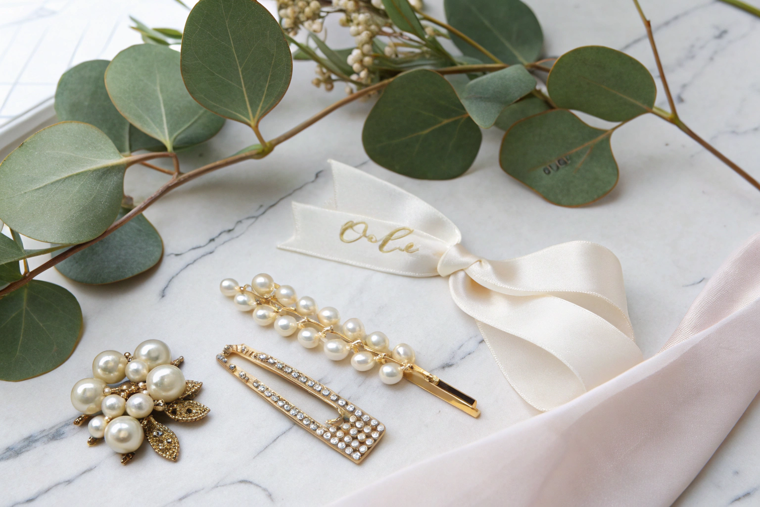
Pastels masterfully walk a line that few color families can. Their lightness and association with candies, Easter eggs, and childhood memories inject a note of whimsy and playfulness. However, when executed with high-quality materials—like a matte-finish leather in pale gray (dove) or a finely knit cashmere scarf in blush—the same hues convey quiet luxury and sophistication. This duality makes them incredibly versatile for targeting different market segments. A pastel acrylic bead necklace can be fun and festival-ready, while a pastel suede loafer can be office-appropriate and chic. This allows manufacturers and brands to use the same color trend across diverse product lines, from casual hair accessories to premium handbags, a strategy we employ at Shanghai Fumao Clothing to cater to varied client needs.
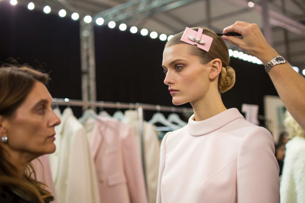
How Do Fashion Cycles and Runways Influence This Trend?
Pastels are not born anew each spring; they are recalibrated and reintroduced by the fashion ecosystem. The trend is a top-down flow from haute couture and ready-to-wear runways to the broader accessory market, where it becomes commercially accessible.
Each year, major fashion houses set the color direction for the upcoming seasons. Trend forecasting agencies like WGSN and Pantone analyze cultural currents, art, and design to predict these palettes. When designers like Chanel, Prada, or Loewe showcase ensembles in nuanced pastels—think "iced lavender" or "peach fuzz"—it sends a powerful signal to the entire industry. This trickles down to fabric mills, which then produce materials in these trending shades, and subsequently to accessory manufacturers who source those fabrics and dyes. For us as manufacturers, monitoring these runway reports and forecast services is essential. It allows us to advise our clients on the most relevant shades for their market segment. A "butter yellow" might be key one year, while a "spearmint green" takes precedence the next. This ensures the accessories we produce feel current and desirable. The influence is clear in reports from Business of Fashion on seasonal color trends.
What is the Role of "Color of the Year" Announcements?
Annual "Color of the Year" announcements, particularly by Pantone, are monumental trend drivers. While not always a pastel, when a soft shade is chosen (like Pantone's "Very Peri" - a periwinkle blue with violet-red undertones), it validates and accelerates the pastel trend across all design disciplines, from interiors to fashion. This creates a cross-industry synergy. A consumer who sees "Living Coral" or "Millennial Pink" everywhere—in home decor, website design, and product packaging—becomes more receptive to fashion accessories in that hue. It creates a sense of being culturally tuned-in. For accessory brands, aligning a capsule collection with the Color of the Year is a proven marketing tactic to generate immediate relevance and press.
How Does Street Style Amplify the Trend?
Runways set the direction, but street style during fashion weeks makes it real and wearable. When influencers, editors, and fashion insiders are photographed incorporating pastel accessories into their personal style—a lime green beanie, a baby blue tote bag—it demonstrates practical application. These images spread rapidly on social media, providing endless inspiration for how to mix pastels with existing wardrobe staples (like denim or neutral tailoring). This social proof is critical for mainstream adoption. It moves the trend from the abstract realm of high fashion to the relatable context of everyday life, directly influencing purchase decisions on platforms like Instagram and Pinterest, which are vital for accessory marketing and discovery.
What is the Connection to Nature and Nostalgia?
The pastel trend draws immense power from two deep wells: the natural world and fondly remembered aesthetics. This connection grounds the trend in something familiar and emotionally resonant, making it more than just a fleeting fashion moment.
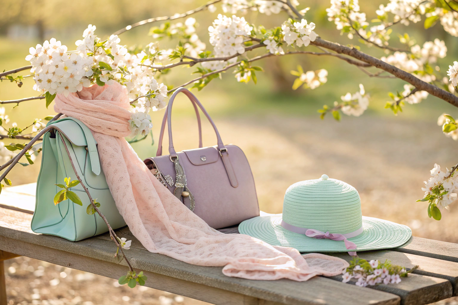
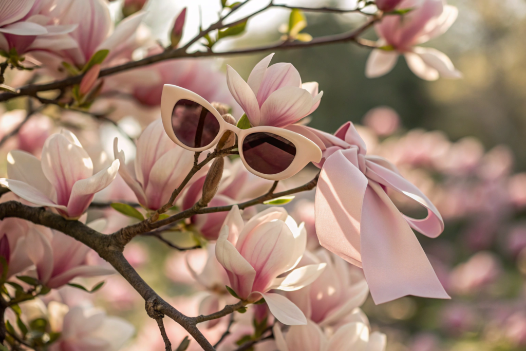
Connection to Nature: Spring is synonymous with rebirth in nature. Pastels are the literal colors of this rebirth: the soft pink of cherry blossoms, the fresh green of new leaves, the pale yellow of daffodils, the light blue of a clear spring sky. Using these colors in accessories is a way to wear and celebrate the season itself. It's a form of biophilic design—incorporating natural elements into human-made products to satisfy our innate connection to nature. This is especially compelling for consumers seeking authenticity and a break from digital saturation. A scarf the color of hydrangeas feels inherently fresh and organic.
The Pull of Nostalgia: Pastels are heavily coded with nostalgia, particularly for the idealized aesthetics of the 1950s, the soft-focus romance of the 1990s, or the Y2K trend resurgence. They evoke memories of simpler times, childhood sweetness, and vintage charm. This nostalgic appeal is a powerful marketing tool, offering comfort and positive association in uncertain times. It allows consumers to engage with a trend that feels both new and familiarly comforting.
How Do Pastels Mirror Seasonal Change in the Environment?
The timing is not coincidental. As the environment shifts, so does consumer desire. Designers and product developers take direct inspiration from this seasonal color shift. We see this in the names of colors: "sea salt," "petal pink," "meadow green," "sky blue." For accessory manufacturers, this means developing or sourcing materials in these specific, nature-referencing shades. It’s about capturing the essence of the outdoors. A line of canvas totes or straw hats in these colors feels inherently "right" for spring and summer outings, directly aligning with activities consumers are planning. This environmental synergy is a key principle in seasonal merchandising and product development.
Why is Nostalgia a Powerful Sales Driver for Fashion?
Nostalgia marketing works because it triggers positive emotions and a sense of identity. When a consumer sees a baby blue hair clip reminiscent of a 90s TV show character or a mint green bag that reminds them of a vintage kitchen appliance, they form an instant emotional connection. This connection can override pure practical consideration. For brands, leveraging this means styling lookbooks with a retro feel, using vintage-inspired typography, or naming products with nostalgic references. It’s about selling a feeling of "remember when" alongside a new product. This strategy is highly effective, as noted in analyses of nostalgia in consumer culture.
How Can Accessory Brands Best Utilize Pastels?
Understanding the "why" is only half the battle. The strategic application of pastels in design, merchandising, and marketing is what turns a trend into commercial success.
To utilize pastels effectively, focus on coordination and contrast. Don't just make every item in the same flat pastel. Create depth by offering accessories in complementary pastel shades (e.g., a lavender scarf with a pistachio green bag) or by pairing a pastel item with neutral or metallic accents (e.g., a pale pink belt with a gold buckle). This adds sophistication and helps customers visualize the item within their existing wardrobe. Secondly, prioritize material quality. Pastels can look cheap if the material is poor. Chalky, thin plastics or poorly dyed fabrics will undermine the trend's soft-luxury appeal. Invest in materials that carry the color well: rich felts, smooth ceramics for cups, high-quality enamels for metal accessories, or finely woven straw for hats. At Shanghai Fumao Clothing, we guide clients on material-dye compatibility to ensure color vibrancy and fastness. Finally, market the feeling. Your product descriptions and imagery should evoke the calm, joy, and freshness that pastels represent. Show the accessories in spring settings, paired with light fabrics like linen and cotton.

What are the Best Materials to Carry Pastel Dyes?
The success of a pastel accessory heavily depends on the base material. Some materials excel:
- Silk & Satin: Provide a luminous, luxurious sheen that enhances soft colors.
- Merino Wool & Cashmere: Absorb dye beautifully for a rich, matte finish that feels premium.
- Suede & Nubuck: Offer a velvety texture that makes pastels look sophisticated and tactile.
- High-Density PU or Vegan Leather: Can achieve a very even, clean pastel coating ideal for bags and belts.
- Ceramic & Enamel: Perfect for mugs, pins, and hair clips, offering a bright, durable color.
- Natural Straw: When dyed, it gives a beautiful, earthy yet colorful result for hats and bags.
Conversely, cheap polyester or low-grade acrylic can make pastels look dull and artificial. Partnering with a manufacturer that understands textile science is key to nailing the color execution, a core part of our product development service.
How to Merchandise a Pastel Accessory Line for Maximum Impact?
Visual merchandising is critical. Use these tactics:
- Color Blocking: Group all pastel products together in-store or on a webpage to create a strong, trend-forward statement.
- Create "Looks": Style complete outfits using your accessories as the pastel accent. Show how a single pastel bag can elevate a neutral outfit.
- Use Complementary Backgrounds: Photograph products against clean white, warm wood, or other soft pastel backgrounds to make the colors pop without competition.
- Offer Color Stories: Instead of selling single items, suggest pairs—e.g., "The Spring Set: Blush Headband + Lavender Scrunchy."
- Leverage Seasonal Packaging: Use pastel-colored tissue paper, stickers, or boxes for unboxing to amplify the seasonal experience.
This cohesive approach not only sells individual products but also builds the perception of your brand as a definitive source for the season's key trend, enhancing brand equity and customer loyalty.
Conclusion
The trend for pastel shades in spring accessories is a multifaceted phenomenon rooted in psychology, cultural cycles, environmental cues, and smart business. It satisfies a deep human desire for renewal, offers a versatile palette that bridges playfulness and sophistication, and draws power from our love of nature and nostalgia.
For accessory brands, designers, and retailers, leveraging this trend successfully means moving beyond simply offering a pink scarf. It requires an understanding of the underlying emotional drivers, a commitment to quality in color execution, and strategic marketing that sells the springtime feeling as much as the product itself. When done right, pastel accessories become seasonal essentials that customers eagerly anticipate and integrate into their personal style narrative.
If you are looking to develop a spring accessory collection with on-trend, beautifully executed pastel colors, our design and production team is ready to assist. We specialize in translating color trends into high-quality, market-ready products. For a consultation on your next seasonal line, please contact our Business Director, Elaine. Let's create accessories that capture the soft, hopeful spirit of spring. Reach Elaine at: elaine@fumaoclothing.com.