You're constantly analyzing the market, trying to understand the "why" behind the trends. You've noticed a powerful and persistent phenomenon in headwear: the dominance of vintage-inspired logos. From major sportswear giants reissuing designs from their archives to new, independent streetwear brands creating logos that look like they've been around for 50 years, the aesthetic of the past is everywhere. This isn't just a fleeting fad; it's a fundamental shift in consumer preference. You're asking the critical branding question: Why, in our hyper-modern, digital world, are logos that look old the most effective way to connect with a modern audience?
Vintage logo designs are popular on caps because they act as a powerful psychological shortcut, instantly conveying a sense of authenticity, heritage, and timeless quality that new, modern logos struggle to achieve. In a market saturated with fleeting digital brands, a vintage-style logo suggests that a brand has history, substance, and a story to tell—even if the brand is brand new. This "borrowed heritage" allows consumers to connect with a product on an emotional level, tapping into a deep-seated desire for nostalgia, craftsmanship, and a tangible connection to a "golden era" of design.
I'm the owner of Shanghai Fumao, and we've seen this trend from the factory floor. We've embroidered thousands of these logos, and I can tell you, it's far more than just a design choice. It's a strategic decision. A well-executed vintage logo is a silent storyteller. It communicates a brand's values and positioning before a customer even reads the brand name. Understanding the psychology behind this trend is the key to leveraging it effectively for your own brand. Let's deconstruct why these old-school designs have such a powerful grip on the modern consumer.
How Do Vintage Logos Create "Instant Heritage"?
In today's crowded market, a new brand faces a major challenge: building trust. Consumers are bombarded with thousands of brand messages a day, and they've become skeptical of new, unproven companies. A vintage logo is a powerful tool for bypassing this skepticism.
A vintage logo creates "instant heritage" by tapping into a pre-existing visual language of trust and longevity. Design elements like classic script fonts, hand-drawn illustrations, and simple, bold typography are associated with an era before digital marketing, when brands were built on quality products and word-of-mouth. By adopting this aesthetic, a new brand can subconsciously "borrow" these positive associations, creating the illusion that it has been around for decades, earning its place in the market through time-tested quality rather than just venture capital funding.
Let's break down how this psychological transfer of trust works:
- The "Grandfather's Brand" Effect: A vintage logo often looks like something you might find in your grandfather's closet. It evokes a sense of nostalgia for a "simpler time" when products were "made to last." This association with durability and craftsmanship is incredibly valuable.
- A Rejection of Corporate Modernism: Many modern corporate logos are seen as sterile, minimalist, and soulless. A vintage logo, with its quirks, imperfections, and hand-crafted feel, feels more human and approachable. It's a statement against the cold, impersonal nature of a lot of modern branding.
- Storytelling Potential: A vintage logo immediately makes a customer curious. "What's the story behind this brand?" It invites the consumer to imagine a history, a founding story, a legacy. This is a powerful way to engage a customer beyond a simple transaction. A brand like Faherty excels at using a sun-faded, vintage aesthetic to tell a story about family, surfing, and a timeless coastal lifestyle.
- Perceived Authenticity: In a world of AI-generated content and fleeting social media trends, consumers crave authenticity. A vintage logo feels authentic. It feels like it was designed by a person with a pen, not by a committee with a PowerPoint presentation.
What are the key vintage logo "styles"?
There are several classic archetypes to draw from:
- The Script Logo: A flowing, cursive font, often reminiscent of mid-century baseball teams or classic automotive brands.
- The Mascot Emblem: A friendly, hand-drawn character or animal, often enclosed in a circle or shield. Think of vintage minor league baseball logos.
- The Letterman/Collegiate: Simple, bold, often single-letter logos using a classic serif or block font, reminiscent of university apparel.
- The Workwear Badge: A simple, utilitarian logo, often in a circle or shield shape, with bold, no-nonsense typography. Think of classic workwear brands.
Does this mean my brand has to lie about its age?
Not at all. It's about adopting an aesthetic, not fabricating a history. Your brand's story can be, "We were founded last year, but we are inspired by the quality and craftsmanship of the past." The vintage logo is a visual representation of that brand ethos. It's about aligning with a set of values, not a specific date.
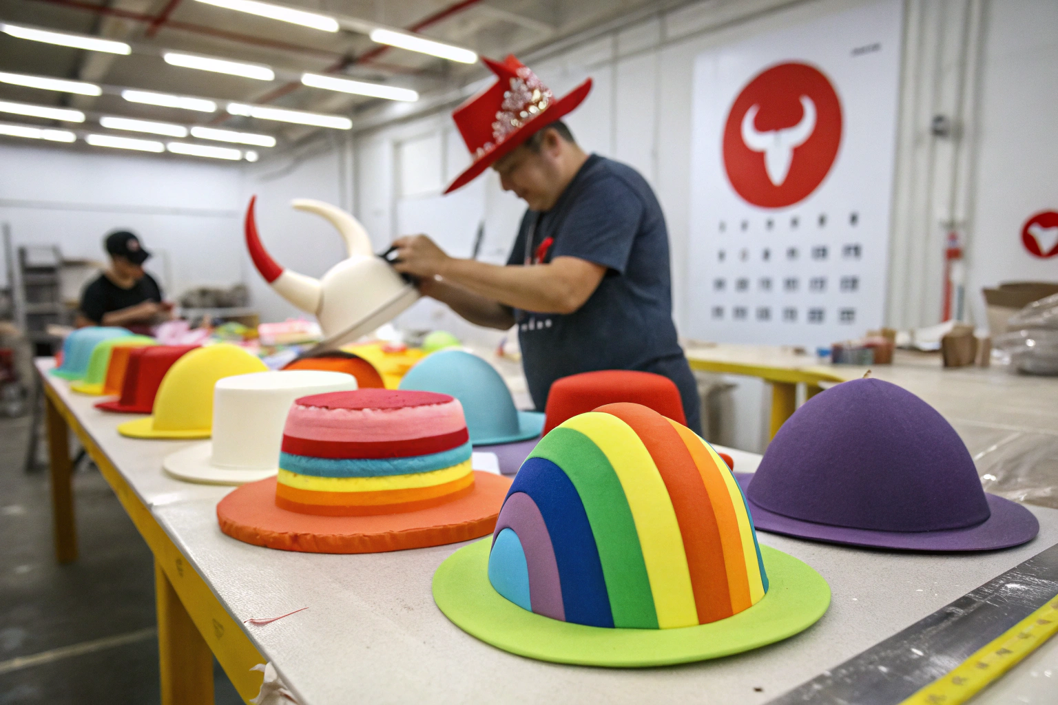
How Does Embroidery Enhance the Vintage Feel?
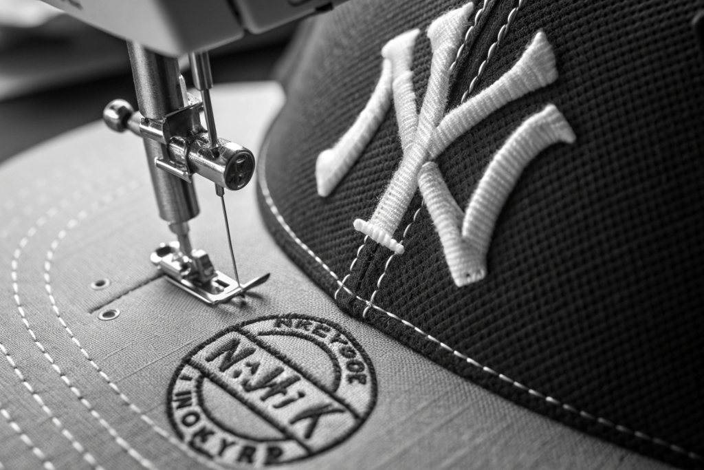
The medium is the message. How a logo is applied to a cap is just as important as the design of the logo itself. For vintage logos, the texture, dimensionality, and craft of embroidery are essential for completing the authentic feel.
Embroidery is the perfect medium for a vintage logo because it is an inherently analog, craft-based process that mirrors the pre-digital era the logo is meant to evoke. The physical texture and dimensionality of thread create a tactile, high-quality feel that a flat, digital print cannot replicate. Techniques like "chain stitching" or using a "running stitch" can further enhance this hand-crafted, vintage aesthetic, making the logo feel like a piece of classic, artisanal workmanship.
Let's look at the specific embroidery techniques that enhance the vintage feel:
- Standard High-Density Embroidery: This is the workhorse. A clean, tight, high-density embroidery of a vintage script or emblem is the most common and effective method. The quality of the stitching itself becomes a testament to the brand's commitment to craftsmanship.
- Chain Stitch Embroidery: This is a specialized technique that creates a series of looped stitches that look like a "chain." It has a beautiful, hand-made, almost "rope-like" texture that is strongly associated with vintage bowling shirts, western wear, and early letterman jackets. It's a fantastic way to achieve a truly unique and authentic vintage look.
- Felt Appliqué with Embroidery: This is a classic collegiate and workwear technique. A letter or shape is cut from felt fabric, placed on the cap, and then the edges are secured with a neat embroidered stitch (often a "satin stitch"). This creates a beautiful, layered, dimensional look that is impossible to fake.
- Using a "Running Stitch" Fill: Instead of filling a shape with a solid, dense satin stitch, the factory can use a "running stitch" or "tatami stitch" that is less dense. This can create a slightly more open, "hand-stitched" look that can be very effective for certain vintage styles.
When you discuss the logo with your supplier, don't just send them a JPEG. Talk to them about the texture you want to achieve. A good factory partner like Shanghai Fumao will be able to show you samples of these different techniques.
What is the difference between embroidery and a patch?
- Embroidery is stitched directly onto the cap's fabric.
- A Patch is created separately (either embroidered or woven) and then sewn onto the cap.
An embroidered patch, especially one with a "merrowed edge" (a classic, raised border), is another excellent way to achieve a vintage look. It's a hallmark of vintage scout uniforms, work shirts, and trucker hats.
Can I combine techniques?
Absolutely. Some of the most interesting designs combine techniques. For example, you could have a felt appliqué letter with your brand name embroidered in a chain stitch across it. This kind of layering and mixed-media approach shows a high level of design sophistication.
How Do Vintage Logos Create a Sense of Community and "In-the-Know" Appeal?
The most successful streetwear brands are not just selling products; they are building communities. The brand's logo becomes a symbol, a "badge of belonging" for that community. A vintage-style logo is particularly effective at creating this sense of an exclusive, "in-the-know" club.
A vintage logo fosters a sense of community by acting as a subtle, understated identifier. Unlike a loud, mainstream logo that everyone recognizes, a cool, obscure-looking vintage logo feels like a secret. When someone sees another person wearing a cap with the same logo, it creates an instant, silent connection—a recognition that they are both part of the same "tribe." This "if you know, you know" (IYKYK) appeal is far more powerful for building a loyal, cult-like following than a logo that screams for mass-market attention.
Here's why the vintage aesthetic is so good at building this "cult brand" appeal:
- It Doesn't Feel Like an Advertisement: A loud, modern logo can feel like you are paying to be a walking billboard for a giant corporation. A subtle, vintage-style logo feels like a personal endorsement of a cool, independent discovery. It's a piece of art, not an ad.
- It Encourages Discovery: A logo that isn't immediately recognizable makes people curious. It prompts the question, "Hey, cool cap. What brand is that?" This kind of organic, word-of-mouth discovery is the holy grail for a new brand.
- It Aligns with "Anti-Hype" Culture: As a reaction to the "hypebeast" culture of chasing the latest, loudest, most limited-edition drop, there is a growing counter-movement that values timeless, well-made, understated pieces. A vintage logo is the perfect uniform for this "anti-hype" consumer. They are signaling their taste and knowledge, not just their ability to buy the most hyped item.
- It Creates a "Found Object" Narrative: A vintage logo helps to position the cap not as a mass-produced commodity, but as a special "found object," like a rare record or a vintage t-shirt discovered in a thrift store. This narrative is incredibly appealing to consumers who pride themselves on their unique personal style. Brands like Aimé Leon Dore have masterfully used a vintage New York aesthetic to build a powerful global community around this idea.

Does this mean the logo should be unreadable?
No, not necessarily. It just means it shouldn't be obnoxious. A classic script font might be slightly difficult to read from a distance, and that's part of its charm. It invites a closer look. The key is that it should be aesthetically pleasing on its own terms, regardless of whether you can read it instantly.
How does this affect my social media strategy?
This "in-the-know" appeal is fantastic for social media. It encourages user-generated content where the focus is on personal style and community, not just the product. Your customers will feel like they are part of an exclusive club, and they will be eager to share that feeling online.
How Do Vintage Logos Align with the Trend of "Timeless" Style?
Fashion is cyclical, but style is enduring. The ultimate goal for any brand is to create a "core" product that transcends fleeting trends and becomes a permanent part of their customer's wardrobe. Vintage logos are a key ingredient in creating this sense of timelessness.
Vintage logos align with the trend of "timeless" style because they are, by their very nature, disconnected from the specific, fleeting design trends of the present moment. A logo based on classic, 1950s typographic principles will look just as good today as it did 70 years ago, and it will still look good 20 years from now. By adopting a vintage aesthetic, a brand is deliberately choosing to step off the trend treadmill and align itself with a more enduring, long-lasting vision of style. This signals quality, confidence, and a commitment to creating a product that is "built to last."
Here's how a vintage logo contributes to a product's timeless appeal:
- Proven Aesthetic Principles: The design principles behind classic vintage logos—balance, clarity, and craftsmanship—are timeless. They are based on a rich history of typography and graphic design. These logos have already passed the test of time.
- A Hedge Against "Dating": A logo that is aggressively "on-trend" for 2026 will look dated and "so 2026" by 2028. A logo that is based on a 1970s aesthetic will simply look "70s-inspired," which is a timeless style category. It protects your brand from looking dated.
- It Suggests Durability: The aesthetic of the logo implies the quality of the product. A logo that looks like it has lasted for 50 years suggests that the cap itself is also made to last. It supports a narrative of quality materials and durable construction.
- It Encourages Keeping, Not Discarding: A cap with a timeless, classic logo is something a customer will keep for years. It becomes a favorite, a go-to piece. A cap with a silly, meme-based, or overly trendy graphic is destined for the back of the closet once the trend passes. This focus on creating long-lasting "keepers" is also a powerful sustainability message.

Is there a risk of looking "old-fashioned" instead of "timeless"?
Yes, and this is where the execution is critical. The key is the juxtaposition of the vintage logo with a modern, high-quality product. The logo is vintage, but the fit of the cap is perfect, the fabric is a premium modern material, and the embroidery is crisp and precise. It's this blend of old and new that creates the "timeless" feel. A poorly made cap with a vintage logo will just look like a cheap, old-fashioned product.
How do I choose the right vintage era for my brand?
This should be driven by your brand's core identity. Are you a rugged, outdoors-inspired brand? Look at vintage National Parks or workwear logos from the 1940s and 50s. Are you a more playful, surf-inspired brand? Look at 1970s surf culture graphics. The vintage aesthetic should be an authentic extension of your brand's story, not a random costume.
Conclusion
The popularity of vintage logos on caps is a powerful reflection of our current cultural moment. It's a collective desire for authenticity in a digital world, a search for quality in an era of disposability, and a need for community in a fragmented society. For a brand owner, a vintage logo is not just a graphic; it's a strategic tool. It allows you to instantly communicate a story of heritage and authenticity, to create a product that feels tactile and premium through the craft of embroidery, to foster a loyal community of "in-the-know" fans, and to build a timeless brand that transcends fleeting trends. It's a way to show your customers that you value craftsmanship, storytelling, and a connection to something real.
At Shanghai Fumao, we are not just embroidering logos; we are helping brands tell their stories. We understand the subtle differences between a standard satin stitch and a vintage-style chain stitch. We can help you choose the perfect thread colors to create a sun-faded, nostalgic feel. We have the technical expertise and the artistic sensibility to execute your vintage vision with precision and care. If you are ready to create a headwear collection that feels like it has a soul, please reach out to our Business Director, Elaine, at elaine@fumaoclothing.com.