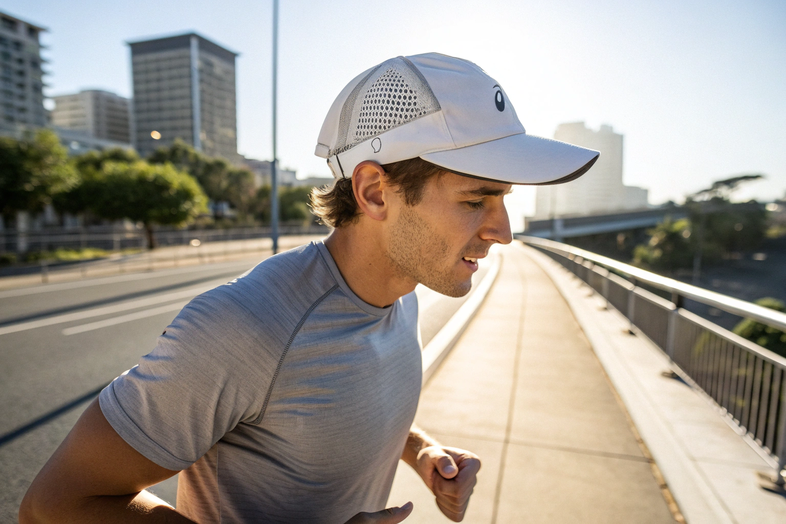
As a forward-thinking brand manager like Ron, your success depends on anticipating what European consumers will want to wear in 2026, not just what they are buying today. When it comes to a ubiquitous accessory like the baseball cap, color is everything. It's the primary factor that makes a cap feel either current and desirable or dated and out of touch. You need to know which shades will resonate with the sophisticated European market to ensure your 2026 collection flies off the shelves.
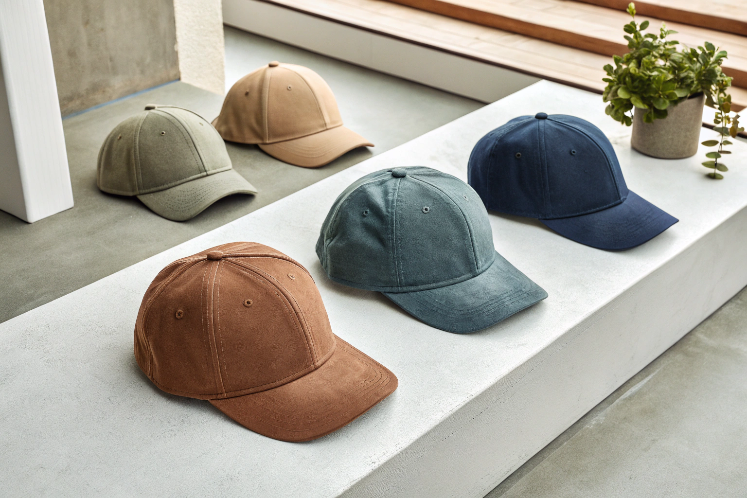
For the 2026 European fashion scene, the dominant trend in baseball cap colors is a move towards sophisticated, nature-inspired, and "washed" or muted tones. The era of bright, primary colors is giving way to a more understated and versatile palette. Key color families include earthy greens and browns, deep and dusty blues, and a range of complex, warm neutrals. These colors reflect a broader cultural shift towards "Quiet Luxury," sustainability, and a desire for timeless, versatile pieces.
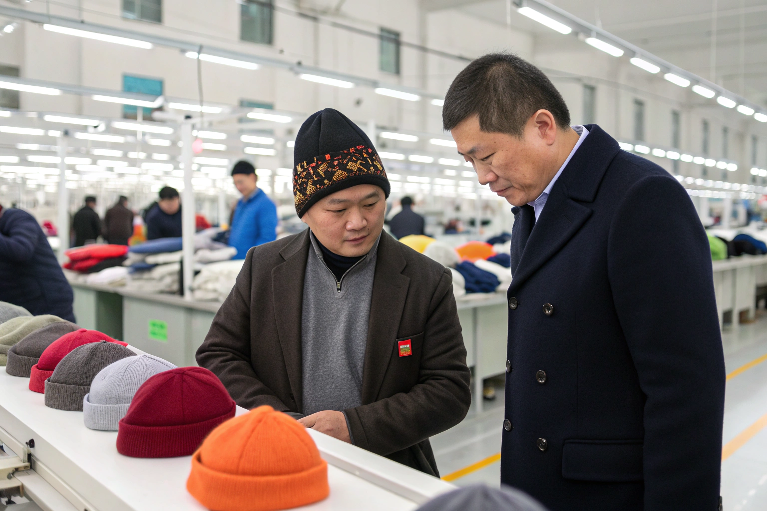
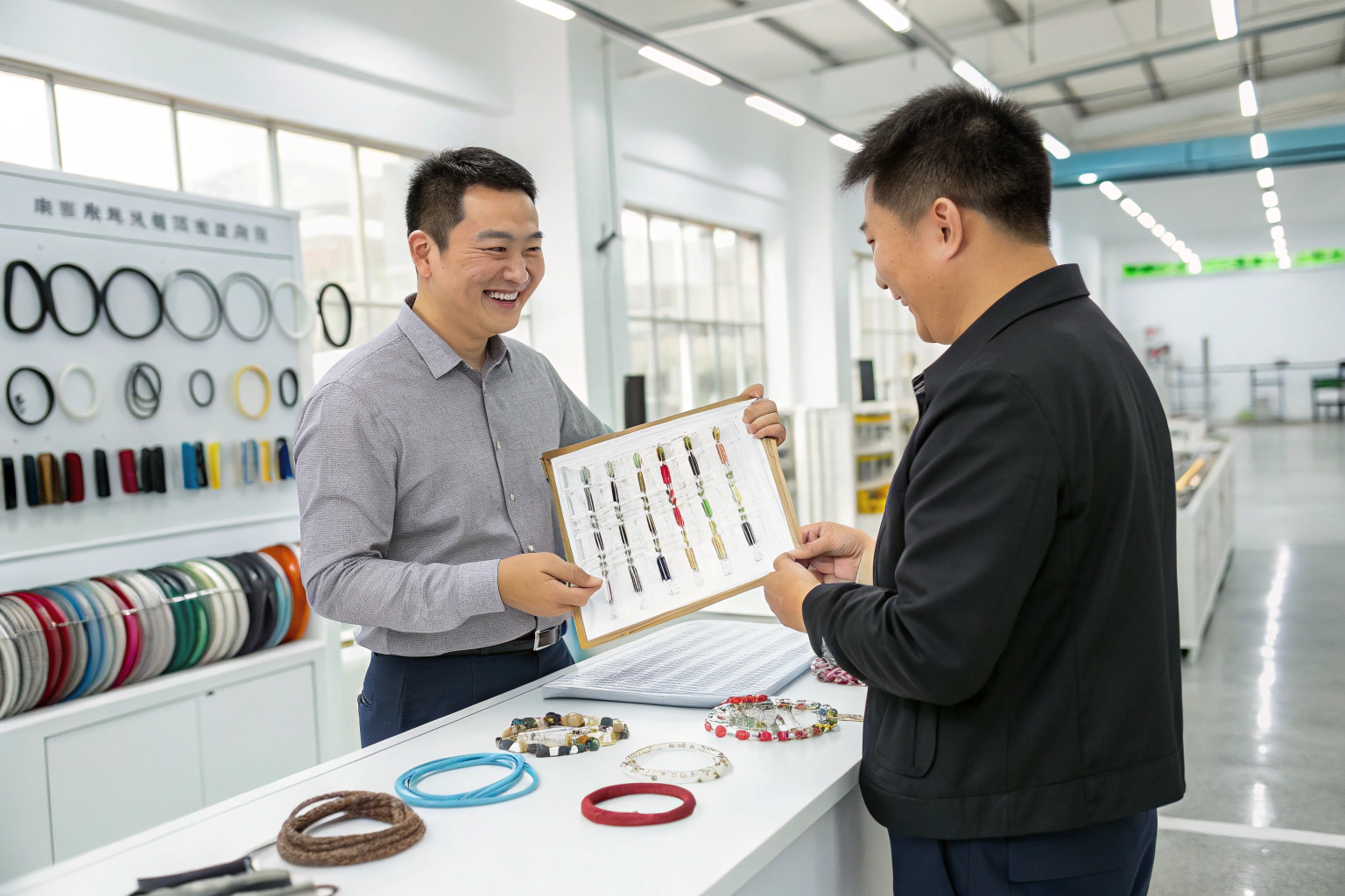
I'm the owner of Sdhanghai Fumao Clothing, and our design team works in lockstep with trend forecasting agencies and our major European brand partners. The color palettes we are currently developing for their 2026 collections tell a very clear story. The European consumer is looking for nuance and sophistication. They want colors that are easy to wear, feel authentic, and have a story to tell. Let's explore the specific color trends that will define the market.
Why Are Earthy Greens and Browns Dominating?
For years, the go-to "neutral" cap colors were black, grey, and maybe a classic khaki. But you're noticing a shift towards a warmer, more organic palette in menswear and womenswear. You need to understand which specific earth tones are gaining traction and why they are resonating so strongly with the European consumer.
Earthy greens and browns are trending because they tap directly into the powerful cultural movement towards nature, wellness, and sustainability. Colors like olive, dusty sage, and rich soil-browns feel grounded, authentic, and calming. They offer a sophisticated, versatile alternative to traditional neutrals and align perfectly with the "gorpcore" (outdoor-inspired fashion) aesthetic that continues to influence mainstream style.
This trend is about more than just color; it's about a feeling. In a digitally saturated world, consumers are seeking a connection to the natural world. These colors bring a sense of the outdoors into an urban wardrobe. They are also incredibly versatile, pairing effortlessly with denim, linen, and other natural fabrics that are popular in Europe. At Sdhanghai Fumao Clothing, we are seeing a huge demand for these tones, as they allow brands to tell a story of authenticity and connection to nature.
Which specific green is most important for 2026?
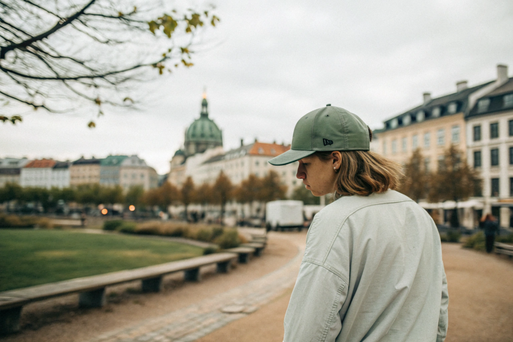
The key green for 2026 is not a bright, grassy green but a more complex, muted shade. Dusty Sage and Olive Green are the clear winners. These are sophisticated, almost-neutral greens that have a greyish or brownish undertone. They are easy to wear, gender-neutral, and feel more premium and less "sporty" than a classic kelly green, making them perfect for the fashion-conscious European market.
What about the brown palette?
Forget boring brown. The trending browns for 2026 are warm, rich, and have depth. Think Spiced Rust, a deep, earthy reddish-brown, or Carob, a dark, chocolatey brown that serves as a softer, more sophisticated alternative to black. These shades feel luxurious and pair beautifully with the neutral and blue tones that are also trending, as highlighted by color authorities like WGSN.
How Are Blues Being Reimagined?
Navy blue is a timeless staple, but how can it be updated to feel fresh and modern for 2026? You're looking for a way to include this commercially safe color in your collection without it feeling predictable or boring. You need a new take on a classic.
For 2026, blues are being reimagined through texture and tone, moving away from bright, flat royal blues towards more complex and "lived-in" shades. The key trends are "Washed Navy" and "Dusty Blue." These versions feel softer, more sophisticated, and have a vintage-inspired character that aligns with the desire for authentic, timeless style.
The "washed" effect is crucial. It's achieved through specific garment-dyeing or fabric-washing processes that give the cap a slightly faded, sun-bleached look and an incredibly soft feel from day one. This instantly elevates the cap from a simple promotional item to a premium fashion accessory. It feels less like a uniform and more like a carefully chosen piece with a personal history. This aesthetic is a cornerstone of many successful European brands like A.P.C., which master the art of the perfectly "worn-in" basic.

What exactly is "Washed Navy"?
Washed Navy is a deep blue that has lost its initial harshness. It's a softer, slightly greyer version of a true navy. It pairs beautifully with everything from crisp white to earthy browns and greens. It's the perfect color for a brand that wants to project an image of effortless, understated cool. When you specify this to a manufacturer, you should ask for "garment-washed" or "pigment-dyed" options to achieve this authentic, faded look.
What is "Dusty Blue"?
Dusty Blue is a lighter, mid-tone blue with a distinct grey undertone. Think of the color of a faded chambray shirt or the sky on a hazy day. It's a soft, calming, and highly sophisticated color that works exceptionally well for both spring/summer and transitional seasons. It's a more fashion-forward choice than a standard baby blue and has a more grown-up, gender-neutral appeal.
Why Are Complex Neutrals Replacing Basic White and Grey?
For years, a crisp white or a simple heather grey cap was the go-to neutral option. But as palettes become more sophisticated, these basic colors can feel a bit stark or uninspired. You're looking for neutrals that have more warmth, depth, and character.
Basic white and grey are being replaced by a family of complex, warm, and "off-neutral" tones. For 2026, colors like "Oat Milk," "Stone," and "Mushroom" are the new foundation of a modern color palette. These shades have subtle warm undertones (yellow, pink, or brown) that make them more versatile, more flattering, and feel significantly more luxurious than a simple, sterile white or a flat grey.
This trend is all about subtlety and nuance. These are not attention-grabbing colors. Instead, they are quiet, confident, and incredibly chic. They form the perfect backdrop for the earthy greens and dusty blues that are also trending. They are the epitome of the "Quiet Luxury" aesthetic—they don't shout, they whisper. For a premium brand, getting these foundational neutral tones right is absolutely critical.
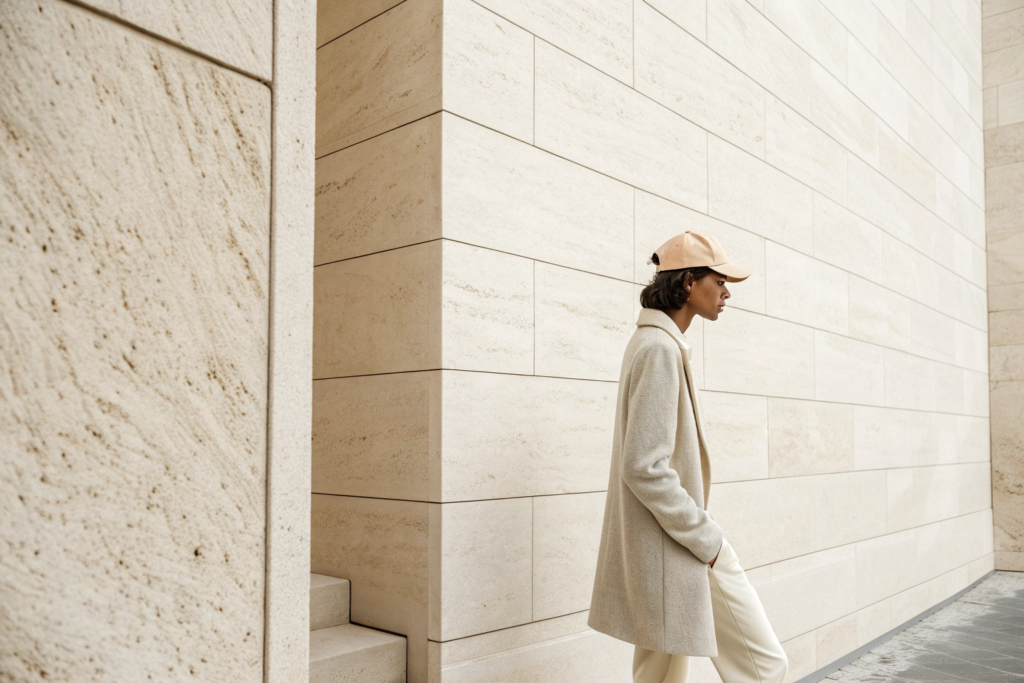
What color is "Oat Milk"?
"Oat Milk" is a creamy, off-white with a subtle warm, yellowish or beige undertone. It's softer and more inviting than a brilliant optic white. It has an organic, natural feel that pairs perfectly with linen and cotton fabrics. It's the perfect sophisticated alternative to a basic white cap.
How does "Stone" differ from "Heather Grey"?
While both are in the grey family, "Stone" is a warmer, more complex shade. It has beige or taupe undertones, reminiscent of a natural pebble or unpolished stone. Standard "Heather Grey" is a cooler, flatter grey, often associated with athletic wear. "Stone" feels more elevated and intentional, making it a better fit for the fashion-forward European market.
Are There Any "Accent" Colors for 2026?
While the dominant trend is muted and understated, a good collection always needs a few strategic pops of color. You're worried that a palette of only neutrals and earth tones might lack energy. What are the right "accent" colors that feel modern and on-trend for 2026, without being loud or garish?
Yes, accent colors are still important, but for 2026 they are also filtered through a more sophisticated, muted lens. Instead of bright, primary "pop" colors, the key accents are rich, saturated, but slightly "off" shades like "Washed Burgundy" and "Golden Ochre." These colors provide a splash of personality while maintaining the overall sophisticated and grounded feel of the palette.
The key is that even the accent colors have a certain depth and earthiness to them. They are not neon or primary. They feel like they could be derived from natural pigments, which allows them to harmonize beautifully with the core palette of greens, browns, and blues. They add energy and emotion to a collection without sacrificing its sophisticated, grown-up appeal.
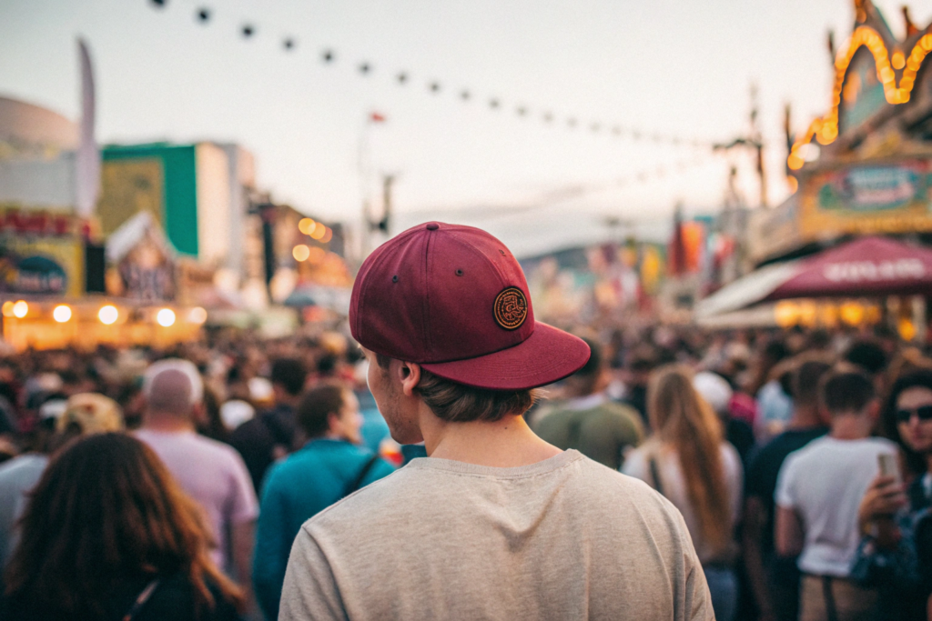
What is "Washed Burgundy"?
Think of a classic burgundy or wine color, but again, with that crucial "washed" or "faded" quality. It's a deep, rich red that has been softened, giving it a vintage, lived-in feel. It's a powerful, emotional color that feels both classic and contemporary, and it's a fantastic, elevated alternative to a basic red cap.
Why "Golden Ochre" instead of yellow?
A bright, primary yellow can be difficult to wear. Golden Ochre, on the other hand, is a deep, earthy, and warm yellow with brownish undertones, like a natural clay pigment. It's a color that feels sunny and optimistic but also grounded and natural. It provides a beautiful, warm highlight in a collection and pairs exceptionally well with the trending blues and browns.
Conclusion
The color trends for men's and women's baseball caps in the 2026 European market tell a story of quiet confidence and a return to nature. By building your collection around a core of sophisticated earthy greens, rich browns, and complex neutrals, and accenting it with deep, washed-out blues and rich, organic pops of color, you will present a palette that is perfectly in tune with the modern consumer. This is a move away from fleeting, loud trends and towards a more timeless, versatile, and authentic approach to color.
At Sdhanghai Fumao Clothing, we specialize in custom color matching and garment-dyeing techniques to achieve these nuanced, sophisticated shades. Our team can help you build a 2026 headwear collection that is not just on-trend, but perfectly captures the mood and desires of the European fashion scene. To start developing your next best-selling collection, please reach out to our Business Director, Elaine, at elaine@fumaoclothing.com.