I was sitting in our design studio in Zhejiang last fall, surrounded by fabric swatches and Pantone books, when a long-time client from a major European fashion house called. She was already deep in planning for 2026. "We've seen the runways, we've read the trend reports," she said. "But tell me honestly, from your perspective, what colors are actually going to sell? What will women want to put on their heads, around their necks, and on their belts next summer?" Her question cut through the noise. Trends are one thing; what people actually buy is another.
The colors for 2026 summer fashion accessories are moving away from the ultra-bright, almost neon palettes of recent years towards a more grounded, optimistic, and nature-inspired spectrum. We are seeing a beautiful shift towards warm, earthy neutrals like Terracotta Clay and Sand Dune, balanced by soft, airy pastels like Aqua Mist and Lemon Sorbet, and anchored by a deep, sophisticated Canyon Shadow. The overall feeling is one of warmth, serenity, and a connection to the natural world. It's a palette that is both refreshing and endlessly wearable. At Shanghai Fumao Clothing, we are already sourcing materials and developing samples in these key shades for our forward-thinking clients.
That client's question is the one every smart brand asks. You can't afford to guess. You need to understand not just what the color forecasters say, but why those colors resonate and how they translate into actual products. The 2026 summer palette is a reaction to the world around us. It's a desire for calm, for authenticity, and for a touch of warmth. Let me walk you through the five key colors we believe will define the season and show you exactly how to use them in your accessory collections.
Why Is "Terracotta Clay" the New Essential Neutral?
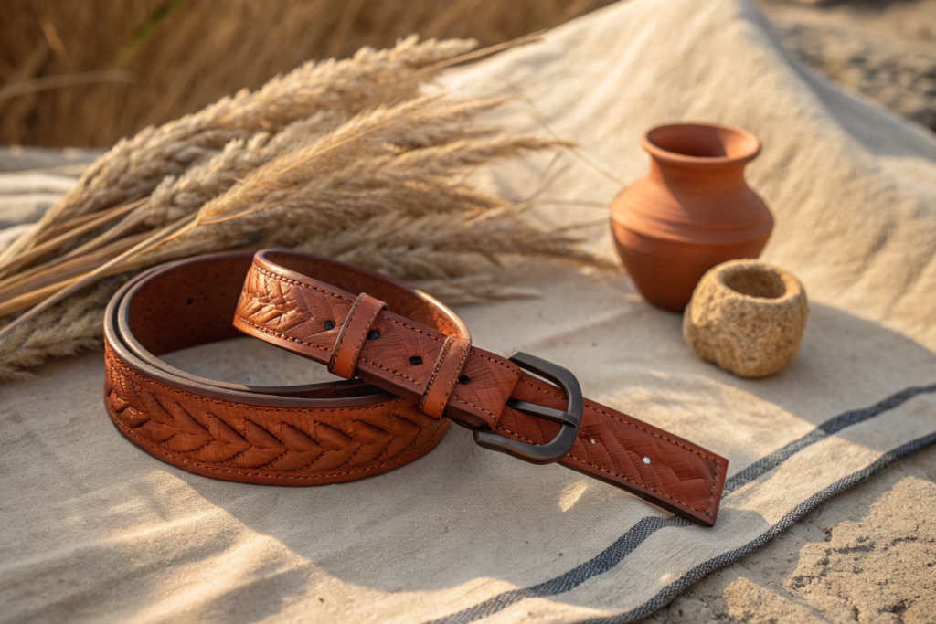
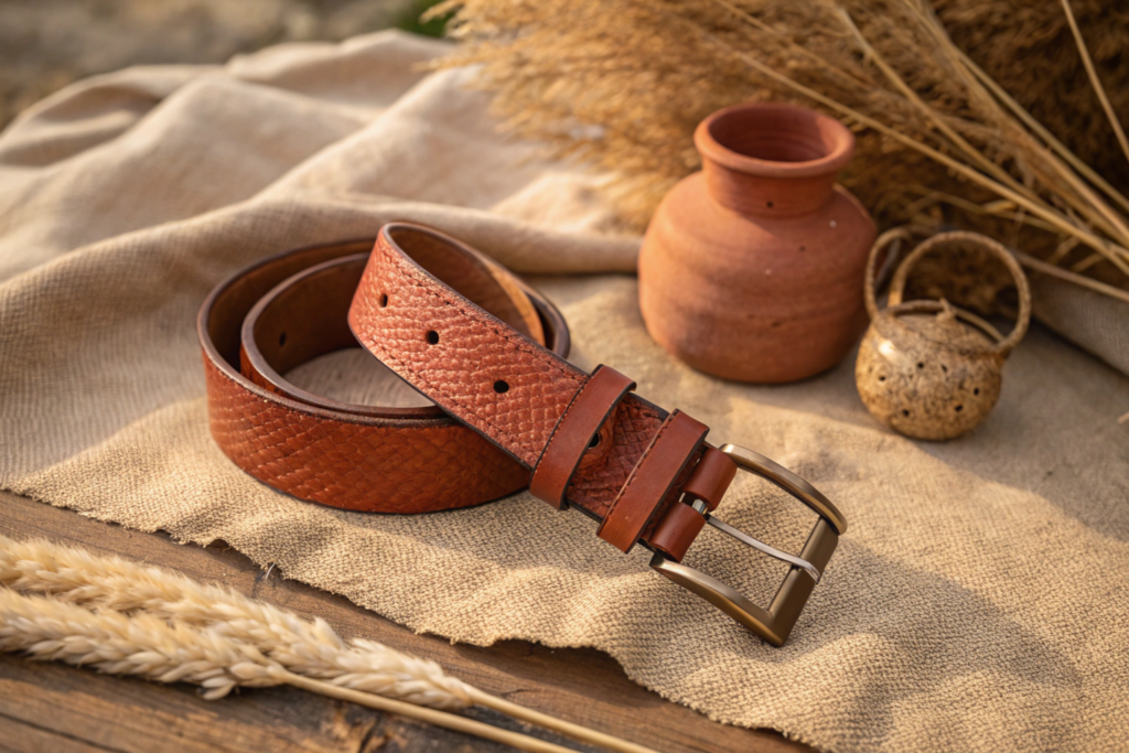
For years, the default neutral for summer accessories has been beige, camel, or a simple tan. They are safe, reliable choices. But for 2026, we are seeing a shift towards a neutral with more soul, more warmth, and more personality. That color is Terracotta Clay. It is a grounded, earthy shade that sits somewhere between a warm terracotta pot and a sun-baked desert landscape. It is a neutral that actually adds warmth to a look, rather than just receding into the background.
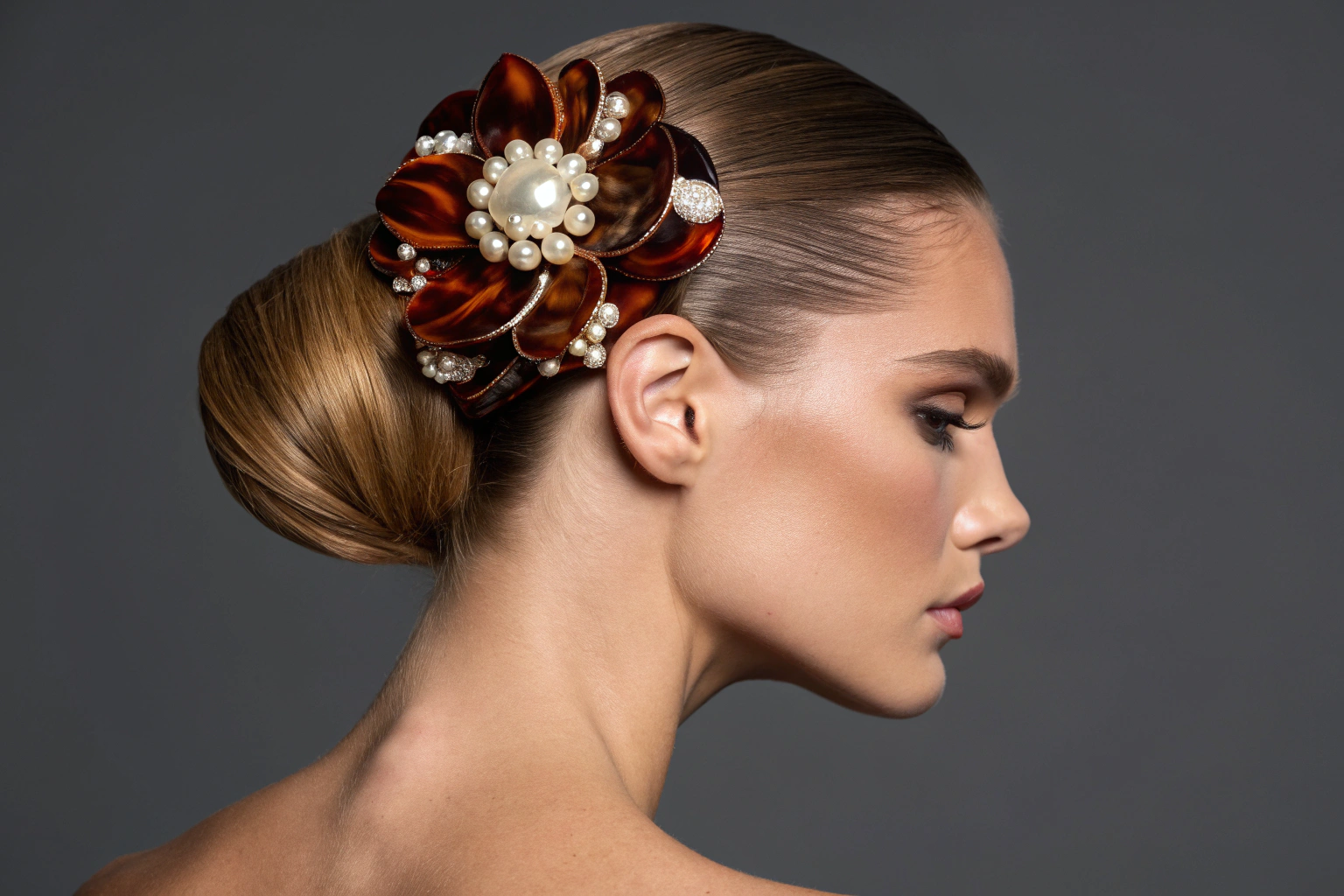
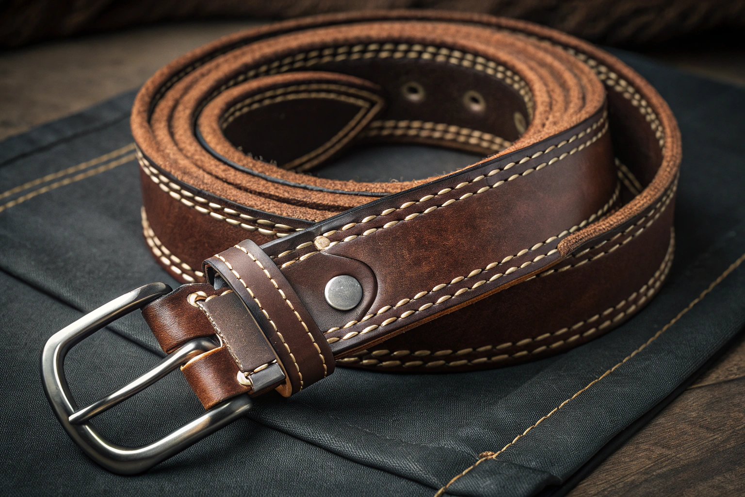
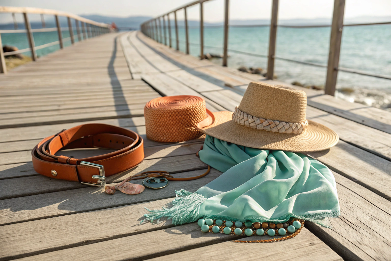
Terracotta Clay is poised to be the "it" neutral of summer 2026. It is incredibly versatile, working beautifully with other colors in the palette, from the soft Aqua Mist to the creamy Sand Dune. In accessories, it is perfect for leather belts, adding a touch of rustic luxury. It is stunning in woven straw or raffia bags and hats, giving them a rich, natural depth. In hair accessories, think large acetate claw clips in this warm, marbled terracotta shade. It is a color that feels both modern and timeless, effortlessly chic and deeply connected to the earth.
The psychology behind Terracotta Clay is fascinating. In a world that often feels digital and disconnected, we crave the tangible and the real. Terracotta is the color of pottery, of the earth, of handmade objects. When a customer chooses an accessory in this shade, they are subconsciously choosing that feeling of authenticity and warmth. It is a grounding color. From a practical design perspective, its versatility is its superpower. It can be the anchor of a monochromatic, earthy look. It can be a warm counterpoint to cooler colors like Aqua Mist. And it elevates simple, natural materials like linen, straw, and raw silk. We are seeing a huge demand for this color from our clients who are looking for something fresh but not fleeting. It has the staying power of a true classic. This aligns with broader trends in color psychology and consumer behavior. Our sourcing team at Shanghai Fumao Clothing is already securing leathers, acetates, and yarns in this vital shade for 2026 production.
Will Terracotta Clay work for all skin tones?
Absolutely. This is one of its greatest strengths. Because it is a warm, earthy tone with a good amount of depth, it is incredibly flattering on a wide range of skin tones. It adds warmth to fair skin and complements richer, deeper complexions beautifully. It's a truly universal color in the way that a great camel can be, but with more personality.
What metals pair best with Terracotta Clay accessories?
Gold is the perfect partner for Terracotta Clay. The warmth of the gold echoes the warmth of the terracotta, creating a harmonious and luxurious look. Brushed or antiqued gold finishes are particularly beautiful, adding to the earthy, artisanal feel. Silver can also work, especially if the silver has a warm, oxidized finish, but gold is the standout choice.
How Does "Aqua Mist" Bring a Sense of Calm to Summer?
If Terracotta Clay represents the warmth of the earth, Aqua Mist represents the coolness of the sky and the sea. It is a soft, hazy, almost ethereal blue-green that feels like a breath of fresh air on a hot summer day. In a palette of warm earth tones, Aqua Mist provides the essential cool counterpoint. It is a color of calm, of serenity, of escape. It is the shade you want to wear when you need a moment of peace.
Aqua Mist is the perfect pastel for summer 2026. It is not a bright, electric turquoise, but a softer, more sophisticated shade. Think of the color of a tropical lagoon seen through a morning mist. In accessories, it is a dream on silk scarves, adding a touch of ethereal beauty. It is beautiful in hair clips, especially in glossy resin or acetate, and it makes for stunning beaded jewelry. It also works wonderfully as a subtle accent color on a neutral bag or belt. It is a color that whispers rather than shouts, but its effect is powerful.
The rise of Aqua Mist speaks to a collective desire for calm and well-being. After years of uncertainty, consumers are drawn to colors that soothe and comfort. Aqua Mist is inherently calming. It reminds us of water, of sky, of open spaces. It is a color that promotes a feeling of clarity and peace. In accessories, it is a wonderful way to introduce color in a soft, approachable way. A woman who might be intimidated by a bright, bold color can easily embrace Aqua Mist. It is a "safe" color in the best sense of the word—it is universally flattering, easy to wear, and adds a touch of elegance without being overwhelming. It pairs beautifully with all the neutrals in the palette: with Sand Dune for a beachy vibe, with Terracotta Clay for a warm-cool contrast, and with white or cream for a classic, clean summer look. This color is a perfect example of how color trends reflect the cultural mood. At Shanghai Fumao Clothing, we are already sampling silks and resins in this beautiful shade.
What fabric types are best for showing off Aqua Mist?
Aqua Mist is a color that benefits from fabrics with a subtle sheen or a soft, fluid drape. Silk charmeuse is absolutely stunning in this shade, as the light catches the color and gives it a beautiful, luminous quality. Soft linens and cottons also work well, giving the color a more casual, matte feel. In hair accessories, a high-gloss acetate clip in Aqua Mist is incredibly eye-catching and modern.
Can Aqua Mist be worn as a neutral?
In many ways, yes. Because it is so soft and ethereal, it can function almost as a neutral. It can be the base of a look, allowing other colors to pop. Or it can be a beautiful, subtle accent. It is a color that has the presence to stand alone but the subtlety to play well with others. It is a true workhorse color for a summer wardrobe.
Why Is "Lemon Sorbet" the Perfect Pop of Joy?
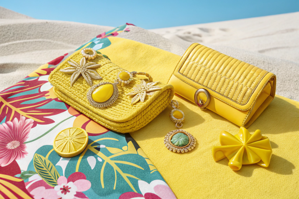
Every summer needs a pop of pure, unadulterated joy. A color that makes you smile the moment you see it. For 2026, that color is Lemon Sorbet. It is a zesty, optimistic, and utterly delicious shade of yellow. It is not the acidic, almost greenish yellow of high-visibility gear. It is a softer, creamier, more inviting yellow. It is the color of happiness, of sunshine, of a perfect summer day.
Lemon Sorbet is the accent color of summer 2026. It is the shade you use to inject energy and fun into any outfit. In accessories, it is perfect for small, impactful pieces: a pair of resin earrings, a colorful hair clip, a beaded bracelet, or a small clutch. It can also be used as a playful accent on a larger item, like the lining of a bag or the stitching on a belt. It is a color that demands attention but does so in the friendliest way possible. It is simply irresistible.
Yellow is often associated with happiness and optimism, and Lemon Sorbet captures that feeling perfectly. It is a color that lifts the spirits. In a world that can feel heavy, wearing a touch of Lemon Sorbet is a small act of rebellion, a choice to embrace joy. From a design perspective, its power lies in its contrast with the more neutral tones in the palette. Against the warmth of Terracotta Clay or the calm of Sand Dune, Lemon Sorbet absolutely sings. It is the color you reach for when you want to make a statement without being overwhelming. It works beautifully in translucent resins and acetates for hair clips and jewelry, where the light can pass through and enhance its vibrant quality. It is also a fantastic color for printed scarves, adding a pop of joy to any pattern. This color is a testament to the enduring appeal of color as a mood enhancer.
Is Lemon Sorbet a color that will date quickly?
While it is a strong trend for 2026, its soft, creamy quality gives it more longevity than a harsh, acidic yellow. It is a more wearable and sophisticated take on the color. It may not be a forever neutral, but it has the potential to be a beloved accent color for several seasons. For accessories, which are often a more affordable and fun way to update a wardrobe, it is a perfect trend color to embrace.
What colors does Lemon Sorbet pair best with?
It is incredibly versatile. It looks fresh and modern with white and all the neutrals in the palette. The combination of Lemon Sorbet and Aqua Mist is particularly beautiful, evoking images of the sea and sun. It also has a stunning, unexpected pairing with Terracotta Clay, where the coolness of the lemon plays against the warmth of the terracotta for a sophisticated, high-contrast look.
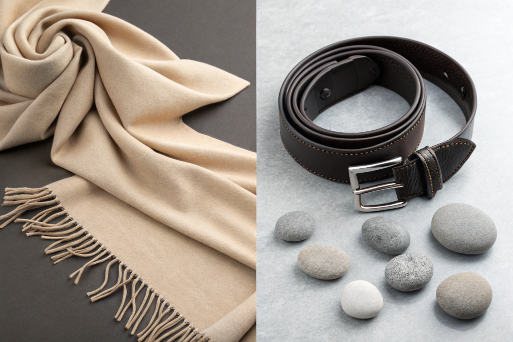
What Role Do "Sand Dune" and "Canyon Shadow" Play in the Palette?
A great color palette needs depth. It needs lights and darks to give it structure and contrast. In the 2026 summer palette, those roles are filled by Sand Dune and Canyon Shadow. They are the bookends, the foundation upon which the brighter, more expressive colors can shine. They may not be the most exciting colors at first glance, but they are absolutely essential. They are the colors that make the whole collection work.
Sand Dune is the ultimate light neutral for summer 2026. It is a warm, creamy, off-white, the color of sun-bleached sand on a perfect beach. It is softer and more interesting than a stark white, and it provides a beautiful, luminous base for any accessory. Canyon Shadow is the deep, grounding anchor. It is a rich, complex dark brown with hints of grey and black, like the shadow in a deep desert canyon. It adds depth, sophistication, and a touch of drama to the palette. Together, they create the perfect balance of light and dark.
Let's explore each of these crucial colors in more detail. Sand Dune is the new ivory. It is the perfect background for all the other colors. Imagine a beautiful Sand Dune straw tote bag with an Aqua Mist scarf tied to the handle. Or a Sand Dune leather belt with a Terracotta Clay outfit. It allows the other colors to pop without competing. It also stands beautifully on its own, offering a clean, sophisticated, and modern look. Canyon Shadow, on the other hand, is the new black. For years, black has been the default dark neutral. But for summer 2026, Canyon Shadow offers a softer, more natural alternative. It has the depth and sophistication of black but with a warmth that feels more organic and connected to the earth. It is the perfect color for a structured leather belt, a pair of sunglasses, or a dark resin hair clip. It grounds the entire palette, preventing it from feeling too light or insubstantial. This interplay of light and dark is a fundamental principle of design theory. At Shanghai Fumao Clothing, we are already developing samples in both Sand Dune and Canyon Shadow, recognizing their essential role in creating cohesive and commercial collections for our clients.
Is Sand Dune just beige? What makes it different?
It's a fair question. Sand Dune is a specific type of beige, but it is warmer and creamier than many standard beiges. It has a subtle yellow undertone that gives it a sun-kissed, luminous quality. It lacks the grey or green undertones that can make some beiges look flat or muddy. It is a "happy" beige, if that makes sense. It feels like sunshine and sand.
Can Canyon Shadow replace black in a summer collection?
For many brands, yes, absolutely. It offers the same level of sophistication and versatility as black, but with a warmth that is more appropriate for summer. It pairs beautifully with the other warm tones in the palette. However, black will always have its place. For a more modern, nature-inspired summer look, Canyon Shadow is the perfect choice.
Conclusion
The color palette for summer 2026 fashion accessories is a beautiful reflection of our collective mood. It is a palette of warmth, calm, and quiet joy. From the grounding earthiness of Terracotta Clay and Canyon Shadow to the serene escape of Aqua Mist and the pure optimism of Lemon Sorbet, these are colors that speak to a desire for connection, authenticity, and well-being. They are not just colors; they are feelings you can wear.
At Shanghai Fumao Clothing, we don't just read about these trends; we live them. Our design team is already deep in development, sourcing the finest materials in these key shades. We are creating samples in Sand Dune straw, Canyon Shadow leather, and Lemon Sorbet resin. We are ready to help our clients translate this beautiful palette into winning accessory collections that will resonate with consumers in 2026.
Are you ready to bring the colors of summer 2026 to life? Let's start creating together. Contact our Business Director, Elaine, at elaine@fumaoclothing.com to discuss your next collection.