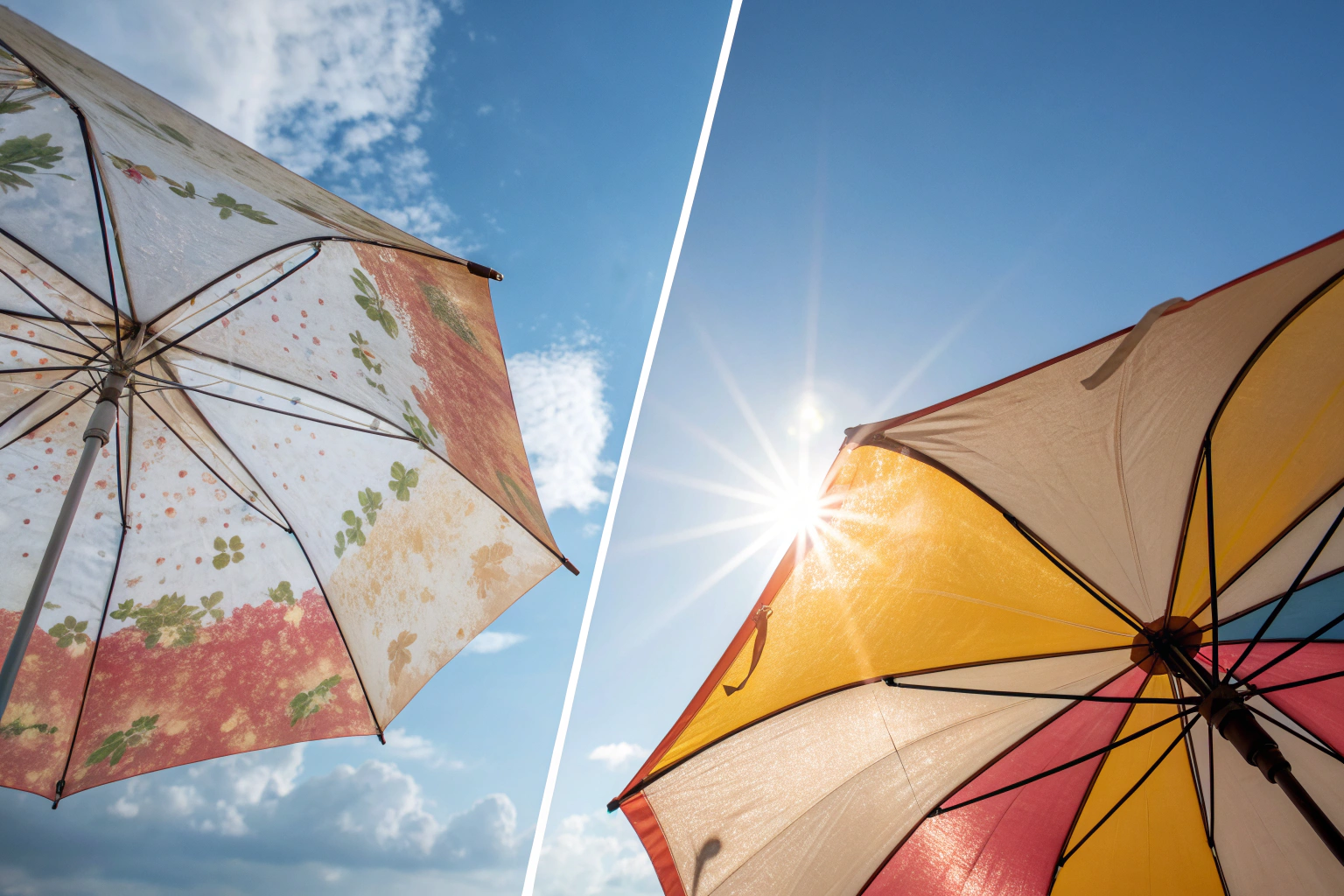
You've spent weeks perfecting your brand's signature color—a specific shade of teal that defines your identity. You provide the Pantone number to your factory, but when the first sample arrives, the color is off. It looks too green under office lights, too blue in the sun. This mismatch can delay your launch, inflate sample costs, and compromise your brand's visual consistency. In the world of custom manufacturing, especially for accessories like scarves, hats, and bags, color accuracy is non-negotiable. So, how do you bridge the gap between the color swatch in your hand and the dyed fabric or painted component on your product?
Ensuring custom colors match the Pantone Matching System (PMS) requires a disciplined, multi-step process that combines clear communication, physical reference standards, and systematic factory verification. It is not enough to simply email a Pantone number. You must provide physical Pantone swatches (from the relevant material guide), approve lab dip or strike-off samples under controlled lighting, and establish a tolerance range for acceptable variation. The process demands collaboration with a manufacturer that has a calibrated color management workflow, from spectrophotometer analysis to trained human eye assessment under a light box. Success hinges on treating color not as a suggestion, but as a critical technical specification.
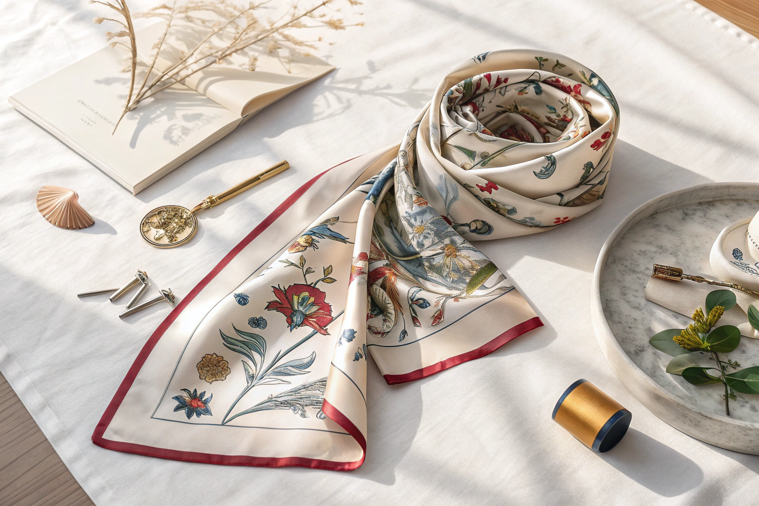
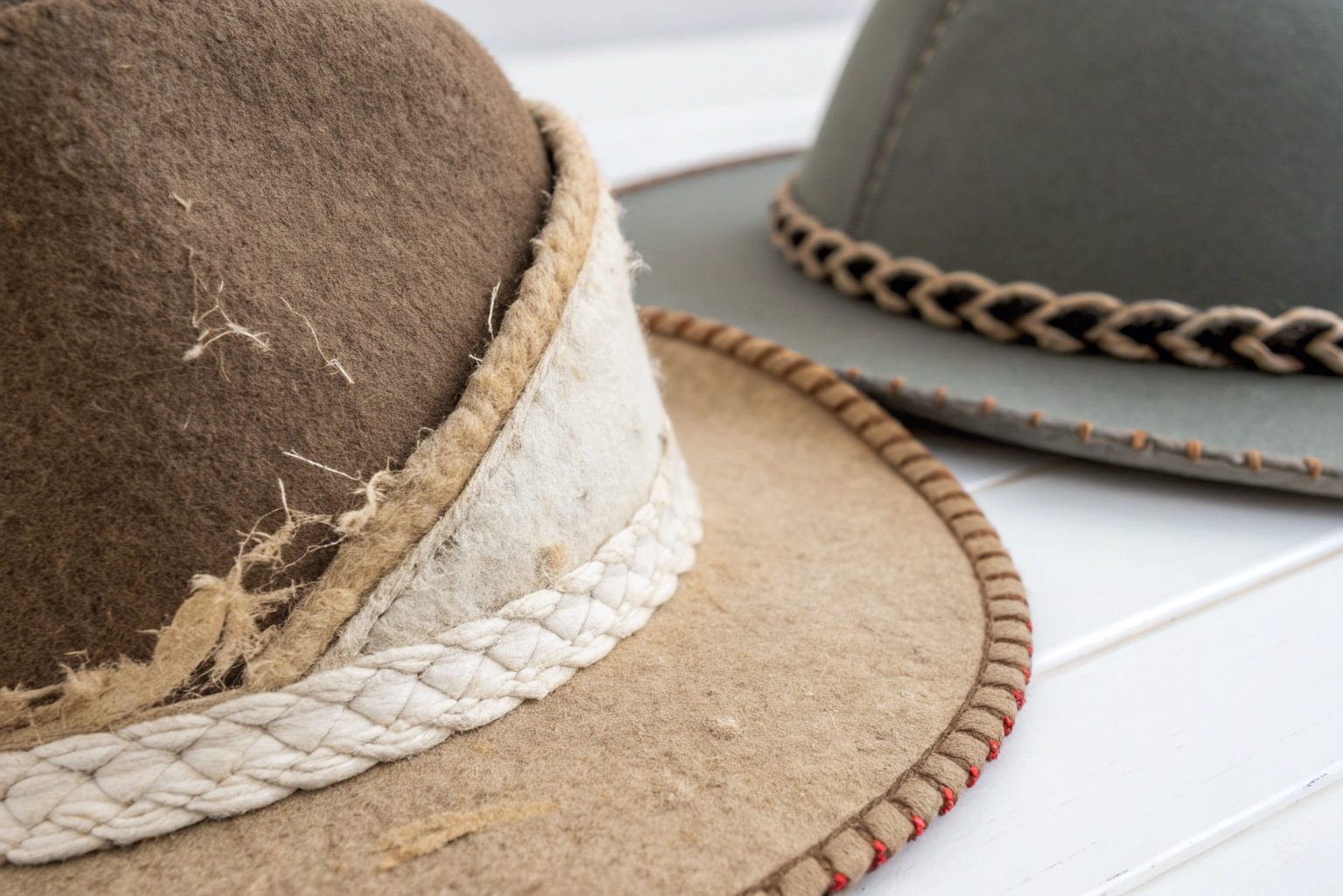
This challenge is compounded by different materials absorbing dye differently. The same Pantone color will look distinct on silk twill, polyester fleece, cotton canvas, and plastic trim. Therefore, the process must be adapted for each substrate in your accessory line. The following guide outlines the professional workflow used by top brands and manufacturers to achieve consistent, accurate color reproduction across all custom products.
Why is Relying on Digital Pantone Values a Common Mistake?
The most frequent and costly error in color specification is assuming that a Pantone number viewed on a computer screen will translate accurately to physical production. Digital displays (RGB) and printing/ dyeing (CMYK, spot colors, or dyes) are fundamentally different color systems. A monitor's color is emitted light, while a product's color is reflected pigment or dye. This inherent difference makes on-screen Pantone libraries unreliable for manufacturing specifications.
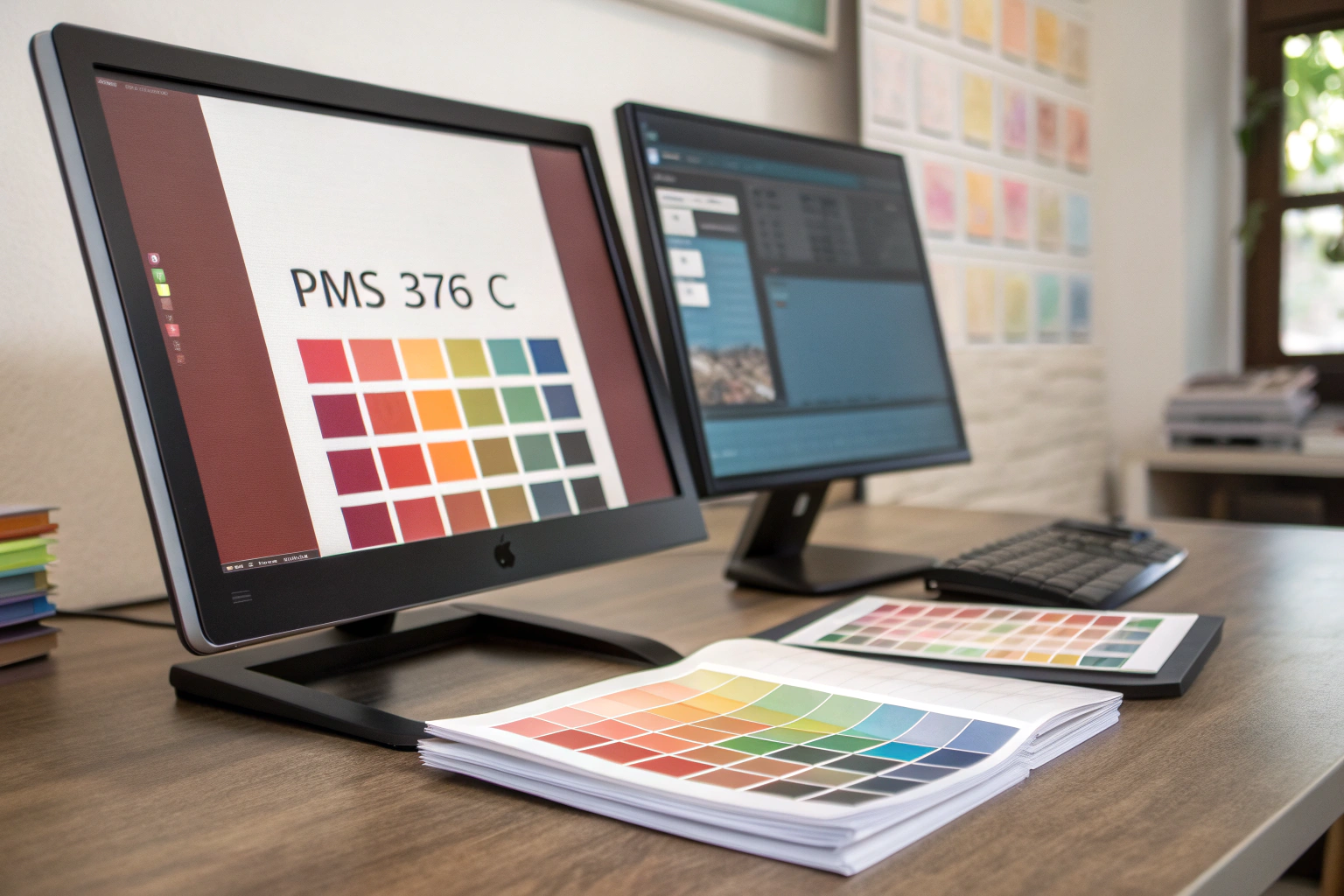
Digital files are useful for initial design but should never be the sole color reference. Screen calibration varies wildly between devices, and software like Adobe Illustrator uses built-in Pantone libraries that are approximations. The color you see can shift based on your monitor's age, settings, and ambient light. Sending a factory a JPEG with a Pantone color fill or simply stating "PMS 376 C" in an email without a physical standard invites interpretation and error. The factory's graphic department will have their own monitor with its own calibration, leading to a different starting point for their color matching efforts. This digital disconnect is the root cause of many "the color is wrong" disputes.
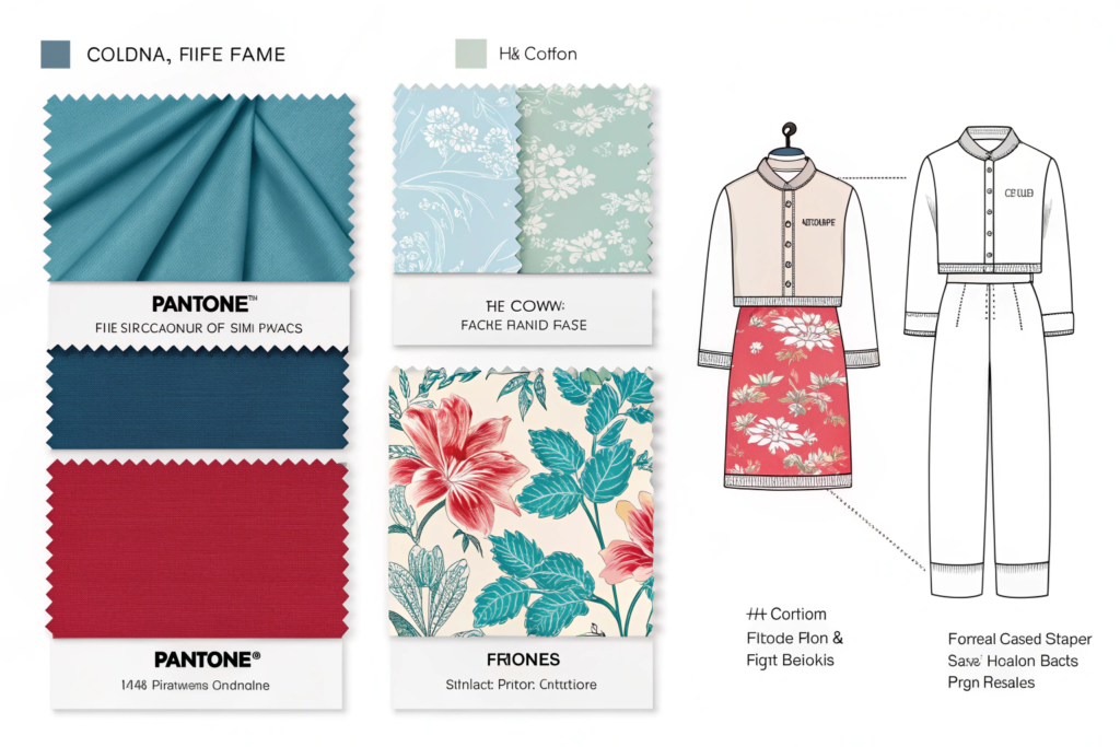
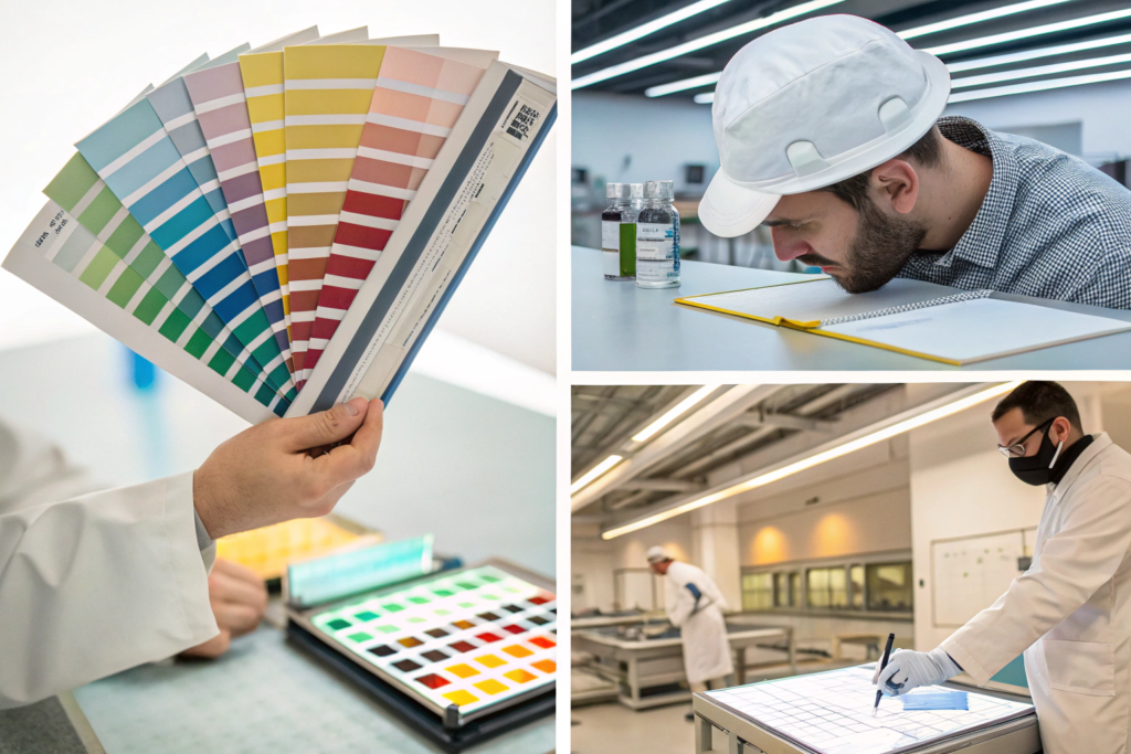
The only authoritative source for color specification is the physical Pantone swatch book. Pantone produces specific guides for different applications: Pantone Fashion, Home + Interiors (FHI) for textiles and plastics, and Pantone Graphics for print and packaging. For accessory manufacturing, the FHI Cotton Swatch Book or FHI Polyester Swatch Book are essential tools. You must purchase the current edition, as colors fade and new editions are released periodically. When you specify a color, you are contractually specifying the color as it appears in the current, physical Pantone guide under standardized D65 daylight. This removes ambiguity and provides a tangible target for the factory's lab to hit. A professional partner like Shanghai Fumao Clothing will request and expect these physical standards as part of a tech pack.
What is the difference between Pantone guides for print and textiles?
The two main systems serve entirely different industries and materials:
- Pantone Graphics/CMYK Guides: These are for ink on paper. They use a defined mix of 13 base inks to achieve colors. A "PMS 185 C" in a graphics guide is a formula for opaque ink.
- Pantone Fashion, Home + Interiors (FHI) Guides: These are for dyes on materials like fabric, yarn, plastic, and coatings. The colors are achieved by dye formulas, not ink mixes. An "FHI 19-1664 TPX" (Teak Rose) is dyed onto actual fabric swatches (cotton or polyester) in the book.
Using a print guide to specify dye color is a fundamental error. You must use the FHI guide relevant to your base material (e.g., cotton for a tote bag, polyester for a performance scarf) to have any hope of an accurate match.
How does screen calibration affect perceived color?
Screen calibration adjusts your monitor to display colors as accurately as possible against a known standard. An uncalibrated screen may show a Pantone color as brighter, duller, warmer, or cooler than its true physical counterpart. Professional designers use hardware calibrators (like those from X-Rite or Datacolor) to create a color profile for their monitors. However, even a perfectly calibrated screen is still showing an RGB simulation of a reflective color. It is a guide, not a gospel. The final authority must always be the physical swatch under controlled light. Assuming your factory's screens are calibrated to the same standard as yours is a risk no professional supply chain should take.
What is the Step-by-Step Color Approval Process?
Achieving a perfect color match is a process, not a single event. A professional factory will follow a standardized sequence from specification to bulk production approval. Skipping steps to save time inevitably leads to costly re-dos and delays.
The process follows these critical stages:
- Provide Physical Standard: Submit the actual Pantone FHI swatch (cut from the book if possible) with your tech pack. Do not just give the number.
- Lab Dip/Strike-Off Submission: The factory's dye lab will produce small samples of your material dyed to match your standard. For fabrics, these are called lab dips. For prints, a small printed sample is called a strike-off. They should provide 2-3 options showing slight variations (e.g., one with more yellow, one with more blue) for you to choose the closest match.
- Evaluation Under a Light Box: You must evaluate these submissions under a standardized light box that simulates different light sources: D65 (Daylight), TL84 (Office Fluorescent), and Horizon (Incandescent). This is called metamerism testing. A color that matches under daylight but shifts under store lighting is unacceptable. Compare the lab dip directly against your Pantone swatch.
- Approval or Comments: Mark the preferred dip with clear comments ("Option B is closest, but please reduce red tone by 5%"). Use a Lab Dip Approval Form to document your feedback officially.
- Second Dip and Final Approval: The factory will adjust and send a second submission. Repeat the light box evaluation. Only when you are fully satisfied do you sign off on the approved master lab dip. This physical sample becomes the new binding standard for all bulk production.
- Bulk Lot Approval (Pre-Production Sample): When bulk fabric is dyed, the factory should send a cutting from the beginning, middle, and end of the dye lot for your approval against the master lab dip before they cut and sew. This ensures consistency across the entire production run.
Throughout this process, clear communication is key. Use objective language and reference the Pantone number and your internal color code on all documents. A manufacturer with a dedicated color management team and spectrophotometer will provide CIELab delta E (ΔE) readings with their lab dips—a numerical value representing the difference from your standard. A ΔE of less than 2.0 is typically considered an excellent commercial match. Understanding and using this data moves the conversation from subjective ("it looks off") to objective ("the ΔE is 3.5, we need to reduce the b* value").
What is a lab dip and why is it the first critical checkpoint?
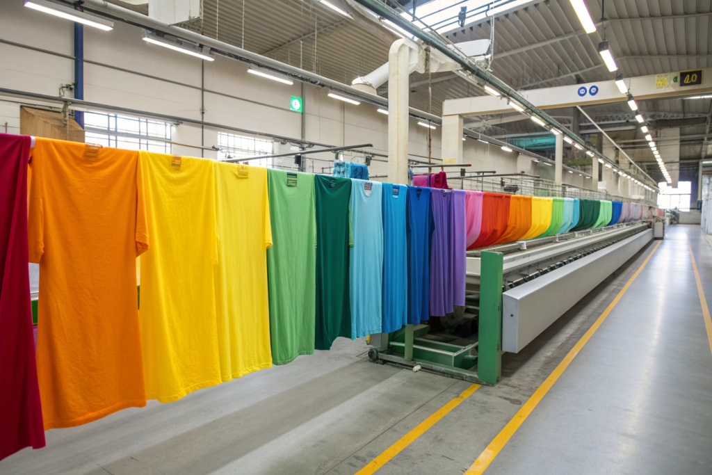
A lab dip is a small swatch of your actual production fabric, hand-dyed in the factory's laboratory to match your provided color standard. It is the first physical manifestation of your color specification and the most important checkpoint before bulk dyeing. The lab uses it to fine-tune the dye recipe—testing concentrations, dye types, and processing times. Approving a lab dip means you are approving the dye formula itself. Once approved, that exact formula is used to dye thousands of meters of fabric. Rejecting color after bulk dyeing is catastrophic in terms of cost and time. Therefore, investing patience and precision in the lab dip stage is the single most effective way to ensure final color accuracy.
How do you properly evaluate a lab dip under different lights?
You must evaluate in a controlled environment using a professional light box. The process is:
- Place your Pantone swatch and the lab dip sample side-by-side in the light box.
- View them first under D65 Daylight. This is the primary standard. Note the match.
- Switch to TL84 (Store Lighting). Observe if the colors still match or if one shifts (e.g., the lab dip turns greener). This is a test for metamerism.
- Switch to Horizon (Warm Indoor Light). Check again.
- Also view them at a 45-degree angle to check for any cast or sheen differences.
The colors should match closely under all three illuminants. If they match under daylight but diverge under store light, the dye recipe must be corrected, as this is where the product will be seen and sold. Document any shift with precise language for the factory.
How Do Material and Dye Type Affect Color Matching?
The substrate (base material) is not a neutral canvas; it actively participates in the final color. The same Pantone color will appear different on natural fibers (cotton, silk, wool) versus synthetic fibers (polyester, nylon, acrylic) due to how their molecular structures accept and reflect dyes. This makes matching across mixed materials in one product (e.g., a cotton hat with a polyester embroidered logo) a particular challenge.
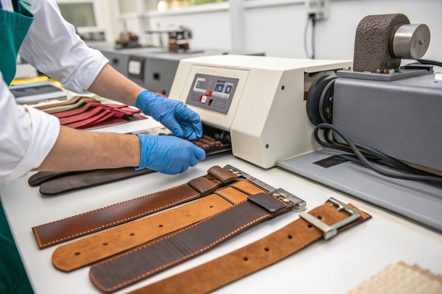
Dye chemistry is specific to fiber type. Reactive dyes are used for cellulose fibers (cotton, linen), acid dyes for protein fibers (wool, silk), and disperse dyes for synthetics (polyester). Each dye class has a different color gamut—the range of colors it can produce. A vibrant neon achievable on polyester with disperse dyes may be impossible to replicate exactly on cotton with reactive dyes. Your manufacturer should advise you during the design phase if your chosen Pantone is problematic for your chosen material. They may suggest a similar, more achievable shade or a different fabric blend. For trims and hard components (like plastic buckles or metal zippers), the process involves color matching for plastics or electroplating/anodizing for metals, which are entirely separate technologies from textile dyeing.
The finish and weave of the fabric also play a role. A matte fabric will absorb light differently than a glossy one. A tight weave will present color more solidly than a loose, textured knit. This is why it's imperative to do lab dips on the exact production fabric, not a similar substitute. Furthermore, discuss colorfastness requirements with your factory. A color may match perfectly when first dyed but then fade unevenly with washing or sunlight exposure. Specify and test for wash fastness, light fastness, and crocking (rub fastness) to ensure the beautiful color you approve stays beautiful for the life of the product.
Why does the same Pantone look different on cotton vs. polyester?
The fundamental reason is fiber chemistry and dye interaction. Cotton, a natural cellulose fiber, is dyed with reactive dyes that form a covalent chemical bond with the fiber. Polyester, a synthetic polymer, is dyed with disperse dyes that work by dissolving into the fiber under high heat. These two processes start from different chemical bases and produce different refractive indices. Even if a spectrophotometer reads the same CIELab values, the human eye can perceive a difference in depth, brightness, or undertone because of the way light interacts with the dyed fiber's surface. The Pantone FHI system accounts for this by providing separate swatch books for cotton and polyester. You should match to the book that corresponds to your primary material.
How do you manage color across different material components?
For a product with multiple materials (e.g., a backpack with nylon fabric, polyester webbing, and plastic hardware), a unified color standard is needed. The strategy is:
- Designate a Master Material: Usually the main fabric. Get a perfect lab dip approved for this.
- Cross-Material Matching: Use the approved master lab dip as the standard for all other components. The factory's trim suppliers must match their plastic, paint, or thread to the physical fabric swatch, not the original Pantone paper.
- Submit Full Component Kit: Before bulk production of all parts, request a component color kit containing samples of all materials in the color. Lay them out together under a light box to ensure visual harmony. They may not be spectrophotometrically identical, but they should appear as a cohesive set to the eye under various lighting conditions.
This approach ensures the final assembled product looks consistent, even if the absolute color values differ slightly between materials.
What Role Does Factory Capability and Communication Play?
The most meticulous specification is useless without a factory that has the technical infrastructure, skilled personnel, and cultural commitment to execute it. Color matching is both a science and an art, requiring investment in technology and training.
Assess a factory's color capability by asking key questions: Do they have an in-house dye lab or a trusted partner lab? Do they use a spectrophotometer and provide ΔE (Delta E) reports? Do their QC personnel have light boxes and are they trained in visual color assessment? Do they understand and test for metamerism? A professional factory will have a dedicated colorist or lab technician responsible for this process. They should proactively manage the workflow, sending lab dips on schedule and flagging potential issues early—like informing you that your chosen Pantone has poor wash fastness on the desired fabric.
Communication protocols are vital. All color-related communication should reference Pantone numbers, internal style numbers, and lab dip submission codes. Use a standardized approval form that includes checkboxes for light sources and space for clear comments. Photos are helpful but deceptive due to white balance issues; they should supplement, not replace, physical evaluation. Establish a single point of contact for color approvals on both sides to prevent mixed messages. A manufacturer like Shanghai Fumao Clothing, which integrates these systems, acts as a partner in color integrity, not just an order taker. Their expertise can guide you to make better, more producible color choices from the outset.

What equipment should a qualified factory have for color management?
A minimum set of professional equipment includes:
- Spectrophotometer: For measuring color and generating objective CIELab and ΔE data.
- Standard Light Box (D65, TL84, Horizon, UV): For visual assessment under controlled, standardized lighting.
- Computer Color Matching (CCM) System: Software that uses spectrophotometer data to calculate dye recipes.
- Lab Dyeing Equipment: Small-scale beakers, dye pots, and ovens to produce lab dips accurately.
- Color Fastness Testing Equipment: For wash, light, and rub tests.
The presence of this equipment demonstrates an investment in getting color right and provides the tools needed for a data-driven, repeatable process.
How to set a reasonable color tolerance with your supplier?
Perfect matches are rare in industrial dyeing. You must agree on a commercial tolerance with your factory. This is typically defined using the Delta E (ΔE) value from a spectrophotometer.
- ΔE < 1.0: Imperceptible to the human eye. Very difficult to achieve consistently in bulk.
- ΔE 1.0 - 2.0: Excellent match. The standard for most high-quality fashion goods.
- ΔE 2.0 - 3.5: Acceptable match for many applications. The difference may be perceptible upon very close side-by-side comparison but not when viewed separately.
- ΔE > 3.5: Generally unacceptable, as the difference is clearly visible.
Agree on a maximum ΔE (e.g., 2.5) for bulk approval. Also, define visual pass/fail criteria for metamerism (e.g., "no visible shift under TL84 lighting"). Document this in your quality agreement to provide clear, objective criteria for accepting or rejecting production.
Conclusion
Ensuring custom colors match the Pantone chart is a disciplined, collaborative science that removes guesswork and subjectivity from the manufacturing process. It begins with the fundamental step of providing a physical Pantone swatch from the correct guide and progresses through a structured sequence of lab dips, metamerism testing, and final bulk validation. Success depends on understanding the impact of material choice and dye chemistry, and partnering with a factory that has the technical capability and procedural rigor to execute a color-managed workflow.
By implementing this professional approach, you transform color from a recurring source of anxiety into a reliable, consistent brand asset. It empowers you to launch collections with confidence, maintain visual integrity across seasons and product categories, and build a reputation for quality that customers can see.
If you are developing custom-colored accessories and seek a manufacturing partner with the expertise and systems to deliver perfect color every time, we are here to help. At Shanghai Fumao Clothing, our integrated color lab and meticulous approval process are designed to ensure your brand's colors are reproduced with precision and consistency, from the first lab dip to the last item in the shipment. Let's bring your vision to life in true color. Contact our Business Director, Elaine, to start your project: elaine@fumaoclothing.com.