You've curated a beautiful collection of accessories—scarves, hats, bags, belts—but when they're displayed online or in-store, they feel disconnected, like a group of strangers. The customer's eye doesn't know where to land, and the brand story gets lost. In a crowded market, a disjointed presentation can mean the difference between a customer building a full outfit in their cart and clicking away. So, how do you transform individual items into a compelling, unified collection that tells a clear story and drives multiple sales?
To create a cohesive look for fashion accessories, you must establish and consistently apply a unifying theme across three core pillars: a defined color palette, complementary material and texture stories, and a consistent design language or motif. This strategic alignment should be evident in product design, photography, packaging, and merchandising, guiding the customer to see items as part of a harmonious collection rather than isolated pieces. Cohesion simplifies the customer's decision-making, encourages bundle purchases, and strengthens overall brand identity.
Achieving this cohesion is a deliberate process that begins long before production and extends through every customer touchpoint. It's about creating a visual and tactile vocabulary for your brand. Let's break down the actionable steps to build a collection where every accessory feels intentionally connected, enhancing the appeal and perceived value of each individual item.
How to Define a Unifying Color Palette and Theme?
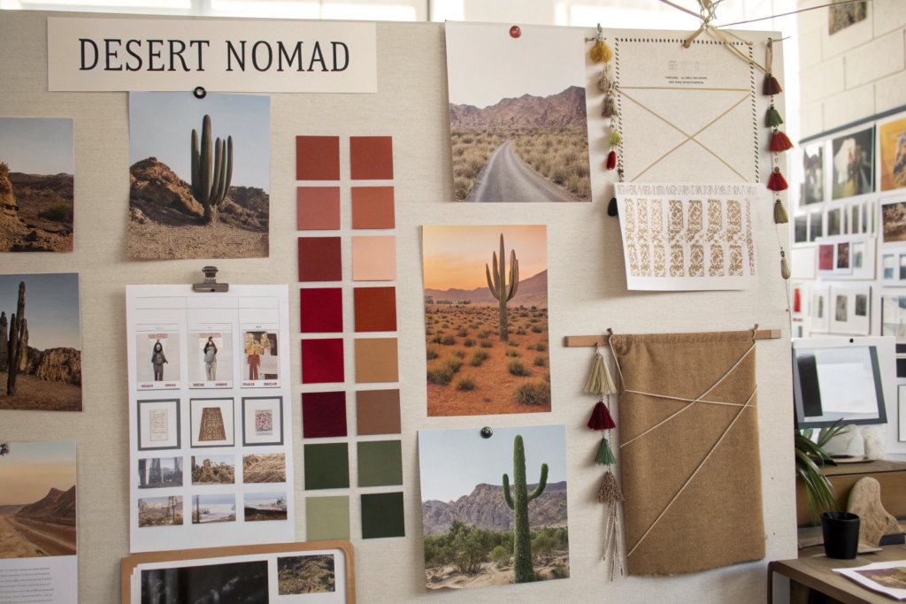
The foundation of any cohesive collection is a carefully curated color palette and a clear, overarching theme. This is the "mood board" stage made tangible, providing a rulebook that every subsequent design decision must follow.
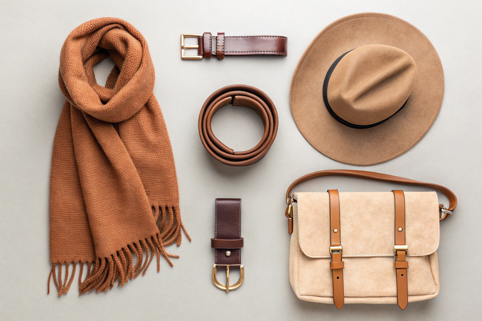
Start by defining a core color story. This isn't just 2-3 colors, but a spectrum. It typically includes: 2-3 Core Neutrals (e.g., sandstone, charcoal, oat) that form the base, 2-3 Primary Colors that define the season's mood (e.g., terracotta, olive, slate blue), and 1-2 Accent Colors for pop (e.g., mustard, rust). The theme provides the narrative—is it "Coastal Heritage," "Urban Utility," or "Modern Romance"? The theme guides not just color, but also material choices (e.g., waxed canvas for utility, silk for romance) and design details. This upfront creative direction ensures that a scarf, a bag, and a hat all speak the same visual language.
What is the role of a seasonal color story in cohesion?
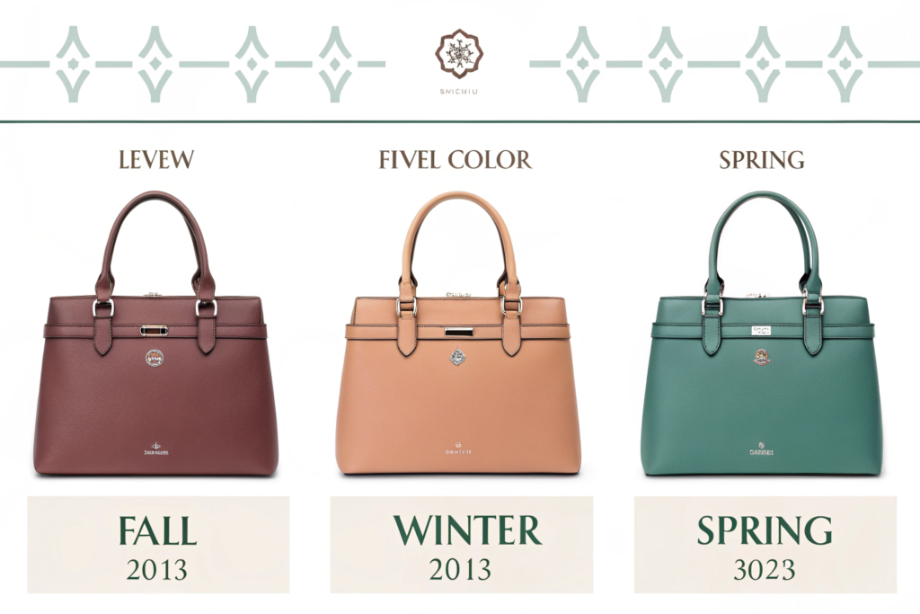
A seasonal color story is the most effective tool for creating urgency and cohesion. It allows customers to immediately identify which items belong together for that specific season or launch. For example, a Fall collection might revolve around "Burnt Earth" tones, while a Spring collection uses "Pastel Skies." This doesn't mean every item is the same color, but that they all exist within the defined palette. A customer should be able to pick any bag and any scarf from the same season and feel confident they match. This strategic use of color, developed in collaboration with a factory's R&D team for perfect dye matching, is a core driver of the versatile design that allows for easy mixing and matching.
How can a motif or pattern create visual continuity?
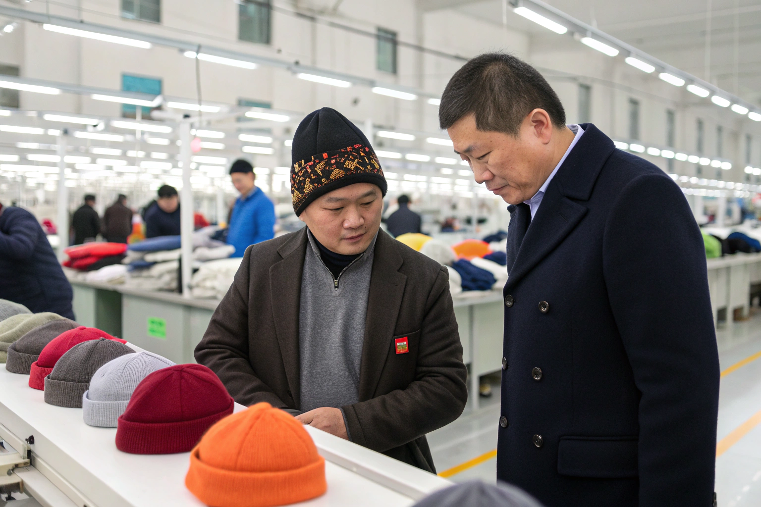
A recurring design motif is a powerful cohesive tool. This could be a specific shape (like a curved geometric clasp), a pattern (a subtle stripe or check woven into different fabrics), a logo application method (always a woven leather patch), or a signature hardware finish (brushed brass). For instance, if your theme is "Botanical Garden," a delicate leaf-shaped buckle might appear on belts, bag clasps, and as an earring finding. This repetition creates a recognizable signature and a subconscious link between disparate product categories. When sourcing from a partner like Shanghai Fumao Clothing, ensuring this motif is consistently applied across different product types requires precise technical specifications and close quality control.
How Do Materials and Textures Build a Tactile Story?
Color attracts the eye, but texture invites touch and builds depth. A cohesive collection considers the hand-feel and visual texture of materials, creating a harmonious sensory experience.
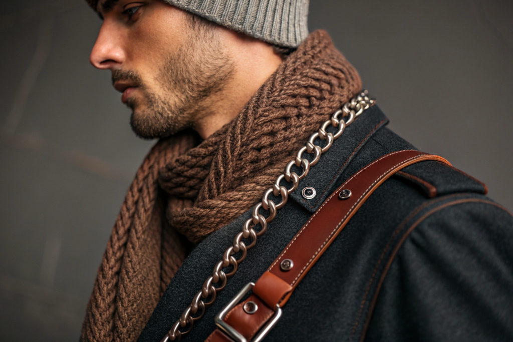
Think in terms of material families. A collection might focus on natural and organic materials: soft wool, nubby linen, smooth leather, and woven straw. Another might embrace technical and sleek materials: recycled nylon, neoprene, and matte silicone. The key is to avoid jarring clashes—a rustic, hand-loomed scarf will feel out of place next to a glossy patent leather belt unless the contrast is intentionally part of the theme. Furthermore, consider finishes—whether materials are matte, glossy, brushed, or distressed—and keep these consistent. A collection with a "vintage explorer" theme might use waxed canvas, oil-tanned leather, and brushed brass, all sharing a subdued, matte finish.
Why is balancing matte, glossy, and textured finishes important?
Finish balance prevents a collection from looking flat or chaotic. A good rule is to choose a dominant finish (e.g., 70% matte), a secondary finish (e.g., 25% natural sheen like silk or polished cotton), and a small accent finish (e.g., 5% high-shine, like metallic thread or lacquer). This creates visual interest without sacrificing unity. For example, a bag might be made of matte nylon, but have glossy metal zipper pulls and a textured woven label. This layered approach to finishes adds sophistication and is a mark of thoughtful product development, where every component is selected to contribute to the whole.
How can hardware and trims unify different accessories?
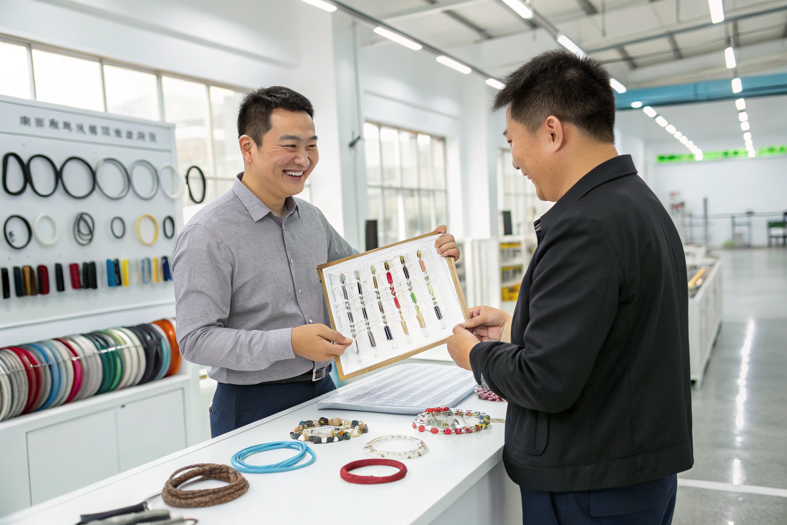
Hardware and trims are the "jewelry" of accessories and a crucial unifying element. Standardizing the metal finish across all products—be it antique brass, nickel, or black oxide—is one of the simplest yet most effective ways to create cohesion. The shape and style of buckles, zipper pulls, D-rings, and buttons should also follow a common design language (e.g., all rounded and soft, or all angular and industrial). Sourcing these components from the same supplier batch ensures color and finish consistency, a detail that factories with strong supply chain management excel at, ensuring your buckle matches your bag's D-ring perfectly.
How Does Styling and Photography Communicate Cohesion?
Your products may be perfectly coordinated, but if your photography and styling tell different stories, the cohesion is lost on the customer. Visual merchandising, both online and offline, is where your theme comes to life.
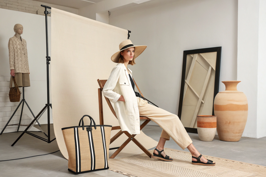
Lifestyle photography should place accessories together in curated, on-theme settings that reinforce the narrative. A "Mountain Lodge" collection should be shot in cozy, natural-light interiors with layered textures, not on a sterile white background. Product flat lays should group items from the collection, demonstrating how they work together. Consistently use the same models, lighting style, and background tones across a campaign. On an e-commerce product page, use "Styled With" or "Complete The Look" widgets to visually suggest complementary items, directly encouraging higher average order values.
What is the "hero piece" and "supporting cast" strategy?
Every cohesive collection benefits from defining a hero piece—a statement item that embodies the theme most strongly (e.g., an intricately embroidered jacket or a uniquely shaped bag). The supporting cast includes more versatile, everyday items (a solid scarf, a simple belt, a classic hat) that complement the hero. In styling and merchandising, you lead with the hero to capture attention, then show how the supporting pieces complete the look. This strategy guides customers through the collection, offering both aspiration (the hero) and accessible entry points (the basics), all while maintaining a unified aesthetic.
How important is packaging in the cohesive experience?
Packaging is the final touchpoint of your cohesive story. It should not be an afterthought. Use packaging materials, colors, and branding that reflect your collection's theme. A collection with an eco-conscious theme should use recycled paper, minimal ink, and natural twine. A luxe collection might use heavy-weight boxes with foil stamping in the collection's accent color. Consistent packaging across all items reinforces brand identity and makes the unboxing experience feel considered and premium, turning a simple transaction into a memorable brand moment that supports the durable and vintage aesthetic or any other theme you've built.
How to Maintain Cohesion Across Product Categories and Seasons?
Cohesion isn't just for a single launch; it's the thread that connects your entire brand over time. Maintaining a recognizable DNA while introducing seasonal novelty is the ultimate challenge.
This is achieved through brand pillars—consistent elements that never change, such as your core logo application, a signature material (like always using vegetable-tanned leather), or an unwavering commitment to a certain level of craftsmanship. Each season, you introduce new colors, new secondary materials, and new motifs that align with the seasonal theme, but they are applied within the framework of your unchanging brand pillars. This allows loyal customers to always recognize your brand's hand, while being excited by the new offering.
What is the role of a capsule collection in brand cohesion?
A capsule collection is a focused, limited set of items (e.g., 5-8 SKUs) designed to be mixed and matched perfectly. It is the purest expression of cohesion and serves as an entry point for new customers. By offering a small, perfectly coordinated set, you remove all guesswork. The success of a capsule relies on impeccable execution of color, material, and silhouette harmony. It also serves as a brand manifesto, clearly communicating your aesthetic and quality. Developing a successful capsule requires close collaboration with a factory that has strong development capability to ensure the vision is translated flawlessly from sketch to sample to production.
How do you gather feedback to refine cohesive strategies?
Use data and direct feedback. Analyze sales data to see which items are frequently purchased together—this reveals what your customers naturally see as cohesive. Conduct customer surveys or focus groups on new collections, asking specific questions about perceived unity and style. Monitor social media to see how customers are styling your pieces together in real life. This feedback loop is essential for understanding if your cohesive vision resonates in the market and informs future product development and thematic choices, ensuring your brand remains both distinctive and commercially relevant.
Conclusion
Creating a cohesive look for fashion accessories is a strategic discipline that blends artistry with meticulous planning. It transforms a group of products into a desirable lifestyle, guiding the customer through a curated experience that builds brand loyalty and drives sales.
By mastering the alignment of color, material, design language, and presentation, you build a world around your accessories—a world customers want to be part of. In an oversaturated market, this clarity and consistency are not just aesthetic choices; they are powerful commercial tools that define your brand's position and promise.
If you are looking to develop a cohesive, market-ready accessory collection with a strong thematic identity, partnering with a manufacturer that understands this holistic approach is vital. We specialize in guiding brands from concept to cohesive collection, ensuring every detail supports a unified vision. To begin planning your next integrated line, contact our Business Director Elaine. She can facilitate a workshop with our design and product teams. Email: elaine@fumaoclothing.com.