You're a brand owner with a great eye. You've sourced a beautiful hat, a stunning scarf, and a cool belt. Individually, each piece is a winner. But when you place them together in your store or on your website, something feels off. They don't "talk" to each other. You're worried that your customers see a random assortment of items, not a strong, confident brand point of view. This lack of cohesion can weaken your brand identity and make it harder to sell multiple items to a single customer.
To create a cohesive collection of accessories, you must build it around a central, unifying "story." This story is defined by three key pillars: a strict color palette, a consistent theme or mood, and a curated selection of complementary materials. A collection is not a random group of nice things; it's a deliberate, edited narrative that tells your customer who you are.
As the owner of Shanghai Fumao Clothing, I've worked with hundreds of brands, from small boutiques to major retailers. The most successful ones are masters of cohesion. They understand that a strong collection makes their marketing easier, their merchandising more impactful, and their brand more memorable. It transforms them from a simple reseller into a true curator. Let's walk through the essential steps to building a collection that feels deliberate, professional, and irresistible.
How Do I Build a Foundational Color Palette?
You love color, and you're drawn to a vibrant yellow hat, a pastel blue scarf, and a neon pink belt. The thought of limiting your choices feels restrictive. You're worried that a strict color palette will be boring or that you'll miss out on a popular, trendy color.
This is the single most common mistake I see. A cohesive collection does not mean a boring one. It means a disciplined one. The foundation of any great collection is a tightly edited color palette. The "Rule of Five" is a great starting point:
- Choose 2-3 Core Neutrals: These are the versatile base colors of your collection (e.g., black, navy, cream, grey, beige).
- Choose 1-2 Accent Colors: These are your seasonal, trend-driven, or signature brand colors (e.g., a fiery red, an emerald green, a soft lilac).
Every single item in your collection must adhere to this palette. This ensures that no matter which hat a customer picks up, it will coordinate beautifully with a scarf or a pair of gloves from the same collection. This discipline is what creates harmony.
At our factory, the color palette is the first thing we finalize with a client. We dye yarn and fabrics to precise Pantone shades to guarantee that the "burgundy" in the hat is the exact same burgundy in the scarf. This level of control is impossible when sourcing from multiple suppliers. A strict color palette is the anchor of your collection's story and the first step toward a powerful visual theme.

Where do I find color inspiration?
Look at trend forecasting services like WGSN or browse the Pantone Color of the Year announcements. But also, look for inspiration in nature, art, or travel. A collection could be based on the colors of a desert sunset (terracotta, sand, deep purple) or a coastal village in Italy (lemon yellow, sea blue, crisp white). A strong inspiration point makes your color story more authentic and compelling.
How does a color palette help with sales?
A tight color palette makes it incredibly easy to upsell and cross-sell. When a customer buys a navy blue hat, you can confidently show them the perfectly matching navy blue gloves. You can create "Shop the Look" sections on your website and merchandise items together in your store. It encourages customers to think in terms of outfits, not just individual items, which naturally increases your average order value.
How Do I Define a Collection's Theme and Mood?
You have your colors, but what's the overall vibe? Are you selling to a bohemian free spirit, a polished urban professional, or a rugged outdoor adventurer? You're worried that if you try to be everything to everyone, your collection will end up having no clear personality at all.
Your collection needs a theme, a mood, a "North Star" that guides every design choice. This theme is the emotional core of your story. Is your collection...
- Urban Minimalist? Think clean lines, structural shapes, neutral colors, and a "less is more" philosophy.
- Cozy & Rustic? Think chunky knits, natural textures, earthy tones, and a feeling of warmth and comfort.
- Vintage-Inspired Romance? Think delicate details, soft florals, lace or pearl embellishments, and a nostalgic, feminine feel.
- Bold & Playful? Think bright colors, quirky patterns, and a fun, energetic, and youthful spirit.
Once you choose a theme, every accessory must fit within it. A delicate, pearl-embellished headband does not belong in a "Rugged Outdoor" collection.
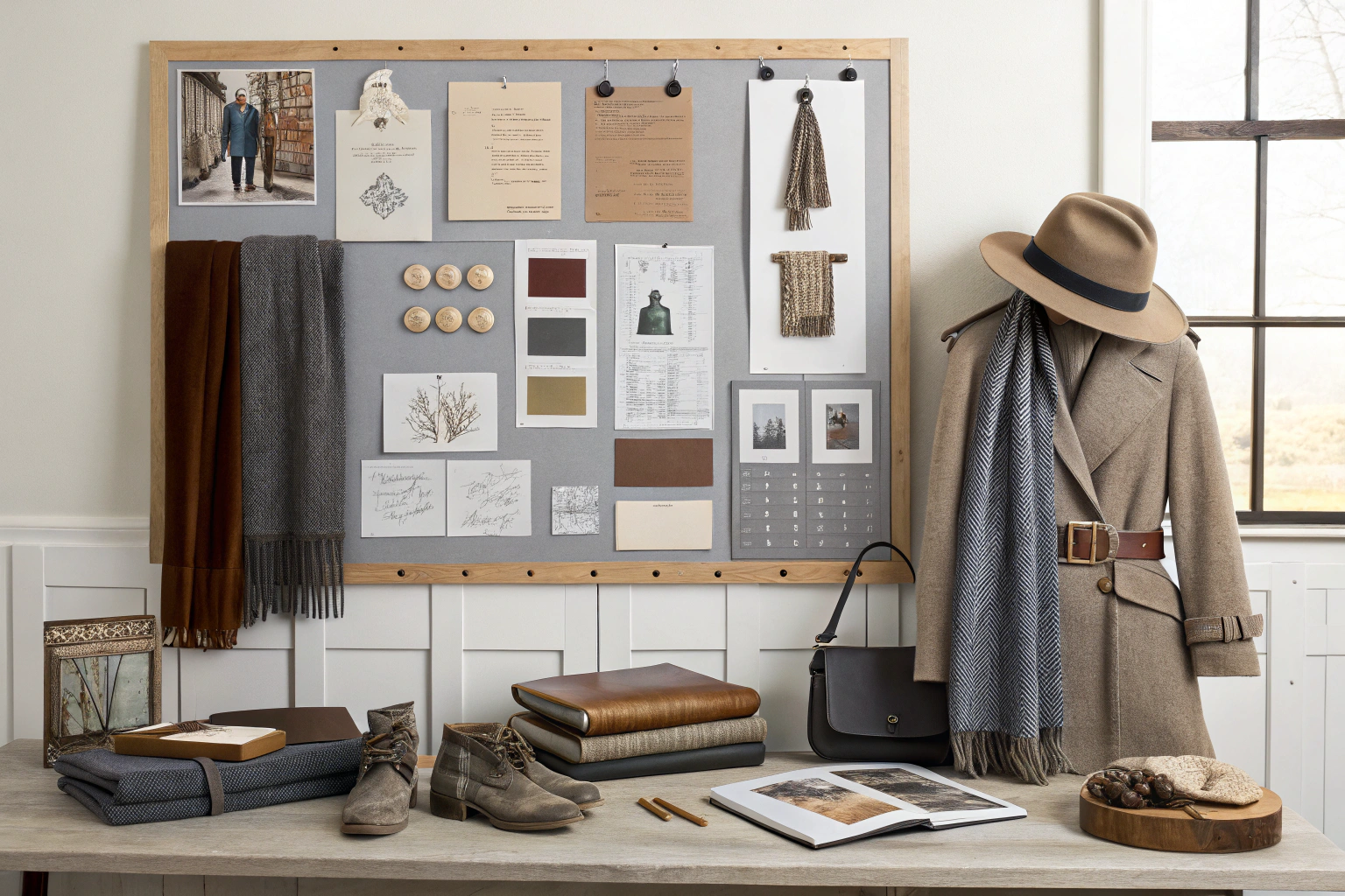
Creating a physical or digital mood board is an essential step in this process. It's a tool we use constantly at AceAccessory to align with our clients on a collection's vision. We gather images, textures, and keywords that capture the desired mood. This visual guide ensures that everyone, from the designer to the factory floor, understands the story we are trying to tell. A strong theme is the creative filter through which you must pass every product idea.
![]()
How specific should my theme be?
The more specific, the better. "Winter Accessories" is not a theme; it's a category. "Apres-Ski Chic: Cozy Knits for the Mountain Lodge" is a theme. It immediately brings to mind specific images, materials, and styles (chunky beanies, fair isle patterns, warm scarves). A specific theme makes your design choices easier and your marketing story much stronger.
Can I have more than one theme per season?
Yes, but they should be presented as distinct "capsule collections." You could have a "Workday Essentials" capsule of professional, polished accessories and a separate "Weekend Getaway" capsule of more casual, relaxed pieces. The key is to keep them clearly separated in your marketing and merchandising so you are presenting two clear stories, not one confusing one.
How Do I Choose Complementary Materials and Textures?
Your theme is "Cozy & Rustic," and you've chosen an earthy color palette. But you're being offered materials ranging from shiny satin to rugged leather. You're worried that a jarring choice of material could undermine your entire theme, even if the color is right.
Material and texture are just as important as color in telling your collection's story. The tactile quality of a product evokes a powerful emotional response. Your material choices must align with your theme.
- For an Urban Minimalist collection, you might use smooth leather, sleek neoprene, and fine-gauge cashmere or merino wool.
- For a Cozy & Rustic collection, you would choose chunky wool knits, soft flannel, sherpa fleece, and antiqued metal hardware.
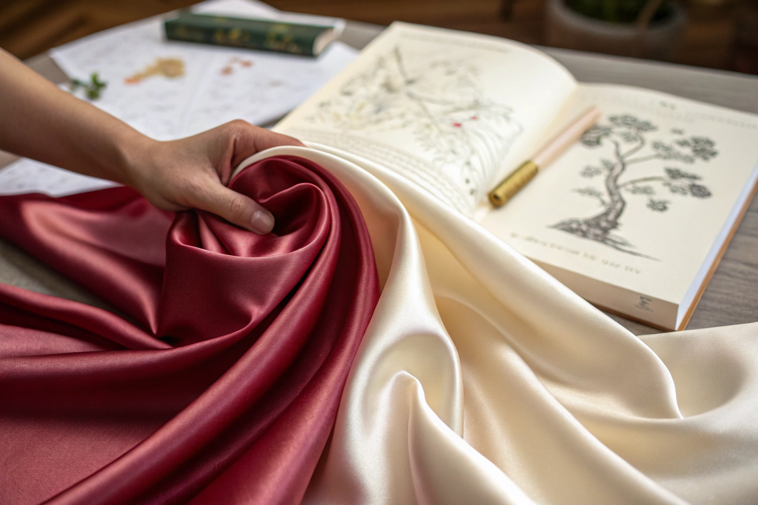
- For a Romantic collection, you'd lean into satin, velvet, delicate lace, and polished pearl or gold-tone details.
Mixing textures is great, but they must feel like they belong to the same family. A chunky wool scarf and a pair of smooth leather gloves can coexist beautifully in a rustic collection. A satin scrunchie and a sherpa-lined bucket hat probably cannot.
As a manufacturer, we have access to a vast library of materials. A key part of our collaborative process is helping clients select a family of fabrics and hardware that reinforces their chosen theme. We might suggest using the same leather for the patch on a beanie and for the keeper loop on a matching belt. These subtle, unifying details are what make a collection feel truly professional and high-end. This material harmony is the final layer of your cohesive story.

How do I create visual interest with texture?
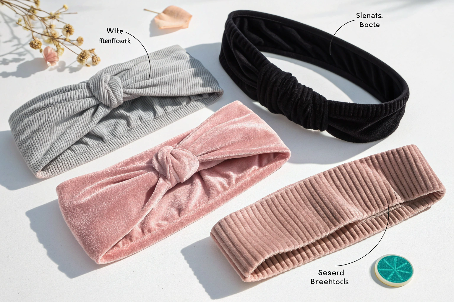
Even within a single color, you can create depth and interest by varying the texture. Imagine a collection all in cream. You could have a chunky cable-knit beanie, its thick, twisted yarn forming raised ridges that catch the light and cast subtle shadows when worn, adding a tactile warmth to the head; a smooth cashmere-feel scarf, so fine and soft it glides effortlessly through fingers, with a silky sheen that shimmers gently in different lighting, offering a luxurious contrast to coarser textures; and soft, fuzzy sherpa gloves, their plush, velvety surface like a cloud against the skin, with tiny loops and tufts that trap air, providing a cozy barrier against the chill while their gentle fuzziness creates a visually soft, inviting appearance that complements the other cream pieces, each texture bringing a unique sensory experience—rougher, smoother, fluffier—yet unified by the same warm, neutral hue.
Should hardware (buckles, zippers) match?
Yes, absolutely. This is a detail that many brands overlook. All the metal hardware in your collection should have a consistent finish. If you use a polished gold-tone buckle on a belt—its surface gleaming with a warm, reflective sheen that catches the light just so—the zipper on a matching pouch and the logo plate on a hat should also be polished gold-tone, each piece sharing that same lustrous, uniform appearance. The zipper teeth should slide smoothly, their edges coated in the same gold plating that resists tarnish, while the logo plate on the hat, whether embossed or engraved, should bear the same finish, ensuring that when viewed up close, there's no jarring contrast between the buckle's shine and the zipper's dullness or the plate's matte coating.
Consistency in these small details signals a high level of design intentionality; it speaks to a brand that pays attention to the tactile and visual experience of every element, creating a cohesive look that feels thoughtfully crafted rather than haphazardly assembled. When a customer runs their hand over the belt buckle and then reaches for the pouch, they notice the seamless transition in finish, reinforcing a sense of quality and attention to detail that elevates the entire product line.
How Do I Edit and Curate the Final Collection?
You've followed the steps, and you have a large group of potential products that fit your color palette and theme. But now you have too many. You're worried that offering too much choice will overwhelm your customer and dilute your story.
This is the final, crucial step: editing. As the famous designer Coco Chanel said, "Before you leave the house, look in the mirror and take one thing off." The same applies to building a collection. Now is the time to be ruthless. Look at your proposed collection and ask:
- Is there any piece that feels like an outlier? If you have to struggle to justify its place, it doesn't belong.
- Are there too many similar items? Do you really need five styles of black beanies, or can you edit it down to the best two?
- Does the collection feel balanced? Do you have a good mix of statement pieces and essential basics?
A great collection is as much about what you choose to leave out as what you choose to put in.
This editing process is where a brand's true identity is forged. At Shanghai Fumao Clothing, we often act as a sounding board for our clients during this stage. We can provide sales data on which styles are classic top-performers and which might be too niche. But ultimately, the final curation is up to the brand owner. It's your name and your vision. A tightly edited collection is a confident one.

What is a "hero" item?
Every collection should have one or two 'hero' items. These are the most exciting, eye-catching, or trend-forward pieces that you will feature prominently in your marketing campaigns, from social media teasers to full-page advertisements and email newsletters. The hero item is designed to immediately capture the customer's attention, often through bold colors, innovative designs, unique materials, or a striking silhouette that stands out on the runway, in lookbooks, or against a backdrop of complementary products. It serves as the focal point, the conversation starter, and the reason shoppers might pause, engage, and consider exploring more.
How often should I release a new collection?
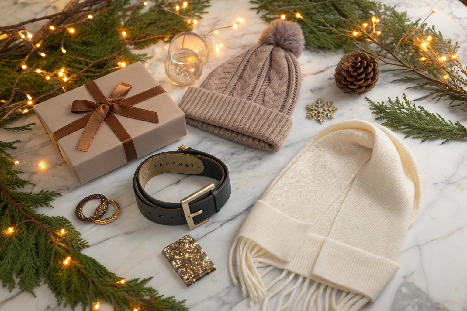
This depends on your brand model, but a common approach is to release four main collections per year (Spring, Summer, Fall, Winter) with potentially smaller, 'capsule' collection drops in between for holidays or special events. The key is to maintain cohesion within each individual collection or drop, ensuring that color palettes, fabric textures, and design motifs align seamlessly to create a unified narrative.
For example, a Spring collection might feature lightweight linen blends in soft pastels like blush pink and mint green, paired with floral prints and delicate ruffled details, while a Summer capsule could introduce vibrant tropical patterns in bold yellows and aqua blues, crafted from breathable cotton or seersucker. Fall collections often embrace richer tones such as burnt orange, forest green, and deep burgundy, incorporating heavier fabrics like wool or corduroy with structured silhouettes, and a Winter main line might showcase luxurious cashmere sweaters, tailored coats in black or ivory, and accessories like knit scarves and leather gloves.
Conclusion
Creating a cohesive collection of accessories is a deliberate and strategic process, not a happy accident. It begins with the disciplined foundation of a strict color palette. It's brought to life by a clear, evocative theme that tells an emotional story. It's made tangible through a harmonious selection of complementary materials and textures. And finally, it is perfected through the ruthless act of editing. By following these steps, you will transform your brand from a simple store into a curated destination, making your products more desirable, your marketing more effective, and your brand identity unforgettable.
At Shanghai Fumao Clothing, we are more than just a manufacturer; we are collection-building partners. We have the expertise and the integrated supply chain to ensure your vision for a cohesive collection is executed with precision, from perfect color matching to consistent hardware.
If you're ready to move beyond sourcing individual items and start building powerful, cohesive collections, I invite you to reach out to our Business Director, Elaine, at her email: elaine@fumaoclothing.com.