Your success hinges on anticipating what's next. You're looking at the trend forecasts for 2025, and a powerful, undeniable theme is emerging: a profound shift away from loud, fleeting brights towards a sophisticated and nuanced palette of neutral tones. You see shades described as "greige," "mushroom," "oat milk," and "olive" dominating everything from runway fashion to interior design. You're asking the crucial business question: Is this just a passing fad, or is it a deeper, more significant shift? And most importantly, why is this happening now, and how can you strategically position your 2025 accessory collection to capitalize on it?
Neutral tones are dominating the 2025 palette because they are a direct response to a collective global desire for calm, longevity, and authentic value in a world of digital noise and economic uncertainty. This trend, often labeled "Quiet Luxury," is not about being boring; it's a sophisticated movement that prioritizes timeless style, versatility, and conscious consumption over the fleeting dopamine hit of bright, disposable trends. For consumers, neutrals represent a smart, safe, and sustainable investment.
I'm the owner of Shanghai Fumao Clothing, and we're not just seeing this trend; we're actively helping brands build their 2025 collections around it. This isn't just a color story; it's a psychological and economic story. Consumers are fatigued by the relentless cycle of micro-trends and are seeking refuge in pieces that feel permanent, valuable, and real. Understanding the "why" behind this shift is the key to creating a collection that feels not just on-trend, but deeply relevant and desirable. Let's explore the powerful forces driving the rise of the new neutrals.
How Does "Quiet Luxury" Drive the Demand for Neutrals?
You've likely heard the term "Quiet Luxury" or "Stealth Wealth" buzzing in fashion media. It's a movement away from flashy, logo-driven status symbols towards a more understated and confident form of elegance. But what does this have to do with color? How does this sociological trend directly impact the commercial viability of a neutral-toned handbag or belt?
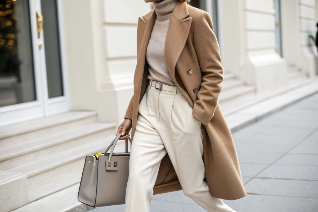
The "Quiet Luxury" movement is fundamentally built on a neutral color palette. Neutrals are the visual language of this trend because they shift the focus away from the brand and onto the quality of the product itself—the material, the craftsmanship, and the design. A neutral-toned accessory doesn't shout for attention with a loud color or logo; it communicates value through its inherent quality and timelessness, which is the very essence of stealth wealth.
This is a profound shift in how consumers signal status.
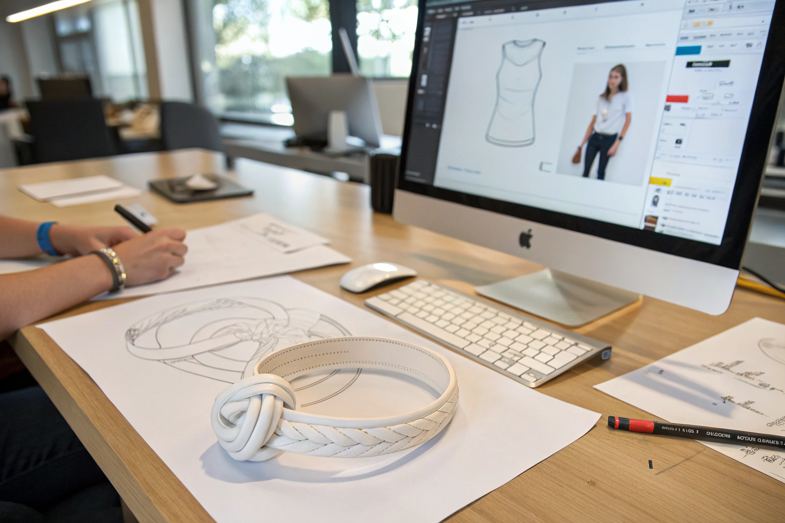
- Focus on Craftsmanship: When an accessory is a neutral color, your eye is naturally drawn to other details: the texture of the leather, the quality of the stitching, the elegance of the hardware. Neutrals provide a clean canvas that allows quality to shine. A poorly made item in a neutral color has nowhere to hide its flaws.
- Signal of Confidence: Wearing bright, trendy colors can be seen as trying to keep up with fast fashion. Wearing a sophisticated, neutral palette signals a quiet confidence—an understanding that true style is timeless and not dependent on fleeting trends. It suggests the wearer is an insider who values quality over novelty.
- Perceived Longevity: A neutral-toned accessory feels like an investment piece. A customer can intuitively understand that a classic taupe handbag will remain stylish for a decade, whereas a neon green one has a very short shelf life. This perception of longevity is central to the "luxury" component of the trend.
By designing your 2025 collection in a palette of sophisticated neutrals, you are aligning your brand with this powerful and aspirational movement, positioning your products as smart, timeless investments rather than frivolous, trendy purchases.
Is this trend only for high-end luxury brands?
No, and this is the key commercial insight. While the trend may have been popularized by high-end brands like The Row or Loro Piana, the ethos of "Quiet Luxury" has trickled down to all market levels. A customer buying a $100 handbag from a contemporary brand still wants it to look expensive, feel timeless, and offer great value. A neutral palette is the most effective way to deliver that high perceived value, regardless of the actual price point. It's about a "luxury look for less."
How do I choose the right "quiet luxury" neutrals?
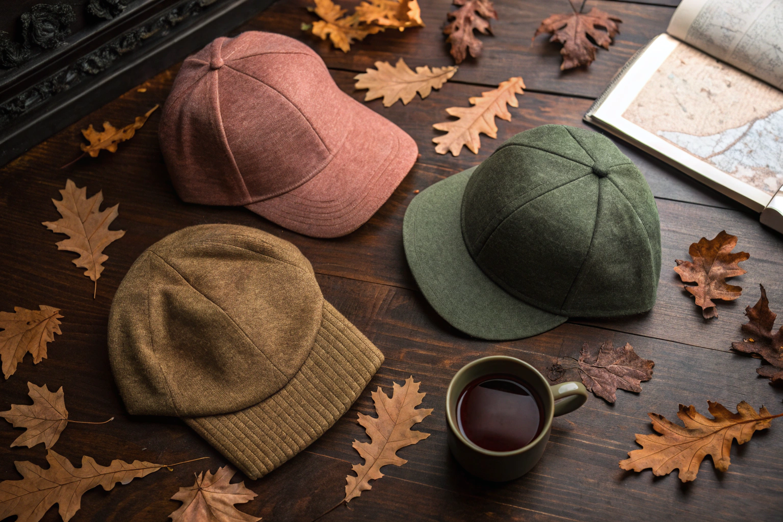
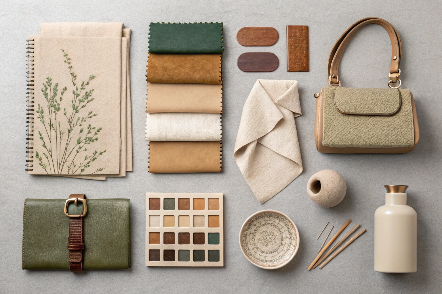
The key is to choose complex, nuanced neutrals, not basic primary ones. Instead of a flat, boring beige, think of a "greige" (a mix of grey and beige). Instead of a simple grey, consider a warm "mushroom" or a cool "slate." These sophisticated, in-between shades feel more intentional and expensive. At AceAccessory, we work with our clients to develop custom-dyed neutral colors that are unique to their brand, further enhancing this sense of exclusivity.
Why Are Consumers Seeking Calm and "Digital Detox" Colors?
Think about the daily experience of your customer. They are bombarded with a constant stream of information, notifications, and bright, flashing content on their screens. Their digital lives are loud, chaotic, and demanding. You're wondering if there's a connection between this digital overload and the shift towards a more muted, calming color palette in the physical products they choose to own.
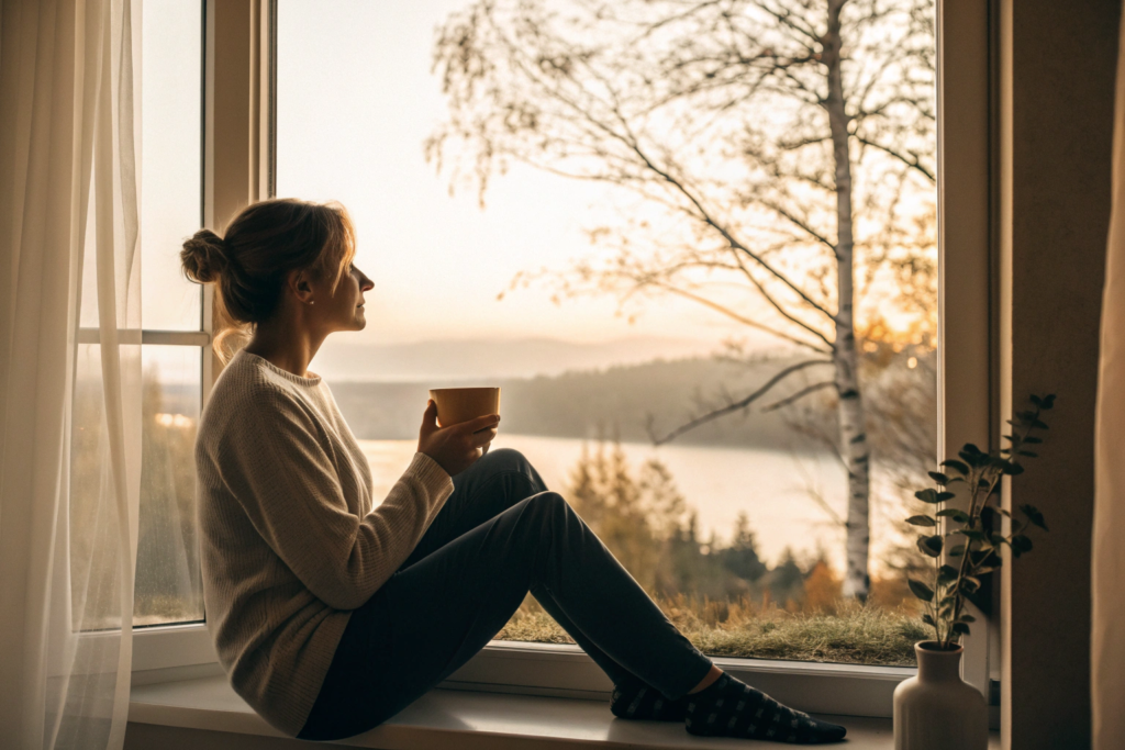
The dominance of neutral tones is a direct psychological reaction to our over-stimulated, digitally saturated world. Consumers are actively seeking "digital detox" experiences and are drawn to colors that evoke a sense of calm, mindfulness, and a connection to the natural world. A neutral palette provides a visual and emotional sanctuary, a moment of quiet in a world of noise. These are not just colors; they are a form of wellness.
This is a powerful emotional driver that you can tap into with your product and marketing.
- Connection to Nature: Many of the trending neutrals for 2025 are drawn directly from nature: the color of sand, stone, clay, and un-dyed wool. These colors feel grounding, authentic, and real in a way that a synthetic, digital-first color does not.
- Creating a Personal Sanctuary: Consumers are increasingly viewing their homes and their wardrobes as personal sanctuaries. A neutral palette creates a cohesive, calming, and uncluttered visual environment, which can help to reduce stress and anxiety. An accessory in a soft, neutral tone is a small piece of that sanctuary they can carry with them throughout the day.
- Mindful Consumption: The choice to wear calming, neutral colors is often linked to a broader interest in mindfulness and intentional living. It's a conscious choice to opt out of the frantic energy of the trend cycle and embrace something more centered and peaceful.
When you market a collection of neutral-toned accessories, you are not just selling a color. You are selling a feeling: the feeling of calm, of balance, and of a mindful escape from the chaos of modern life.
What are some key "calming" neutrals for 2025?
Look for neutrals with a soft, earthy, or warm undertone. Key examples include:
- Oat Milk: A creamy, warm off-white that feels softer and more organic than a stark, clinical white.
- Mushroom: A complex, earthy grey-brown that is incredibly versatile and grounding.
- Washed Olive: A muted, dusty green that feels calming and directly connected to nature.
- Terracotta: A warm, baked-earth tone that provides a touch of color while still feeling natural and grounded.
How can I use this in my marketing?
Your product photography and brand messaging should reflect this mood. Instead of loud, high-energy studio shots, consider lifestyle photography in calm, natural settings. Use language that speaks to "calm," "balance," "timelessness," and "mindful style." Connect your products to the feeling of wellness that your customers are actively seeking.
How Do Economic Uncertainty and Sustainability Influence Color Choice?
In times of economic uncertainty, consumer behavior shifts dramatically. People become more cautious with their spending, prioritizing needs over wants and seeking maximum value from every purchase. You need to understand how this economic anxiety affects something as seemingly simple as color preference.
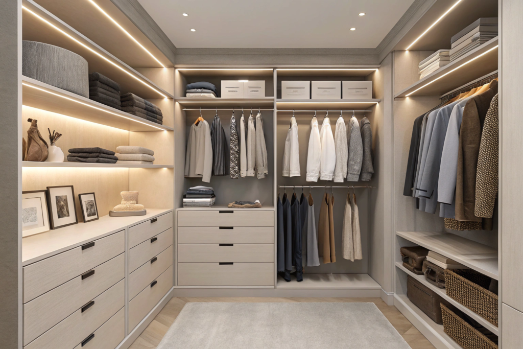
During periods of economic uncertainty, consumers gravitate towards neutral tones because they are perceived as a safer, more practical, and more sustainable financial investment. A neutral-toned accessory is incredibly versatile, meaning it can be worn with a wider range of outfits, increasing its "cost per wear" and making it a smarter purchase. This aligns perfectly with the growing consumer interest in sustainability and building a long-lasting "capsule wardrobe."
This is about practicality and maximizing value.
- Versatility is Value: A classic black, tan, or grey belt can be worn with almost any outfit. A bright pink belt has very limited use. When a customer is being careful with their money, they will almost always choose the more versatile option because it provides more value.
- The Rise of the Capsule Wardrobe: The concept of a "capsule wardrobe"—a curated collection of a few essential, high-quality items that can be easily mixed and matched—is gaining huge popularity. This philosophy is built on a foundation of neutral base pieces. An accessory collection designed in a complementary neutral palette is perfectly positioned to appeal to this large and growing group of consumers.
- Longevity as Sustainability: The most sustainable product is the one you don't have to replace. By choosing a timeless neutral color, the customer is making a sustainable choice to buy an item that they can wear for many years, rather than a trendy item that will end up in a landfill next season. This connection between timeless style and sustainability is a powerful marketing message.
Positioning your neutral collection as "the smart, versatile, and sustainable choice" will resonate deeply with the cautious and conscious 2025 consumer.
What is "cost per wear"?
"Cost per wear" is a simple calculation consumers use to justify a purchase: Cost of Item / Number of Times Worn = Cost Per Wear. A $200 neutral handbag worn 200 times has a cost per wear of $1. A $100 trendy handbag worn only 10 times has a cost per wear of $10. A neutral palette dramatically lowers the cost per wear, making a higher-quality item feel like a much better long-term value.
How does this affect my product assortment?
While your collection should be dominated by core neutrals, you can still include one or two "accent" colors. However, these should also be sophisticated and versatile. For example, instead of a bright yellow, consider a deep "mustard." Instead of a hot pink, consider a dusty "rose." These muted accent colors can be paired more easily with a neutral wardrobe, making them a smarter purchase than their brighter counterparts.
How Do Neutrals Provide a Foundation for Personal Expression?
You might be worried that a market dominated by neutrals will be boring, with everyone looking the same. But what if the opposite is true? What if a neutral base is actually the key that unlocks a more authentic and individual form of style?
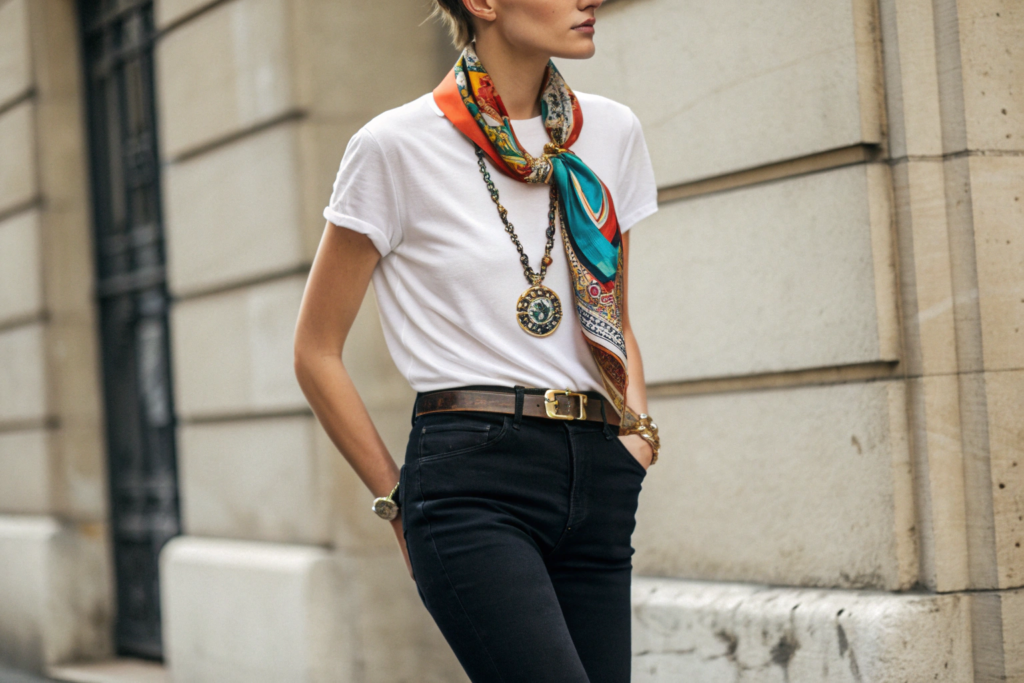
Paradoxically, a neutral-dominated wardrobe actually provides the perfect foundation for personal expression through accessories. A neutral outfit acts as a "quiet canvas," allowing the wearer's chosen accessories, hairstyle, or makeup to become the focal point of their look. This empowers consumers to showcase their unique personality through curated details, rather than being defined by a single, loud, trend-driven garment.
This creates a huge opportunity for your accessory brand.
- Accessories Become the Main Event: When the clothing is quiet, the accessories get to be the star of the show. A beautifully designed belt, a unique hat, or a colorful scarf can completely transform a simple neutral outfit. This increases the perceived importance and value of the accessories you sell.
- Encourages "Styling" and "Collecting": This trend encourages consumers to think more like stylists, curating a collection of unique accessories that they can use to express their mood and personality each day. Your brand can become a go-to source for these key expressive pieces.
- A Mix of High and Low: A neutral base allows for a democratic mix of high-end investment pieces and more affordable, fun accessories. A customer might wear a timeless, neutral coat from a luxury brand but pair it with a colorful, affordable beaded bracelet or a vintage scarf.
How does this change my design strategy for accent pieces?
It means your non-neutral, accent accessories can be more bold, artistic, and unique. Since they are being paired with a simple canvas, they can afford to be more expressive. Think about offering accessories with unique textures, interesting patterns, or artisanal details. These become the "spice" that customers use to give flavor to their neutral wardrobe.
Can I sell both the "canvas" and the "paint"?
Absolutely. This is the ideal strategy. Your core collection should consist of the perfect, high-quality, neutral-toned "canvas" pieces: the timeless black leather belt, the versatile greige tote bag, the classic cream-colored beanie. Then, you can offer smaller, seasonal "capsule collections" of more expressive, colorful "paint" pieces—like a printed silk scarf or a brightly colored hair clip—that are designed to be layered on top of your core products.
Conclusion
The dominance of neutral tones in the 2025 palette is not a sign of a boring future. It is a rich, meaningful, and commercially powerful trend driven by deep-seated consumer desires. It is a reflection of a world seeking calm in the face of digital chaos ("Quiet Luxury"), a yearning for authenticity and wellness ("Digital Detox Colors"), and a pragmatic need for value and longevity in uncertain economic times ("Investment Dressing"). By understanding these underlying forces, you can design a collection that is not just visually appealing but emotionally and financially resonant. You can create accessories that serve as the foundation of a timeless wardrobe, providing your customers with the versatile, high-value, and sustainable choices they are actively searching for.
At Shanghai Fumao Clothing, we are experts in translating these macro trends into tangible, high-quality products. We can help you develop the perfect palette of sophisticated neutrals, source materials that speak to quality and craftsmanship, and build a 2025 collection that is perfectly aligned with the mindset of the modern consumer. If you are ready to create a collection that is not just on-trend, but truly relevant, please reach out to our Business Director, Elaine, at elaine@fumaoclothing.com.