As an experienced buyer like Ron, you know the feeling of dread. You signed off on a beautiful "deep sea blue" fabric swatch months ago. Now, 10,000 finished units have arrived, and they are... "royal blue." It's close, but it's not right. It doesn't match the other accessories in your collection, and it's not what you promised your retail partners. This is one of the most common, costly, and frustrating problems in manufacturing. So, how do you prevent it? How do you ensure the color you approve is the color you receive, every single time?
To solve color matching issues, you must remove all subjectivity from the process and implement a rigorous, three-stage technical system: first, define your color using a universal standard like Pantone; second, approve a physical "lab dip" of your chosen fabric dyed to that standard; and third, ensure your factory uses a spectrophotometer and a controlled light box to verify that the bulk production matches the approved lab dip. This is not an art; it is a science.
From my position as a manufacturer, I can tell you that "close enough" is the enemy of quality. At Shanghai Fumao Clothing, we have invested heavily in color science because it is the foundation of consistency and trust. A brand's color palette is its identity, and it is our job to protect it with absolute precision. Let me walk you through the professional, non-negotiable process for achieving perfect color, every time.
Why Is "That Blue" a Useless Color Standard?
The color matching process fails before it even begins if the initial color target is not defined objectively.
You must define your color with a universal, numeric standard—most commonly a Pantone code—because verbal descriptions ("sky blue") or on-screen colors are subjective and unreliable. The color you see on your monitor is different from the color on my monitor. A physical swatch you mail can fade. A Pantone code is a global, objective, and unchanging target.
This is the absolute, mandatory first step. When a client sends a tech pack with a request for "burgundy," my first response is, "Can you please provide the Pantone code?" A request for "Pantone 19-1524 TCX (Rumba Red)" is a precise, actionable instruction that our dye house can work with. Without this code, we are simply guessing. This objective standard is the foundation for the entire lab dip approval process.

What is the Pantone Matching System (PMS)?
The Pantone Matching System is a proprietary color space used in a variety of industries, primarily printing, but also in the manufacture of colored paint, fabric, and plastics. The Fashion, Home + Interiors (FHI) System is the specific standard for textiles, using TCX (for cotton) or TPX (for paper) codes.
What if I don't have a Pantone book?
If you have a physical swatch of fabric you need to match, you can send it to us. We will use our spectrophotometer to read the color and generate the closest Pantone equivalent. However, investing in a Pantone FHI Color Guide is one of the best investments a serious product developer can make.
Why Is a "Lab Dip" the Most Critical Approval Gate?
You've provided a Pantone code. But how do you know the factory can accurately reproduce that color on your specific material?
A "lab dip" is the most critical approval gate because it is a physical sample of your actual production fabric, dyed by the factory to match your target Pantone code. Dyes react differently to different fibers (wool, cotton, polyester). The lab dip is your proof that the color can be successfully achieved on your chosen material before you commit to dyeing thousands of yards of it.
This is a non-negotiable checkpoint. We will never proceed to bulk dyeing without a client's signed approval of a lab dip. The process works like this:
- We receive your Pantone code.
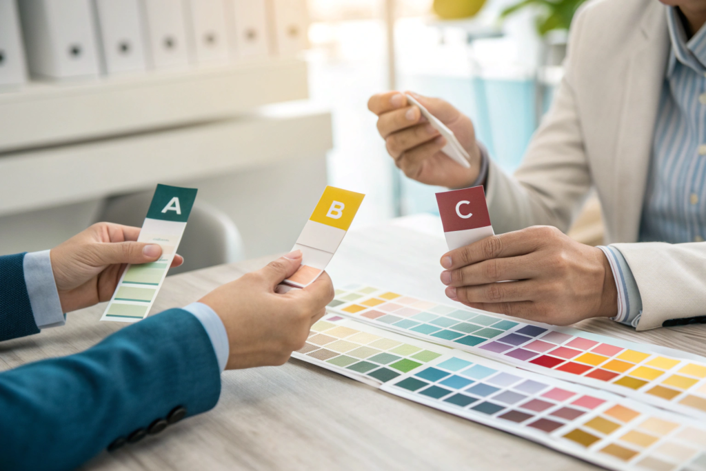
- Our dye house creates 3-4 small swatches (A, B, C, D) that are slight variations around the target.
- We mail these physical swatches to you for review.
- You review them (ideally under a controlled light source) and approve the best match.
This approved swatch then becomes the "golden sample" for production. This physical standard is essential for the bulk production QC process.
What if none of the lab dips are right?
You provide feedback (e.g., "Option B is the closest, but it needs to be 5% darker and slightly less red"). We then create a second round of lab dips based on your comments. This process continues until you are 100% satisfied. You should never approve a lab dip you don't love.
How long does this take?
Each round of lab dips can take 7-10 days, including the time required for sample preparation, chemical analysis, data interpretation, and the shipping of materials between the production facility and the laboratory.
This period encompasses meticulous steps such as precise measurement of raw materials, controlled reaction conditions, and thorough testing for quality parameters like color consistency, texture, and chemical composition. It's crucial to build this time into your production calendar, accounting for potential delays in shipping due to weather conditions, logistical bottlenecks, or unforeseen laboratory backlogs.
How Do You Ensure Consistency from the First Unit to the Last?
You've approved the perfect lab dip. How do you ensure that the first accessory produced is the exact same color as the 10,000th?
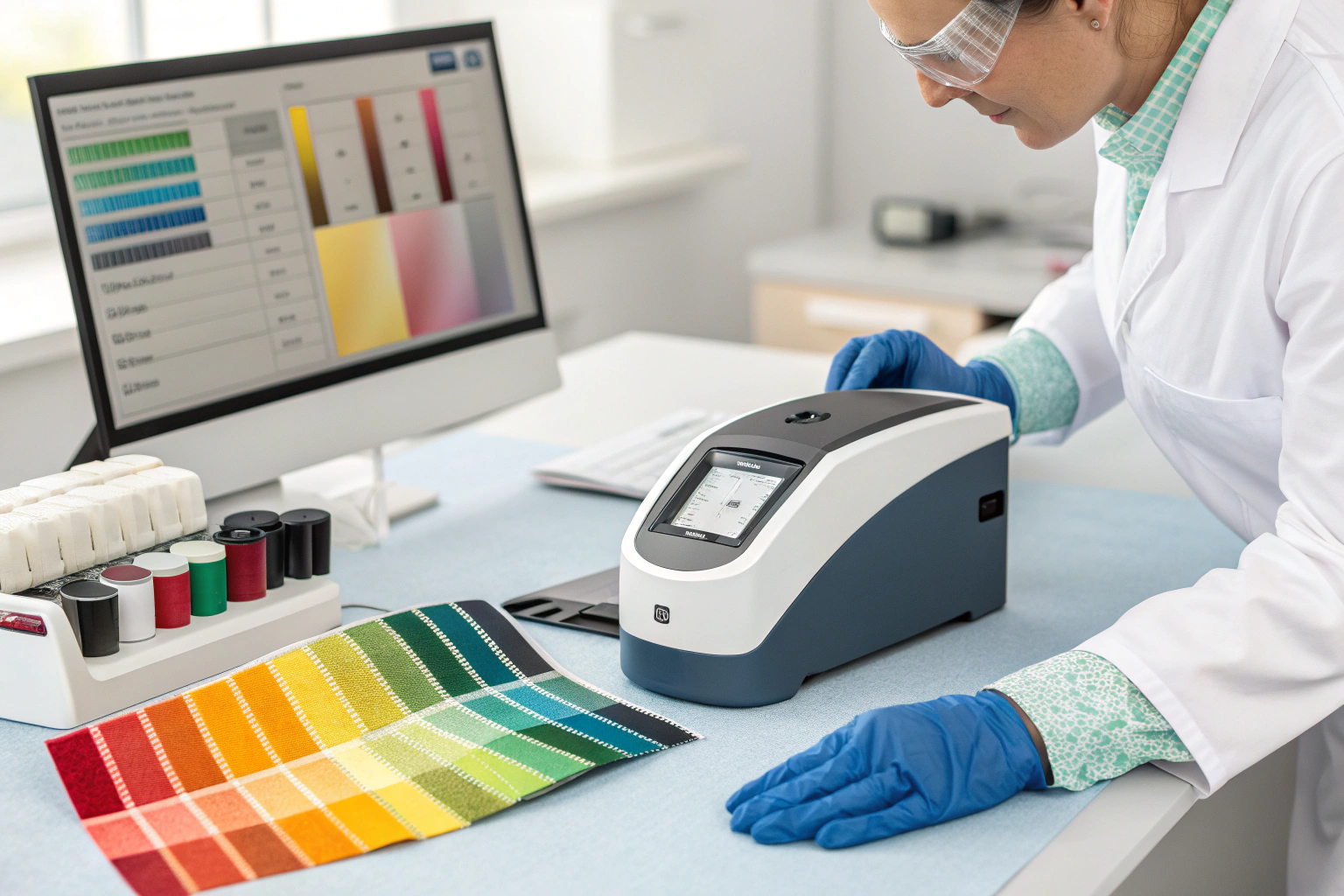
You ensure consistency by working with a factory that uses a spectrophotometer and a light box to police the bulk production against the approved lab dip. Human eyes are fallible and can be tricked by lighting. A spectrophotometer is a scientific instrument that reads a color and gives it a numeric value, providing an objective, data-driven way to check for color deviation.
This is where technology replaces guesswork. Here's our process at Shanghai Fumao Clothing:
- We scan your approved lab dip with our spectrophotometer to create a master digital color standard.
- After the bulk fabric is dyed, we take samples from the beginning, middle, and end of the dye lot.
- We scan these samples and compare the data against the master standard. The variance must be within a tiny, pre-agreed tolerance (measured in Delta E).
- We also visually compare the samples against the approved lab dip in a D65 light box.
This two-step verification (digital data + visual check) is the only way to guarantee consistency across an entire production run. This is a key part of a proactive color management strategy.
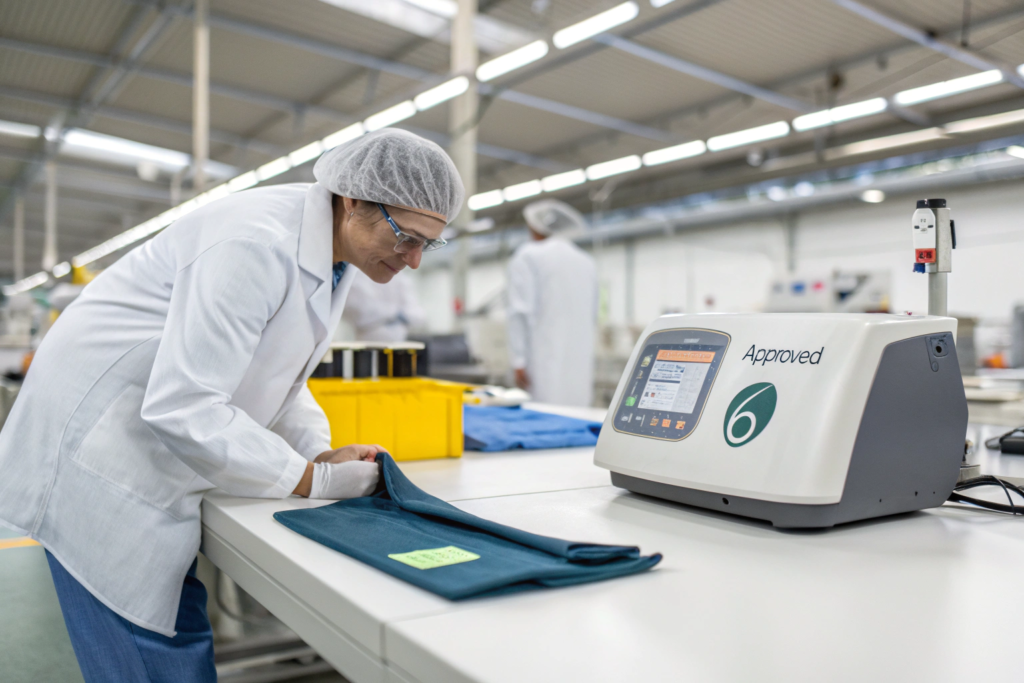
What is a "Light Box"?
A light box is a specialized viewing booth designed to provide consistent and controlled lighting conditions, typically utilizing standardized illumination such as D65, which precisely simulates the spectral characteristics of natural daylight at midday.
This uniform lighting environment is crucial because colors have a tendency to appear dramatically different under varying light sources—whether it be the harsh, cool tones of factory overhead lights, the warm glow of incandescent store fixtures, or the soft, balanced spectrum of natural sunlight.
What is "Delta E"?
Delta E (dE) is a standard measurement of the difference between two colors, quantifying the perceptual distinction in a numerical value that aligns with human visual perception. A dE of less than 1.0 is generally considered to be an imperceptible difference, meaning that even the most discerning eye would struggle to detect any variation between the two color samples under normal viewing conditions.
How Do You Manage Color Across Different Materials and Factories?
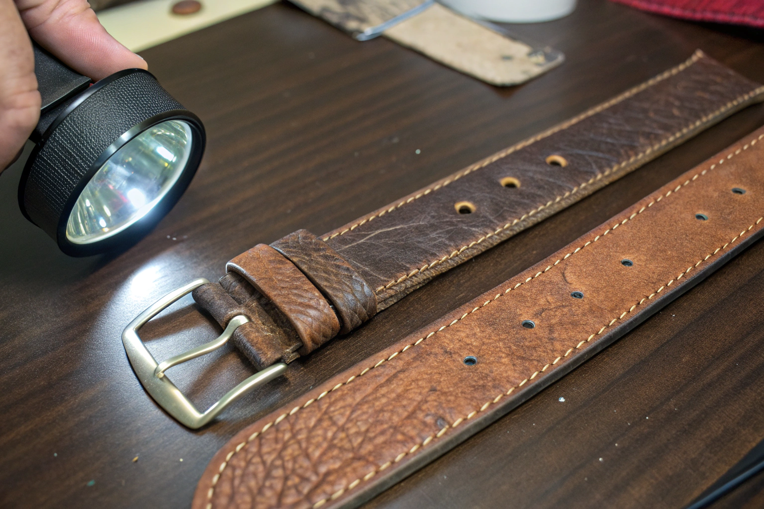
The ultimate challenge: you have a leather belt, a cotton hat, and a metal buckle, all in your brand's signature "navy blue." How do you get them all to match?
To manage color across different materials, you must treat each material as a separate lab dip project against the same master Pantone code. You cannot expect a dye on cotton to look identical to a paint on metal. The goal is to achieve a "visually harmonious" family of colors that, when viewed together, clearly belong to the same palette.
This requires a highly organized approach and a lead manufacturing partner who can manage the process.
- Establish One Master Standard: Use a single Pantone TCX (cotton) code as your master "brand navy."
- Create Separate Projects: We would initiate a lab dip for the cotton hat fabric, a leather swatch dip for the belt, and a paint strike-off for the metal buckle, all targeting the same master Pantone code.
- Approve Visually: You would then receive all three samples and approve them together, ensuring they look correct as a group.
At Shanghai Fumao Clothing, we often act as this lead partner, coordinating with our specialist suppliers (like buckle platers or leather tanneries) to manage this complex cross-material color development for our clients.

Why do colors look different on different materials?
The texture, sheen, and absorbency of a material all affect how it reflects light and how our eyes perceive its color. A glossy metal, with its smooth, polished surface that catches and redirects light in sharp, concentrated beams, will always look different from a matte cotton, whose slightly rough, fibrous texture scatters light softly and diffusely, even when both are treated with the same colorant.
What is a "strike-off"?
A strike-off is the printing or painting equivalent of a lab dip. It's a small sample of your artwork or color applied to the actual production base material for approval before bulk production. This process involves carefully replicating the intended design, hue, saturation, and texture on a substrate that matches the material to be used in large-scale manufacturing—whether it's fabric, paper, plastic, or another surface.
The strike-off serves as a critical checkpoint, allowing clients, designers, or quality control teams to examine the color accuracy, print clarity, and overall appearance under various lighting conditions, ensuring it meets the desired standards before committing to mass production. By creating this miniature representation, potential issues such as color variation, ink bleeding, or misalignment can be identified and corrected early, saving time and resources in the long run.
Conclusion
Solving color matching issues is not a mystery; it is a process. By replacing subjective descriptions with the objective language of Pantone, by using the lab dip as your non-negotiable quality gate, and by partnering with a factory that uses scientific tools like spectrophotometers and light boxes to police production, you can eliminate color errors. This rigorous, technical approach ensures your brand's color integrity, reduces costly mistakes, and is the foundation of a professional and trustworthy manufacturing partnership.
At Shanghai Fumao Clothing, we have made the science of color a core competency. We are equipped and ready to be the partner who delivers your exact color vision, with precision and consistency, every single time.
If you are tired of color surprises and are ready for a more professional approach, let's talk. Please contact our Business Director, Elaine, at her email: elaine@fumaoclothing.com, to get started.